23 Understanding the Purposes of Data visualization
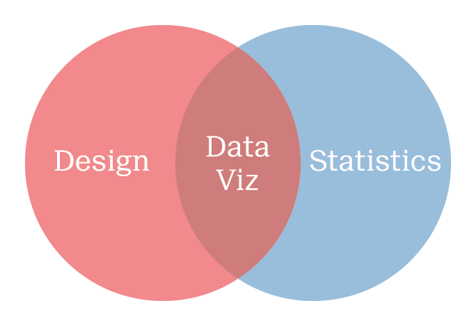
Data visualization is an analytical tool combining both statistics and communication skills. It bridges the gap between a solid technical understanding of data on one side, and proper implementation of design on the other.
My goal with this book is to provide scientists of all stripes with the tools they need to create effective data visualizations of quantitative data. This involves bringing together many diverse topics into a cohesive set of principles. I’ll address statistics, such as LOESS curves, density and binning functions, as well as design elements, such as visual perception, saliency, and color choice.
By the end of the book, readers will have an overview of the many possibilities for plotting quantitative data. They’ll understand which methods best represent a given data-set to address specific underlying research questions.
The grammar of graphics plotting framework will tie all the concepts together. As we progress, I’ll explore the seven layers involved in building all variety of plots:
- Data
- Aesthetics (@ref(sec-contEnc), @ref(sec-catEnc))
- Geometries (@ref(sec-geom-uni))
- Statistics (@ref(sec-geom-multi))
- Coordinates (@ref(sec-coord))
- Facets (@ref(sec-SM))
- Themes (@ref(sec-NonDataInk))
23.1 Explore versus Explain
The first important aspect of visualization is to recognize the distinction between exploratory and explanatory data visualizations, summarized in fig. @ref(fig:Purpose) and table @ref(tab:EE).
Exploratory visualizations are among the first steps of any Exploratory Data Analysis (EDA) workflow. Here, data visualization is not only an extension of descriptive statistics, but also use for diagnostic plots. It allows us to get the first, crucial impression of a data-set, and to assess if we’ve used the appropriate statistics.
Explanatory visualizations are the polished plots that appear in scientific writing and presentations. Data journalism is an extension of this, where the audience is typically lay people, and further still infographic are another elaboration. Here, I’ll focus on explanatory visualizations by and for scientists.
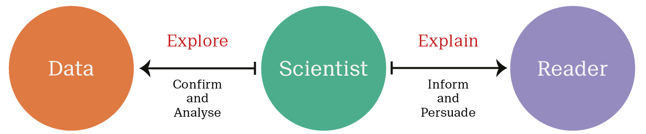
Table (#tab:EE): The two broad purposes of data visualization.
| Exploratory | Explanatory | |
|---|---|---|
| When | First stages of analysis | End of analysis |
| Purpose | Exploratory Data Analysis (EDA) and diagnostic plots | Communicate a clear message to a specific audience |
| Effort | Quick & dirty | Labor intensive |
| Data content | Potentially many variables | Edited to meaningful variables |
| Audience | Small, specialist only | Broad, specialists to generalists |
| Breadth | Internal, for yourself & colleagues | External, for publication & presentation |
This book, and the accompanying workshop, focuses on explanatory data visualizations. I view these as an extension and refinement of exploratory data visualizations. I’ll mostly limit our discussion to static print and screen plots, which make up the lion’s share of scientific data visualizations. Examples of interactive plots will be presented when they offer solutions that static plots cannot deliver. For tips on presenting quantitative data, e.g. in an oral presentation, see the Presentation Skills reference book.].
23.2 Exploratory Data visualization
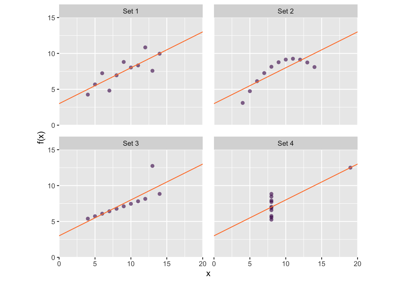
Data visualization are a form of graphical data analysis, i.e. a part of your statistics tool-box. Thus, we must appreciate the intimate link between graphics and statistics when using graphics as a first step in EDA. A classic example of this concept is Anscombe’s plots, shown in Fig @ref(fig:anscombe-new-gg). In each plot a different data set is described not only by the same linear model, \(y = 3.0 + 0.5x\), but also by the same correlation coefficient, \(r = 0.82\). Each plot tells a strikingly different story, but in this case, the statistical analysis performed does not provide enough information about the underlying distribution of the data.
As another example, let’s consider the relationship between mammalian body weight and brain weight, working with a small data set of representative members from 62 species. The head and tail of our data set are given in table @ref(tab:nice-tab):
| Species | Body weight (Kg) | Brain weight (g) |
|---|---|---|
| African elephant | \(6 654.000\) | \(5 712.00\) |
| Asian elephant | \(2 547.000\) | \(4 603.00\) |
| Giraffe | \(529.000\) | \(680.00\) |
| Horse | \(521.000\) | \(655.00\) |
| Cow | \(465.000\) | \(423.00\) |
| \(\vdots\) | \(\vdots\) | \(\vdots\) |
| Musk shrew | \(0.048\) | \(0.33\) |
| Big brown bat | \(0.023\) | \(0.30\) |
| Mouse | \(0.023\) | \(0.40\) |
| Little brown bat | \(0.010\) | \(0.25\) |
| Lesser short-tailed shrew | \(0.005\) | \(0.14\) |
Looking at the data, our first problem becomes apparent — both variables have extremely large ranges. That’s not surprising, and we’d probably come to this conclusion just by thinking about what we expect to see. Further consideration would lead us to the reasonable assumption that both variables are heavily positively skewed. This is pre-existing information we have about our data before we even plot it. It’s likely that you have pre-existing knowledge of your data and the expected distribution because of your domain expertise.
Domain expertise allows us to anticipate appropriate data visualizations before actually working on the data.
If you are an experimentalist, it’s important that you don’t discount your domain knowledge. In particular, the relationship between variables, purpose of the experiment of expected distributions will all come in handy when visualizing, like performing any statistics. When consulting a data scientist or colleague for help, be clear and forthcoming about what you anticipate the data will look like, especially if they are not familiar with your experiments.
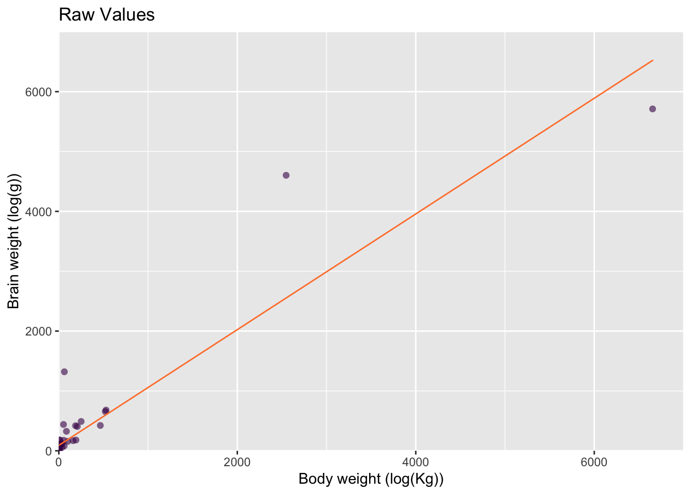
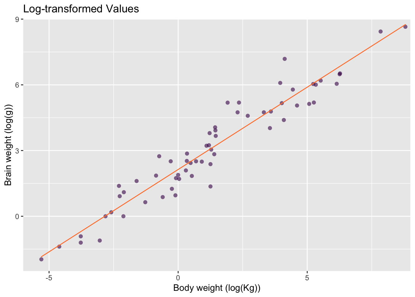
We can already see that it’s going to be difficult to plot such disparate values on a single plot, but let’s give it a go! To understand the relationship between the two variables, scatter plots are a logical first choice, as shown in fig. @ref(fig:mamm-poor-model), left, See section @ref(sub:ScatterPlots) for more details on scatter plots.
Our initial plot confirms what we already guessed — both variables are heavily positively skewed — making our scatter plot difficult to interpret. This is the first and most typical use of exploratory plots:
Exploratory plots allow you to assess the quality and distribution of your data during EDA.
But there is another equally important use of exploratory plots at this stage.
Exploratory plots encompase diagnostic plots that allow you to assess the quality of your statistical methods.
In this sense we use data visualization as a statistical tool. For example, here, we’d like to calculate the relationship between brain and body weight using a linear model (fig. @ref(fig:mamm-poor-model), left).
Given that both variables are positively skewed and the two Elephant species have an enormous influence, this model is not really appropriate.
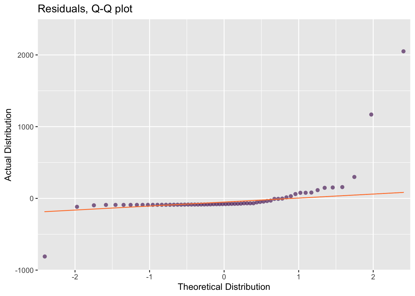
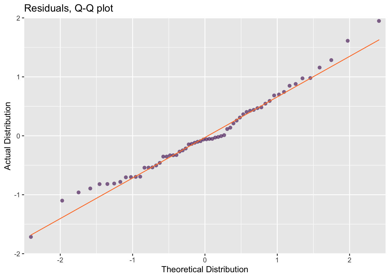
In a well-fit model, the distribution of the residuals — the distance between each observed and predicted \(y\) value, \(y_i - \hat{y}\), should be Normal. In our case that means that the differences between the observed and predicted brain weights should be Normally distributed. A typical and useful diagnostic plot for for assessing distributions is a Quartile-Quartile (Q-Q) plot. For now, all we need to know is that the more closely our residuals (the dots) fall onto the Q-Q line (fig @ref(fig:mamm-poor-model), right), the farther they are from a normal distribution. This confirms our suspicions that our model is not really the best choice.
The two extreme values from the African and Asian Elephants will also have a large influence on the linear model compared to the small values clustered near the origin. Visualizing influencers is a great diagnostic plot that you can use to asses you models.
So far, our exploratory plots revealed that the data set is poorly-presented in its present state and also poorly-described by our linear model. A solution is to use log-transformed data. The scatter plot of the log-transformed data-set allows each data point to be distinguished (fig.@ref(fig:mamm-better-model), left) and reveals that a log-linear model is much more appropriate. The residuals of the linear model also fit the normal distribution much better (fig. @ref(fig:mamm-better-model), right).
Remember, transformation functions are often used to adjust for some amount of positive or negative skew in the data. \(log_e\), \(log_2\) and \(log_{10}\) are very common in science and many variables have a log-log or a log-linear relationship. For further examples, refer to the section on transformation in the Statistical Literacy reference book and the protein abundance case study in the Data Analysis reference book.
23.3 Explanatory Data visualization
So far, we’re still dealing with exploratory plots. They are nicely formatted for the purposes of this book, but in reality all the plots we’ve seen so far would not typically be visually appealing. That’s OK, since they don’t have to be beautiful to be meaningful. To develop our solution further, for publication, we can imagine the preparation of fig. @ref(fig:mamm-explain).
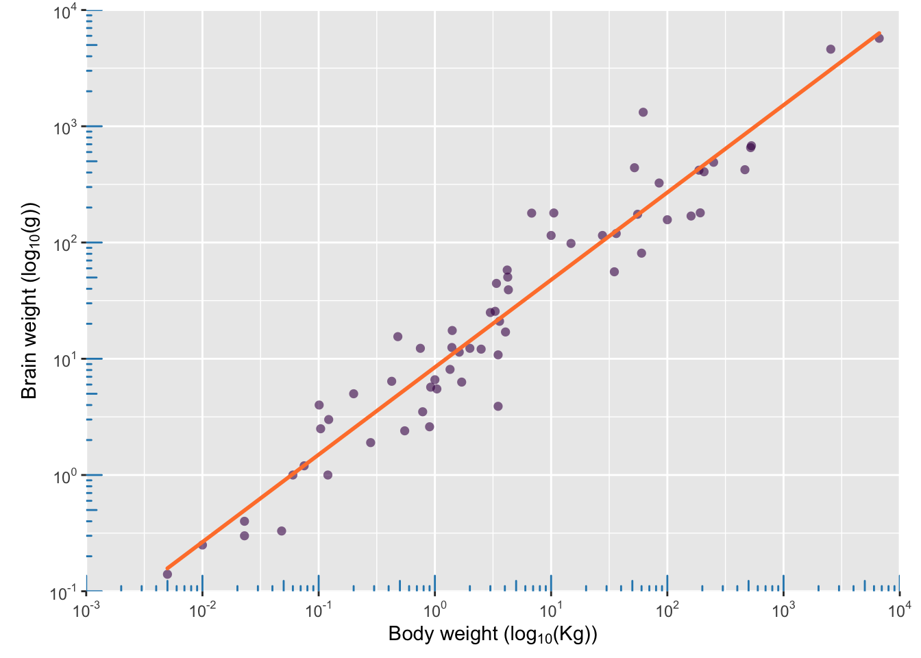
Like the text of a scientific paper, explanatory data visualizations tell the story of your research, regardless of where they appear. That’s why it’s important to understand the purpose of your plot, i.e. what do you want to say?, as well as the intended audience. Explanatory plots are presented for a specific purpose, so fig. @ref(fig:mamm-explain) will not be appropriate in all situations! It’s just one of many solutions.
Explanatory plots always exist in the context of an audience and media.
| Specialist | Generalist |
|---|---|
| Yourself | Lay audience |
| Lab members | Scientists outside you field |
Depending on the media, there are different questions we should consider:
For print:
- Is it a specialist research article?
- Is it a review article?
- Is it for a lay publication?
- How broad is the audience?
- How many figures will there be in total?
- How will the figures work together?
- How does a typical reader consume this content?
- Are the figures consistent?
For oral presentations:
- Who is the audience?
- How long will the presentation be?
- In what context will the presentation be held?
- Are the figures consistent?
For poster presentation:
- Do the figures tell a complete story of your research?
- Are the figures large enough to be legible?
- How much accompanying text will be on the poster?
If you choose to publish on-line, further options beyond data visualizations for print are available:
- Is an interactive component available or appropriate?
- Will the image be displayed on a mobile device, on a web-site or in a video?
- Is is a stand-alone image or will there be accompanying text?
For composing a scientific article see the Scientific Writing reference book including sections on writing figure legends, for oral presentations and some special use cases for data visualization in that context, see the Presentation Skills reference book.
23.4 Degrees of Separation
We’ll encounter plenty of examples of explanatory plots having clear messages throughout the rest of the book. Before we dig in, I’d like you to begin thinking about data visualization as learning a new visual language for communicating your results. Just like written and oral language, our new visual language needs a solid grammar and vocabulary. The grammar and vocabulary we use changes according to the needs of our audience so that we can best communicate our message to them.
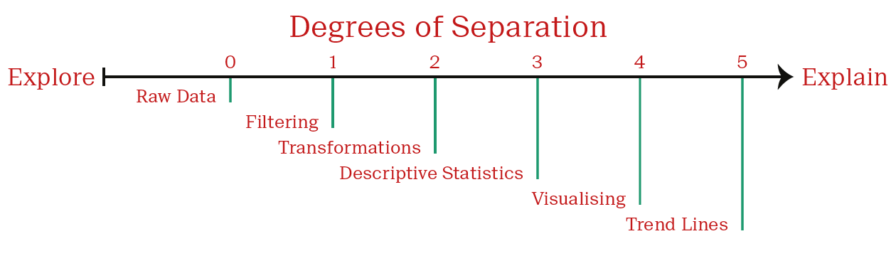
In this regard, I find a good way of distinguishing between exploratory and explanatory data visualizations is to think about how many degrees of separation exist between a visualization and the raw data that it describes.
Every manipulation of the data adds one degree of separation.
Each degree is intended to aid the viewer’s understanding of the data. At the same time, it also distances the viewer from the raw data. As an example, consider the following paradigm:
Zero degrees of separation is our starting point — a table of raw data. We have full access to all the data, including exact values. The specialist will feel right at home, mostly everyone else will just be overwhelmed. Very few people are interested in dealing with this level of detail. This is a true exploratory plot.
The first degree of separation is often a meaningful descriptive statistic, such as the mean. This allows the viewer to understand data-sets of any size. But be cautious! As we’ll see later on, we can already misrepresent our data at this point. Filtering is also a common first step.
The second degree of separation may be introduced when we choose a plot type to compare mean values. Which type of plot did we choose? Which values are intuitively compared to other values on the plot? Is this an appropriate arrangement? Is the data accurately represented?
Each degree of separation makes the data easier to understand, but this is accomplished by the loss of information. The descriptive statistic removes information about the distribution of the data. A plot removes the precise value of the mean, since we need to read it from an axis label.
Data visualisations typically result in a loss of precision.
But that’s perfectly fine! If you wanted the exact values, you can go to the raw data. We’re interested in trends and relationships here.
Exploratory data visualizations will have fewer degrees of separation than those for publication, since they are for the deeply-embedded specialist. Consider the following outline as a guide:
There is no universal path. There are many steps that occur before you have data ready for plotting and there are many decisions to be made in the plotting process itself. All of these contribute to the plot’s readability.
Your goal is to minimize the degrees of separation, while making your data visualization as easy to understand for its intended purpose.
Lastly, realize that in all of this we’re maing two very different fields. The soft design concepts are combined with the hard statistical understanding.
Now that we have an overview of the purpose of data visualization, let’s consider some design and statistical topics.