24 Perception
Many scientists equate good design with beauty and are surprisingly easily persuaded by aesthetic qualities. In reality, good design is a measure of usability. Think form follows function — use dictates appearance1. Beauty is a laudable goal, but first-and-formost data visualizations should work.
For explanatory data visualisation, this means clear, meaningful and honest communication. For exploratory data visualization, this means understanding your data thoroughly, including diagnostic plots to assess your models, see table @ref(tab:EE).
Let’s begin by considering visual preception. There are two ends of the spectrum, as described in table @ref(tab:perception).
Table (#tab:perception): The two extremes of visual perception.
| Slow | Fast |
|---|---|
| Exploratory phase | Explanatory phase |
| Confusing | Intuitive |
| Table look-up | Gestalt principles |
| Labour intensive | Saliency |
| Many messages | Self-explanatory |
24.1 Gestalt Principles
Gestalt is a German word that can be variously translated as design, form or shape. It encapsulates all of these ideas - the complete essence of an entity. Gestalt psychology took root in 1920s Berlin and is based on the principle that we see objects first in their entirety and second as individual parts. Hence, “the whole is greater than the sum of its parts”. Gestalt psychologists identified several visual principles that our minds intuitively recognize, some of which (fig. @ref(fig:gestalt)) are valuable in the context of data visualization. Remember, here, we are mainly interested in explanatory plots. They should be fast and communicate a clear message.
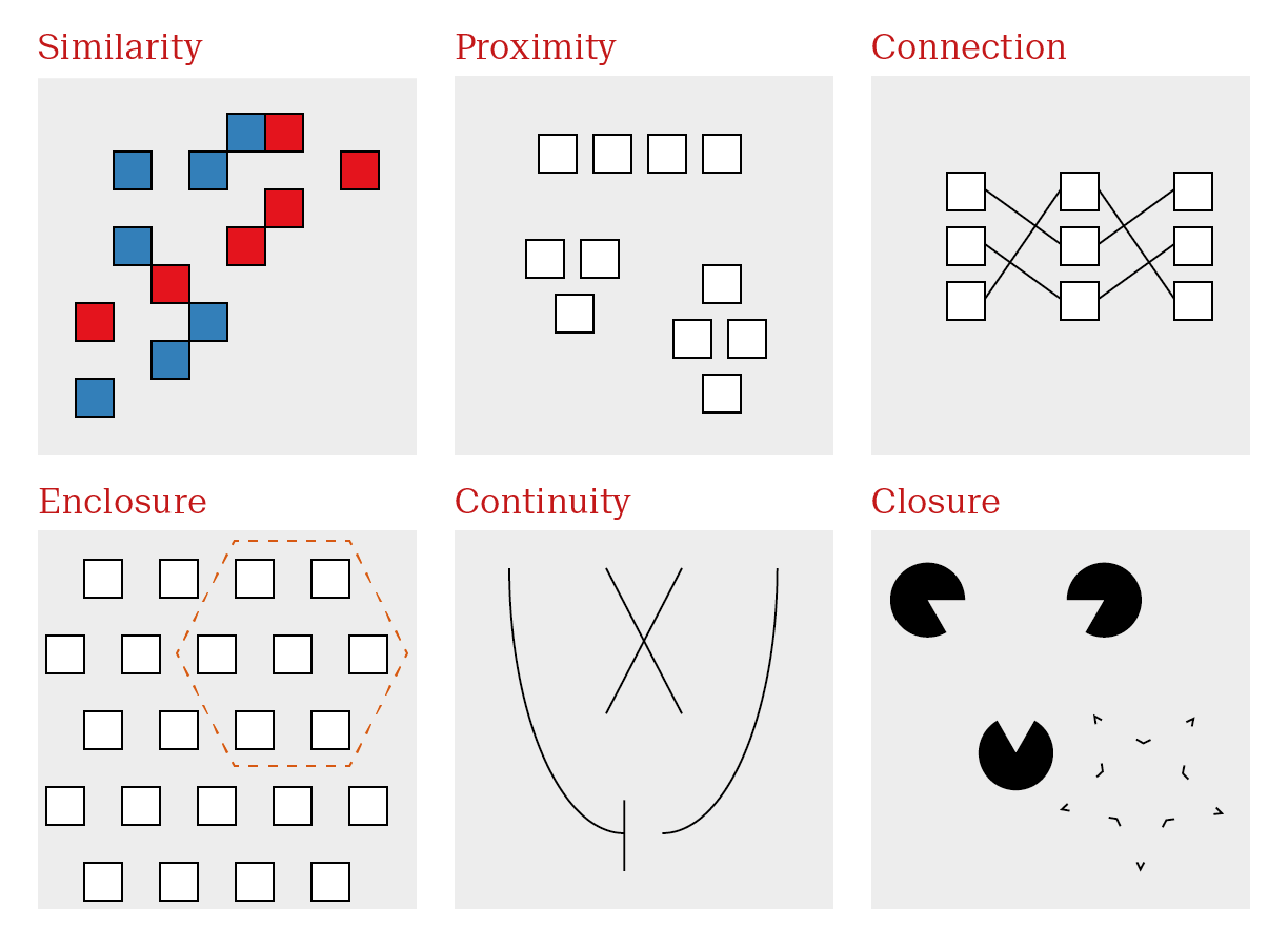
Gestalt principles dictate the first and immediate response to an image. Taking advantage of gestalt principles allows us to optimize visualizations to effectively communicate a clear message.
| Principle | Description | Use case |
|---|---|---|
| Similarity | Objects similar in appearance belong to the same group | Encode groups using distinct, easily distinguishable elements |
| Proximity | Objects physically close together belong to the same group | Arrange sub-items according to relationship |
| Connection | Objects that are physically connected with lines belong to the same group | Highlight patterns with lines where appropriate |
| Enclosure | Objects contained within borders belong to the same group | Highlight regions of interest with circles or boxes |
| Continuity | Objects continue as they are perceived | Make trends explicit so they are not misinterpreted |
| Closure | Missing parts are mentally filled in | Remove extraneous visual elements |
Similarity and Proximity are common place every multivariate plot. A very common construction is shown in fig. @ref(fig:basicBar). Even without any background knowledge, we can immediately see that we have a continuous measure described by two color groups (red versus blue) and three x axis categories.
Exactly what the variables are requires further input, but we already know the experimental design without any introduction. This plot depicts the mean length of odontoblasts (the cells responsible for tooth growth) from 60 guinea pigs is described by two variables. Dose levels of vitamin C (3: 0.5, 1, and 2 mg/day) and delivery method (2: orange juice or ascorbic acid, a form of vitamin C).
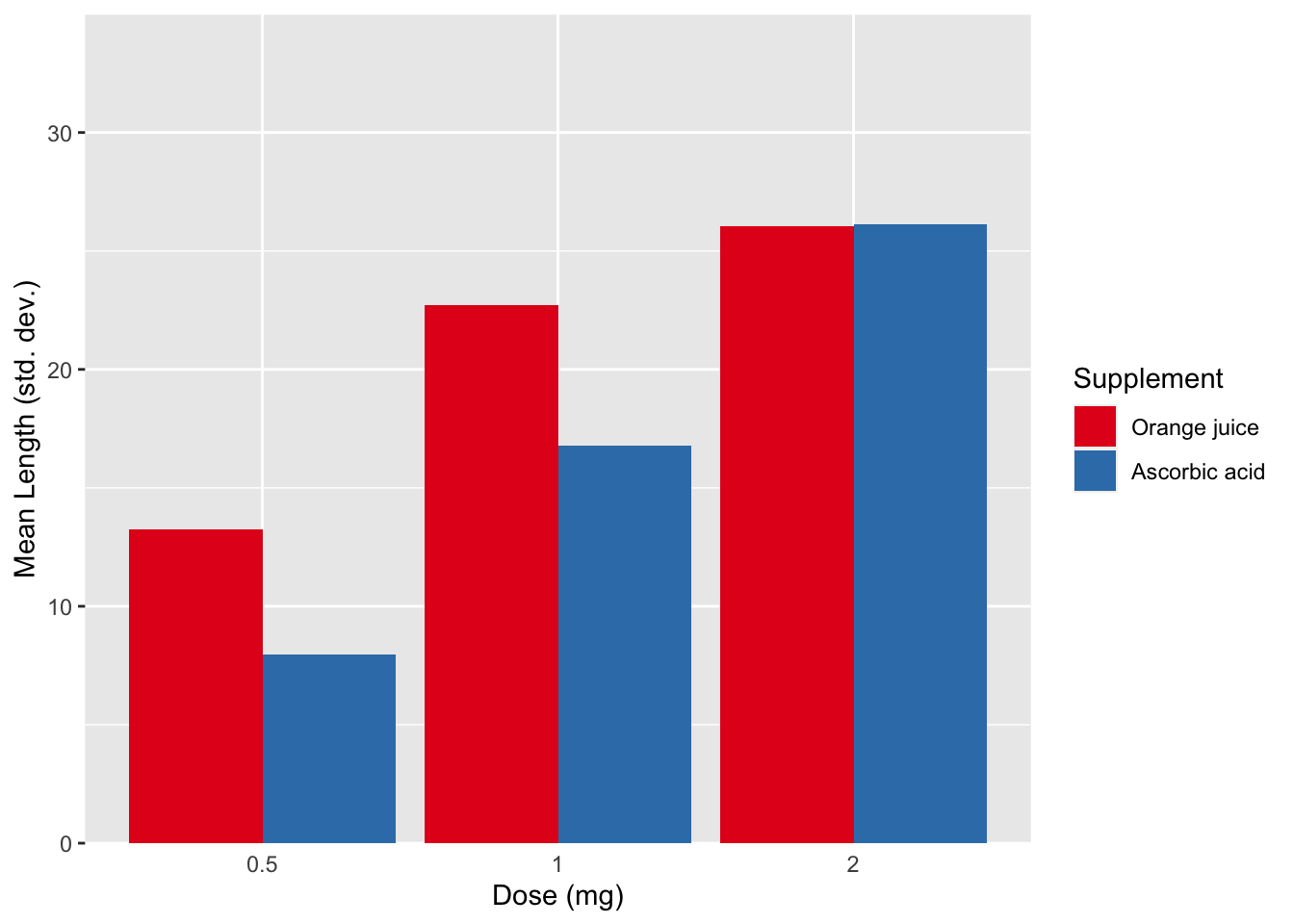
In terms of structure, @ref(fig:basicBar) is great. Dose increases as we move along the x axis, the colors are easily distinguishable, and the error bars are clearly labeled. Unfortunately, this is where many biologists begin and end their data visualization journey. The problem here is two fold. This is not an exploratory plot since we are already viewing summarized data. Bar plots with error bars, although very common, are poor representations data. Second, as an explanatory plot, this plot should make use of the the next most common gestalt principle: connection. We can add a line to connect mean values across doses for each supplement. Although it is technically not paired or continuous data, since they are distance individuals, they are a progression in increasing dose. The use of lines for ordinal data is somewhat debatable. I make the distinction between ordinal and interval data. The distance between the categories holds information and it’s reasonable to connect the values with a line, which is what we’re asking the reader to do anyways.
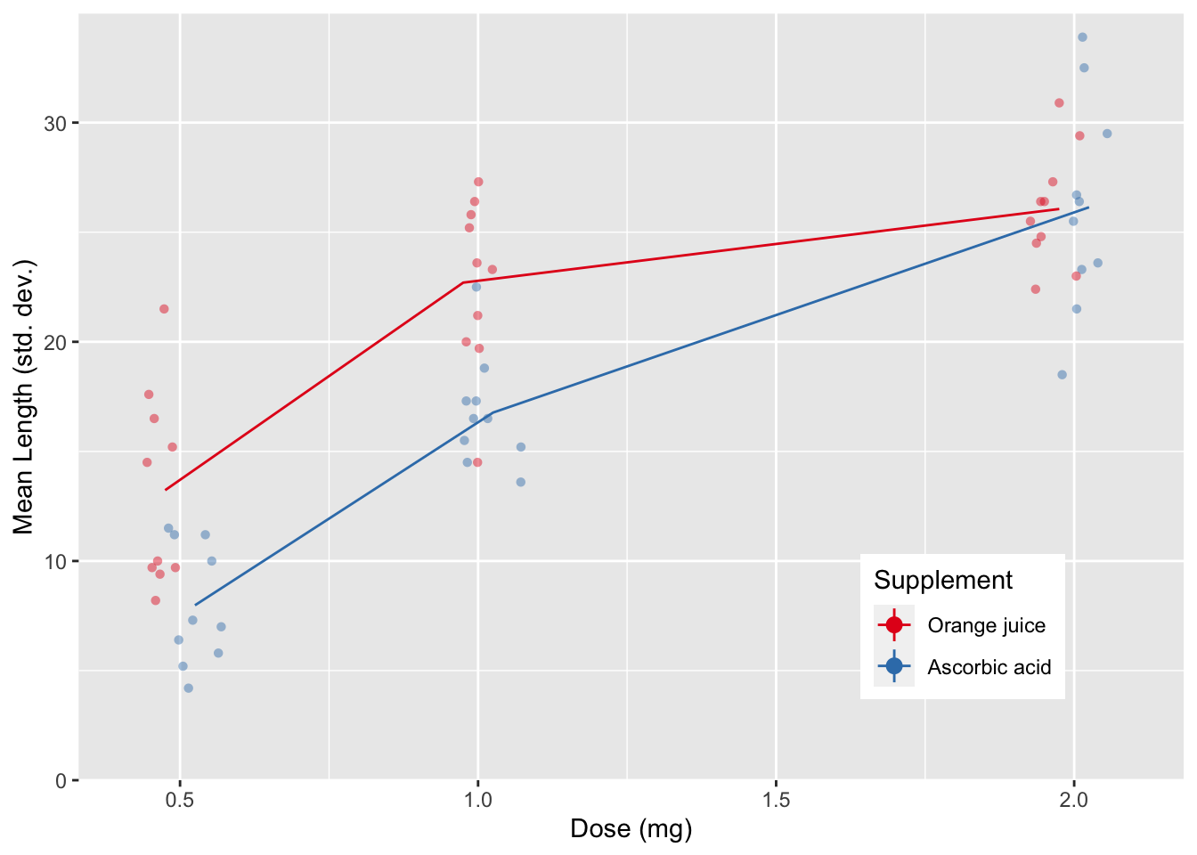
There’s one more thing. On the x axis, each dose is a doubling of the previous value, but the categories are evenly spaced. This is misleading, since the visual doesn’t match the empirical $mdash; spacing should reflect the actual values. Fig. @{fig:basicBarRevisited} contains a revised plot making these adjustments. Notice that the dots on each dose are dodged so that we avoid overlap between values as the same dose. Despite not sitting directly on the tick marks, there is no confusion about which dose each value represents. The error bars have also been simplified; point ranges don’t depict the meaningless crossbar at the tips of the error bar. In the background individual values are presented, and are not only dodged but also jittered. I’ll address jittering in section @ref(sub:ScatterPlots).
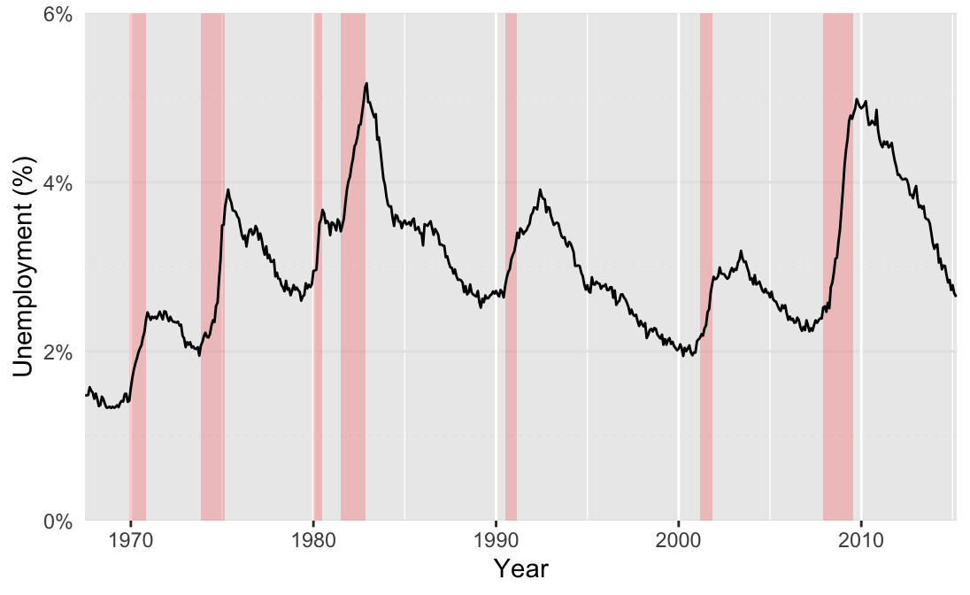
Enclosure is another common gestalt principle implemented in scientific plots. A common example of an enclosure is the use of background elements to highlight regions of a plot, as seen in fig. @ref(fig:ggrepelLine1). Here we have the unemployment rate in the US from 1967 - 2014. Enclosure can take many forms, here, the shaded backgrounds highlight recession periods, which correspond to an increase in the unemployment rate.
 {#fig-ggrepelLine1, width=548.031456}
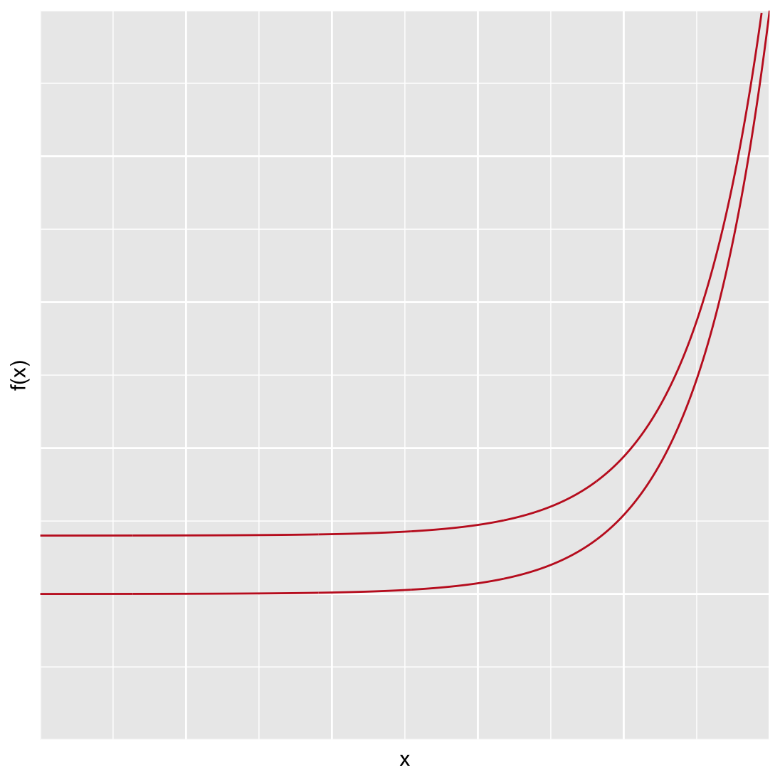
As an example of continuity, consider the plot of two curves shown in fig. @ref(fig:expggplot). Many viewers expect that the two lines will converge somewhere outside of the plotting space. Our mind fills in the blanks given the trend we see, we expect that the lines will continue as we see them on the page. In reality, the only difference between the lines is their y-intercept — the distance between the two lines is constant along the x-axis! Our mind tricks us into seeing a trend that is not there. William Cleveland summarizes this phenomenon nicely: “… the minimum distances lie along perpendiculars to the tangents of the curves. As the slope increases, the distance along the perpendicular decreases, so the curves look closer as the slope increases … we cannot force our visual system to process the right segments without using slow sequential search.”
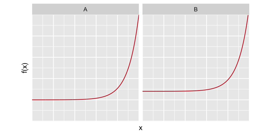
In this case if we wanted to overcome the fast form of visual perception, we have to invest a lot of work, adding embellishments or redrawing the plot. For example in fig. @ref(fig:expggplotsplit) the two lines are separated to make it difficult to draw false conclusions.
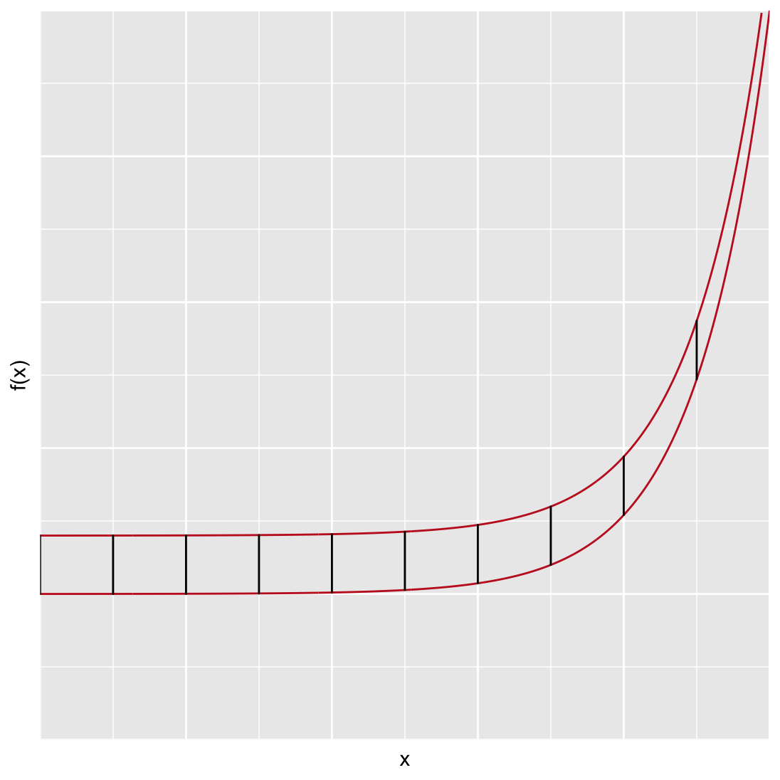
In @ref(fig:expggplotRedo) line segments are added between each line to highlight that they are equidistant apart over the entire x range.
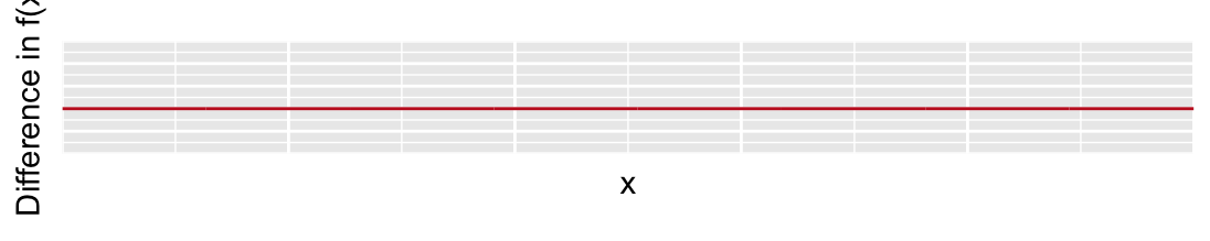
There is an underlying issue with all these solutions. Do we really need to show two lines when what we really want the viewer to know is that they are the same distance apart? If the difference between two lines is the message, then we should just show that! Fig. @ref(fig:expggplotDiff) depicts this. It’s a pretty boring plot, but also the most honest and meaningful of the series.
Remember, fast forms of visual perception are typically used in explanatory plots, but we are constantly implementing gestalt principles, even when producing exploratory plots.
24.2 Slow forms of visual perception
William Cleveland popularized the “table look-up” type of slow visual perception in the 1980s. This is a kind of visual perception typical with exploratory plots. It allows us to ask precise and detailed questions when we first begin to examine our data. They may make an appearance as explanatory plots, but because they are time-consuming to read, are less common. It also depends on the context and audience. You may see plots that activate slow forms of visual perception in specialist, data-heavy scientific journals, where the audience has the time and interest to pour over the details. In contrast, it’s unlikely that a large audience for a short conference presentation will get any meaningful information.
An example that Cleveland used to exemplify this concept is the Barley Yield data set. In this data set, the yield of 10 varieties of Barley in 1931 and 1932 are reported for 6 farms. That’s only 120 data points, so the issue is not too much data. Rather the issue is that we have 4 variables and 60 time series. The heat map presented in fig. @ref(fig:ClevelandHeat) may be a first idea for a data visualization.^[Heat maps can be a good choice as an explanatory plot if there is an immediate and clear message or only a few, very different categories. As an exploratory plot, it is not detailed enough. Basically, it’s as if we have used conditional formatting in an Excel spreadsheet.
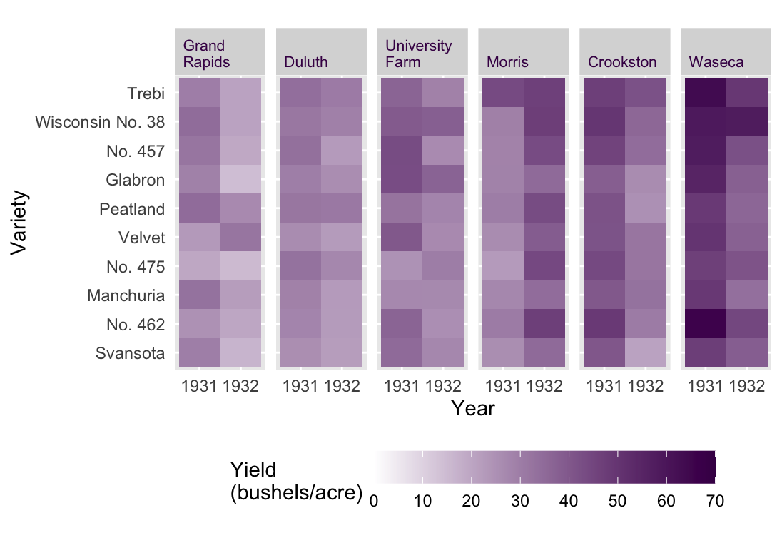
A much more detailed view would be fig. @ref(fig:ClevelandDot), a Cleveland-style dot plot. In this plot type, we make some unconventional choices. First, the independent variable is presented on the y axis and the dependent variable is on the x. It works, since the long labels of the Barley varieties are easy to read. Time is encoded by color, instead of taking its typical place on the x axis. This arrangement means that we can read the plot like a table, hence slow table look-up. We can ask very detailed questions and scan the plot (i.e. table) from left to right and from top to bottom to retrieve exactly the information we need.2
An example: Which variety had the worst yield in 1931 at the Waseca farm? All we have to do is move from top to bottom looking for the Waseca sub plot. Then we move from left to right looking for the first blue dot (the smallest value in 1931). It turns out to be No 475, which had a yield of ca. 47 bushels/acre. Try answering that with the heat map! Unless the value is striking, you’ll have a hard time.
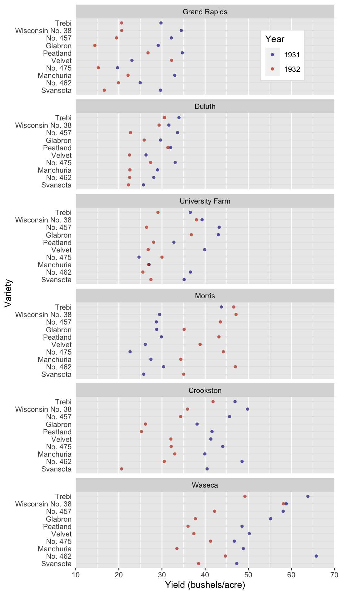
Fig. @ref(fig:ClevelandDot) is the most data-heavy and time-consuming (to read) plot we could produce with this data set. But it’s not bad! It serves a specific purpose for an interested audience in the right context. Can you see some trends in the data set? Did you notice that the farms are arranged from low to high producers? That’s a useful feature. The sub-plots are not arranged alphabetically, further information is contained in their order! Also, notice that some farms have a low mean yield and variance, like Duluth, whereas others have a relatively large mean and variance, like Waseca. Did you also notice the anomaly in the data set? All farms suffered a decrease in yield from 1931 to 1932 except for Morris. The reason for this is a different, and somewhat contested, question. We’ll imagine that this is an interesting anomaly that we want to highlight.
Systematic shifts in the location, spread or direction of change are important results that we typically want to highlight. They are not readily apparent in fig. @ref(fig:ClevelandDot). We need a plot type that allows us to communicate these messages a bit faster. A line plot, fig. @ref(fig:ClevelandLine), could come in handy here. In this case the most logical, and typical, choice for the x axis is going to be time.
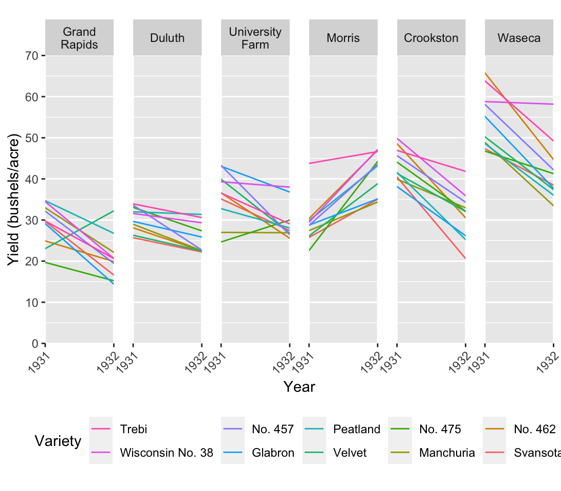
Fig. @ref(fig:ClevelandLine) is pretty detailed since we see all 60 time series. It’s still manageable, but consider that we have 10 distinct colors. We’re kind of pushing the limit on how many colors the human eye can easily distinguish. Nonetheless, we can see the trends we expected as we move from left to right. In particular we can see more clearly that Morris behaves differently compared to the other farms. On top of that we do gain some extra insights. For example, although many varieties decrease, some of them actually increase, and some are worse off than others.
Edward Tufte, whom we’ll also encounter again later on in the workshop, developed a slope plot. For Tufte, an explanatory plot wasn’t complete until all non-data ink was removed. The slope plot in fig. (ref?)(fig:ClevelandSlope), does away with the axes. In their place are the actual mean values. So although it looks like we have lost precision, this is actually the most precise plot of the series since we know the exact value to two decimal places and we can see the values in a visual context. On top that fig. (ref?)(fig:ClevelandSlope) communicates one very clear message by the clever use of color. Instead of coloring the lines according to farm, they are colored according to direction of change. Did the yield increase of decrease?
There are two disturbing things about this slope plot. First, there is no legend. Any visual element that encodes information should be defined somewhere on the plot. In this case we may make the argument that it is obvious and so goes without saying. That’s a dangerous perspective, but you may be able to get away with it. Second, the spread is not depicted, which is typical for slope plots. That should be a major cause of concern for scientists. You never want to show the location without some measure of spread. This plot is not suitable for a scientific publication, but it may work well for lay people or in a report for managers. It’s easy to read and communicates a clear message. Extra information like the standard deviation or the 95% interval may already be information overload and just confuse the audience.
No amount of good design can compensate for poor data quality or analysis. Design is too often used to divert the reader’s attention away from in inadequate or faulty analysis. This workshop will help you to identify cases where visualisations are flawed or misleading, while at the same time helping you make outstanding visualisations. We will begin by considering composition and color.↩︎
Remember, we can ask detailed questions, but precision is a different matter. Most data visualization suffers from some degree of imprecision, unless precise labels are added.↩︎