25 Color
Color is a very powerful tool in data visualization, but it’s often used poorly or even incorrectly. Here, I’ll review the most important features of good color use; we’ll see plenty examples throughout the rest of the workshop.
Use hexadecimaal codes when available
Before selecting colors, we should be able to name them. Screens make use of RGB color space, where Red, Green, and Blue make up the three primary colors.1 Regardless of software, a six-digit hexadecimal codes will serve as a consistent color naming convention. Hexadecimal (i.e. “16”) is a base-16 counting system, as described in fig. @ref(fig:hexCodes).
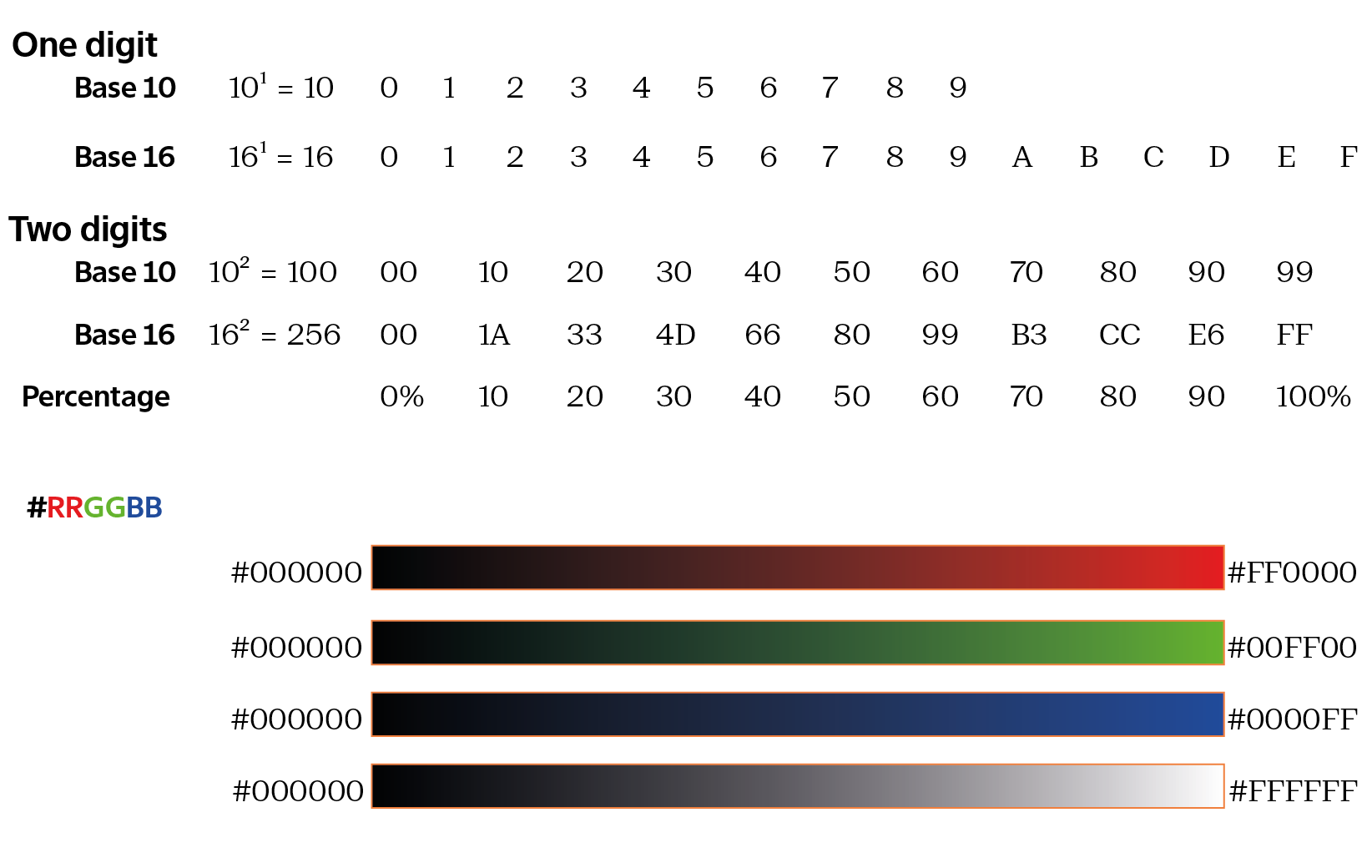
Together the combination of these three values provides approximately 16.8 million colors (\(256^2 = 16,777,216\)). Now that we have an easy convention to refer to color, let’s think about how to select them appropriately.
Avoid harsh, high saturation bright colors
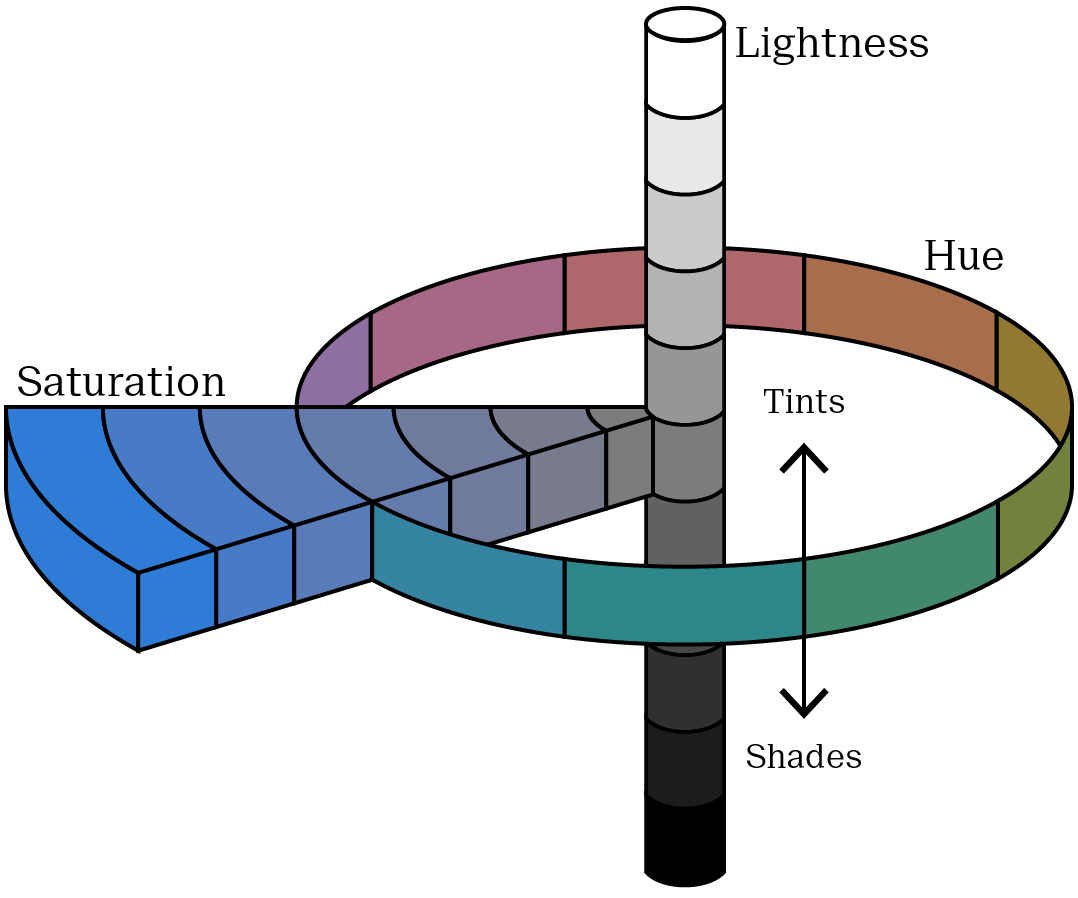
One of the first questions students have regarding color selection is how do I choose pretty colors? The short answer is that this is not your first concern! Remember good design means form follow function. Of course, you want your colors to be appealing! But beauty comes after you do the work. Let’s address beauty in the context of function and then get into more detail. First, we must understand the four dimensions of color:
| Dimension | Description |
|---|---|
| Hue | What we typically refer to as the color. |
| Lightness | The amount of white or black. Tints, containing more white, are lighter. Shades, containing more black, are darker. |
| Saturation | The purity of the color. Low saturation colors converge onto grey. |
| Alpha | The transparency |
The relationship between the three dimensions is visually depicted in fig. @ref(fig:Munsell).
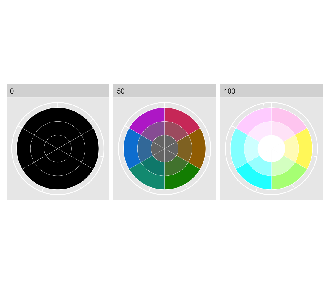
We’ll get to alpha later on, for now let’s see how the hue, lightness and saturation affect colors. In fig. @ref(fig:HSVColSpaceSimple) we have the three primary colors (red, green and blue) and the three secondary colors (magenta, yellow and cyan) composed of even mixtures of primary colors.2
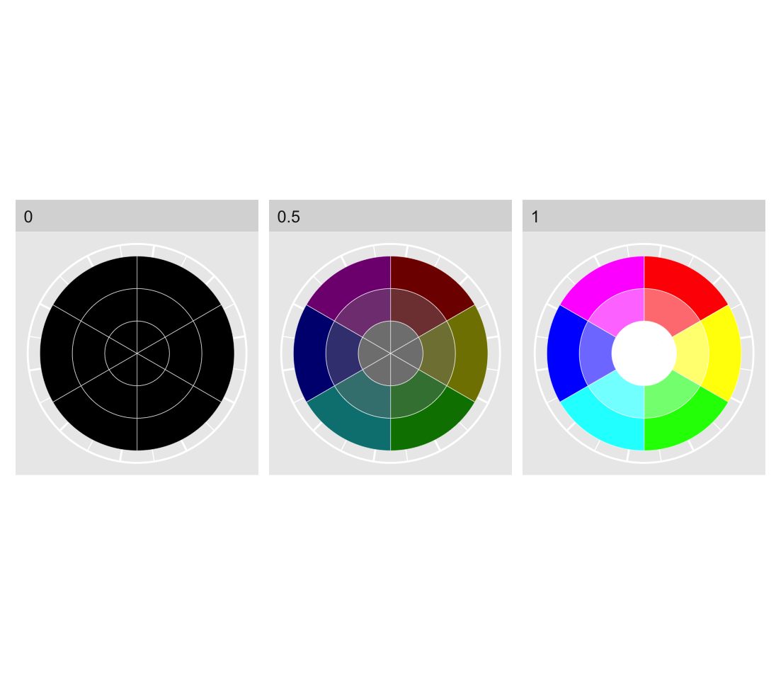
Each pie chart in fig @ref(fig:HSVColSpaceSimple) reveals that as saturation decreases, different hues converge on a monochrome spectrum from black to white. As lightness increases the colors become brighter, and as saturation decreases the colors become less pure, converging on white, for high lightness, grey for mid lightness and black for low lightness. This is why we won’t encode information with saturation. Very low saturation colors are difficult to distinguish from each other. So that leaves us with hue and lightness. Very dark colors are also difficult to distinguish, so we should use them with caution.
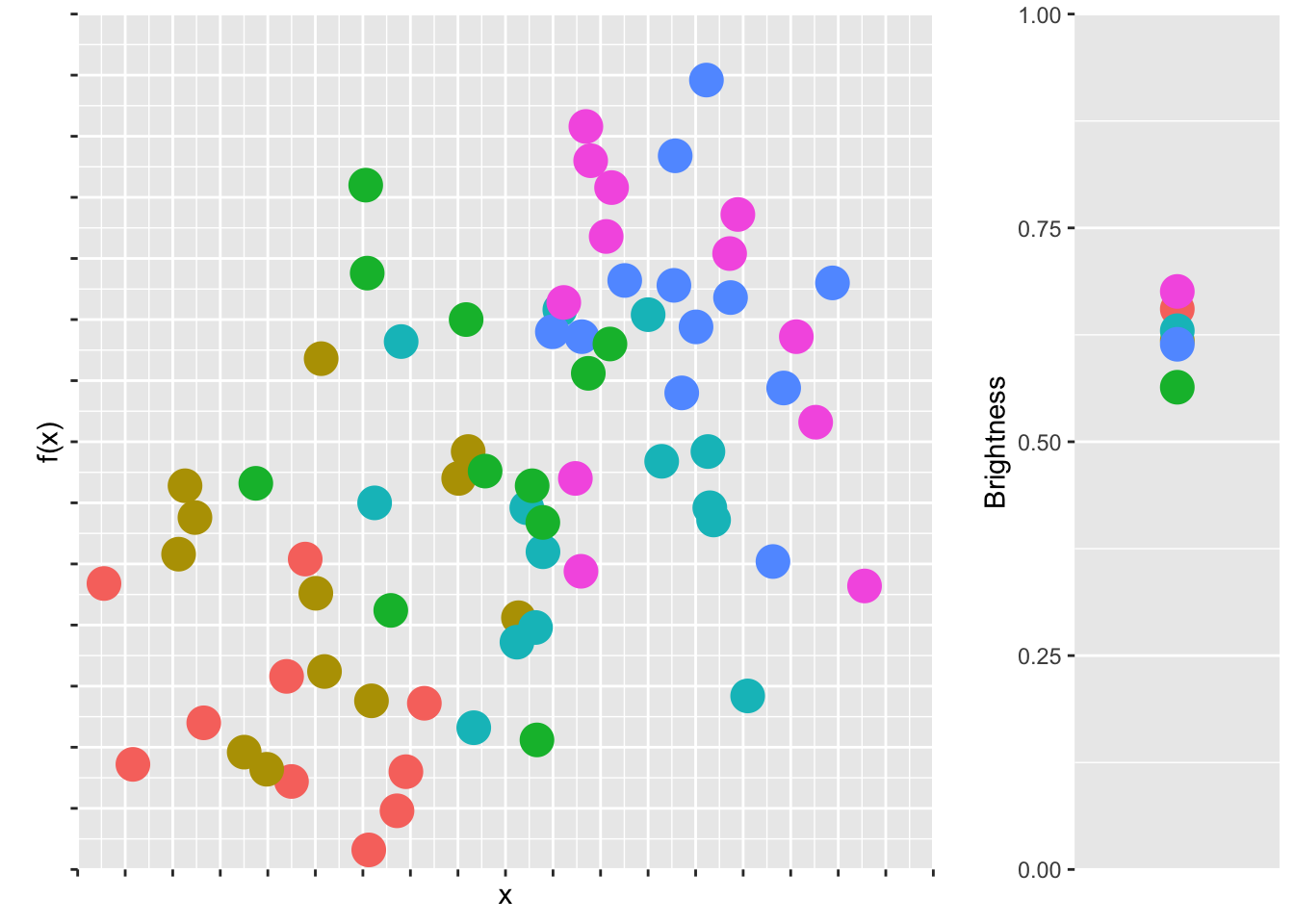
In fig. @ref(fig:cheapcol) we have a scatter plot of some play data with six disparate colors, each having a high lightness value.
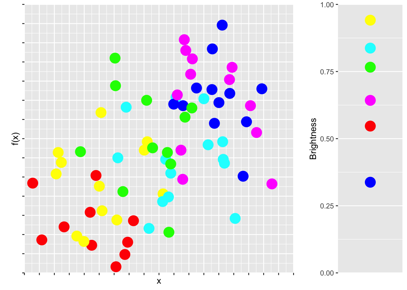
There are couple reasons why the plot in fig. @ref(fig:cheapcol) doesn’t look very nice. First, the colors are very jarring. High saturation, high lightness colors are just not nice to look at. They kinds of remind us of children’s play rooms. Second, and more subtly, pure colors tend to have cultural meanings. Think of red as a warning color, or yellow for cheapness, or the logos of discount brands. Aldi and Lidl are trying to say something with their color choices!
Third, the main reason why fig. @ref(fig:cheapcol) doesn’t look good is because the colors, although equally spaced along the color wheel, do not have the same brightness. Brightness refers to the way colors are perceived by our eyes. A bright color appears to emit more light, even if it’s the same lightness in the color space. Brightness can be measured as \(brightness = \sqrt{0.299R^2 + 0.587G^2 + 0.114B^2}\), which means that yellow appears as very bright and blue appears as very dark. The brightness of our six colors is depicted in fig. @ref(fig:cheapcol), right.
So this is a perception problem, because colors that are equidistant on the color wheel are not perceived as such by our eyes. They should look great together, but they don’t.3
So what is the solution? There have been a few attempts to standardize and make the RBG color space more intuitive. One of the most popular models is the Hue Saturation Value (HSV) (or the Hue Saturation Brightness (HSB)) color space. Here, a color can be specified using three values: hue, saturation, and value (brightness), all in the range of [0, 1]. This is what we saw in the color wheels in fig. @ref(fig:HSVColSpaceSimple). As we just saw with our little play example, HSV color space distorts data when used for visualization so that the distance between perceived colors does not reflect their distance in the actual color space.
The Hue Chroma Luminance (HCL) color space solves this problem. HCL color space is like HSV except for one very important distinction: changes in the hue do not effect the lightness. In HCL color space, the perceived difference between two colors is proportional to their Euclidean distance in color space, i.e. we have perceptual uniformity. That makes HCL colors ideal for accurate visual encoding of data. Good news for us!
Here, a color can be specified using three values: hue [0, 360], chroma [0, 100]4, and luminescence [0,100]. The HCL color space is designed to match with human visual perception of color in that steps of equal size correspond to approximately equal perceptual changes in color.5
Now, distinct colors can be chosen by evenly spacing them around an HCL color wheel. Two colors will be separated by 180°, three colors by 120° and so on. In fig @ref(fig:ggplotDefault), a chroma of 100 and luminosity of 45 and 65 is used to keep the saturation and lightness consistent while selecting from 2 up to 10 evenly spaced colors.
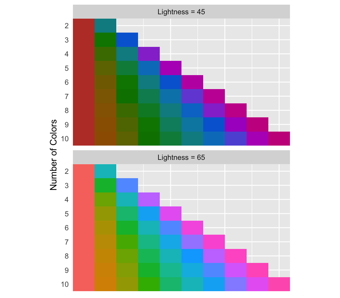
The default colors used in the R plotting package ggplot2 use an HCL color space with a lightness of 65 and chroma of 100. If you are going to use high saturation, decrease the lightness to avoid blaring colors. Let’s see how the brightness compares now:
The variance of the brightness among the HCL colors is much lower than what we had previously. So if we’re looking for colors that look good together starting with similar brightness helps. However, that doesn’t necessarily mean that the colors will be beautiful or meaningful.
Beautiful colors are subject to fads and trends. What’s beautiful now is hideous in ten years later. If you want to have the nicest color palettes, and don’t have a feeling for choosing colors that work, my best advice is simply to search for “best color palettes” of what ever year you’re in. There is a segment of designers who take joy in developing trendy color palettes and sharing them, so use them to your advantage. A great source is canva.
Use color to highlight a specific aspect of the data (e.g. trend lines) or to depict all values without bias.
Color serves two seemingly contrasting purposes in data visualization. It’s used to either draw the reader’s attention to a specific piece of information, or to make all information equally visible. Both uses of color may be implemented in the same plot and we’ve already seen lots of examples, e.g. the regression line in @ref(fig:mamm-explain) and the semi-transparent dots of the scatter plot in the background.
The challenge to using color appropriately is choosing the right combinations which allow them to fulfill their purpose. To this end, we need to consider the kind of data we’re encoding as color.
Avoid using colors to encode continuous variables (see section @red{fig:Cont-Encoding})
Many software applications allow continuous variables to be encoded as color. Sometimes this works really well, but often times it leaves a lot to be desired. Several issues need to be considered. 6
First, the brain does not recognize color as being ordered, like size or numbers. Although sequential wave lengths result in different colors, there is no logical ordering to the actual colors as distinct from the logical ordering of their wave lengths. We will return to this point when we discuss the different possibilities of visually encoding continuous variables.
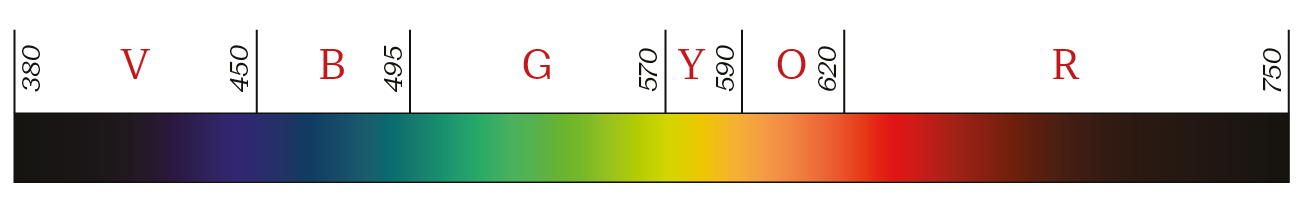
Second, in a rainbow, there are different widths for each “pure” color. This means that we cannot use the rainbow as an evenly dispersed gradient for a range of values because it is inherently uneven. Consider the rainbow spectrum shown below:7
Despite these short-comings color remains a popular choice for encoding continuous variable. Heat-maps are a popular example in the life sciences. For the most part heat maps are difficult to interpret for the reasons given above, so limit them to those instances where there is a clear message. There are specific cases where it works really well! One famous example is shown in fig. @ref(fig:MeaslesHeat). Here the number of measles cases per US state is encoded with an uneven color scale. It works because there is a dramatic shift after the vaccine is introduced. We’re less interested in the individual values than the extreme ends of the distribution.
Although @ref(fig:MeaslesHeat) is a nice example of a heat map, heat maps can often be represented in a better way, especially if there is a temporal component. Consider Cleveland’s barley example earlier in this chapter. A reworking of the measles case study in fig. @ref(fig:MeaslesGAM) uses a GAM model to make the same dramatic statement. Notice the two uses of color here, the purple semi-transparent dots in the background show all the US states in one pool, the bright orange line highlights the GAM trend line.
Use easily distinguishable colors to encode categorical variables (see section @red{fig:Cata-Encoding})
In contrast to continuous variables, categorical variables8 lend themselves well to color representation. For nominal (i.e. unordered) variables, qualitative colors are appropriate, whereas ordinal data can be better represented with sequential colors (see Fig. @ref(fig:Cata-Encoding)). Adobe Illustrator, as well as R, come with pre-selected color palettes. When you have to choose colors manually, consult the guidelines for color schemes below.
Consider color blindness and avoid encoding important information in red and green
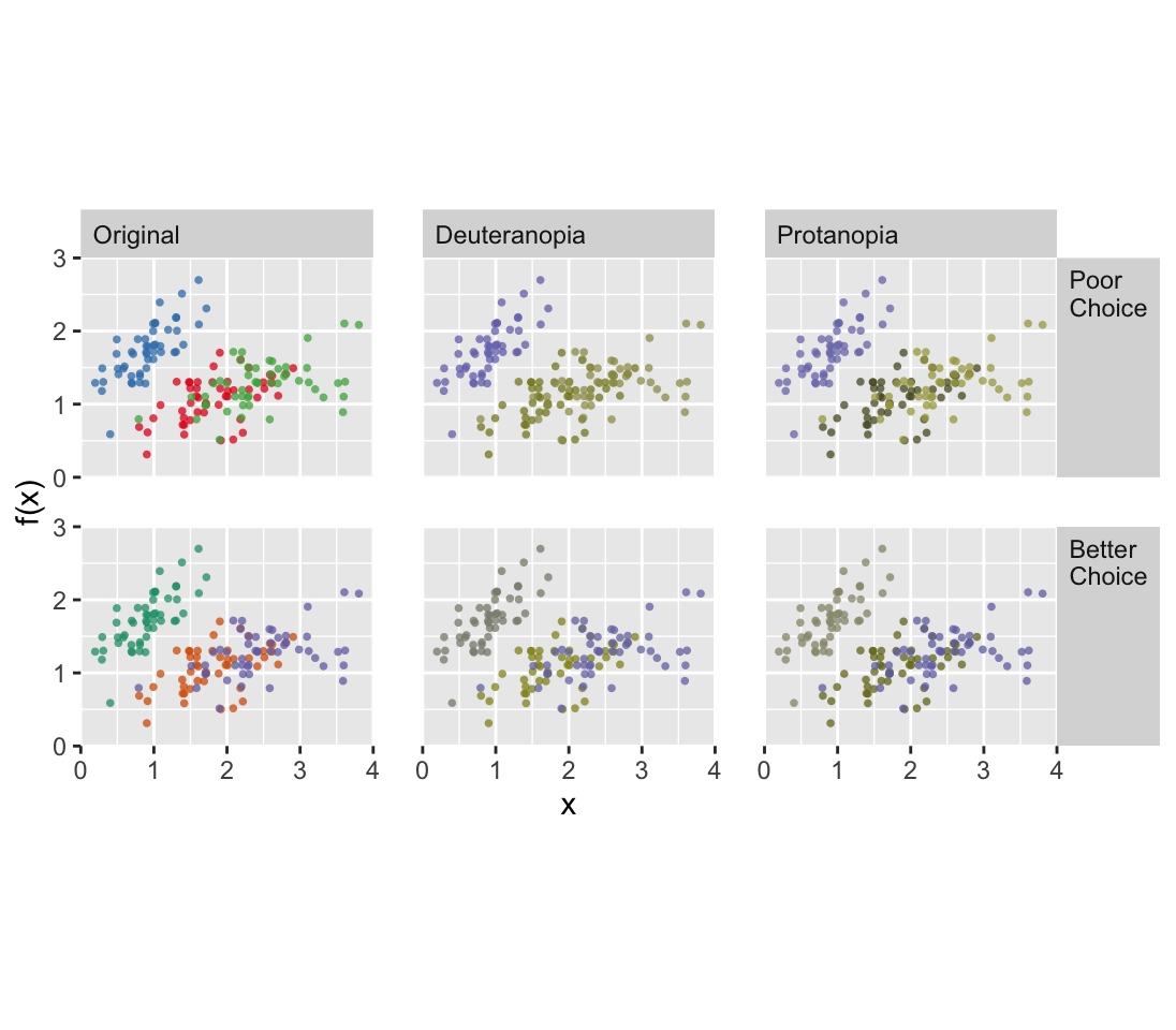
When possible, color choice should take color blindness into account. Two color palettes of the same data in fig. fig:color-blind-small reveal the importance of proper choice. Colorblind-safe palettes primarily avoid red-green color combinations, which is the most common form of color blindness. Computationally simulating color blindness (deuteranopia or protanopia, the two most common forms of red-green color blindness) reveals that although distinct colors were chosen, they are difficult to distinguish under these conditions. If you choose a color blind-safe color palette, you will avoid the risk of losing part of your audience.
Choose an appropriate color palette
A color palette is a logical selection of a group of colors. Although making this selection is not straightforward, there are some general and easy-to-follow guidelines for what looks good and what works together. Note that in these examples I’ll use a standard artist’s color wheel, where the primary color triad is red, yellow and blue. This RYB color space is an intuitive color model that you probably learned in school and was popular before display shifted the trend towards the RGB additive color space described above.
The choice of color is determined by the object being colored. Smaller objects and thinner lines need larger differences in their colors to be distinguishable from each other. In this case, you should avoid sequential color schemes (see below) that include very light colors.
When manually choosing colors, begin with a color wheel divided into discrete colors (fig. @ref(fig:Color-wheel-1)a). The primary colors, Red, Yellow and Blue are arranged in an equilateral triangle. The secondary colors, Orange, Green and Violet are positioned in an inverted equilateral triangle interspersing the primary colors. Tertiary colors fill in the remaining gaps. Consider the following conventions when choosing a color scheme based on this color wheel.
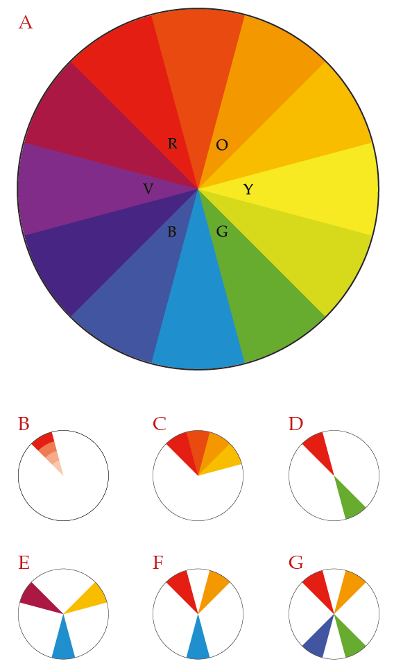
Table (#colSel): Color selection for continuous and categorical variables:
| Name | Description | Data Types | Color wheel |
|---|---|---|---|
| Monochromatic | Change the lightness of a single color | Continuous, ordinal, date or time | fig. @ref(fig:Color-wheel-1)b |
| Analogous | Include two or more colors adjacent to each other on the color wheel | Continuous, ordinal, date or time | fig. @ref(fig:Color-wheel-1)c |
| Complementary | Two colors opposite each other on the color wheel | Nominal | fig. @ref(fig:Color-wheel-1)d |
| Triadic | Three colors, equally dispersed on the color wheel, forming an equilateral triangle | Nominal | fig. @ref(fig:Color-wheel-1)e |
| Split-Complementary | Begin with complementary colors, but choose the two colors directly adjacent to one of them | Nominal & Ordinal | fig. @ref(fig:Color-wheel-1)f |
| Tetradic | Four colors, arranged in either a square or rectangular pattern on the color wheel | Nominal & Ordinal | fig. @ref(fig:Color-wheel-1)g |
The warm and cold color palettes are just analogous color palettes, beginning with red and excluding blue, or beginning with blue and excluding red, respectively.
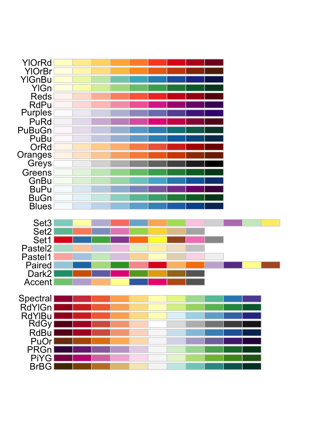
Color Brewer is a simple-to-use tool for selecting well-designed color palettes to meet your specific needs.9 The color palettes are based on the HCL color space and so provide ready-to-use palettes for accurate data visualizations.
Table (#colPal): Palettes are arranged into three classes
| Class | Description | Examples |
|---|---|---|
| Sequential | Ranges from light (typically low values) to dark (high values) | fig. @ref(fig:colorBrewer), top |
| Qualitative | Distinct colors to accommodate categorical data | fig. @ref(fig:colorBrewer), middle |
| Diverging | Range from low/high contrasting colors for extreme values and light colors for mid-range values | fig. @ref(fig:colorBrewer), bottom |
This is distinct from CMYK color space (Cyan, Magenta, Yellow and Key (Black)), which is subtractive and used in print. It’s also different than what you may have expected given what you know from mixing paints: Red, Yellow, Blue define the primary triad in the RYB color space.↩︎
Note that the secondary colors in RBG color space correspond roughly to the primary colors in CMYK color space and vice versa.↩︎
On top of the perception problem, really bright colors cause problems with cheap projectors. Pure yellow or cyan appears faintly, or not at all!↩︎
Chroma corresponds to saturation.↩︎
The HSV and HSL color spaces are more intuitive translations of the RGB color space, since they provide a single hue number, either [0, 1] or [0, 360].↩︎
Two notable instances of encoding a continuous variable onto color are topography on maps and density in 2d (i.e. smoothed-scatter) plots.↩︎
The topographical color palette suffers from the same draw back.↩︎
To avoid confusion, it’s useful to know that different text books and even different packages within a software program, such as R, will refer to categorical variables under different names. I use the generic categorical, which I feel makes a nice distinction to continuous. Discrete, qualitative (as opposed to quantitative), and factor variables are also used in specific contexts. For our purposes they are all the same thing in different guises.↩︎
Color Brewer can be found online at http://colorbrewer2.org/.↩︎