Chapter 23 Case Study: RNA-Seq
23.1 Learning Objectives
By the end of this chapter you should be able to:
- Execute a DESeq analysis on counts form a specific RNA-Seq experimental design
- Generate standard output plots for RNA-Seq
This RNAseq example was modified form material provided by Thomas Walzthoeni, from QBM Munich.
23.2 Experimental Design
This dataset is part of the BioConductor pasilla package. A simplified version has been provided for this workshop.
In this case study, we’ll consider an RNASeq experiment designed to investigate alternative splicing events. This was done in an an siRNA knock-down mutant of pasilla. The pasilla gene product is implicated in the regulation of alternative splicing, since its gene product binds spliceosomal mRNA. Here, we’ll use two biological replicates each of the knock-down (called treated) and an untreated control.
The reads have already been aligned to the Drosophila genome using tophat. All the reads which mapped to a gene were counted by using its non-overlapping exonic regions.
23.3 Preparations
Ensure that the following packages are installed
Tabl: (#tab:thom-pkg) Packages use in this chapter.
| Package | Description | Source |
|---|---|---|
DESeq2 |
RNA-Seq analysis | BioConductor |
gplots |
Various R Programming Tools for Plotting Data | CRAN |
lattice |
Advanced plotting functions | CRAN |
Load the libraries using:
23.4 The data
Exercise 23.1
Read “pasilla_gene_counts.tsv” into R. Store it as an object called rawdata (don’t convert it to a tibble, since we’ll make a matrix shortly). Use read.delim(\dots, row.names = 1).
The object rawdata will be a data frame with 14599 observations (rows) and 7 variables (columns).
Exercise 23.2 We’ll only use the PE data, stored in columns untreated3, untreated4, treated2, and treated3. Select only these columns.
# [1] "untreated1" "untreated2" "untreated3" "untreated4" "treated1"
# [6] "treated2"   "treated3"
rawdata should now be 14599 observations x 4 variables. You may have have noticed that all the values are numeric, so the ideal data structure would be a matrix.
Exercise 23.3 Convert the data frame to a matrix.
The top of the dataset should look like:
#             untreated3 untreated4 treated2 treated3
# FBgn0000003          0          0        0        1
# FBgn0000008         76         70       88       70
# FBgn0000014          0          0        0        0
# FBgn0000015          1          2        0        0
# FBgn0000017       3564       3150     3072     3334
# FBgn0000018        245        310      299      308
23.5 Checks/Visualizaion of the dataset
Exercise 23.4
UsecolSums(), nrow(), plus appropriate arithmetic and relational operators.`
For each treatment type (i.e. column in our matrix), what percentage of genes have at least 1 count? 10 counts?
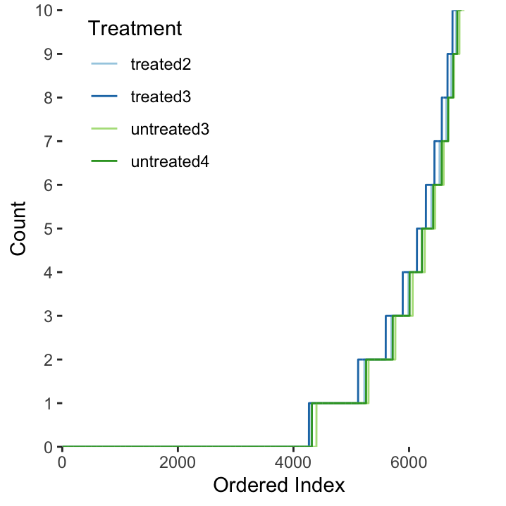
Figure 23.1: The distribution of gene counts (max 10) in each of the four treatment types.
Exercise 23.5 What is the correlation (\(R^2\) value) between the biological replicates (i.e. between the two treated and between the two untreated samples)? Use cor().
#            untreated3 untreated4 treated2 treated3
# untreated3       1.00       0.98     0.95     0.95
# untreated4       0.98       1.00     0.93     0.94
# treated2         0.95       0.93     1.00     1.00
# treated3 0.95 0.94 1.00 1.00ggcorrplot::ggcorrplot()
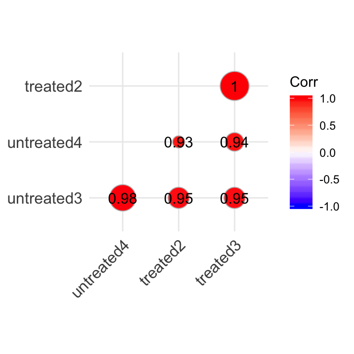
Figure 23.2: A visualisation of our correlation matrix.
Use either a for loop (for(i in …) {}),apply()ormap(). Rank transformations are typical of non-parametric statistics. Calculate the rank for the individual observations in each variable. Here, the highest value should get the first rank position. Save your matrix asma.rank`. Refer to section 10.5 for sorting and ranking functions.
ma.rank <- rawdata
for (i in 1:ncol(ma.rank)) {
  ma.rank[,i] = rank(-rawdata[,i], na.last = 'keep')
}
dim(ma.rank)
# [1] 14599 4If you have done this correctly, the highest value should be:
# [1] 131242And it should be on row…
# FBgn0000556
# 188Table: (#tab:consEx) Some genes which should exhibit stable expression. | ID | Gene | |———————-|——–| | | GADPH2 | | | Syb | | | RpLP1 |
23.6 DEseq2 Analysis Preparations
Because rawdata is still a matrix, use colnames() to get the column names.
Create a dataframe with the column names and the conditions
#      colData condition
# 1 untreated3         U
# 2 untreated4         U
# 3   treated2         T
# 4 treated3 TDESeqDataset data structure, we need to define a new DESeqDataSet class object.
ddsHTSeq <- DESeqDataSetFromMatrix(countData = rawdata,
                                   colData = sampleTable,
                                   design = ~condition)
ddsHTSeq
# class: DESeqDataSet
# dim: 14599 4
# metadata(1): version
# assays(1): counts
# rownames(14599): FBgn0000003 FBgn0000008 ... FBgn0261574
# FBgn0261575
# rowData names(0):
# colnames(4): untreated3 untreated4 treated2 treated3
# colData names(2): colData condition23.7 DESeq analysis
Now we are ready to conduct a differential expression analysis. This is done using the DESeq() function on our DESeqDataSet class object (ddsHTSeq).
# estimating size factors# estimating dispersions# gene-wise dispersion estimates# mean-dispersion relationship# final dispersion estimates# fitting model and testingWe can use the results() function to obtain the results from the DESeq analysis. This will provide log2 fold-changes and p-values according to the contrast argument. This is a three-element long character vector containing:
- The name of a factor in the design formula (i.e.
condition). - The name of the numerator level for the fold change (i.e.
T). - The name of the denominator level for the fold change (i.e.
U).
Here we get a DESeqResults object with six elements:
# NULLbaseMeanthe base means across sampleslog2FoldChangelog2 fold-changeslfcSEstandard errorsstattest statisticspvaluep-valuespadjadjusted p-values
Exercise 23.10 Now that we have our p-values:
- How many genes result in a p-value < 0.01?
- How many genes that result in a significant adjusted p-value < 0.01?
hist() function for a quick and dirty plot.
res, look-up the plotMA() function and modify alpha (significance level threshold) to 0.01. Use plotMA().
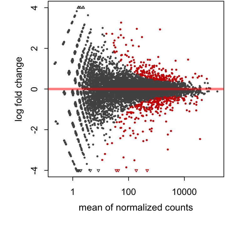
Figure 23.3: An MA plot of our study with an alpha threshold of 0.01.