2 Design Basics
Many scientists equate good design with beauty and are surprisingly easily persuaded by aesthetic qualities. In reality, good design is a measure of usability. Think form follows function — use dictates appearance1. Beauty is a laudable goal, but first-and-formost data visualizations should work.
For explanatory data visualisation, this means clear, meaningful and honest communication. For exploratory data visualization, this means understanding your data thoroughly, including diagnostic plots to assess your models, see table 1.1.
Let’s begin by considering visual preception. There are two ends of the spectrum, as described in table 2.1.
Table (#tab:perception): The two extremes of visual perception.
| Slow | Fast |
|---|---|
| Exploratory phase | Explanatory phase |
| Confusing | Intuitive |
| Table look-up | Gestalt principles |
| Labour intensive | Saliency |
| Many messages | Self-explanatory |
2.1 Gestalt Principles
Gestalt is a German word that can be variously translated as design, form or shape. It encapsulates all of these ideas - the complete essence of an entity. Gestalt psychology took root in 1920s Berlin and is based on the principle that we see objects first in their entirety and second as individual parts. Hence, “the whole is greater than the sum of its parts”. Gestalt psychologists identified several visual principles that our minds intuitively recognize, some of which (fig. 2.1) are valuable in the context of data visualization. Remember, here, we are mainly interested in explanatory plots. They should be fast and communicate a clear message.
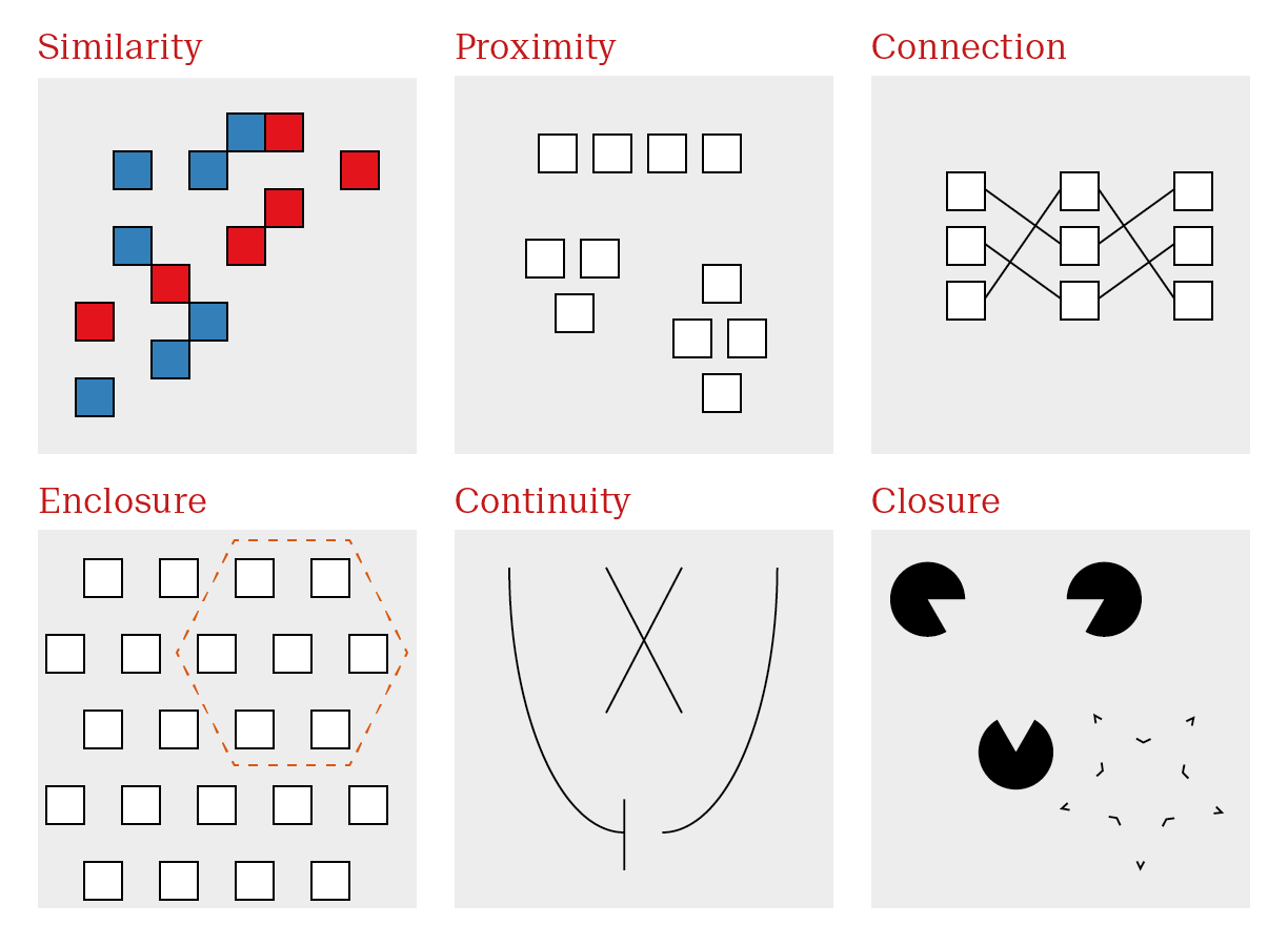
Figure 2.1: Some Gestalt principles are particularly relevant for data visualization.
Gestalt principles dictate the first and immediate response to an image. Taking advantage of gestalt principles allows us to optimize visualisations to effectively communicate a clear message.
| Principle | Description | Use case |
|---|---|---|
| Similarity | Objects similar in appearance belong to the same group | Encode groups using distinct, easily distinguishable elements |
| Proximity | Objects physically close together belong to the same group | Arrange sub-items according to relationship |
| Connection | Objects that are physically connected with lines belong to the same group | Highlight patterns with lines where appropriate |
| Enclosure | Objects contained within borders belong to the same group | Highlight regions of interest with circles or boxes |
| Continuity | Objects continue as they are perceived | Make trends explicit so they are not misinterpreted |
| Closure | Missing parts are mentally filled in | Remove extraneous visual elements |
Similarity and Proximity are common place every multivariate plot. A very common construction is shown in fig. 2.2. Even without any background knowledge, we can immediately see that we have a continuous measure described by two color groups (red versus blue) and three x axis categories.
Exactly what the variables are requires further input, but we already know the experimental design without any introduction. This plot depicts the mean length of odontoblasts (the cells responsible for tooth growth) from 60 guinea pigs is described by two variables. Dose levels of vitamin C (3: 0.5, 1, and 2 mg/day) and delivery method (2: orange juice or ascorbic acid, a form of vitamin C).
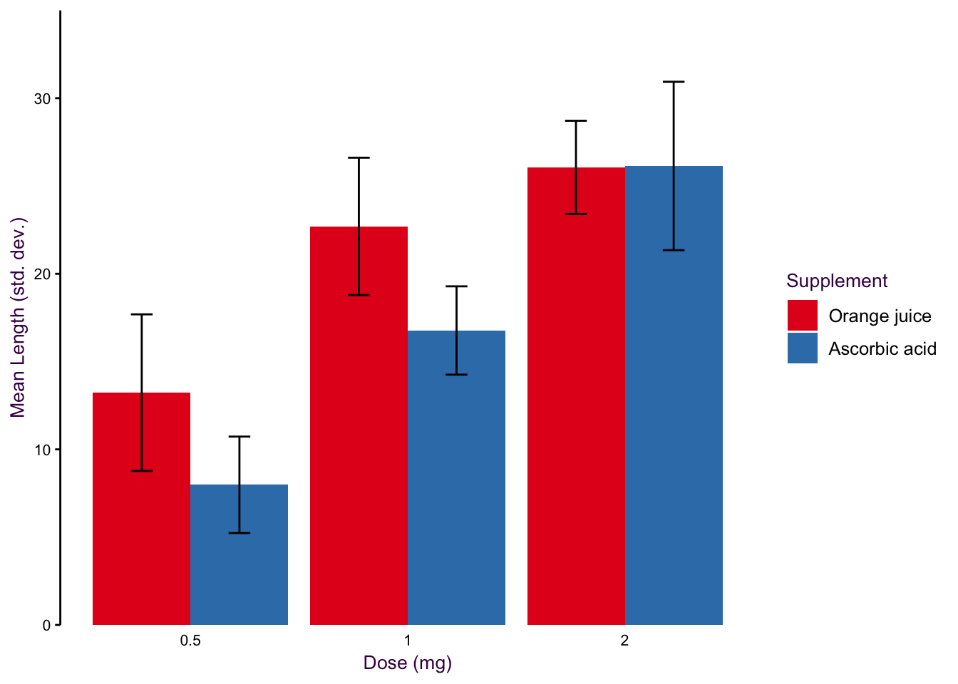
Figure 2.2: Gestalt principles of similarity and proximity. One of the most frequent plot types in science is the dodged bar plot with error bars, which make use of the two most common gestalt principles.
In terms of structure, 2.2 is great. Dose increases as we move along the x axis, the colors are easily distinguishable, and the error bars are clearly labeled. Unfortunately, this is where many biologists begin and end their data visualization journey. The problem here is two fold. This is not an exploratory plot since we are already viewing summarized data. Bar plots with error bars, although very common, are poor representations data. We’ll explore this topic in detail in section XX. Second, as an explanatory plot, this plot should make use of the the next most common gestalt principle: connection. We can add a line to connect mean values across doses for each supplement. Although it is technically not paired or continuous data, since they are distance individuals, they are a progression in increasing dose. The use of lines for ordinal data (see XX) is somewhat debatable. I make the distinction between ordinal and interval data. The distance between the categories holds information and it’s reasonable to connect the values with a line, which is what we’re asking the reader to do anyways.
There’s one more thing. On the x axis, each dose is a doubling of the previous value, but the categories are evenly spaced. This is misleading, since the visual doesn’t match the empirical $mdash; spacing should reflect the actual values. Fig. @{fig:basicBarRevisited} contains a revised plot making these adjustments. Notice that the dots on each dose are dodged so that we avoid overlap between values as the same dose. Despite not sitting directly on the tick marks, there is no confusion about which dose each value represents. The error bars have also been simplified; point ranges don’t depict the meaningless crossbar at the tips of the error bar. In the background individual values are presented, and are not only dodged but also jittered. I’ll address jittering in section 7.1.1.
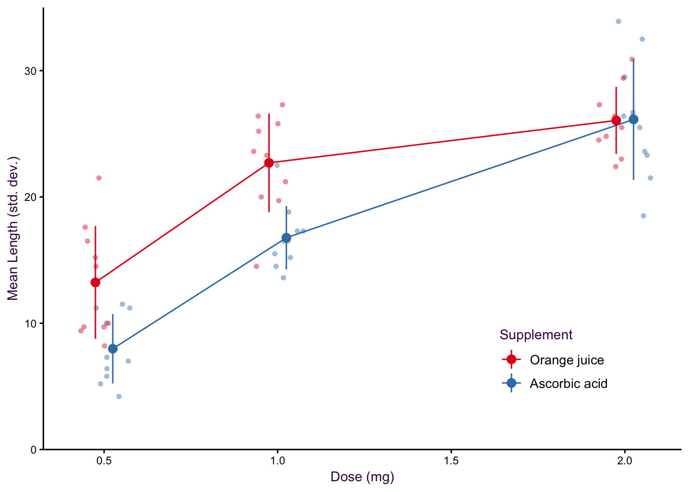
Figure 2.3: Gestalt principle of connection to show the trend in a data set.
Enclosure is another common gestalt principle implemented in scientific plots. A common example of an enclosure is the use of background elements to highlight regions of a plot, as seen in fig. 2.4. Here we have the unemployment rate in the US from 1967 - 2014. Enclosure can take many forms, here, the shaded backgrounds highlight recession periods, which correspond to an increase in the unemployment rate.
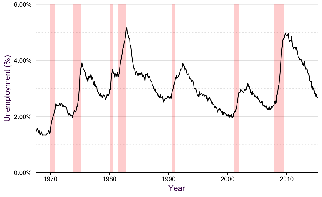
Figure 2.4: A line plot with a shaded background is an exmaple of the gestalt principles of connection and enclosure
As an example of continuity, consider the plot of two curves shown in fig. 2.5. Many viewers expect that the two lines will converge somewhere outside of the plotting space. Our mind fills in the blanks given the trend we see, we expect that the lines will continue as we see them on the page. In reality, the only difference between the lines is their y-intercept — the distance between the two lines is constant along the x-axis! Our mind tricks us into seeing a trend that is not there. William Cleveland summarizes this phenomenon nicely: “… the minimum distances lie along perpendiculars to the tangents of the curves. As the slope increases, the distance along the perpendicular decreases, so the curves look closer as the slope increases … we cannot force our visual system to process the right segments without using slow sequential search.”
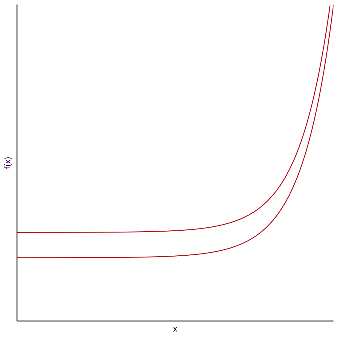
Figure 2.5: An example of the gestalt principle of connection and continuity.
In this case if we wanted to overcome the fast form of visual perception, we have to invest a lot of work, adding embellishments or redrawing the plot. For example in fig. 2.6 the two lines are separated to make it difficult to draw false conclusions.
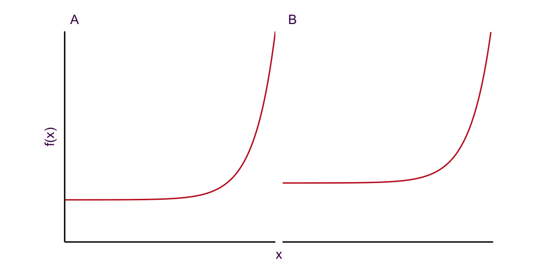
Figure 2.6: Separate plots make it more difficult to make incorrect comparisons.
In 2.7 line segments are added between each line to highlight that they are equidistant apart over the entire x range.
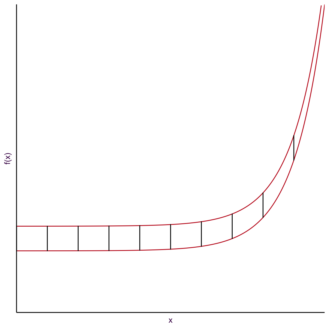
Figure 2.7: An example of the gestalt principle of connection and continuity.
There is an underlying issue with all these solutions. Do we really need to show two lines when what we really want the viewer to know is that they are the same distance apart? If the difference between two lines is the message, then we should just show that! Fig. 2.8 depicts this. It’s a pretty boring plot, but also the most honest and meaningful of the series.
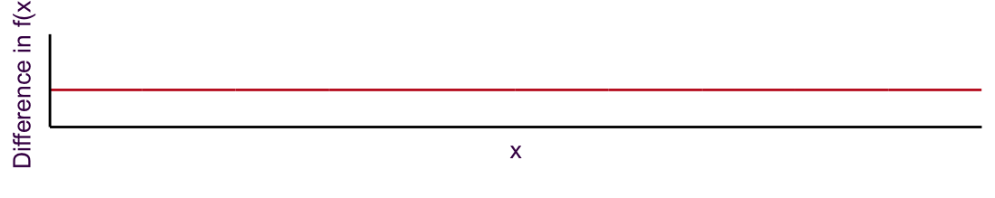
Figure 2.8: Alternatively, plotting the actual difference between the lines reduces any confusion and makes the message even easier to convey.
Remember, fast forms of visual perception are typically used in explanatory plots, but we are constantly implementing gestalt principles, even when producing exploratory plots.
2.2 Slow forms of visual perception
William Cleveland popularized the “table look-up” type of slow visual perception in the 1980s. This is a kind of visual perception typical with exploratory plots. It allows us to ask precise and detailed questions when we first begin to examine our data. They may make an appearance as explanatory plots, but because they are time-consuming to read, are less common. It also depends on the context and audience. You may see plots that activate slow forms of visual perception in specialist, data-heavy scientific journals, where the audience has the time and interest to pour over the details. In contrast, it’s unlikely that a large audience for a short conference presentation will get any meaningful information.
An example that Cleveland used to exemplify this concept is the Barley Yield data set. In this data set, the yield of 10 varieties of Barley in 1931 and 1932 are reported for 6 farms. That’s only 120 data points, so the issue is not too much data. Rather the issue is that we have 4 variables and 60 time series. The heat map presented in fig. 2.9 may be a first idea for a data visualization.2. As an exploratory plot, it is not detailed enough. Basically, it’s as if we have used conditional formatting in an Excel spreadsheet.
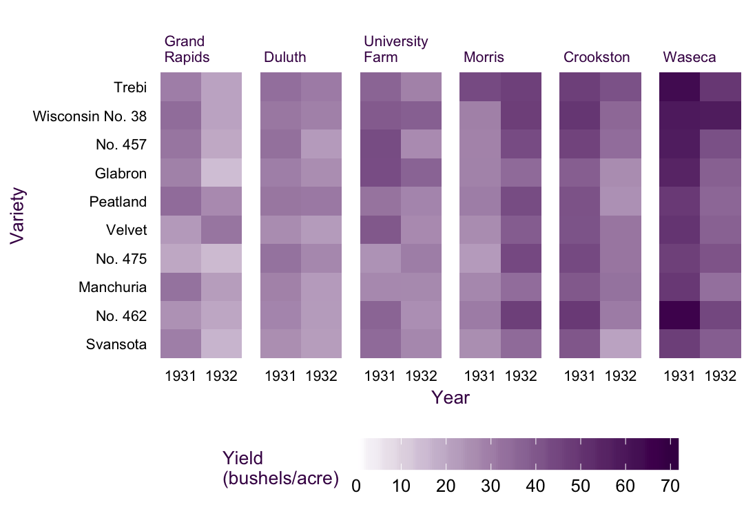
Figure 2.9: The Barley Yield data set as a Heat Map. All values are displayed but trends are difficult to observe.
A much more detailed view would be fig. 2.10, a Cleveland-style dot plot. In this plot type, we make some unconventional choices. First, the independent variable is presented on the y axis (see XX) and the dependent variable is on the x. It works, since the long labels of the Barley varieties are easy to read. Time is encoded by color, instead of taking its typical place on the x axis. This arrangement means that we can read the plot like a table, hence slow table look-up. We can ask very detailed questions and scan the plot (i.e. table) from left to right and from top to bottom to retrieve exactly the information we need.3
An example: Which variety had the worst yield in 1931 at the Waseca farm? All we have to do is move from top to bottom looking for the Waseca sub plot. Then we move from left to right looking for the first blue dot (the smallest value in 1931). It turns out to be No 475, which had a yield of ca. 47 bushels/acre. Try answering that with the heat map! Unless the value is striking, you’ll have a hard time.
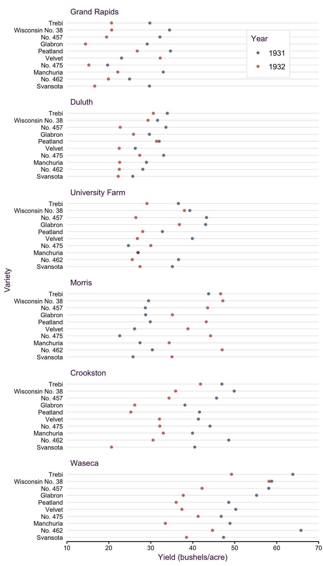
Figure 2.10: A dot plot of the barley data set popularised by William Cleveland. Three variables representing 120 data points are plotted.
Fig. 2.10 is the most data-heavy and time-consuming (to read) plot we could produce with this data set. But it’s not bad! It serves a specific purpose for an interested audience in the right context. Can you see some trends in the data set? Did you notice that the farms are arranged from low to high producers? That’s a useful feature. The sub-plots are not arranged alphabetically, further information is contained in their order! Also, notice that some farms have a low mean yield and variance, like Duluth, whereas others have a relatively large mean and variance, like Waseca. Did you also notice the anomaly in the data set? All farms suffered a decrease in yield from 1931 to 1932 except for Morris. The reason for this is a different, and somewhat contested, question. We’ll imagine that this is an interesting anomaly that we want to highlight.
Systematic shifts in the location, spread or direction of change are important results that we typically want to highlight. They are not readily apparent in fig. 2.10. We need a plot type that allows us to communicate these messages a bit faster. A line plot, fig. 2.11, could come in handy here. In this case the most logical, and typical, choice for the x axis is going to be time.
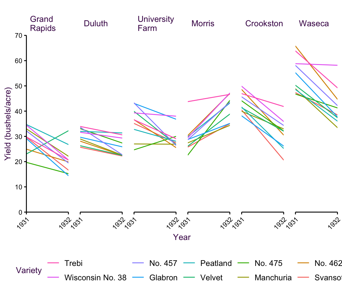
Figure 2.11: Barley data set, Line Plot
Fig. 2.11 is pretty detailed since we see all 60 time series. It’s still manageable, but consider that we have 10 distinct colors. We’re kind of pushing the limit on how many colors the human eye can easily distinguish (see section XX for a more detailed discussion of color). Nonetheless, we can see the trends we expected as we move from left to right. In particular we can see more clearly that Morris behaves differently compared to the other farms. On top of that we do gain some extra insights. For example, although many varieties decrease, some of them actually increase, and some are worse off than others.
By now, we’re progressing from slow exploratory table look-up plots to faster explanatory plots that evoke Gestalt principles. We can go a couple more steps further in this direction. For example, if we are only interested in the verge yield at teach farm in each of the two years, we can focus on the location and spread. We already saw error bars in fig. 2.2, and point ranges in 2.3. Both of those methods required dodging the data points to avoid overlapping error bars. When we have any kind of trend line (e.g. time series), there are another two options we have for depicting spread: ribbons and dotted lines. They both have the advantage that we don’t need to dodge the time series, but they can get overwhelming when we have lots of overlapping trends. For that reason, dotted lines would be too confusing here. We’ll see them in action in section XX. Fig. 2.12 depicts semi-transparent ribbons. It’s not a perfect solution since in some regions there is a bit too much overlap to easily distinguish the values, but we can still communicate a clear message about the Morris farm. Notice also that in this plot, I’ve removed another degree of separation in that the lines are directly labeled. We don’t always need a legend.
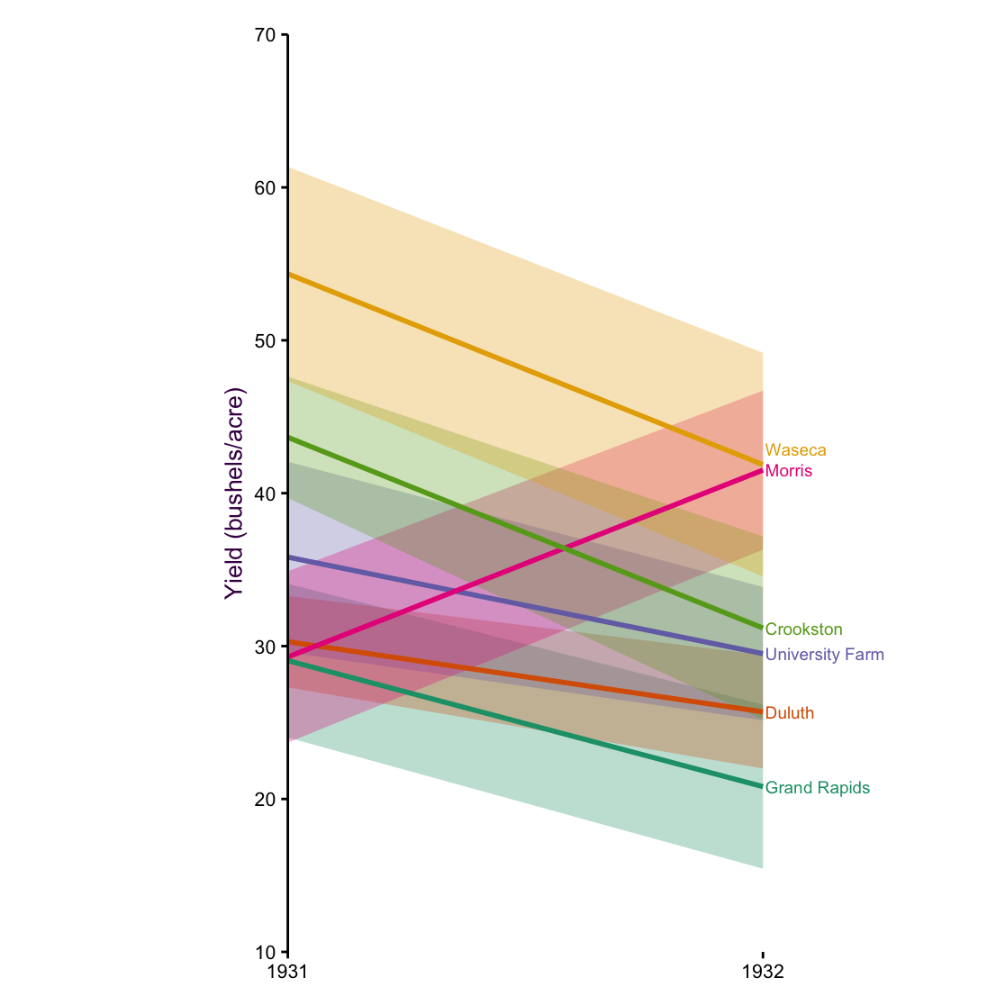
Figure 2.12: Cleveland Barley data set Means with side labels.
Edward Tufte, whom we’ll also encounter again later on in the workshop, developed a slope plot. For Tufte, an explanatory plot wasn’t complete until all non-data ink was removed (see section XX). The slope plot in fig. 2.13, does away with the axes. In their place are the actual mean values. So although it looks like we have lost precision, this is actually the most precise plot of the series since we know the exact value to two decimal places and we can see the values in a visual context. On top that fig. 2.13 communicates one very clear message by the clever use of color. Instead of coloring the lines according to farm, they are colored according to direction of change. Did the yield increase of decrease?
There are two disturbing things about this slope plot. First, there is no legend. Any visual element that encodes information should be defined somewhere on the plot. In this case we may make the argument that it is obvious and so goes without saying. That’s a dangerous perspective, but you may be able to get away with it. Second, the spread is not depicted, which is typical for slope plots. That should be a major cause of concern for scientists. You never want to show the location without some measure of spread (see section XX). This plot is not suitable for a scientific publication, but it may work well for lay people or in a report for managers. It’s easy to read and communicates a clear message. Extra information like the standard deviation or the 95% interval may already be information overload and just confuse the audience.
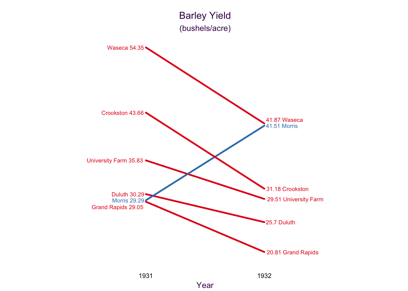
Figure 2.13: Cleveland Barley data set slope plot.
2.3 Color
Color is a very powerful tool in data visualization, but it’s often used poorly or even incorrectly. Here, I’ll review the most important features of good color use; we’ll see plenty examples throughout the rest of the workshop.
Use hexadecimaal codes when available
Before selecting colors, we should be able to name them. Screens make use of RGB color space, where Red, Green, and Blue make up the three primary colors.4 Regardless of software, a six-digit hexadecimal codes will serve as a consistent color naming convention. Hexadecimal (i.e. “16”) is a base-16 counting system, as described in fig. XX.
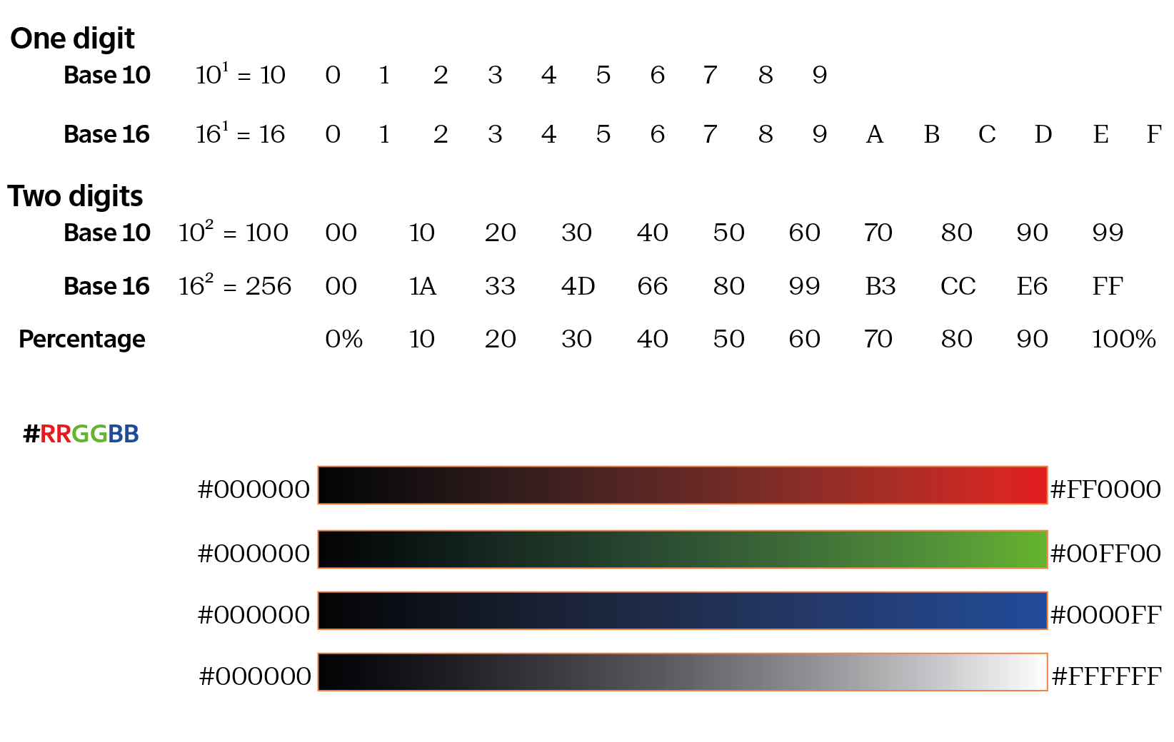
Figure 2.14: A hexidecimal code is made up of three two-digit hexidecimal numbers preceeded by a #.
Together the combination of these three values provides approximately 16.8 million colors (\(256^2 = 16,777,216\)). Now that we have an easy convention to refer to color, let’s think about how to select them appropriately.
Avoid harsh, high saturation bright colors
One of the first questions students have regarding color selection is how do I choose pretty colors? The short answer is that this is not your first concern! Remember good design means form follow function. Of course, you want your colors to be appealing! But beauty comes after you do the work. Let’s address beauty in the context of function and then get into more detail. First, we must understand the four dimensions of color:
| Dimension | Description |
|---|---|
| Hue | What we typically refer to as the color. |
| Lightness | The amount of white or black. Tints, containing more white, are lighter. Shades, containing more black, are darker. |
| Saturation | The purity of the color. Low saturation colors converge onto grey. |
| Alpha | The transparency |
The relationship between the three dimensions is visually depicted in fig. 2.15.
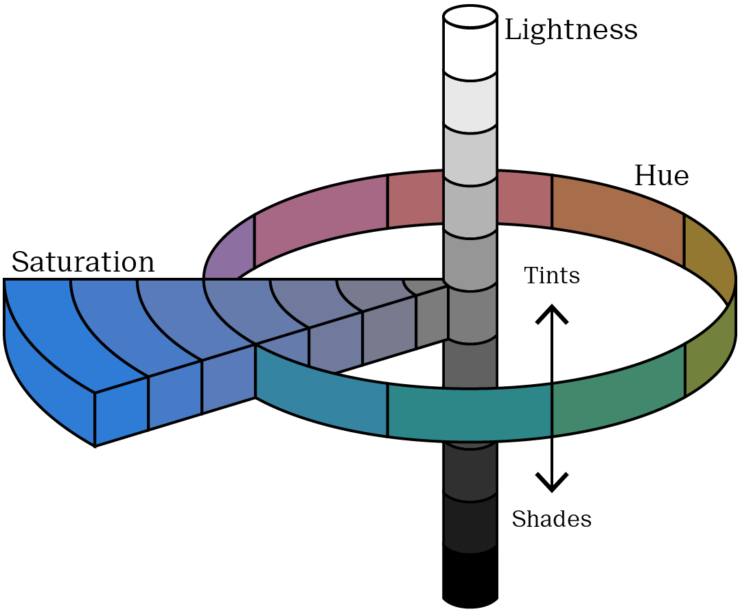
Figure 2.15: Munsell’s color theory depicts the relationshiop between Hue, Lightness and Saturation.
We’ll get to alpha later on, for now let’s see how the hue, lightness and saturation affect colors. In fig. 2.16 we have the three primary colors (red, green and blue) and the three secondary colors (magenta, yellow and cyan) composed of even mixtures of primary colors.5
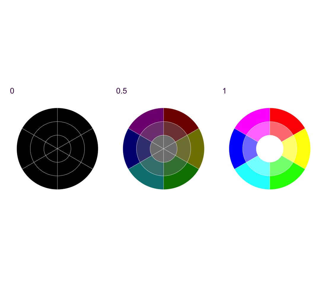
Figure 2.16: HSV color definitions for the primary and secondary additive colors. From left to right: lightness of 0, 0.5 and 1. Each pie chart begins with saturation of 0 in the center, 0.5 in the middle and 1 in the outer ring.
Each pie chart in fig 2.16 reveals that as saturation decreases, different hues converge on a monochrome spectrum from black to white. As lightness increases the colors become brighter, and as saturation decreases the colors become less pure, converging on white, for high lightness, grey for mid lightness and black for low lightness. This is why we won’t encode information with saturation. Very low saturation colors are difficult to distinguish from each other. So that leaves us with hue and lightness. Very dark colors are also difficult to distinguish, so we should use them with caution.
In fig. 2.17 we have a scatter plot of some play data with six disparate colors, each having a high lightness value.
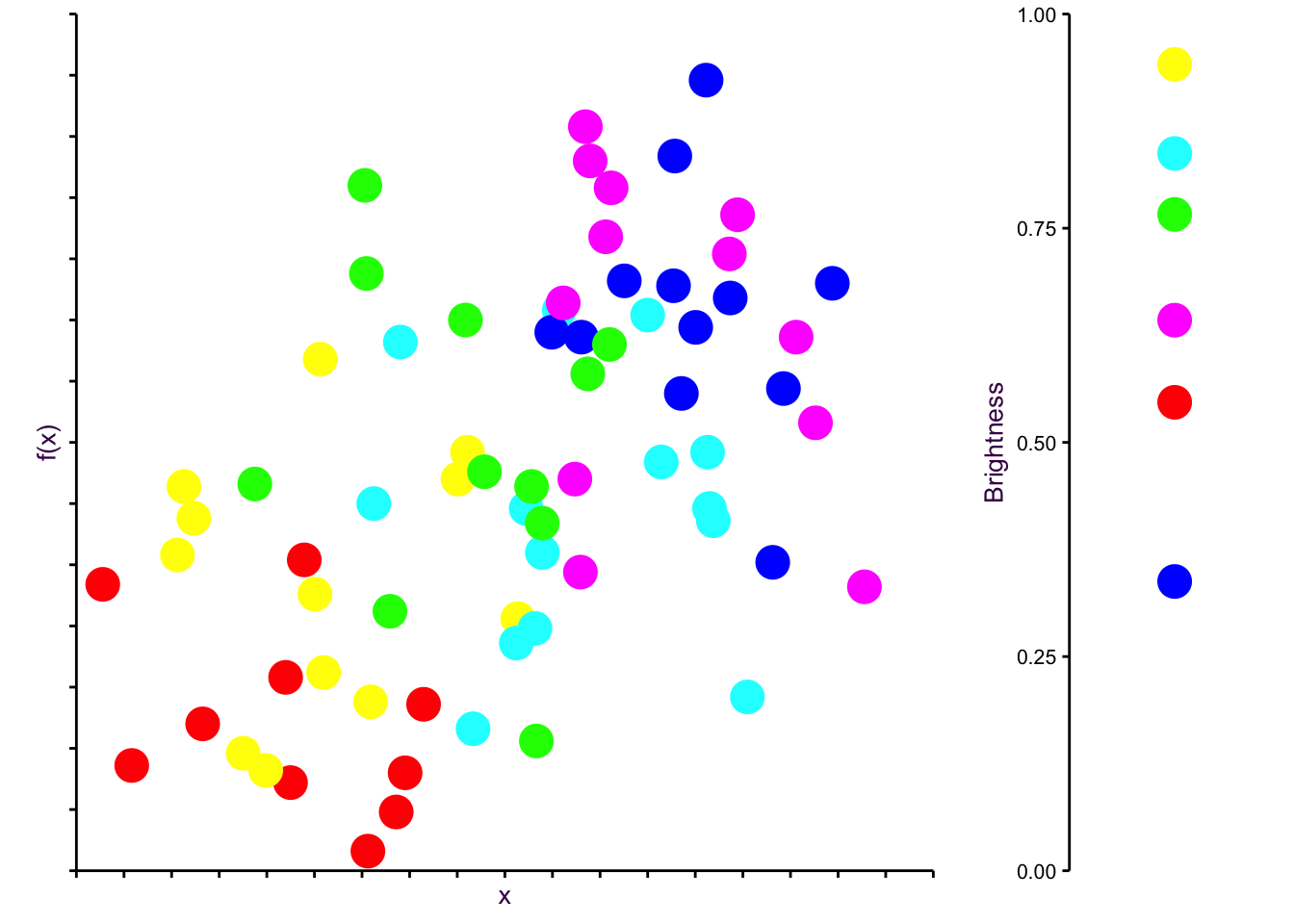
Figure 2.17: Although very distinct, pure colors are unplesant to look at. In this play data set, the dots are draw with no transparency.
There are couple reasons why the plot in fig. 2.17 doesn’t look very nice. First, the colors are very jarring. High saturation, high lightness colors are just not nice to look at. They kinds of remind us of children’s play rooms. Second, and more subtly, pure colors tend to have cultural meanings. Think of red as a warning color, or yellow for cheapness, or the logos of discount brands. Aldi and Lidl are trying to say something with their color choices!
Third, the main reason why fig. 2.17 doesn’t look good is because the colors, although equally spaced along the color wheel, do not have the same brightness. Brightness refers to the way colors are perceived by our eyes. A bright color appears to emit more light, even if it’s the same lightness in the color space. Brightness can be measured as \(brightness = \sqrt{0.299R^2 + 0.587G^2 + 0.114B^2}\), which means that yellow appears as very bright and blue appears as very dark. The brightness of our six colors is depicted in fig. (fig:cheapcol), right.
So this is a perception problem, because colors that are equidistant on the color wheel are not perceived as such by our eyes. They should look great together, but they don’t.6
So what is the solution? There have been a few attempts to standardize and make the RBG color space more intuitive. One of the most popular models is the Hue Saturation Value (HSV) (or the Hue Saturation Brightness (HSB)) color space. Here, a color can be specified using three values: hue, saturation, and value (brightness), all in the range of [0, 1]. This is what we saw in the color wheels in fig. 2.16. As we just saw with our little play example, HSV color space distorts data when used for visualization so that the distance between perceived colors does not reflect their distance in the actual color space.
The Hue Chroma Luminance (HCL) color space solves this problem. HCL color space is like HSV except for one very important distinction: changes in the hue do not effect the lightness. In HCL color space, the perceived difference between two colors is proportional to their Euclidean distance in color space, i.e. we have perceptual uniformity. That makes HCL colors ideal for accurate visual encoding of data. Good news for us!
Here, a color can be specified using three values: hue [0, 360], chroma [0, 100]7, and luminescence [0,100]. The HCL color space is designed to match with human visual perception of color in that steps of equal size correspond to approximately equal perceptual changes in color.8
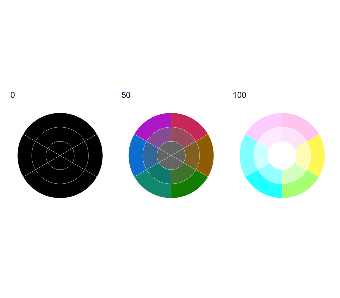
Figure 2.18: HCL color space. The possible values of chroma and luminance depend on the specific hue. The ranges presented here are only indicative.
Now, distinct colors can be chosen by evenly spacing them around an HCL color wheel. Two colors will be separated by 180°, three colors by 120° and so on. In fig 2.19, a chroma of 100 and luminosity of 45 and 65 is used to keep the saturation and lightness consistent while selecting from 2 up to 10 evenly spaced colors.
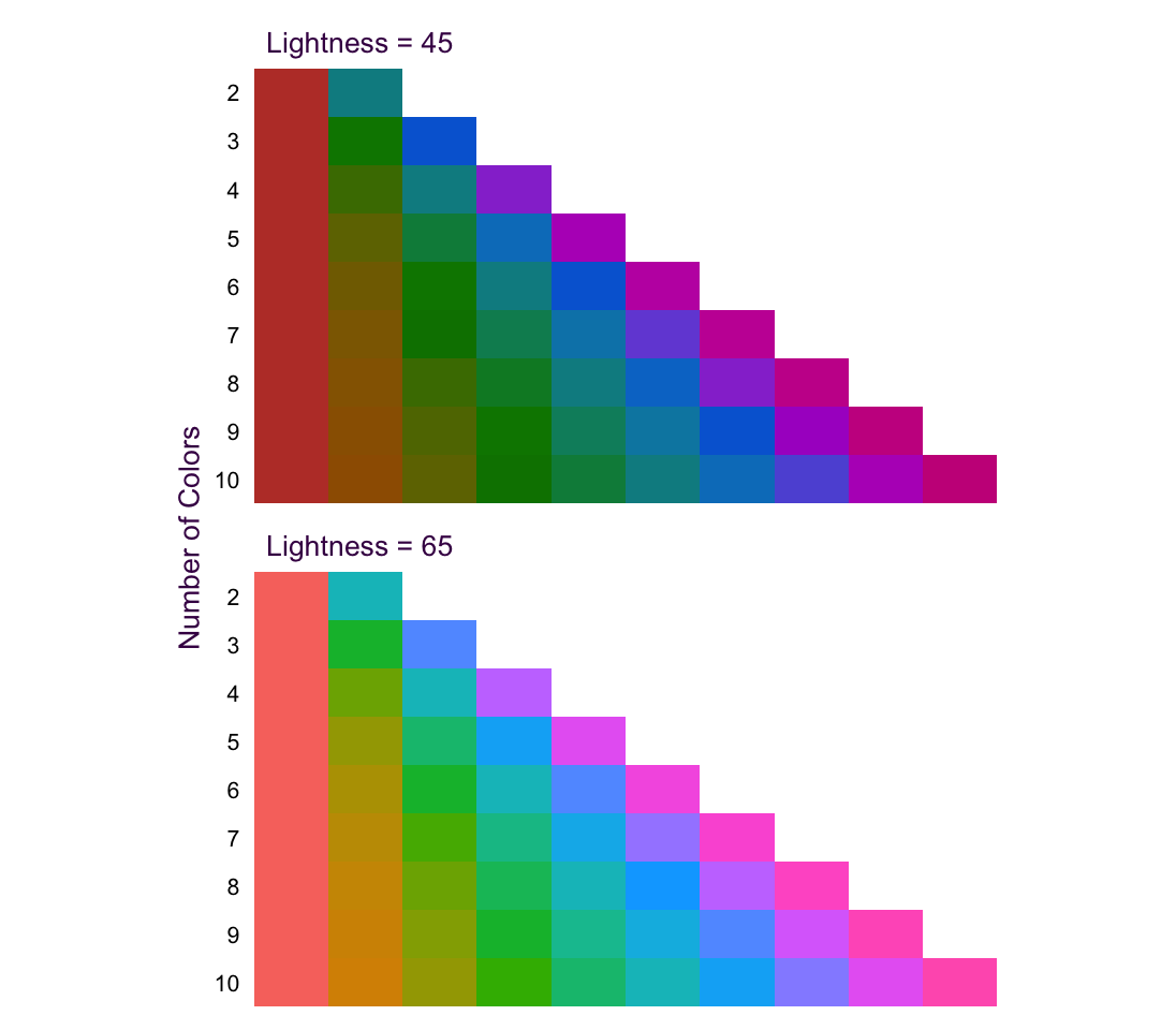
Figure 2.19: Evenly spaced colors on the HCL color space.
The default colors used in the R plotting package ggplot2 use an HCL color space with a lightness of 65 and chroma of 100. If you are going to use high saturation, decrease the lightness to avoid blaring colors. Let’s see how the brightness compares now:
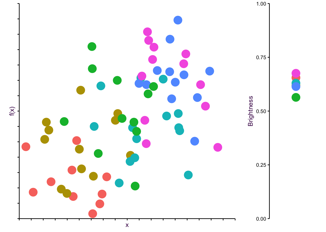
Figure 2.20: A more suitable color scale for our play scatter plot.
The variance of the brightness among the HCL colors is much lower than what we had previously. So if we’re looking for colors that look good together starting with similar brightness helps. However, that doesn’t necessarily mean that the colors will be beautiful or meaningful.
Beautiful colors are subject to fads and trends. What’s beautiful now is hideous in ten years later. If you want to have the nicest color palettes, and don’t have a feeling for choosing colors that work, my best advice is simply to search for “best color palettes” of what ever year you’re in. There is a segment of designers who take joy in developing trendy color palettes and sharing them, so use them to your advantage. A great source is canva.
Use color to highlight a specific aspect of the data (e.g. trend lines) or to depict all values without bias.
Color serves two seemingly contrasting purposes in data visualization. It’s used to either draw the reader’s attention to a specific piece of information, or to make all information equally visible. Both uses of color may be implemented in the same plot and we’ve already seen lots of examples, e.g. the regression line in 1.5 and the semi-transparent dots of the scatter plot in the background.
The challenge to using color appropriately is choosing the right combinations which allow them to fulfill their purpose. To this end, we need to consider the kind of data we’re encoding as color. We’ll discuss different variable types in section XX, but since we’re already dealing with colors, let’s have a preview.
Avoid using colors to encode continuous variables (see section @red{fig:Cont-Encoding})
Many software applications allow continuous variables to be encoded as color. Sometimes this works really well, but often times it leaves a lot to be desired. Several issues need to be considered.9
First, the brain does not recognize color as being ordered, like size or numbers. Although sequential wave lengths result in different colors, there is no logical ordering to the actual colors as distinct from the logical ordering of their wave lengths. We will return to this point when we discuss the different possibilities of visually encoding continuous variables.
Second, in a rainbow, there are different widths for each “pure” color. This means that we cannot use the rainbow as an evenly dispersed gradient for a range of values because it is inherently uneven. Consider the rainbow spectrum shown below:10
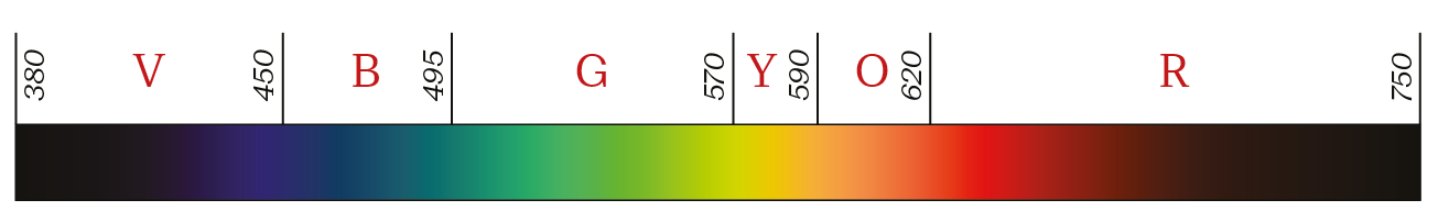
Figure 2.21: The wavelength ranges for visible colors are not equal.
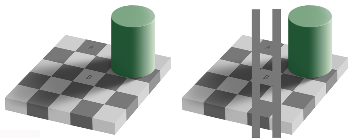
Figure 2.22: Quantitative interpretation of color is inaccurate. In the checker/shadow optical illusion, the gray color of boxes A and B appear different (left image) but are in reality identical (right image).
Despite these short-comings color remains a popular choice for encoding continuous variable. Heat-maps are a popular example in the life sciences, see section XX. For the most part heat maps are difficult to interpret for the reasons given above, so limit them to those instances where there is a clear message. There are specific cases where it works really well! One famous example is shown in fig. 2.23. Here the number of measles cases per US state is encoded with an uneven color scale. It works because there is a dramatic shift after the vaccine is introduced. We’re less interested in the individual values than the extreme ends of the distribution.
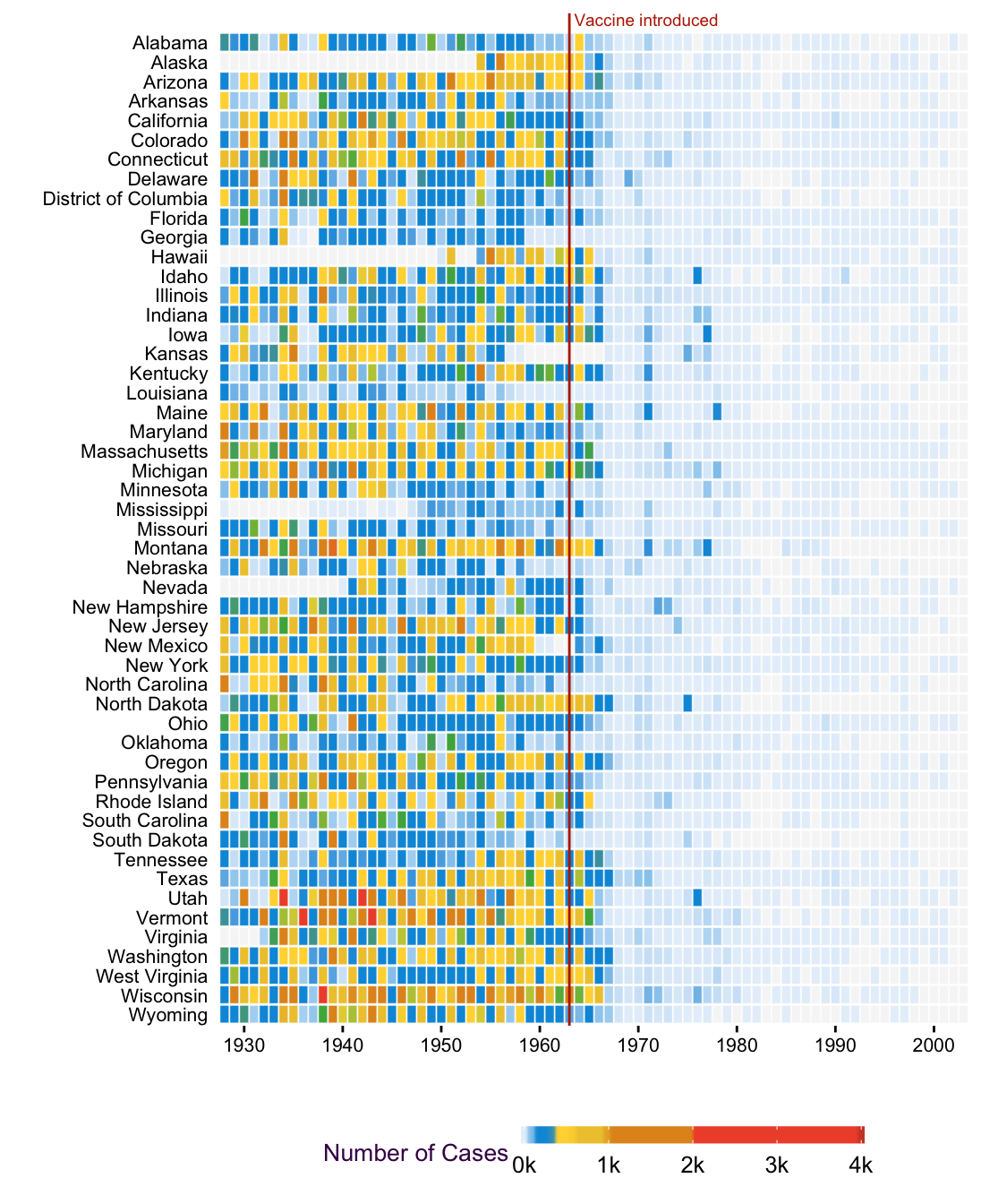
Figure 2.23: Measles Heat map
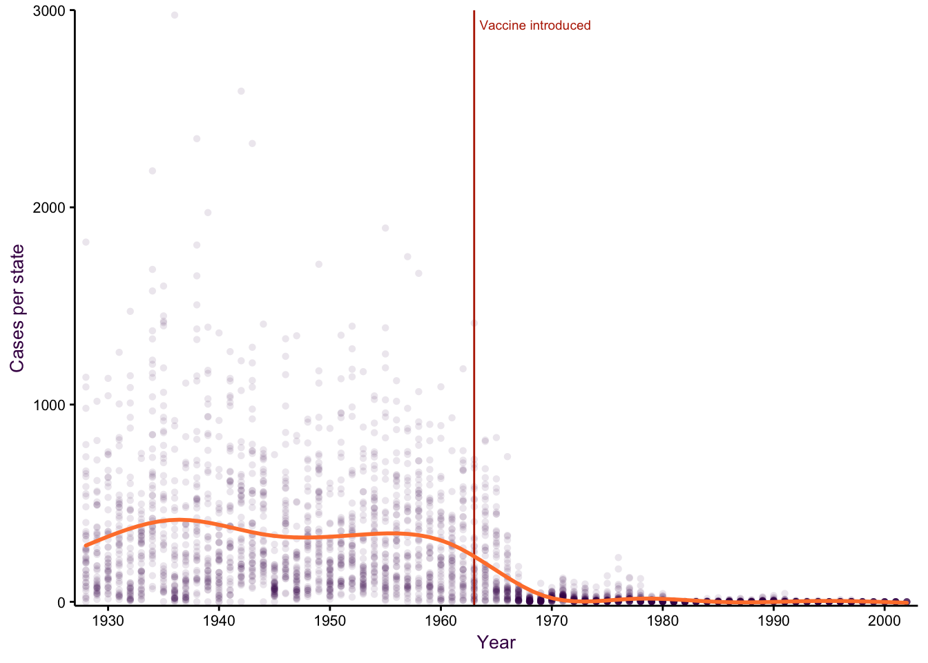
Figure 2.24: Measles line GAM
Use easily distinguishable colors to encode categorical variables (see section @red{fig:Cata-Encoding})
In contrast to continuous variables, categorical variables11 lend themselves well to color representation. For nominal (i.e. unordered) variables, qualitative colors are appropriate, whereas ordinal data can be better represented with sequential colors (see Fig. 4.8). Adobe Illustrator, as well as R, come with pre-selected color palettes. When you have to choose colors manually, consult the guidelines for color schemes below.
Consider color blindness and avoid encoding important information in red and green
When possible, color choice should take color blindness into account. Two color palettes of the same data in fig. fig:color-blind-small reveal the importance of proper choice. Colorblind-safe palettes primarily avoid red-green color combinations, which is the most common form of color blindness. Computationally simulating color blindness (deuteranopia or protanopia, the two most common forms of red-green color blindness) reveals that although distinct colors were chosen, they are difficult to distinguish under these conditions. If you choose a color blind-safe color palette, you will avoid the risk of losing part of your audience.
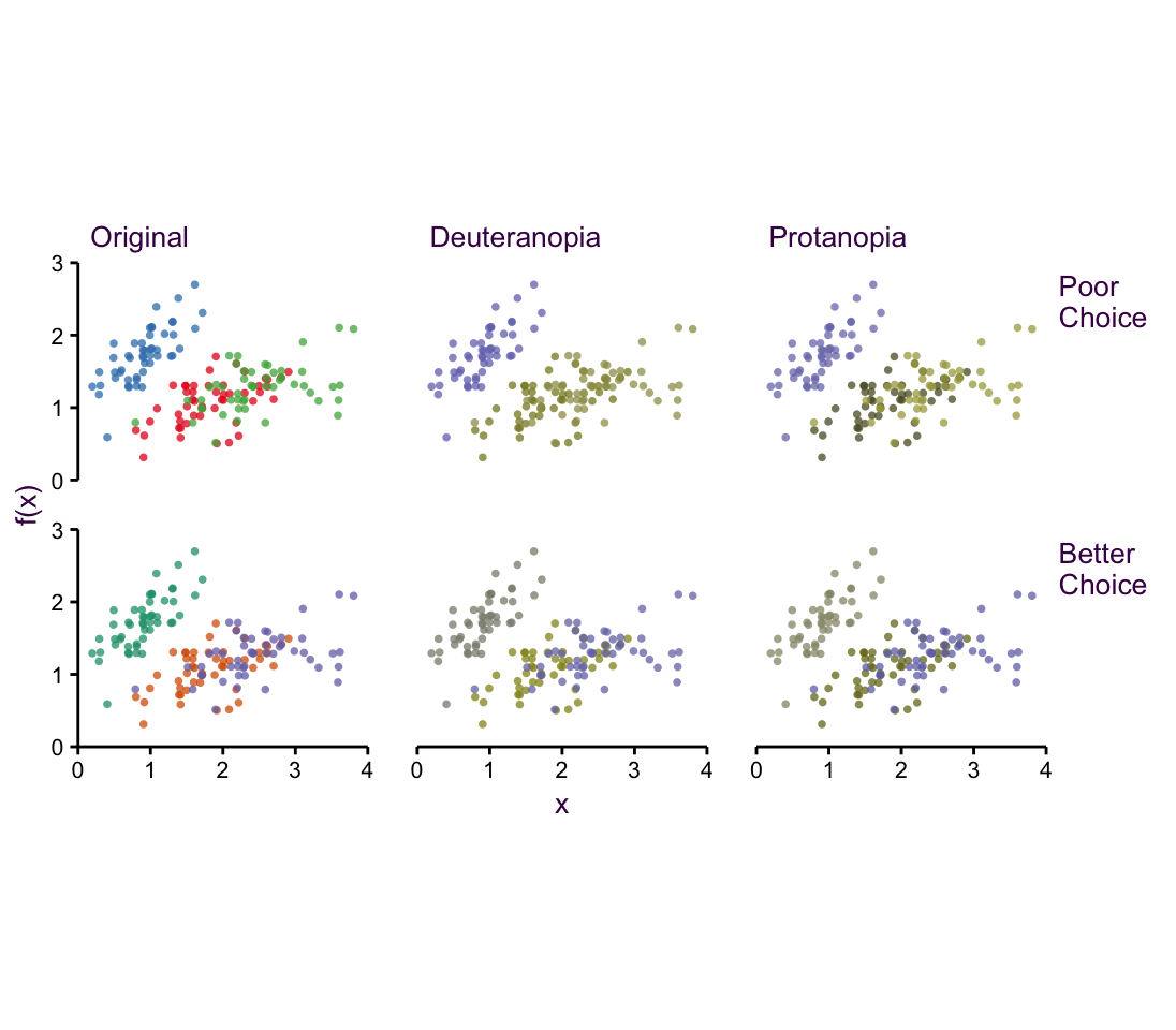
Figure 2.25: Simulating color-blindness.
Choose an appropriate color palette
A color palette is a logical selection of a group of colors. Although making this selection is not straightforward, there are some general and easy-to-follow guidelines for what looks good and what works together. Note that in these examples I’ll use a standard artist’s color wheel, where the primary color triad is red, yellow and blue. This RYB color space is an intuitive color model that you probably learned in school and was popular before display shifted the trend towards the RGB additive color space described above.
The choice of color is determined by the object being colored. Smaller objects and thinner lines need larger differences in their colors to be distinguishable from each other. In this case, you should avoid sequential color schemes (see below) that include very light colors.
When manually choosing colors, begin with a color wheel divided into discrete colors (fig. 2.26a). The primary colors, Red, Yellow and Blue are arranged in an equilateral triangle. The secondary colors, Orange, Green and Violet are positioned in an inverted equilateral triangle interspersing the primary colors. Tertiary colors fill in the remaining gaps. Consider the following conventions when choosing a color scheme based on this color wheel.
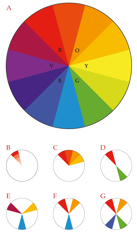
Figure 2.26: The color wheel.
Table (#colSel): Color selection for continuous and categorical variables:
| Name | Description | Data Types | Color wheel |
|---|---|---|---|
| Monochromatic | Change the lightness of a single color | Continuous, ordinal, date or time | fig. 2.26b |
| Analogous | Include two or more colors adjacent to each other on the color wheel | Continuous, ordinal, date or time | fig. 2.26c |
| Complementary | Two colors opposite each other on the color wheel | Nominal | fig. 2.26d |
| Triadic | Three colors, equally dispersed on the color wheel, forming an equilateral triangle | Nominal | fig. 2.26e |
| Split-Complementary | Begin with complementary colors, but choose the two colors directly adjacent to one of them | Nominal & Ordinal | fig. 2.26f |
| Tetradic | Four colors, arranged in either a square or rectangular pattern on the color wheel | Nominal & Ordinal | fig. 2.26g |
The warm and cold color palettes are just analogous color palettes, beginning with red and excluding blue, or beginning with blue and excluding red, respectively.
Color Brewer is a simple-to-use tool for selecting well-designed color palettes to meet your specific needs.12 The color palettes are based on the HCL color space and so provide ready-to-use palettes for accurate data visualizations.
Table (#colPal): Palettes are arranged into three classes
| Class | Description | Examples |
|---|---|---|
| Sequential | Ranges from light (typically low values) to dark (high values) | fig. 2.27, top |
| Qualitative | Distinct colors to accommodate categorical data | fig. 2.27, middle |
| Diverging | Range from low/high contrasting colors for extreme values and light colors for mid-range values | fig. 2.27, bottom |
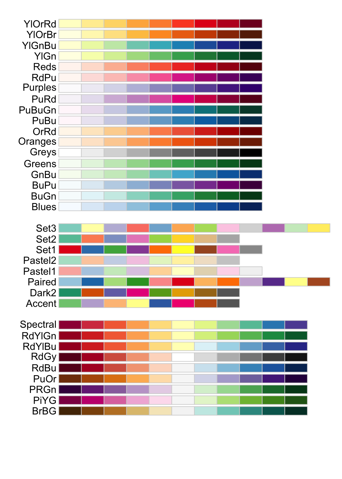
Figure 2.27: Sequential, qualitative and divergent color palettes in Color Brewer.
No amount of good design can compensate for poor data quality or analysis. Design is too often used to divert the reader’s attention away from in inadequate or faulty analysis. This workshop will help you to identify cases where visualisations are flawed or misleading, while at the same time helping you make outstanding visualisations. We will begin by considering composition and color.↩
Heat maps can be a good choice as an explanatory plot if there is an immediate and clear message or only a few, very different categories. I’ll discuss heat maps in section XX and in multivariate comparisons section XX↩
Remember, we can ask detailed questions, but precision is a different matter. As mentioned in section XX, most data visualization suffers from some degree of imprecision, unless precise labels are added.↩
This is distinct from CMYK color space (Cyan, Magenta, Yellow and Key (Black)), which is subtractive and used in print. It’s also different than what you may have expected given what you know from mixing paints: Red, Yellow, Blue define the primary triad in the RYB color space, which I’ll return to in section XX.↩
Note that the secondary colors in RBG color space correspond roughly to the primary colors in CMYK color space and vice versa.↩
On top of the perception problem, really bright colors cause problems with cheap projectors. Pure yellow or cyan appears faintly, or not at all!↩
Chroma corresponds to saturation.↩
The HSV and HSL color spaces are more intuitive translations of the RGB color space, since they provide a single hue number, either [0, 1] or [0, 360].↩
Two notable instances of encoding a continuous variable onto color are topography on maps and density in 2d (i.e. smoothed-scatter) plots (see section XX).↩
The topographical color palette suffers from the same draw back.↩
To avoid confusion, it’s useful to know that different text books and even different packages within a software program, such as R, will refer to categorical variables under different names. I use the generic categorical, which I feel makes a nice distinction to continuous. Discrete, qualitative (as opposed to quantitative), and factor variables are also used in specific contexts. For our purposes they are all the same thing in different guises.↩
Color Brewer can be found online at http://colorbrewer2.org/.↩