5 Data and Design
The first step in thinking creatively about data visualisation is to appreciate that graphics are built upon an underlying grammar. When we write a manuscript, we take great care to form our sentences so that they communicate the specific message we want to convey. That is what we need to do with graphics. We are not limited to specific, standard, forms of expression. We can communicate in the way that best suits our goal.
5.1 Graphics have a Grammar
We now have all the elements necessary to start building meaningful plots using the grammar of graphics plotting concept. Just as every word in a sentence has a clear grammatical definition, so to does every element of a graphic. Consider one of the most well-known sentences in English:
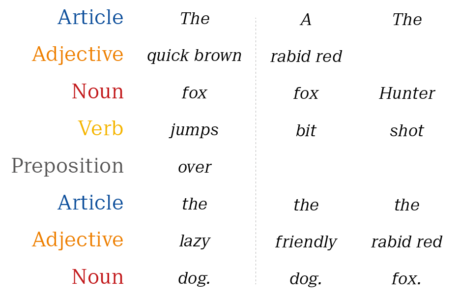
Figure 5.1: The components of English grammar: word choice conveys meaning, grammar permits understanding.
Maintaining the structure of the original sentence, replacing specific words dramatically changes the meaning.
We build graphics in much the same way.21The grammatical elements of our graphics are:
Data The data-set being plotted. Aesthetics The scales onto which we map our data.
Geometries The visual elements used for our data.
Statistics Representations of our data to aid understanding.
Coordinates The space on which the data will be plotted.
Facets Plotting small multiples.
Themes All non-data ink.
This concept will be explored throughout the rest of the workshop. We will make use of the structure depicted in figure 5.2, which lists some attributes that we have already encountered in the workshop.
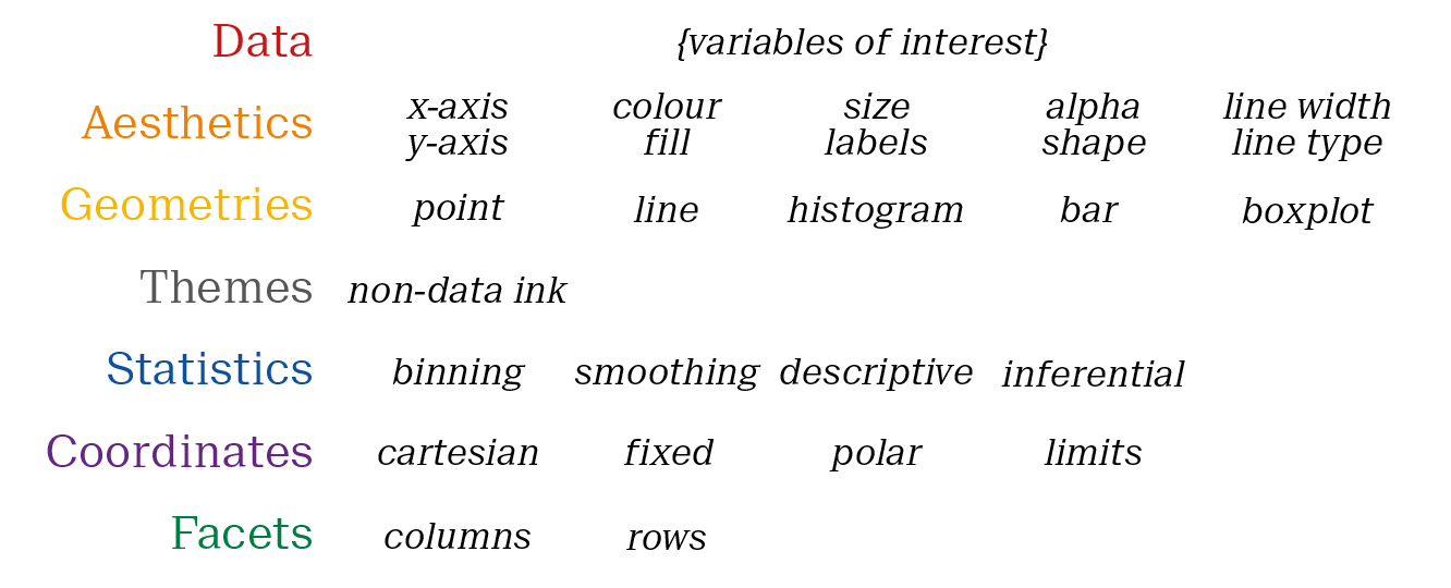
Figure 5.2: The 7 layers in the grammar of graphics provides the basic layout for the Grammar of Graphics plotting concept.
5.2 Case Study: The Iris Dataset
Understanding the data layer is crucial to building plots efficiently using the grammar of graphics framework. Consider the following example using the classic Iris data set.
The data set contains observations for 150 flowers each from three species of Iris, Iris setosa, Iris versicolor and Iris virginica. Four variables were measured on each flower: The petal length and width and the sepal length and width. The sepals are typically the green outer layer of flowers, but in this case they are a colorful part of the flower.
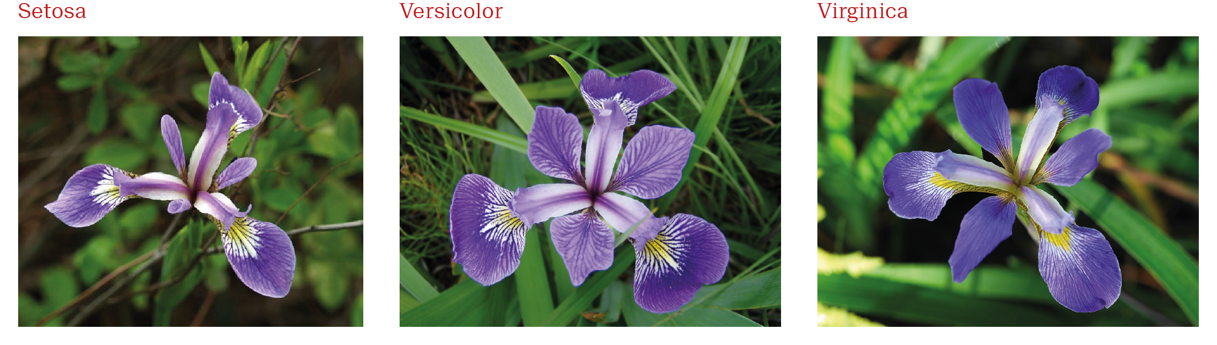
Figure 5.3: The three Iris species in the iris dataset: Iris setosa, Iris versicolor and Iris virginica
In the form presented in table XX, the measurements of the three Iris species can be plotted on a single plotting space. This is practical for making comparisons among a small number of sub-sets.
| Sepal.Length | Sepal.Width | Petal.Length | Petal.Width | Species |
|---|---|---|---|---|
| 5.099182 | 3.505011 | 1.411859 | 0.1909784 | setosa |
| 4.906041 | 2.996428 | 1.382701 | 0.2169218 | setosa |
| 4.682389 | 3.185782 | 1.281282 | 0.2083006 | setosa |
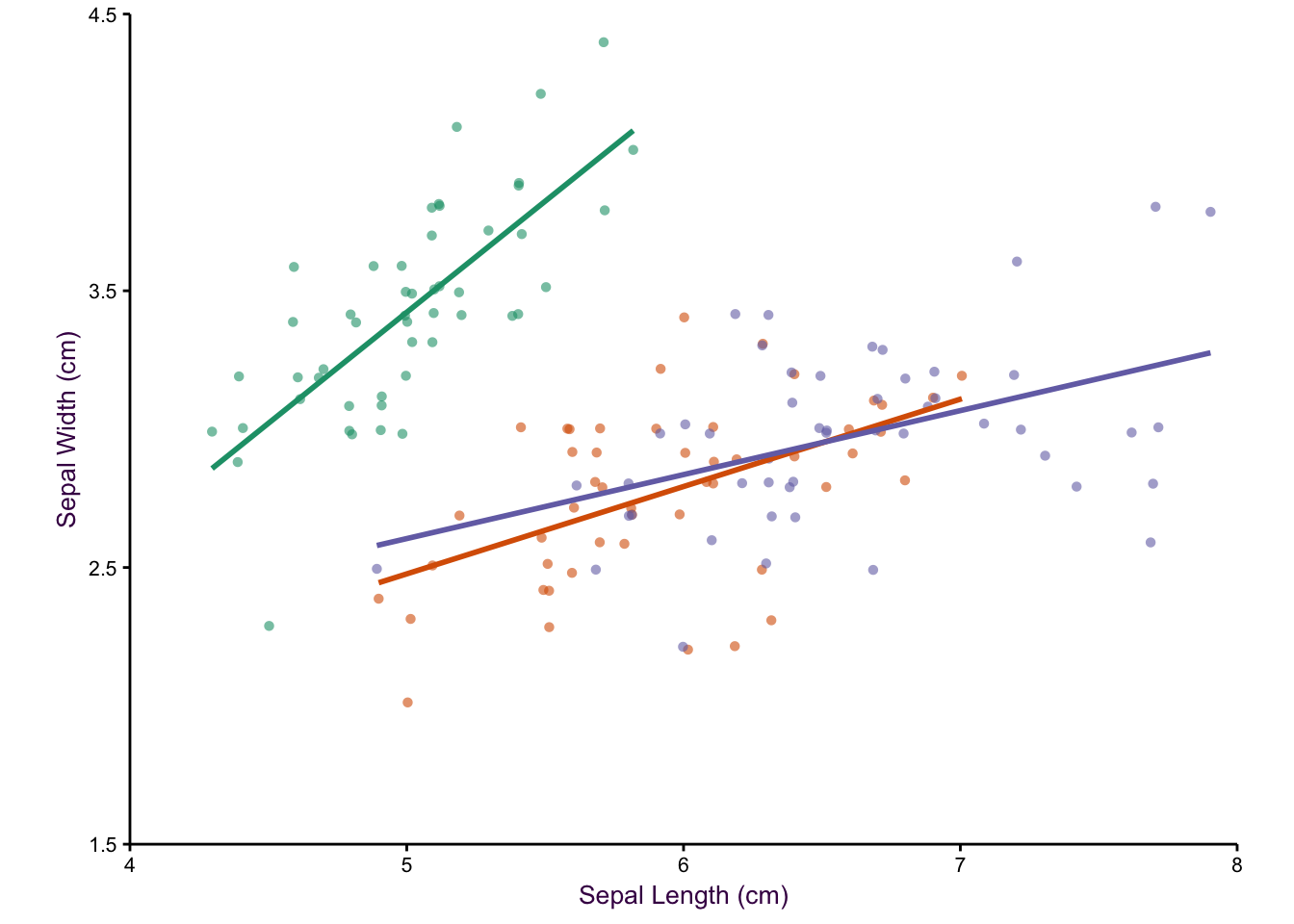
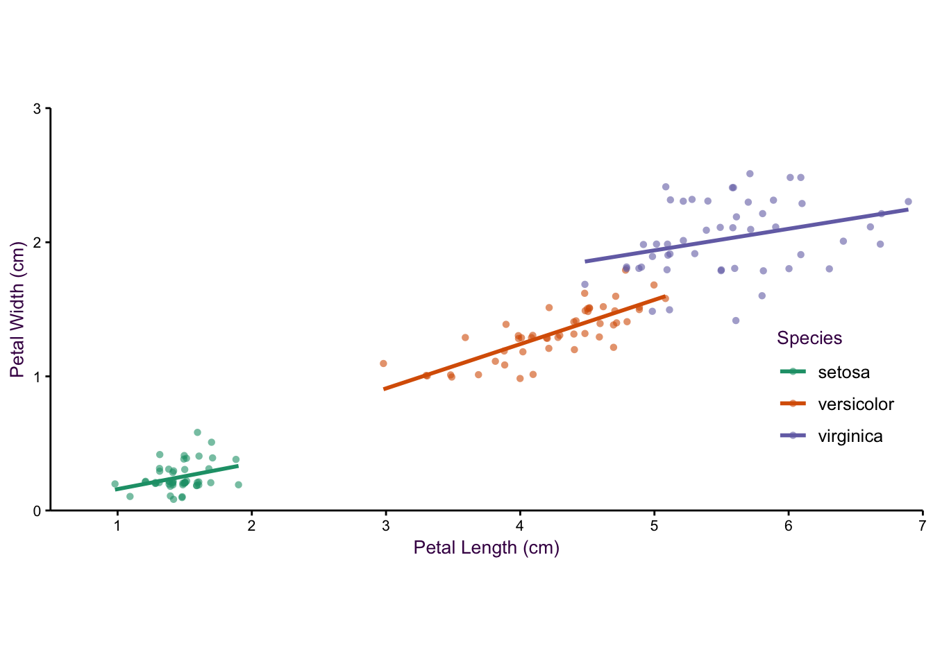
Figure 5.4: An example of plotting with five variables.
| Species | key | value |
|---|---|---|
| setosa | Sepal Length | 5.1 |
| setosa | Sepal Length | 4.9 |
| setosa | Sepal Length | 4.7 |
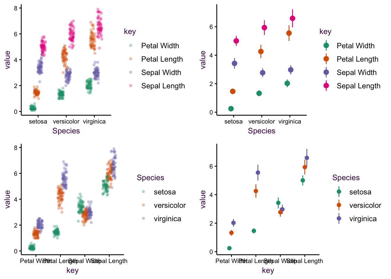
Figure 5.5: An example of plotting with three variables.
| Species | Part | Length | Width |
|---|---|---|---|
| Setosa | Petal | 1.411859 | 0.1909784 |
| Setosa | Petal | 1.382701 | 0.2169218 |
| Setosa | Petal | 1.281282 | 0.2083006 |
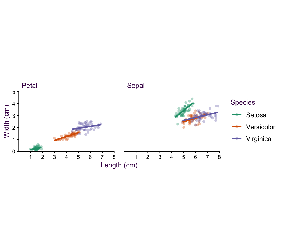
Figure 5.6: Plotting four variables.
| Species | Part | Length | Width |
|---|---|---|---|
| setosa | Petal | 1.4 | 0.2 |
| setosa | Petal | 1.4 | 0.2 |
| setosa | Petal | 1.3 | 0.2 |
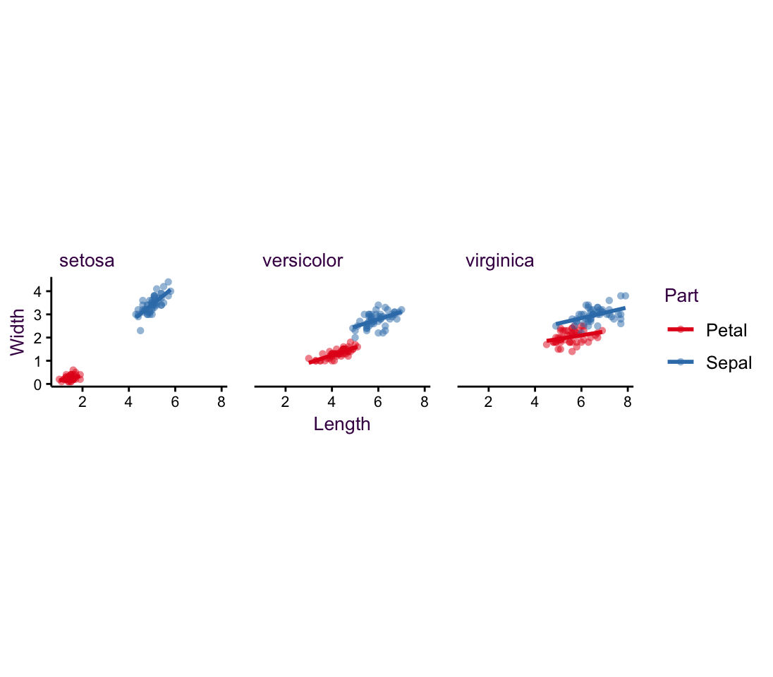
Figure 5.7: Further example of plotting with four variables.
| Species | Part | Length | Width | PartSpec |
|---|---|---|---|---|
| setosa | Petal | 1.411859 | 0.1909784 | setosa.Petal |
| setosa | Petal | 1.382701 | 0.2169218 | setosa.Petal |
| setosa | Petal | 1.281282 | 0.2083006 | setosa.Petal |
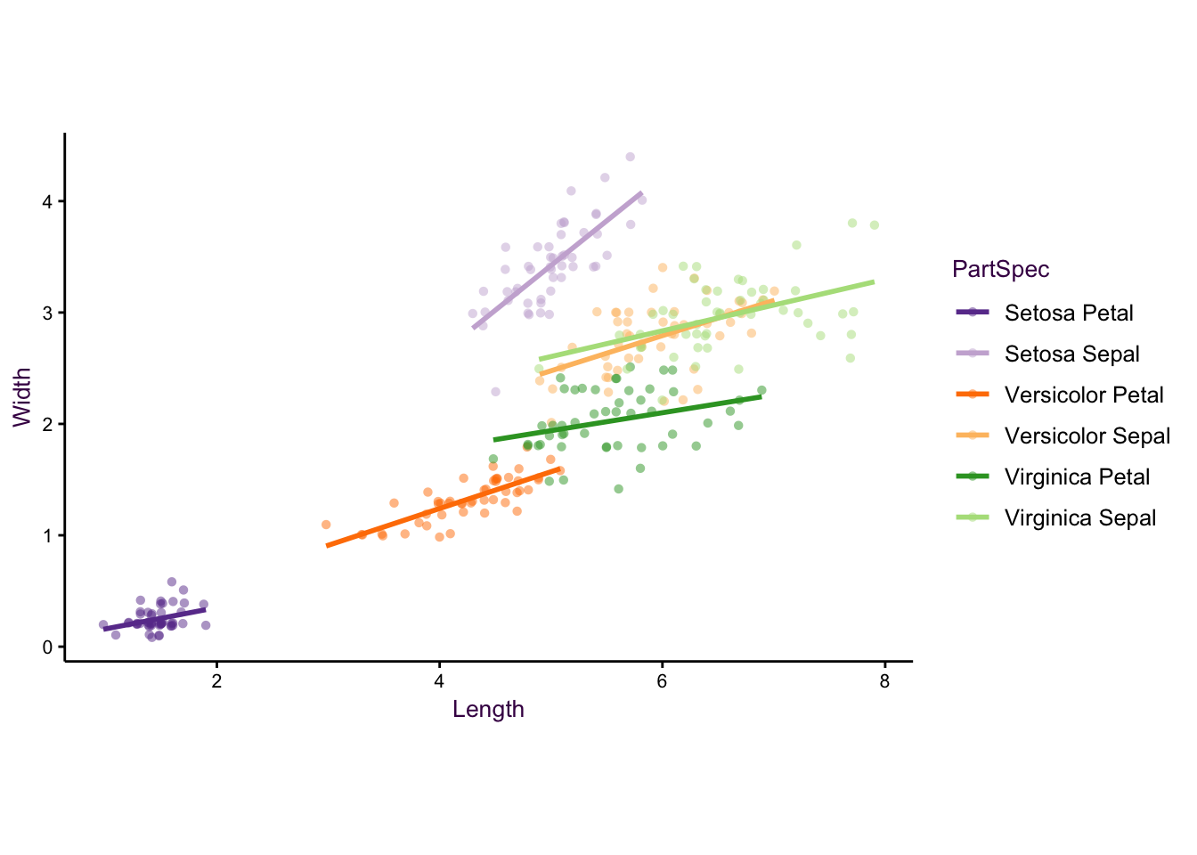
Figure 5.8: Combining variables.
| Species | Measure | Petal | Sepal |
|---|---|---|---|
| setosa | Length | 1.411859 | 5.099182 |
| setosa | Length | 1.382701 | 4.906041 |
| setosa | Length | 1.281282 | 4.682389 |
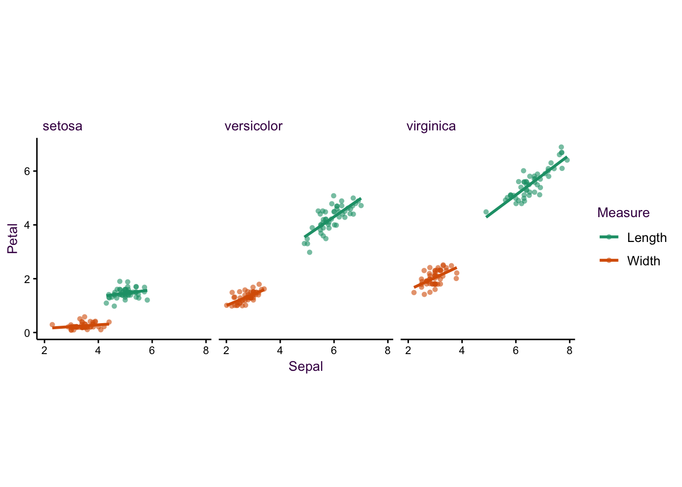
Figure 5.9: Further examples
| Species | Measure | Petal | Sepal | MeasSpec |
|---|---|---|---|---|
| setosa | Length | 1.411859 | 5.099182 | setosa.Length |
| setosa | Length | 1.382701 | 4.906041 | setosa.Length |
| setosa | Length | 1.281282 | 4.682389 | setosa.Length |
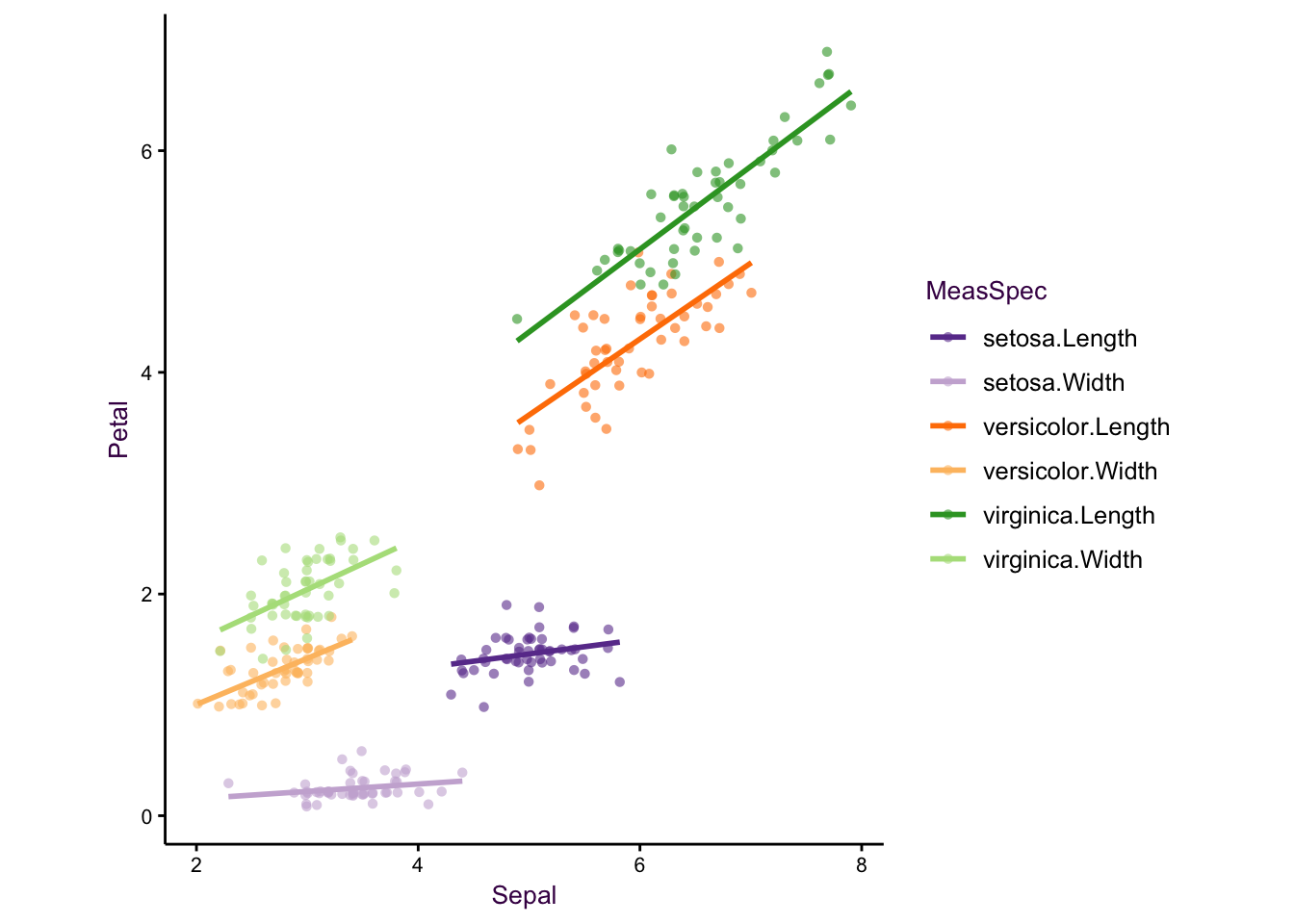
Figure 5.10: Further examples
5.3 Case Study: Sugar Concentrations in Peppermint
Now that we have an idea about some of the geometries available to us, we will use a simple case study to extend this idea to a multivariate comparison. This serves as an introduction to the concepts we will explore in detail in the next chapter.
This data-set comes from a doctoral student at the Max Planck Institute for Biogeochemistry in Jena. She was interested in uncovering the effects of possible future climate conditions on sugar production in a plant - namely peppermint. She measured the sugar concentrations of three sugars at a few time points over several weeks in four different plant parts. She grew the plants under normal water conditions or drought and under low or high carbon dioxide concentrations.
In total, she had over 741 data points classified into 48 different time series (consisting of 2 water conditions, 2 \(CO_2\) conditions, 4 plant parts, and 3 sugars). In keeping with the original plot, I have plotted the means and standard errors for each time point. Note that this produces smaller error bars than the \(95\%\ CI\) or the standard deviation, which are more easily understood.
She began by grouping this into 12 plots according to sugar and plant type. This is our starting point and is shown at the top of the page overleaf. Above the plot is a schematic of the grammar of graphics I used to create it - the blue lines depict the mapping of data onto aesthetics and facets. The plots which follow are variations on this theme and are intended to showcase how changing mapping attributes affects how we communicate information. Subtle changes in mapping can have dramatic effects on information perception.
In this case the central question of the research is how will climate change affect sugar content in peppermint?. The plots are an aid to answering this question, they are only an aid that must be interpreted. We are interested in the change in sugar concentration over time under specific growth conditions. Which of the first five plots on the next pages do you think addresses this question the best? i.e. which plot affords the most suitable route to an interpretation?
After testing multiple different mapping types, the final plot, figure on page , seems to truly depict a clear and easy-to-understand trend for both the researcher and the reader.
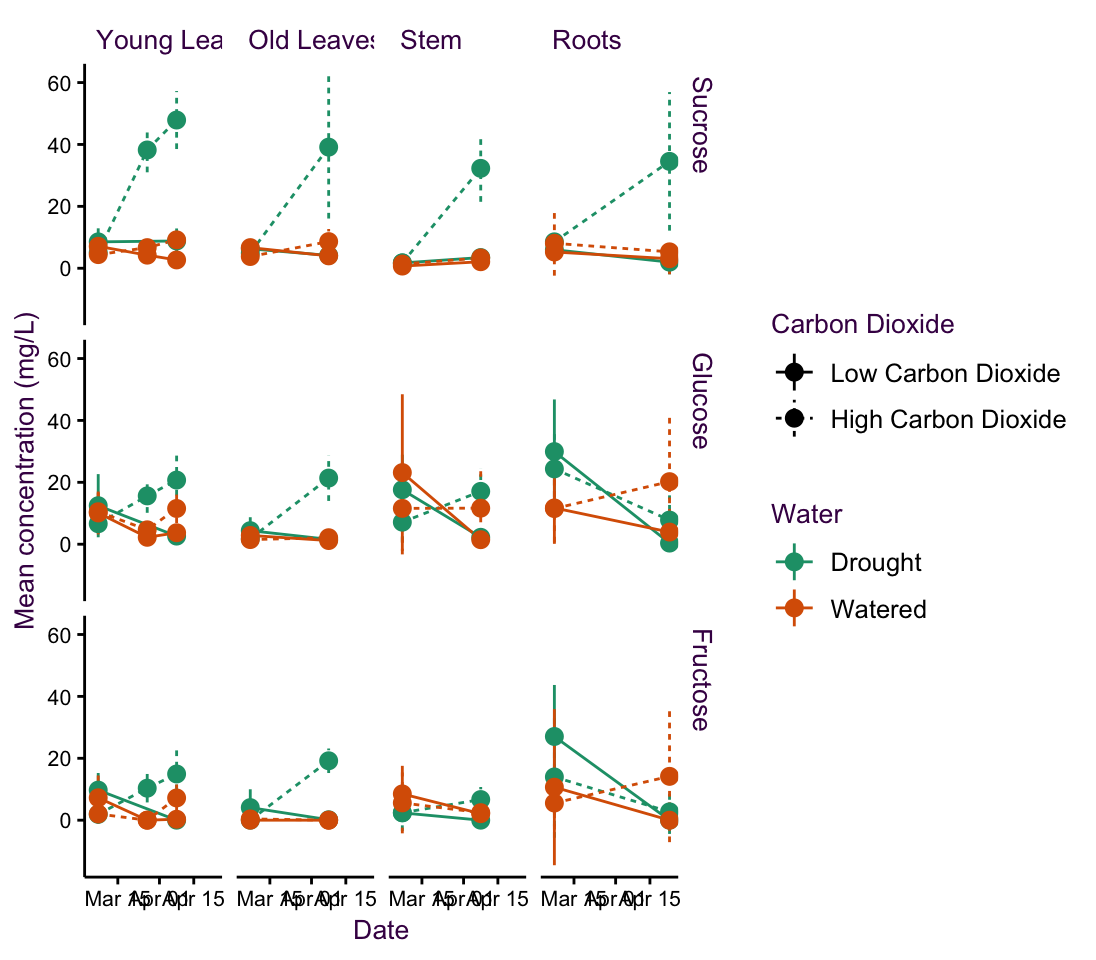
Figure 5.11: fig1
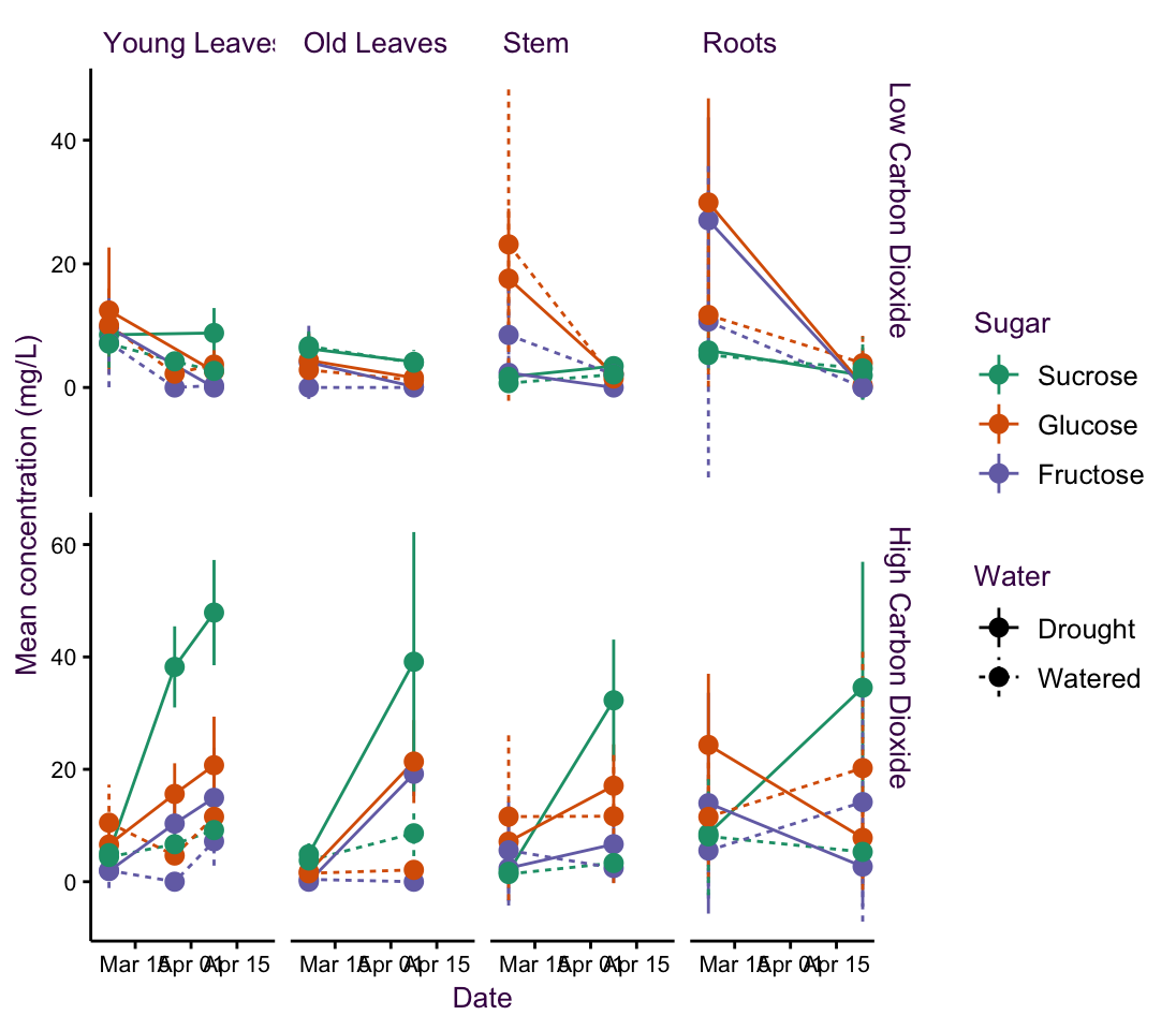
Figure 5.12: fig3
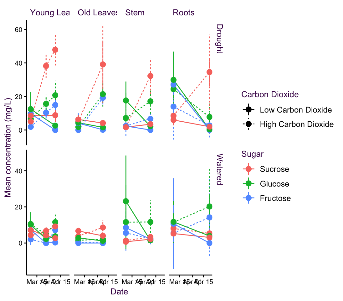
Figure 5.13: fig4
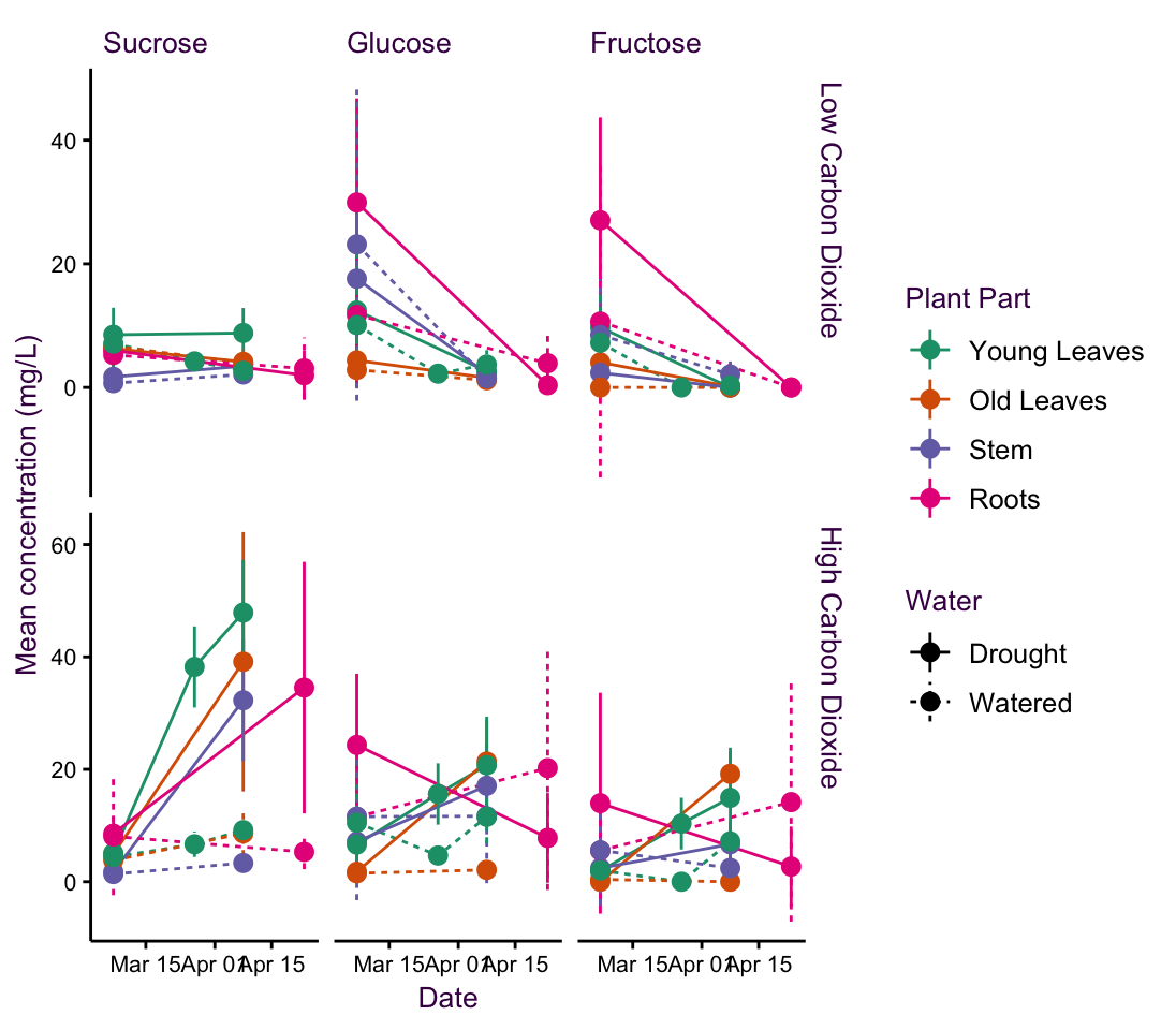
Figure 5.14: fig5
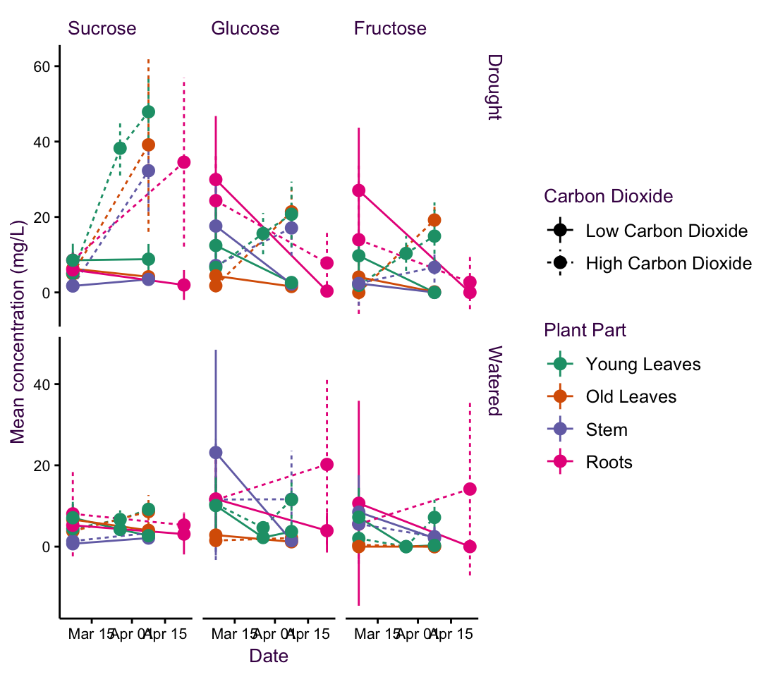
Figure 5.15: fig6
5.3.1 The final plot
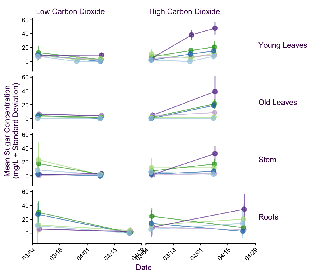
Figure 5.16: The final plot of the peppermint data set showing a clear trend over time under specific growth conditions.
To highlight the relationship between language and visual grammar, I have colour-coded each element. This is for illustrative purposes only and should not be dwelled on to literally.↩