6 Geometries of Univariate Distributions
Plotting univariate data is a starting point to understanding data visualisation as graphical analysis. We’ll use the distribution of univariate data to introduce the four most common plotting geometries – points, lines, bars and boxes.
In this section we will focus on a simple data set: various measurements of mammalian animals, including total sleep time (hours) and eating habits (carnivore, omnivore, insectivore or herbivore). The total sleep times are as follows:.
For univariate data, we are primarily interested in its distribution, i.e. What does the data look like?
\(x = (2.7, 3.5, 5.2, 5.6, 6.2, 6.3, 8.7, 9.8, 10.1, 10.4, 11.0, 12.1, 12.5, 12.5, 13.5, 14.5, 15.8, 17.4, 19.4)\)
6.1 Points: Strip Plots
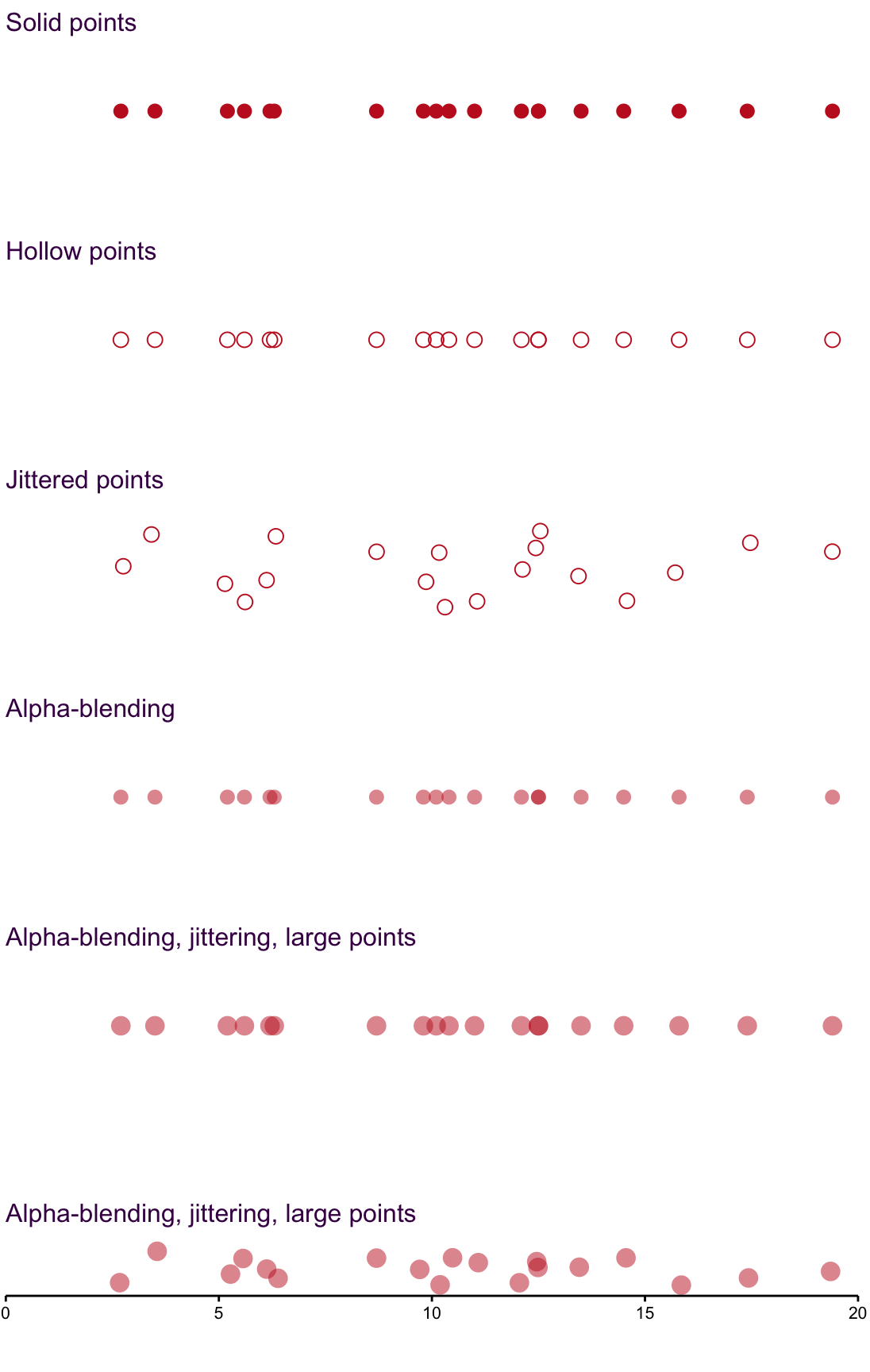
Figure 6.1: Over-plotting is always a concern when using point and can be overcome by changing shape and transparency.
Strip plots are one of the easiest and simplest ways to visualise a distribution. Here, we encounter the frequently observed problem of over-plotting - multiple data points obscure each other and the distribution is falsely represented. To overcome this, we can use four methods:
Symbols such as the hollow circle in the second plot are an improvement, but do not eliminate over-plotting.
Jittering shown in the third plot, scatters the points so that they are not overlapping. It is only applied to the y-axis here. Alpha-blending {#Alpha-blending} or transparency, shown in the fourth plot, permits colour to reveal over-plotting. This is particularly useful as an alternative to jittering.
Size in combination with alpha-blending in the fifth plot emphasises high-density areas of the data set.
Size in combination with alpha-blending and jittering in the sixth plot goes further and allows you to see each point in a data set clearly.
Avoid over-plotting by using jittering and open circles for small data sets and alpha-blending for large data sets
6.2 Lines: Density Plots
Density plots are an excellent way of visualizing the distribution of univariate data sets. Despite being less common than histograms, for example, and therefore poorly understood, they are intuitive.22
Density plots are based on a “kernel density estimate” (KDE). Everitt and Hothorn describe the kernel estimator as:
… a sum of bumps placed at the observations. The kernel function determines the shape of the bumps while the window width h determines their width.
As an example, we will focus on a simple data set of 8 numbers:
\(x = (0.0, 1.0, 1.1, 1.5, 1.9, 2.8, 2.9, 3.5)\)
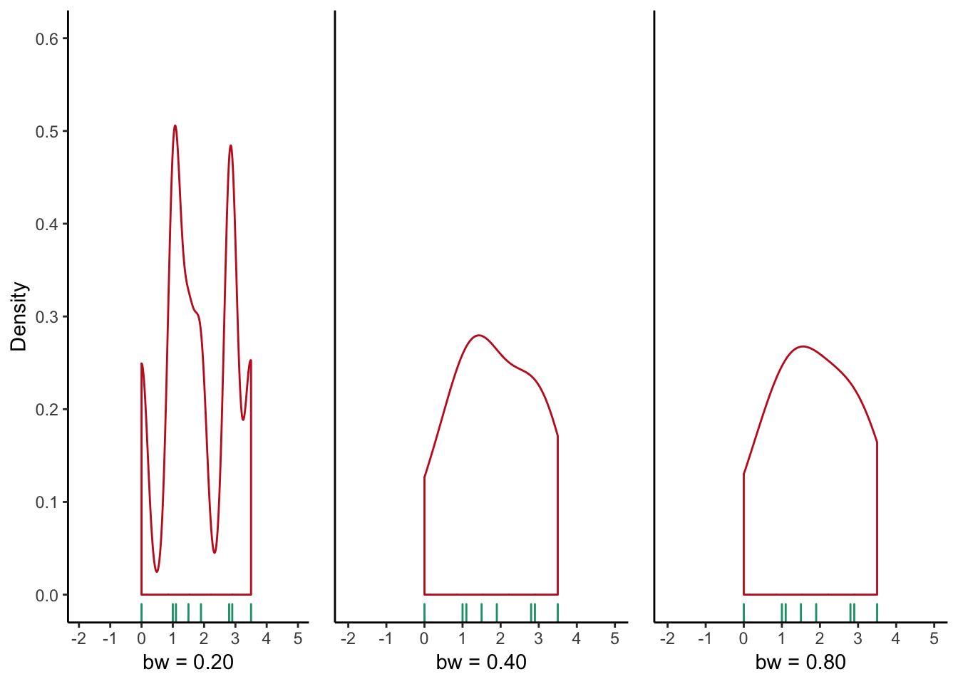
Using a Gaussian KDE with a bandwidth (h) of 0.4, as shown in Figure , right.
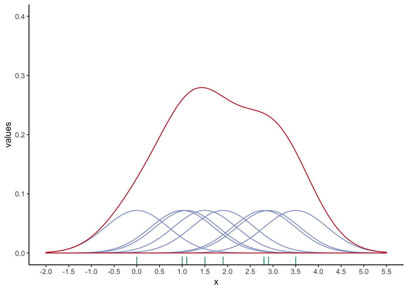
Figure 6.2: An example of how the Gaussian density function (red curve) is derived from 8 data points (green tick marks). The density of each individual data point (purple curves) reaches a maximum of 0.125 (1/8).
Notice that the density function creates values outside}_ the range of the given values (e.g. less than zero in Figure ). Although this can be confusing at first, by looking at the underlying ``bumps’’, we can understand how the density function was calculated without having to know the mathematical formulae underpinning the function.
The KDE can take a Gaussian, triangular or rectangular form. The choice can have a considerable affect on the visual outcome, but Gaussian is the preferred choice. In addition to the shape, changing the bandwidth can misleadingly give the appearance of several clusters (low bandwidth) or a more smoothed distribution (high bandwidth), as shown below.
To see the effect that bandwidth has on the shape of the density plot, consider the density plots using the mammalian total sleep time shown in figure 6.3, using different bandwidth values. It is easy to imagine how our understanding of the data’s distribution is affected by using an inappropriate bandwidth!
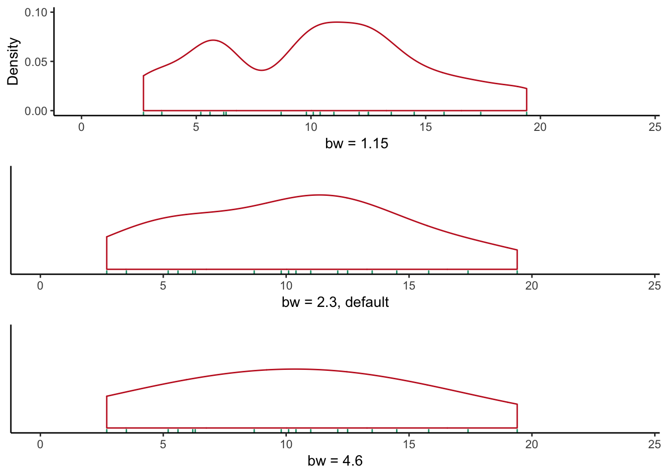
Figure 6.3: Density plots of mammalian total sleep time appear strikingly different when using different bandwidths.
6.3 Bars: Histograms
Histograms are one of the most common visualisations of univariate data. However, they suffer from two main deficiencies. First, they are sensitive to the choice of binning statistic used. For example, trends like bi-modal distributions can be masked by choosing wide bins. The binning statistic adds one degree of separation to our visualisation. Therefore, it is worthwhile to think about visualisations that do not rely on arbitrary choices like binning. Neither strip charts nor box plots transform the data based on a binning or distribution statistic, and are appropriate alternatives to histograms and density plots. Second, histograms are not suitable for super-positioning. If we want to compare multiple distributions, the plot can get rather complicated. This is discussed further in section 7.10.2.
There are three types of histograms:
Frequency of actual counts.
Probability Density where the histogram has a total area of 1, and
Cumulative where successive bins provide a running count of all previous values.
Sturges’ method creates implicitly sized bin sizes dependent on the range of the data. This is a common default choice in many software packages. Scott’s method creates bin sizes based on the estimate of the standard error.
To understand how the three types differ, consider the following histograms based on the total sleep time we have been working with so far.
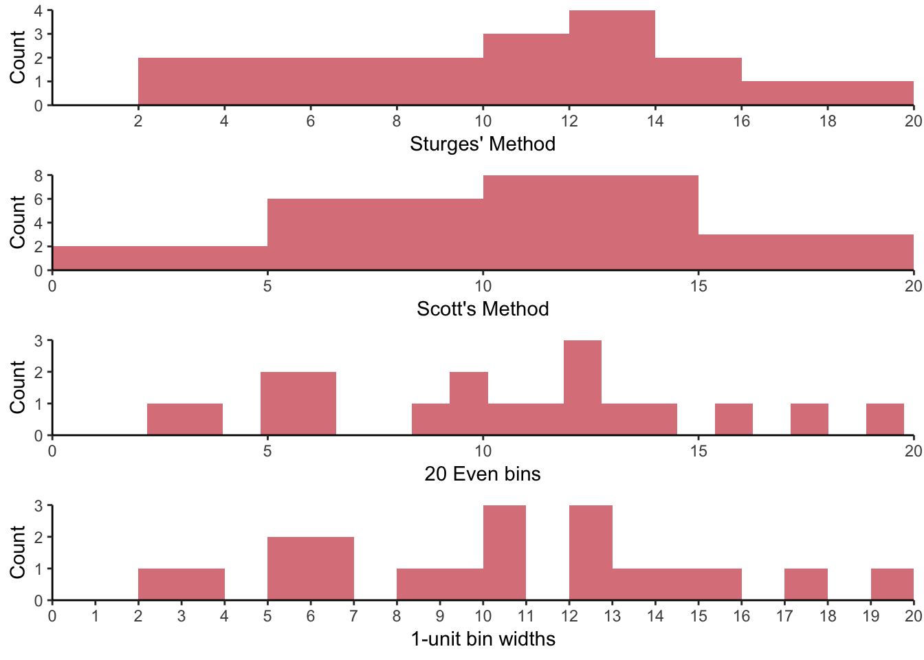
Figure 6.4: Histograms representing the same data using different visual parameters.