9 The ggplot2 Package
In writing, complex ideas are communicated by using relatively simple grammatical rules. For graphics, the same concept holds true, and
has given rise to the concept of the Grammar of Graphics. ggplot2 is an implementation of the Grammar of Graphics in R. In practical terms, it means that you have control of all aspects of a statistical graphic. To continue our writing analogy: We can think of building a sentence by combining different word classes, such as nouns and their modifying adjectives, or verbs and their modifying adverbs. Similarly, we can think of building graphics (see web-site by combining different layers. The main layer classes are:
- Data describes the data set being plotted.
- Geometries (geom) describe the actual plotting elements, such as lines, bars and boxes.
- Aesthetics (aes) describe the way a data point will look, such as colour, size and shape.
- Statistics describe calculated summaries, such as regression lines, binning, and descriptive statistics.
- Coordinates describe the coordinate system on which the data will be plotted.
- Facets describe how the data should be sub-setted for plotting.
- Themes describe the non-data ink.
The main plotting function in ggplot2 ia ggplot(). A key aspect of layering is understanding that ggplot2 plots are themselves R objects. That means they can be assigned to a unique object name, just like vectors and data frames. The first step in creating a ggplot is to create a data layer.
9.1 The Data Layer
Every ggplot2 plot must consist of a data layer, which takes the generic form:
> library(ggplot2)
> obj <- ggplot(dataframe, aes(...))
or simply:
> obj <- ggplot(dataframe, aes(...))By establishing the base data layer, we specify the data frame of interest, and the specific variables to be plotted as aesthetics (see below). Notice that the aesthetics argument does not follow classical argument form for R functions, aes =, but instead appears as a nested function, aes(), having its own arguments.
> # Mapping two aesthetics in the data layer
> mpg.wt <- ggplot(mtcars, aes(x = wt, y = mpg))
> mpg.wt
>
> # Mapping a single aesthetic in the data layer
> mpg <- ggplot(mtcars, aes(mpg))
> mpg| Aesthetic | Description |
|---|---|
x |
Map onto the x axis |
y |
Map onto the y axis |
color/colour or fill |
Map onto the colour or fill |
size |
Map onto the size |
alpha |
Map onto the alpha-blending |
linetype |
Map onto the line style |
shape |
Map onto the shape |
9.2 The Geom Layer
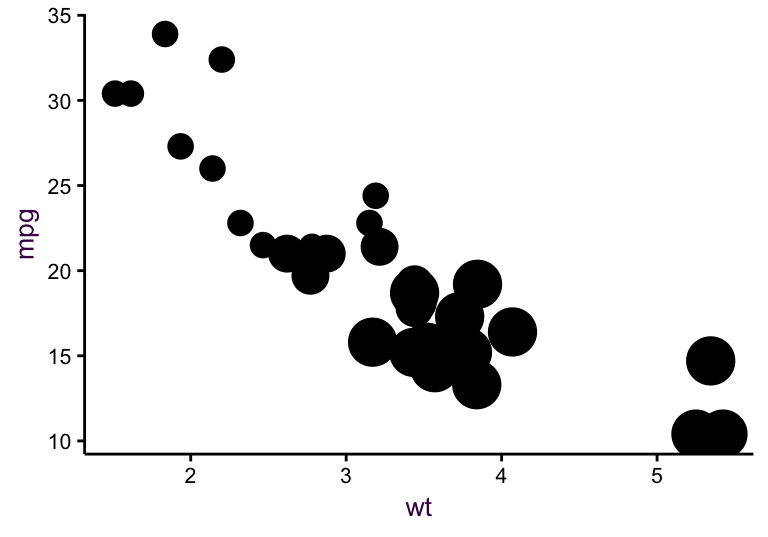
An object consisting of only a data layer (with associated aesthetics) does not produce a plot. A grammatically complete graphic requires a geometry layer, specifying what form the data should take. To add a new layer, a + sign is added and the specific geometry is specified with a geom_ function and any necessary arguments. In Figure ??, geom_point() is used to make a scatter plot of two variables using the default settings and geom_histogram() is used to make a histogram of a single variable.
Table (#tab:ggplot2-geometries): ggplot2 geoms.
| Geom | Description |
|---|---|
geom_bar() |
Draw a bar plot. |
geom_boxplot() |
Draw a bot plot. |
geom_density() |
Draw a density estimate. |
geom_histogram() |
Histogram. |
geom_jitter() |
Add jittered points. |
geom_line() |
Connect observations in order of another value. |
geom_path() |
Connect observations in their original order. |
geom_point() |
Add points, e.g. scatterplots and dot plots. |
geom_smooth() |
Add a smoothed line. |
geom_text() |
Text annotations. |
geom_hline() |
Horizontal lines |
geom_vline() |
Vertical lines. |
geom_errorbar() |
Vertical errorbars |
geom_errorbarh() |
horizontal errorbars |
geom_ribbon() |
Shaded ribbon. |
> # A scatter plot of two variables
> mpg.wt + geom_point()
Figure 9.1: Some examples of simple ggplots.
> # A histogram of a single variable.
> mpg + geom_histogram()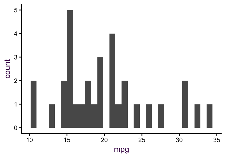
Figure 9.2: Some examples of simple ggplots.
We can use arguments to specify the particulars of each layer. Here, we call the aes() function once again inside geom_histogram() to specify exactly what should be mapped to the y axis. In this case we specify that the density should be plotted on the y axis, and not the default count. The reference to density is surrounded by .. because it is a variable generated by geom\_histogram(). This means that density is an internal variable, accessed using the .. notation to avoid potential confusion with variables in the original data frame.
> # A scatter plot of two variables
> mpg.wt + geom_point(colour = "blue",
+                     shape = "X",
+                     size = 4)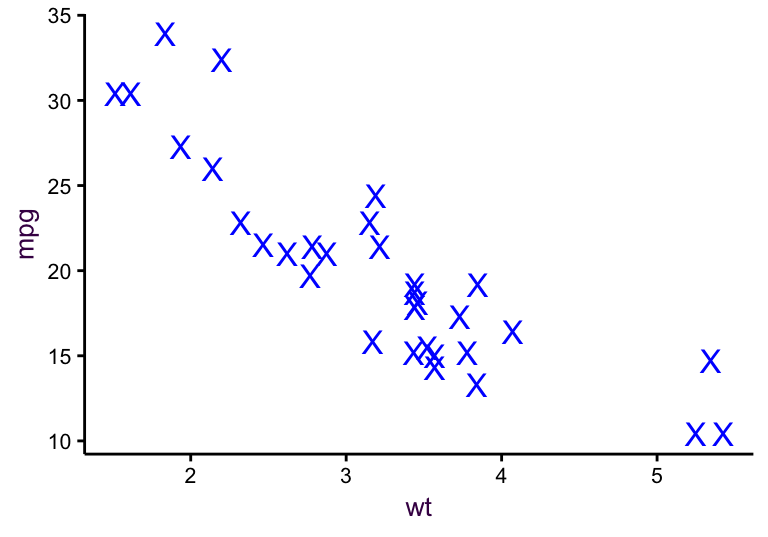
Figure 9.3: Some examples of simple ggplots.
> # A histogram of a single variable, showing density.
> mpg + geom_histogram(aes(y = ..density..),
+                      binwidth = 1,
+                      fill = "#C42126")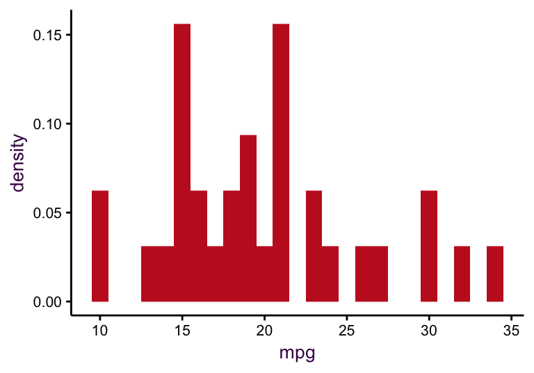
Figure 9.4: Some examples of simple ggplots.
9.3 The Aesthetics Layer
The scale_ functions map data to aesthetics, including position, colour, size, shape and line type. Default scales are used when needed, but you have full control over all aesthetics of a plot with the scale_ functions. There are four categories of scales - position, colour, manual-discrete and identity. We will look at each type using examples from the mtcars data sets.
9.3.1 Position for mapping continuous, categorical and date-time vari- ables onto the appropriate axes.
“Position” determines how plotting elements are arranged in the plotting space. We have encountered this with jittered scatter plots. Consider the example below with bar plots.
Table (#tab:positions): position variants.
position = |
|---|
| “dodge” |
| “fill” |
| “identity” |
| “stack” |
| “jitter” |
| “jitterdodge” |
| “nudge” |
> cyl.am <- ggplot(mtcars, aes(x=factor(cyl), fill=factor(am))) # The data layer:
>
> cyl.am + geom_bar() # Default position = "stack"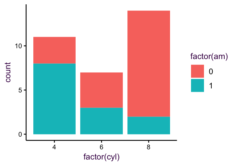
> cyl.am + geom_bar(position="fill") # Position fill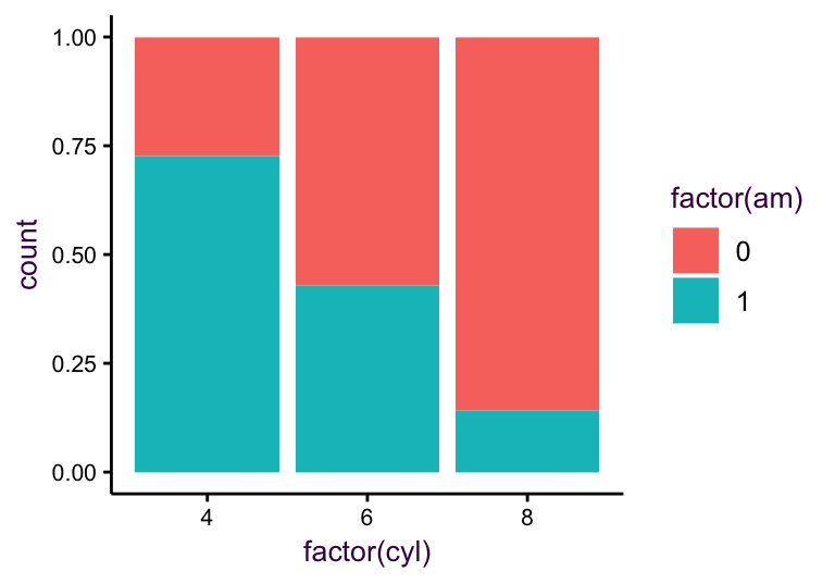
> cyl.am + geom_bar(position="dodge") # Position dodge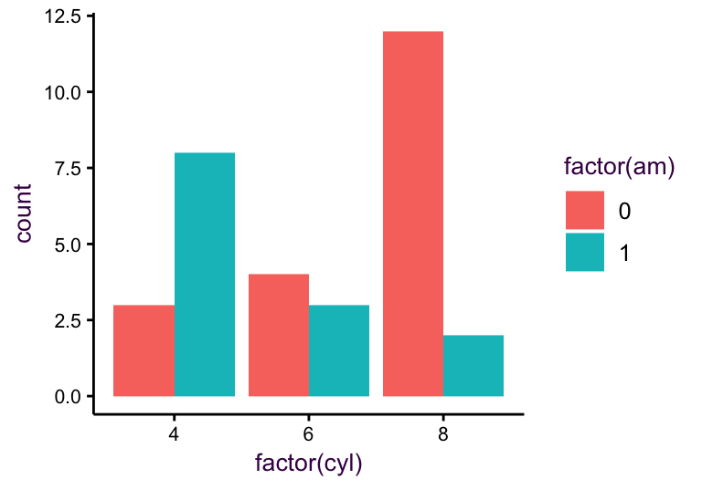
Each position argument in the table above can also be set using a function in the form position\_X(), where X is the position argument. We will see an example on this later on when we look at summary statistics. “Position” also specifically refers to the position scales, i.e. the axes.
9.3.2 Colour for mapping continuous, categorical variable to colours.
> # adjusted discrete and continuous axes:
> cyl.am +
+     geom_bar() +
+     scale_x_discrete("Cylinders", labels = c("4" = "Four","6" = "Six", "8" = "Eight")) +
+ scale_y_continuous(limits = c(0, 40), breaks = seq(0,40,5), expand = c(0,0)) 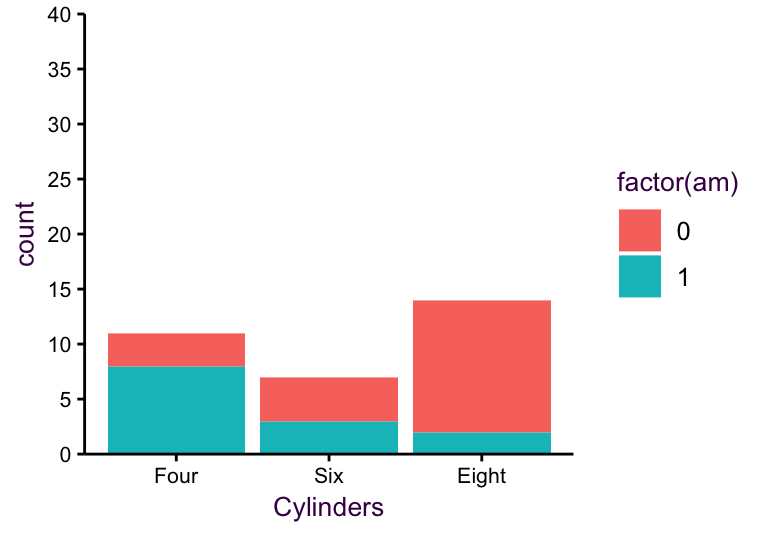
> mpg.wt + geom_point() # Default x axis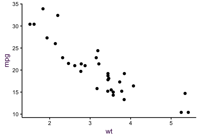
> mpg.wt + geom_point() + scale_x_reverse() # reversed x axis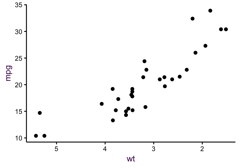
Table (#tab:positionscale): Common scale functions for using the position argument. All scales available with scale_y.
| Position scale functions |
|---|
scale_x_continuous() |
scale_x_log10() |
scale_x_reverse() |
scale_x_sqrt() |
scale_x_discrete() |
scale_x_date() |
scale_x_datetime() |
9.3.3 Colour for mapping continuous, categorical variable to colours.
Table (#tab:ggplot2-aesthetics-1): scale\_colour variants.
| Function Family | Description | Specific functions |
|---|---|---|
scale_color_brewer() |
Sequential, diverging and qualitative colour scales from RColorBrewer. |
scale_color_brewer(), scale\_fill\_brewer() |
scale_colour_gradient() |
Smooth gradient between two colours. | scale\_color\_continuous() scale_colour_continuous() scale\_color\_gradient() scale\_colour\_gradient() scale\_fill\_continuous() scale_fill_gradient() |
scale_colour_gradient2() |
Diverging colour gradient. | scale\_color\_gradient2(), scale\_fill\_gradient2() |
scale_colour_gradientn() |
Smooth colour gradient between n colours. | scale\_color\_gradientn(), scale_fill_gradientn() |
scale_colour_grey() |
Sequential grey colour scale. | scale\_color\_grey(), scale\_fill\_grey() |
scale_colour_hue() |
Qualitative colour scale with evenly spaced hues. | scale\_color\_discrete(), scale_color_hue(), scale\_colour\_discrete(), scale\_fill\_discrete(), scale\_fill\_hue() |
> # Establish the data and geom layers with the factor cyl as a colour aesthetic
> mpg.wt <- ggplot(mtcars, aes(x = wt, y = mpg, col = factor(cyl))) + geom_point()
>
> # Default colour
> mpg.wt # equivalent to: mpg.wt + scale_color_hue()
> # With RColourBrewer
> mpg.wt + scale_colour_brewer() # Defaults to type="seq"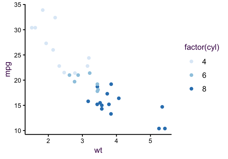
> # An alternative RColourBrewer palette
> mpg.wt + scale_colour_brewer(type="qual", palette="Dark2")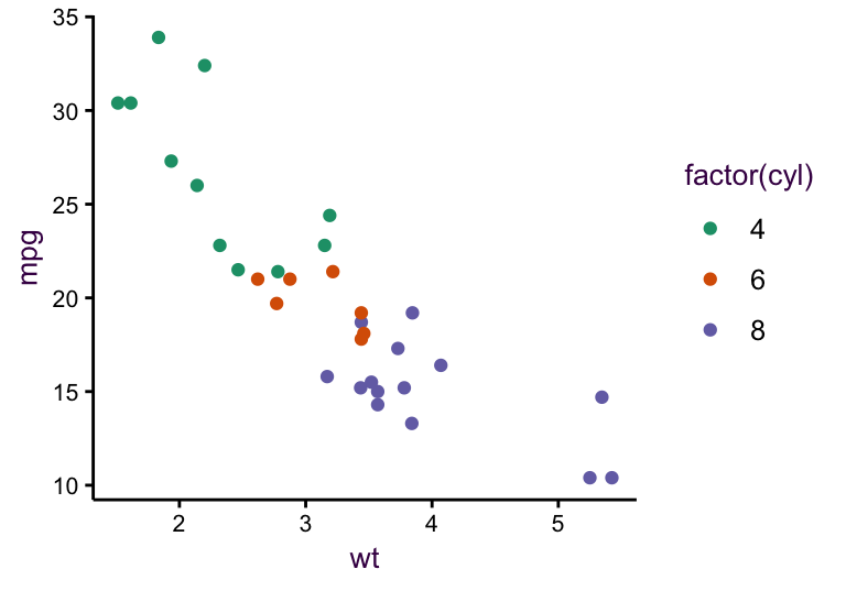
9.3.4 Manual formappingcategoricalvariablestosize,linetype,shape, or colour (plus corresponding legend).
Table (#tab:scale_manual-variants): scale_manual() variants.
Scale_manual() |
|---|
scale_alpha_manual |
scale_color_manual |
scale_colour_manual |
scale_fill_manual |
scale_linetype_manual |
scale_shape_manual |
scale_size_manual |
Manual scales allow you to create your own discrete scales. In the following example, the variable cyl is mapped to the colour aesthetic, so we use scale\_colour\_manual() to adjust the scale as we would like. Table @ref(tab:scale_manual-variants) lists the available functions.
> mpg.wt 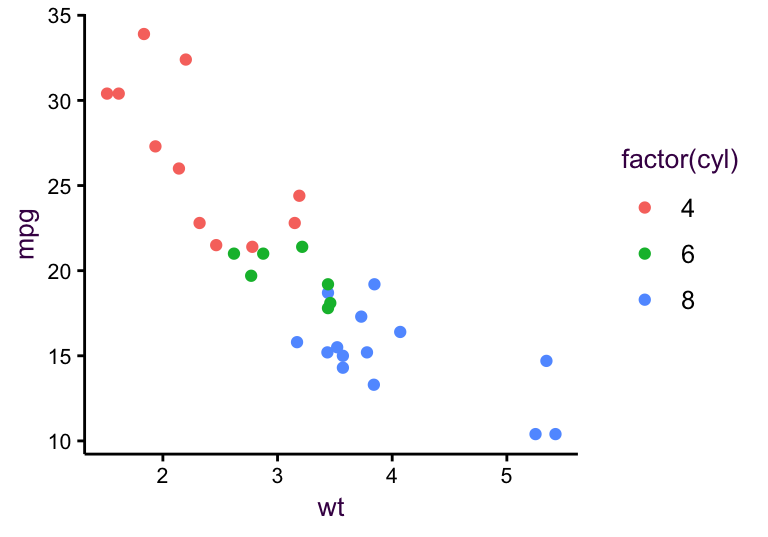
> mpg.wt + scale_colour_manual(limits = c(6, 8, 4),
+                              breaks = c(8, 4, 6),
+                              values = c("pink", "light blue", "yellow"))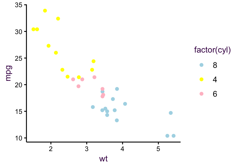
9.3.5 Identity for plotting variables directly to an aesthetic instead of mapping.
Using the identity of a variable means taking its values directly, without using them as a scale, as shown in the following example. The functions available for this purpose are listed in table @ref(tab:scale_identity-variants).
Table (#tab:scale_identity-variants): scale\_identity() variants.
Scale_identity() |
|---|
scale_alpha_identity |
scale_color_identity |
scale_colour_identity |
scale_fill_identity |
scale_linetype_identity |
scale_shape_identity |
scale_size_identity |
> # Plotting cyl scaled to size:
> ggplot(mtcars, aes(x = wt, y = mpg, size = cyl)) + geom_point()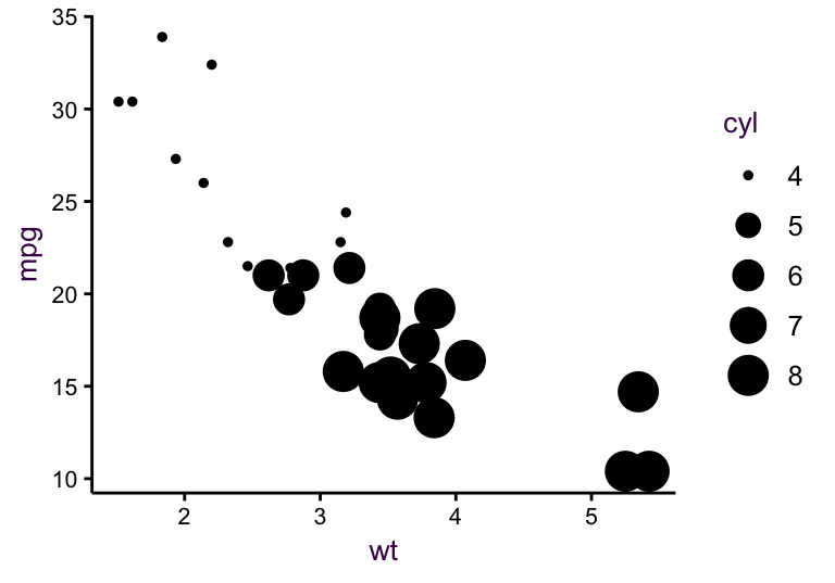
> # However, cyl is not a continuous scale. It is a discrete variable with three categories:
> # levels(factor(mtcars$cyl))
>
> # Plotting cyl as point size
> ggplot(mtcars, aes(wt, mpg, size = cyl)) + geom_point() + scale_size_identity()