4 Using Design to Communicate
William S. Cleveland describes constructing graphs as an exercise in visual encoding. The reader must use visual decoding to interpret the graph, which he refers to as the process of graphical perception. In this section I’ll introduce you to some design aspects of graphical perception that aid in producing statistical plots.
4.1 Small Multiples
Edward Tufte introduced the idea of small multiples as a way of presenting sub-sets of a data set in comparable formats. The concept relies on keeping the design of related graphs identical so that the user can focus on changes in the data.18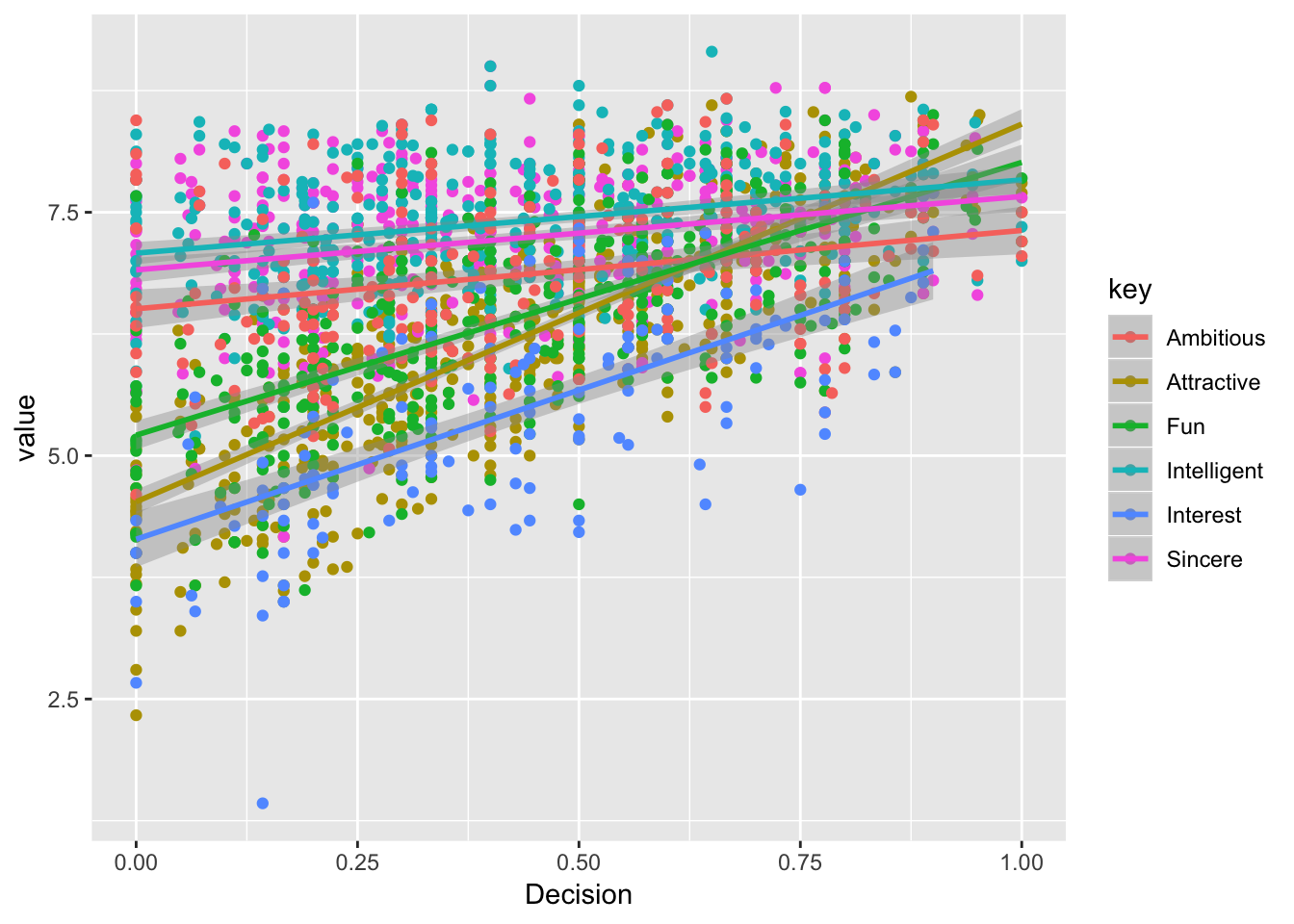
Figure 4.1: Six overlapping trend lines on a single plot are overwhelming for the viewer.
Using small multiples (fig. 4.2), each sub-set is plotted in its own identical plotting space. We refer to each sub-plot as a facet.19 We can more easily distinguish the six trend lines, but making direct comparisons is a bit more difficult. In this case color is redundant, so all points have the same color.
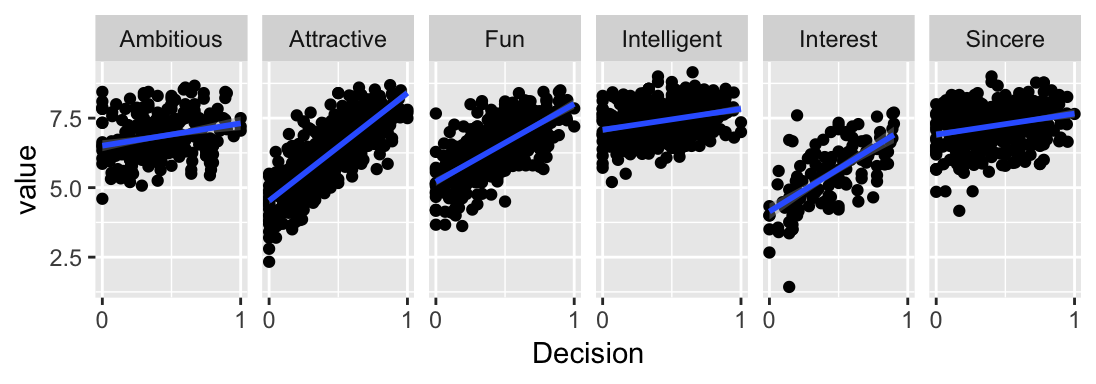
Figure 4.2: Small multiples separate each sub-set into its own plot, making it easier to see individual trends.
4.2 Data-Ink Ratio
Edward Tufte also strongly advocates maximizing the data-ink ratio. The data:ink ratio is the ratio of data ink to total ink and considers how much ink is actually necessary, as opposed to being decorative. In short, the amount of non-data ink should be minimized. This is in line with classic design principles of less is more and simplicity, however there doesn’t appear to be any emperical support that removing non-data ink aids in visual communication. In my experience, plots with a high data:ink ratio do tend to look more professional and are more apealing. My approach is not as extreme as Tufte, who is quite ruthless, removing even axis lines (see slope plot XX). I advocate uncluttered and simple charts as opposed to minimal charts.
Every element on your plot (data and non-data) has to justify its presence
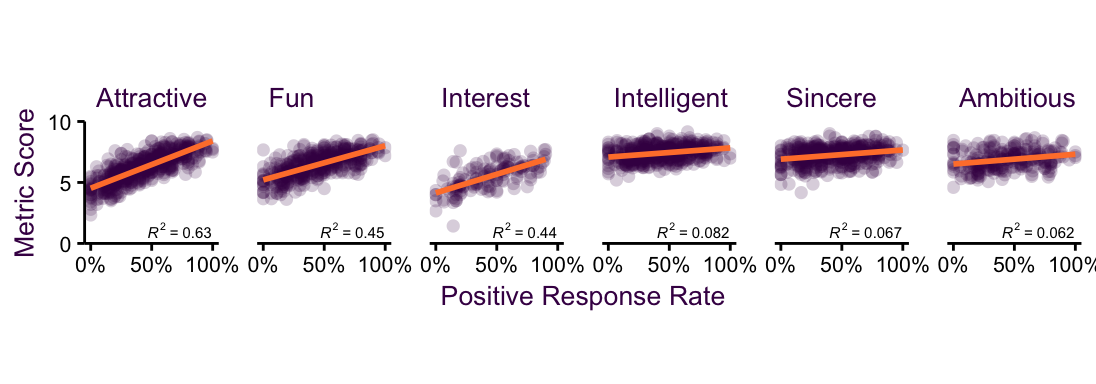
Figure 4.3: Small multiples separate each sub-set into its own plot, making it easier to see individual trends.
The advantage of reducing the information content on each facet is that we now have room to add more interesting variables. In this case, we can add information on the regression line and correlation coefficient.
4.3 Aspect Ratio
A plot’s proportions can have a large effect on how data is perceived. Therefore, finding the optimal aspect ratio (height divided by weight) is of particular interest. Fig. XX is a classic example from William S. Cleveland. Here we have emperical data going back to 1750 $mdash; the number of sun spots which appear on the surface of the sun. There are three clear trends in this data. In the upper plot, we can see two trends.
First, sun spots appear and disappear in a period of approximately 11-years. The beginning and end of these periods has been recorded and we’ll get to the individual trends shortly. Second, there are global rises and dips in the peaks and throughs.
The upper plot has an aspect ratio of 1:1, meaning that one unit on the y axis takes up the same physical space as one unit on the x axis. this is highlighted by the red, perfectly square, box. In this case, there’s no reason for a 1:1 aspect ratio. The axes are on completely different scales $mdash; the number of sun spots and the date.
Reducing the aspect ratio to 1:2 (0.5, fig. XX middle plot) or even further, to a much smaller aspect ratio of 1:20 (0.05, fig. XX lower plot), allows us to see the relationshop between sun spot peak and intensity. The higher the number of sun spots in a cycle are, the my asymmetrical it is. That is, sun spots take a longer time to disappear than they do to appear in high-peack cycles.
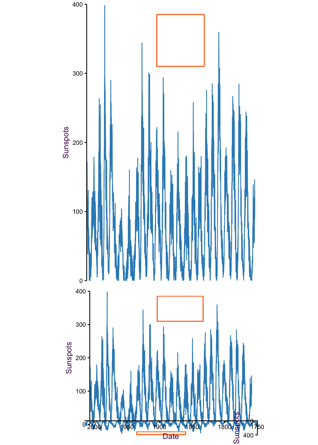
Figure 4.4: 265 years of sun spot counts. The very low aspect ratio of the lower plot helps show the recurring trend that sun spots take longer to disappear than they do to appear.
Although the relationship between intensity and symmetry in sun spot oscillations is a well-observed phenomena, it is admitatdly still somewhat difficult to see in low aspect ratio plot of fig. XX. Now that we have a clear message we want to communicate, let’s see if we can make a plot that emphasizes that point. In
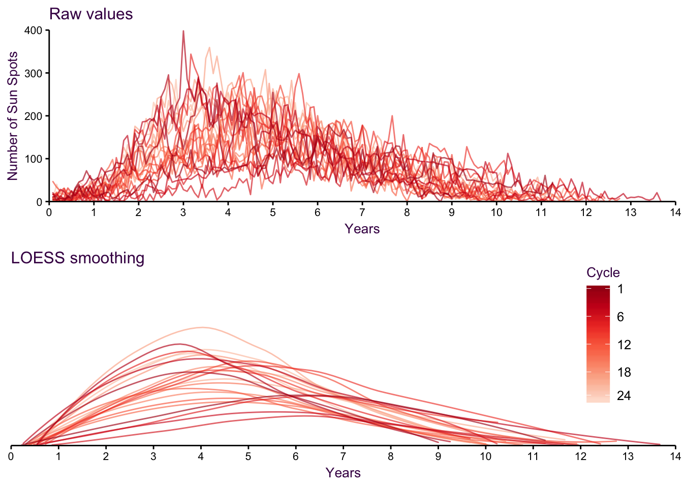
Figure 4.5: Individual cyccles, loess smoothed.
We can reduce the complexity even further by plotting only wlhat we’re interested in. Here, for each cycle, we can plot the maximum number of sun spots and distance from the middle of the cycle. As we expected, the higher the maximum numer is, the earlier the peak occurs.
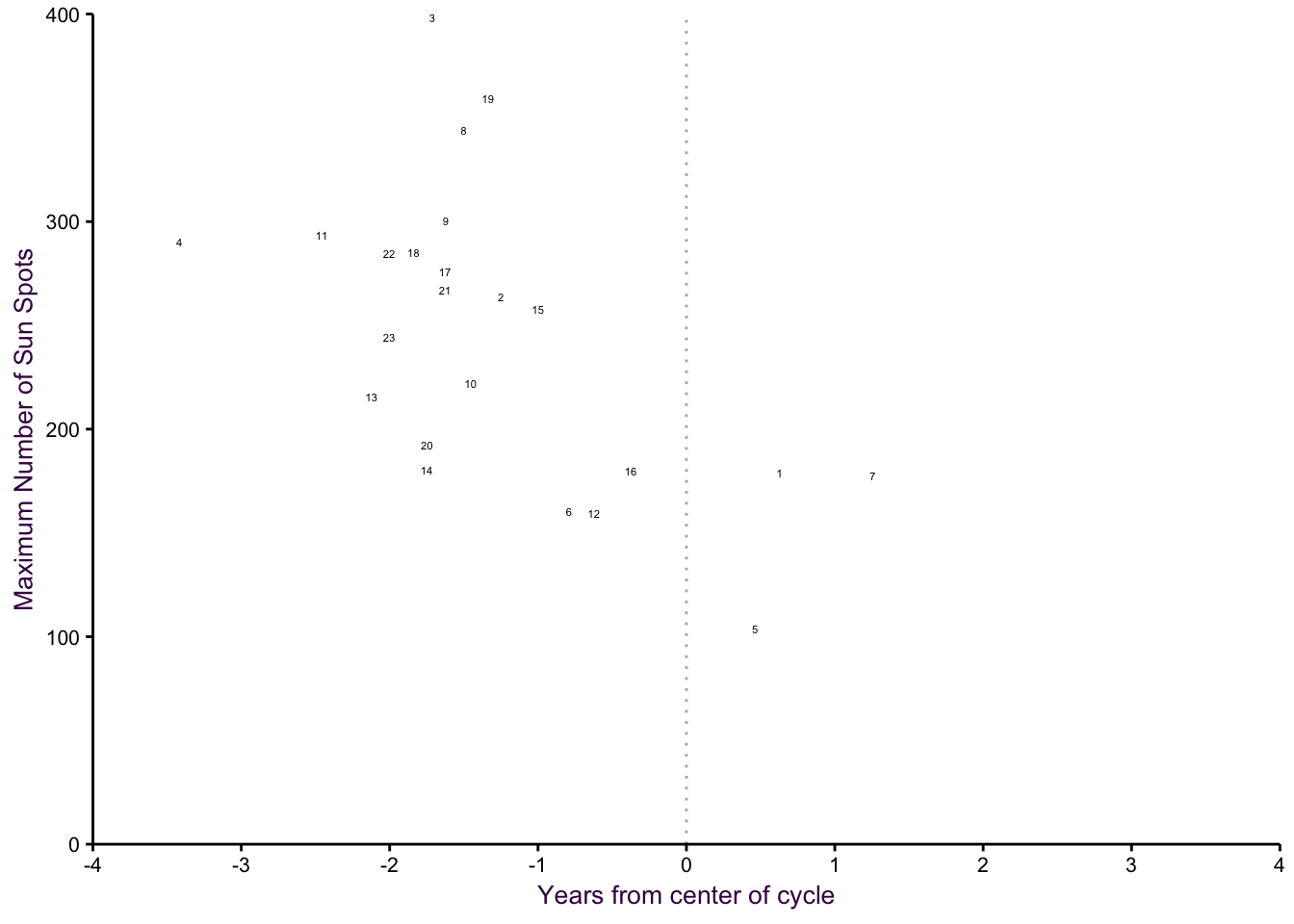
Figure 4.6: Individual cycles, max versus symmetry.
Althouch Cleveland tried to implement an analytical solution to choosing the optimal aspect ratio, it was not applicable in all cases and was never widely adopted. This means you’re at your own discretion to choosing an aspect ratio.
Aspect ratios must not distort the data to the point of deception (e.g. emphasizing or eliminating trends).
Except in some rare circumstances, use an aspect ratio of 1 when the axes have equivalent units (i.e. equivalent physical distances reflect equivalent scales).
4.4 Elements for Encoding Continuous Variables
The optimal encoding of continuous variables uses a common scale, such as multiple dots in a scatter plot on common X and Y axes. Less useful encoding elements are area, angle and length without a common scale20. The least useful encoding element is the colour spectrum, however there are some exceptions (see discussion on page pageref sub:Smoothed-scatter).
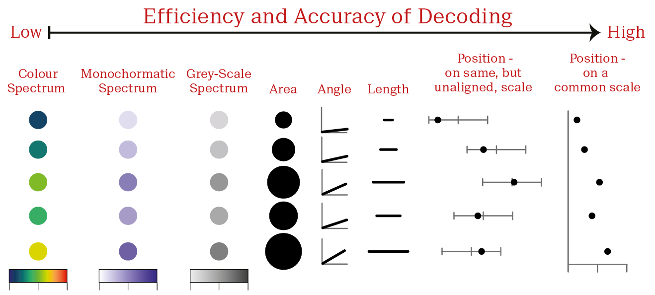
Figure 4.7: Elements for encoding continuous variables.
4.5 Elements for Encoding Categorical Variables
The visual encoding of categorical variables is very flexible since these variables are likely to be qualitative (representing a group) rather than quantitative (representing an actual value on a scale). In general the choice will depend on what is being encoded.
Sequential colours are preferred for ordered variables, since there is an inherent ordering to the categories.
Shape outlines are ideal for dense data sets (preferentially open circles
Filled shapes are suitable if there is no over-plotting or if alpha-blending is used (see page Alpha-blending).
Direct labels can be combined with the other elements to highlight specific data points (see direct line labeling in figure irrigation-good.
Hatching and colours can be used to distinguish groups in bar and box plots.
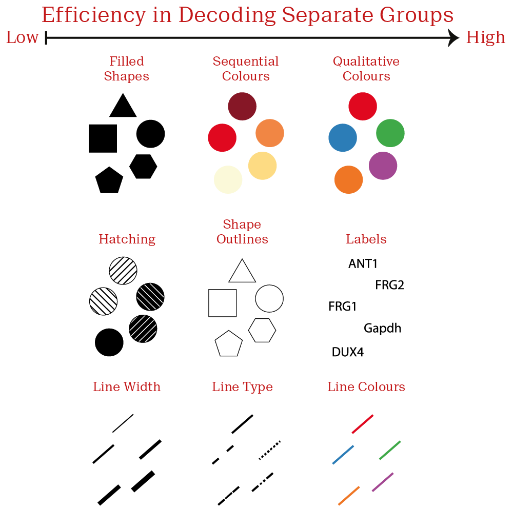
Figure 4.8: Elements for encoding categorical variables.
4.6 The Case Against Pie Charts and Heat maps
Fig @red{fig:Cont-Encoding} tells us why pie charts and heat maps, are not optimal for visualization of quantitative information. Both rely on encoding elements that are poorly decoded by the viewer. We discussed heat maps in section XX. Here I’ll consider the two types of pie charts, when they are used and some great alternatives.
4.6.1 Type 1: Different observations, same variables
A common type of pie chart is what I call the different observations, same variables variant. An example is given in fig. ??.
In the 2017 federal elections in Germany, 16 bundesländer (states) took part in voting for 5 well-established parties (the incumband CDU and the Bavarian sister party CSU, SPD, Linke, Grüne and FDP), one young party (AfD) and a smattering of other regional parties. Here different observations (i.e. voters) of the same variables (i.e. political parties) are plotted. The pie slices are colored according to the party colors, making interpretation at least somewhat intuitive for the informed viewer. The pie charts are arranged according to CDU/CSU results, instead of alphabetically, allowing us to include another layer of information.
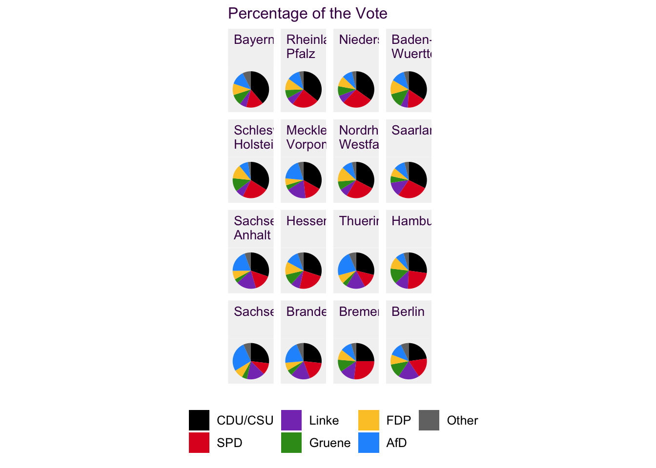
Figure 4.9: 16 pie charts, each consisting of 6 differnt colors is overwhelming for the reader. It’s also difficult to make comparisons between distant sub-plots and with slices that are in different orientations.
The classic solution to a collection of different observations, same variables pie charts is a stack of horizontal, proportional bar charts, fig. 4.10. Here, many of the inefficiencies of decoding a pie chart are alleviated. Each chart begins and ends at the same point and the only difficulty is comparing segments in the middle, which begin and end at differnt points on the scale (i.e. Common, but unaligned scale). It’s a deficiency we can live with since it does improve readability considerably.
Instead of ordering the bars according to CDU/CSU results, we’ll use AfD results. The astonishing results of the young, right-wing, AfD party was mostly unexpected and fig. 4.10 allows us to see that, for example, they achieved approximately 25% of the vote in Sachsen.
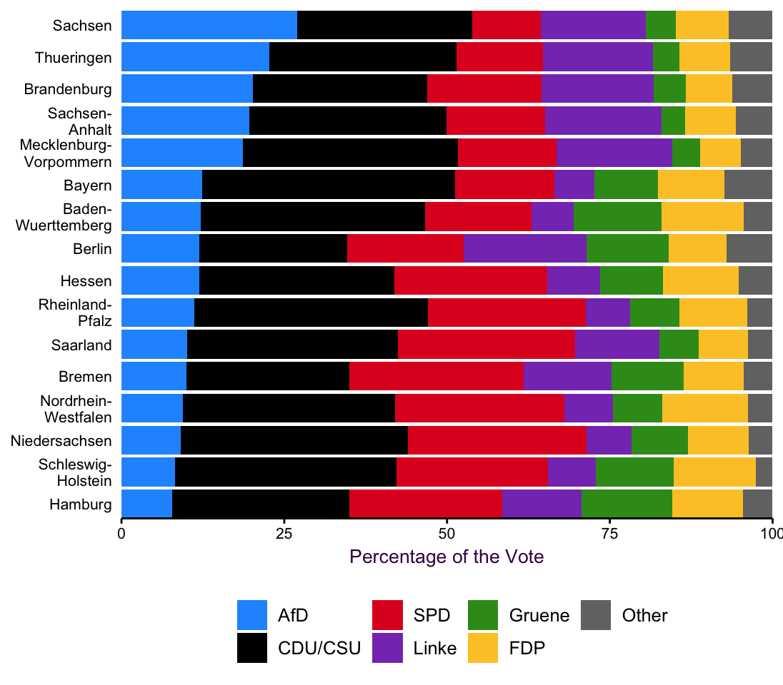
Figure 4.10: 16 stacked horizontal proportional bar charts contains a lot of information in an easy to read format.
Anoter level of information that is easy to convey here is the distinction between the alte, formerly West German, and the neue, formerly East German, Bundesländer, depicted in 4.11. This allows us to see a clear distinction between the “old” and “new” states. Reunification didn’t occur that long ago and it appears that distinctions between the former German states still persist.
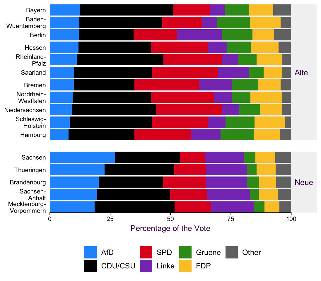
Figure 4.11: It’s easier to introduce another variable via small multiples when our plots are already well organized.
We’ve already move quit a bit away from pie charts, which means we can start thinking about introducing other interesting variables. For example, pie charts are really terrible for looking at a change over time, (see section XX for more exmaples). Allowing for a few exceptions, time is typically mapped onto the x axis and drawn with a line. Fig. 4.12 allows us to compare the 2017 election results with those from 2013. Here, I’ve oped to arrange the individual sub-plots in alphabetical order.
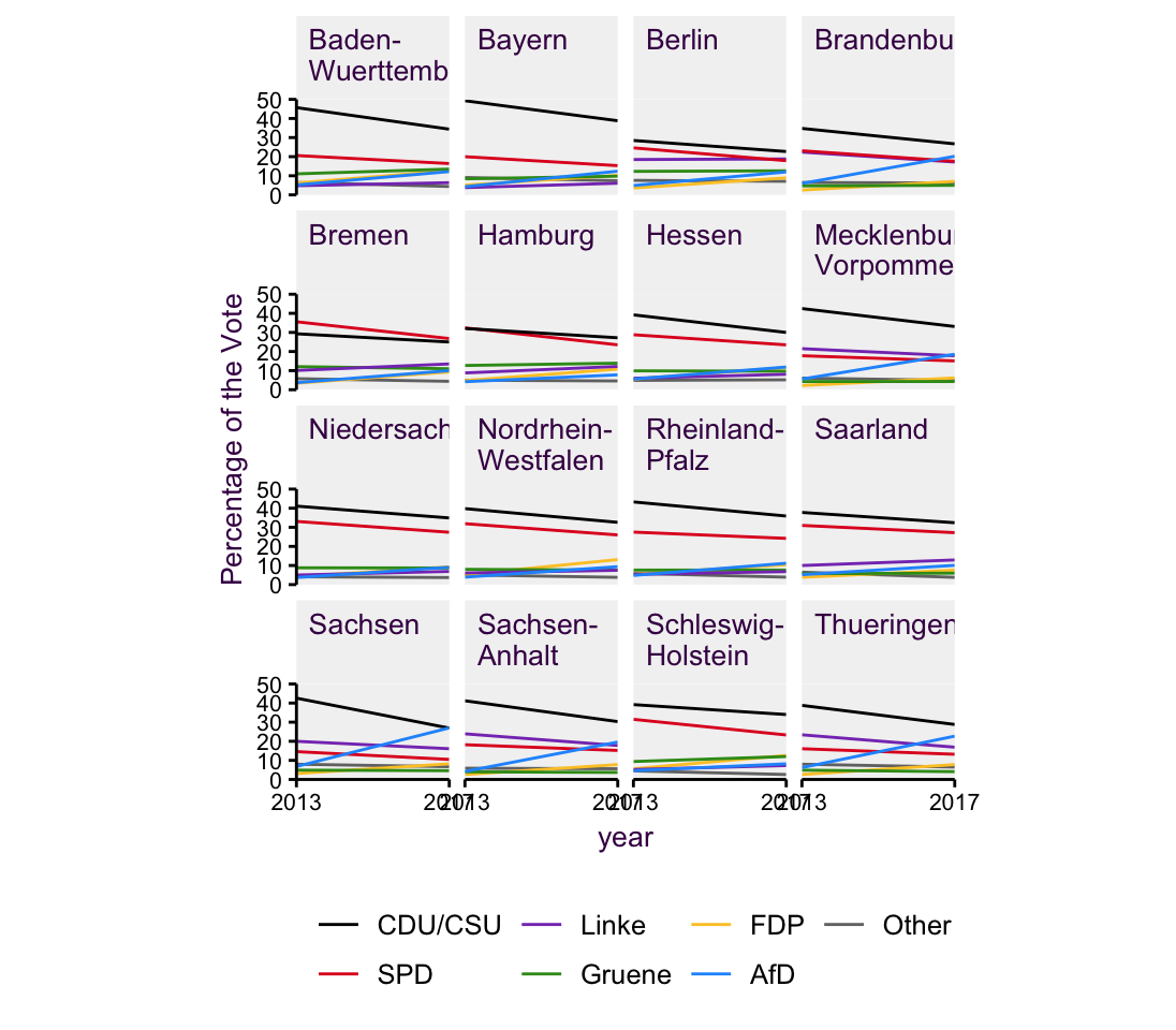
Figure 4.12: time setup.
4.6.2 Type 2: Same observations, Different variables
The other type of pie chart is the same observations, different variables variant. This one is a bit more tricky to work with, but there is an elegant solution. In 4.13 we have three pie charts which I’ve adapted from XX. This review article reported efforts from bayer Pharmaceuticals headquarters in Berlin to reproduce a number of studies in various biological research fields. In the original review, Bayer reported that only about a quarter of the 67 studies surveyed could be reproduced in their hands. They rightly highlight reproducibility as an important topic, so it’s a bit dismaying that they didn’t provide the actual data for their figure. Here, I’ve simulated some values that fit the struture. Each pie chart depicts the same observations but different variables.
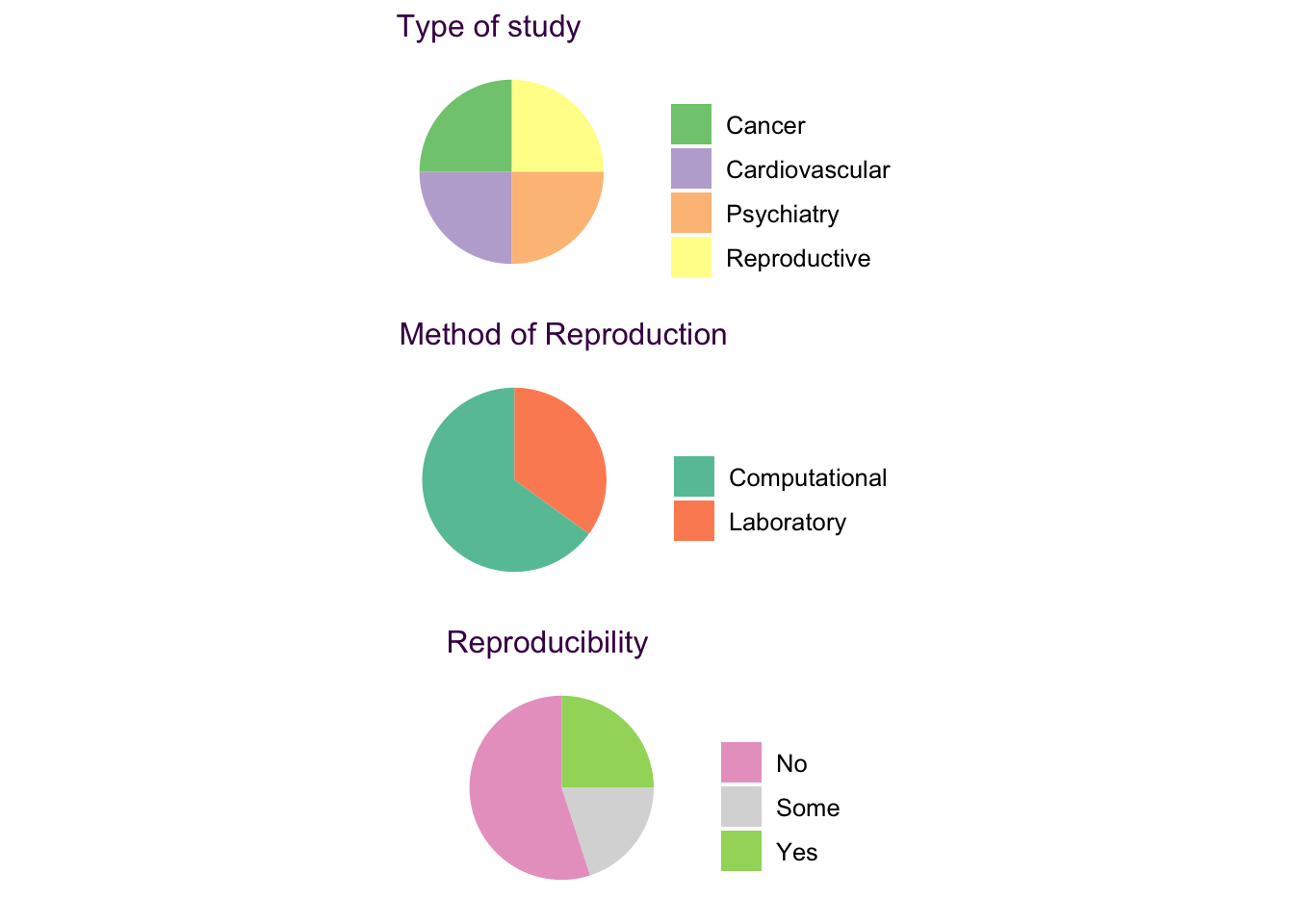
Figure 4.13: Same observation, different variables pie charts.
Aside from the aforementioned difficulties in reading pie charts, this collection is disappointing because a very important and interesting question of the study is obscured. We want to know the story of each study assed here. That is what value does each observation take in each of the three pie charts. It’s just not possible to convey this in three discrete pie charts. The solutuion is a Sankey diagram
4.6.3 The Sankey Diagram
Sankey diagrams are a fantastic alternative to the same observations, different variables pie chart. Sometimes refered to as alluvial plots, these plots allow us to view flow of an item across many categories. Fig. 4.14 depicts the three pie charts from fig. 4.13.
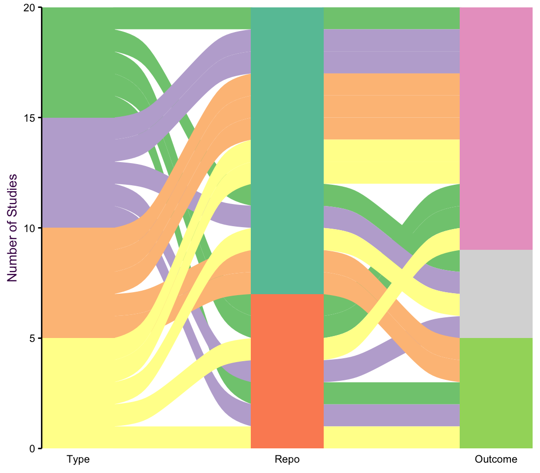
Figure 4.14: A Sankey diagram showing the flow between three different categories. The lines between categories are colored according to the first column.
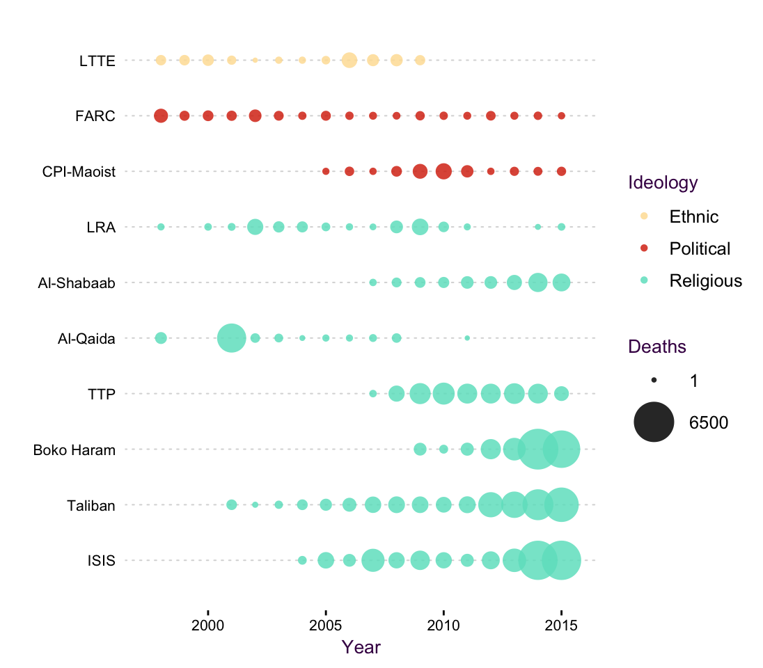
Let’s take a look at another example of a Sankey diagram where the connectors encode a new variable. Fig. @ref(fig.Terror_sankey) depicts 13 346 recorded terrorist attacks from 1998 - 2015. For each attack we can see which country it occured in, which group claimed responsibility and what weapons were used. The color tells us the groups ideology, either ethnic, political or religious.
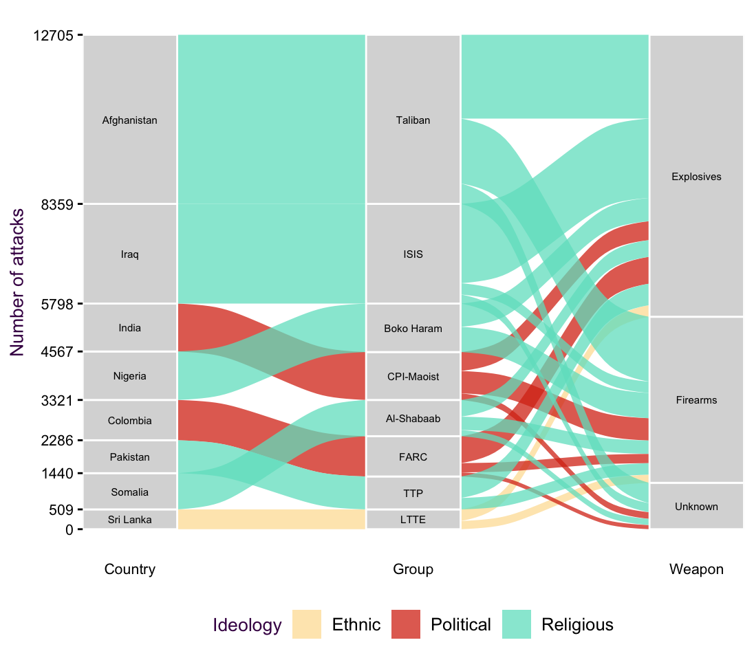
(#fig:Terror_sankey)Sankey diagrams show the connection between categories.
Since this plot has a time component, we would also be interested to see how terrorist attacks have changed over time, i.e. map time onto the x axis. Plotting an individual line for each group is inefficient, since there would be many colors. Plus, I want to know the group’s ideology, which means I have to
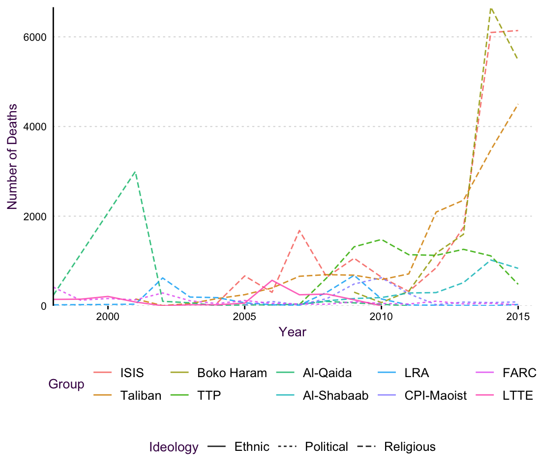
(#fig:Terror_Line)An line plot of the terrorism data set. The overlapping line colors and line types make it difficult to follow trends.
(#fig:Terror_altLine)A bubble chart as an alternative to a line plot.
4.7 Pie chart best practices
In the last sections we saw some great ways to avoid pie charts, in particular when you have many slices or there are interesting trends in the data that pie charts don’t convey. Nonetheless, sometimes pie charts are really just perfect. In particular when you have a small number of categories and can arrange the pie charts in a sensical manner.
Here, I’ll use the mushroom data set, which is popular in machine learning exercises. The underlying research question is, given many input variables, can we predict if a mushroom is going to be poisnous or not? Fig. 4.15 is a very rough exploratory plot of two variables that influence edibility: the cap color and the stalk color.
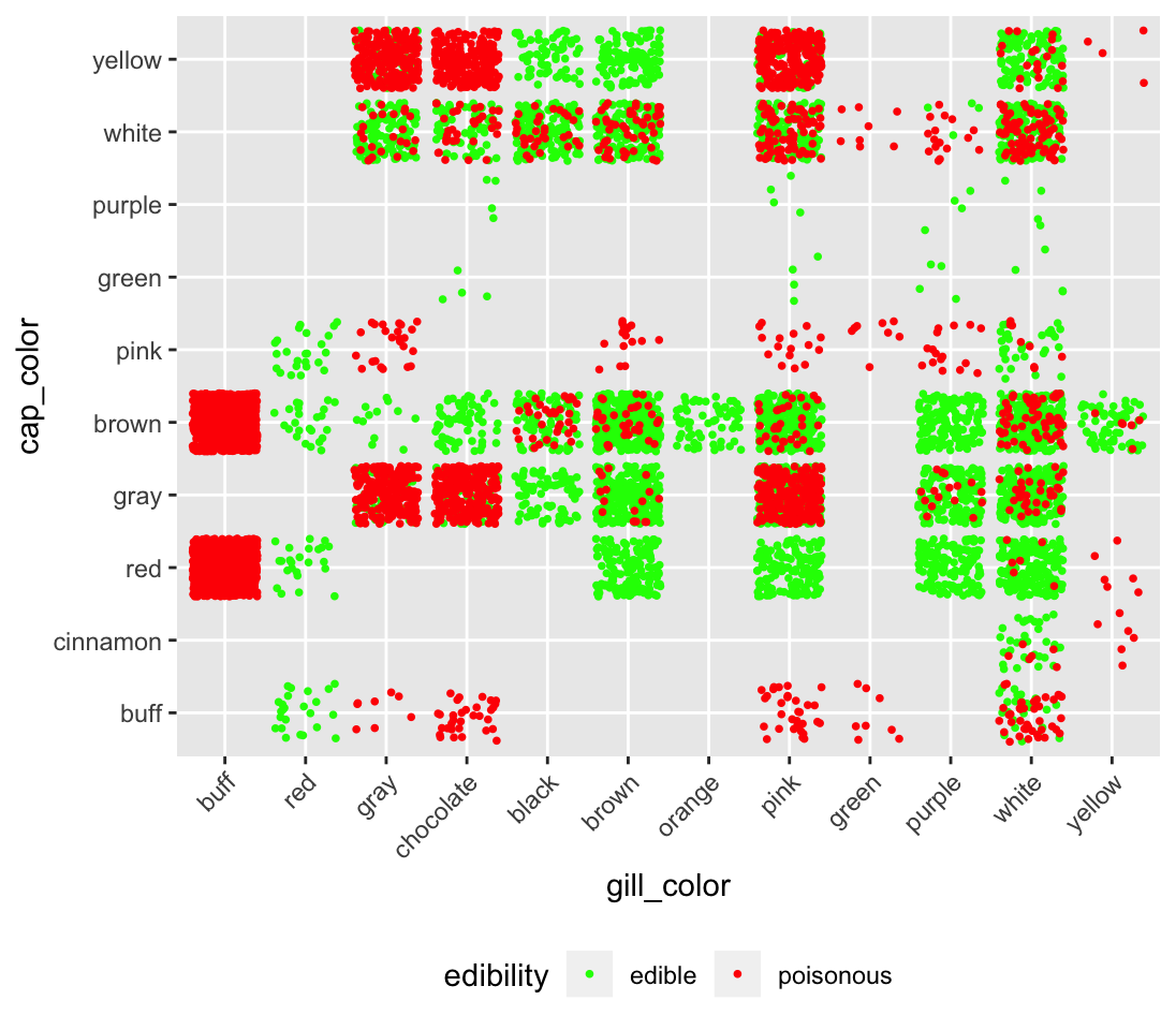
Figure 4.15: An exploratory plot for the mushroom data set
Aside from the terrible color choice (see section XX). This plot is difficult to read because we can only roughly see the separation between the two categories. It’s essentially a scatter plot where the x and y axes are categorical (see scatter plots XXX and Vocab example XXX for a thorough discussion of this plot type). Each observation is represented by one dot, which is draw in the order in which it appears in the data set. To show the pitfalls here, I’ve ordered the data set so that all the edible mushrooms appear first. That means that this entire, interesting, subset is obscured, although we think we have a good exploratory plot!
Let’s simplify the matter. We’re just interested in the ratio of edible to poisonous mushrooms in each category. With only two groups, we can manaage a grid of different observations, same variables pie charts, depicted in fig. 4.16.
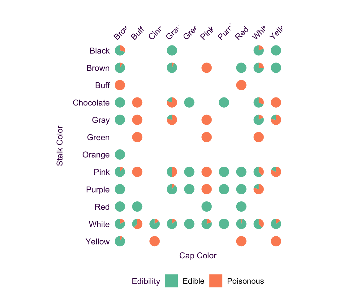
Figure 4.16: An example of a differen observations, same variable pie chart that works well.