7 Geometries of Multivariate Comparisons
7.1 Points
7.1.1 Comparing Two Continuous Variables using Scatter Plots
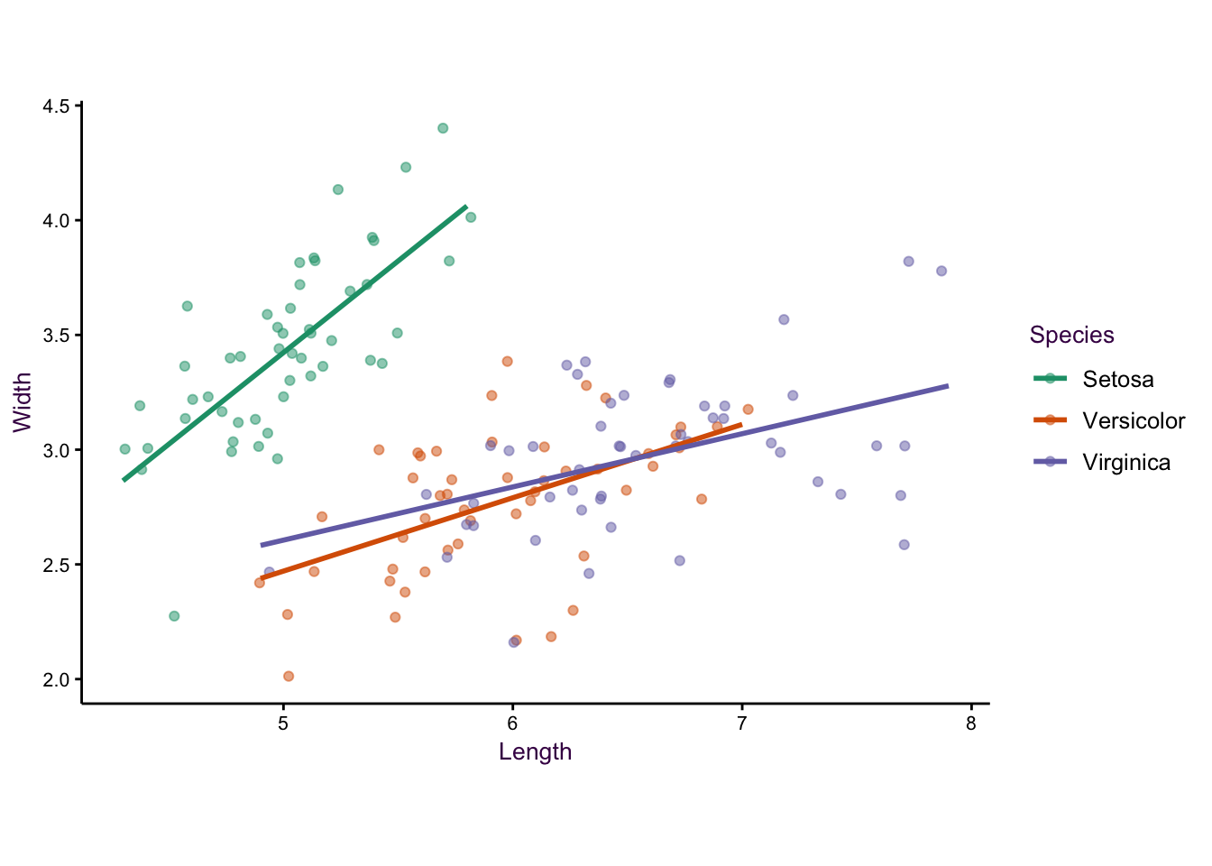
The correlation of two continuous variables is often depicted using scatter plots. Here, we will use Anderson’s iris data set as an example of composing a comprehensive scatter plot. The data set contains 4 continuous variables (width and length of both petals and sepals), with 50 observations each. A fifth, categorical, variable specifies the species of iris plant. Using only sepal width and length, setosa iris is linearly separable from the versicolor and virginica, which are not linearly separable from each other. Plotting only the sepal width and length of the setosa iris is a good starting point.
Don’t obscure data by over-plotting individual data points
The biggest deficiency with this plot is23that it suffers from over-plotting. Some data points are obscured because several points are plotted over each other. We can get around this problem by jittering - adding a small amount of random noise - to each point. This is acceptable because a visualisation does not need to be representative of the exact data. Therefore, if the reader wants to know what the exact value at a given point is, then a table look-up is required.
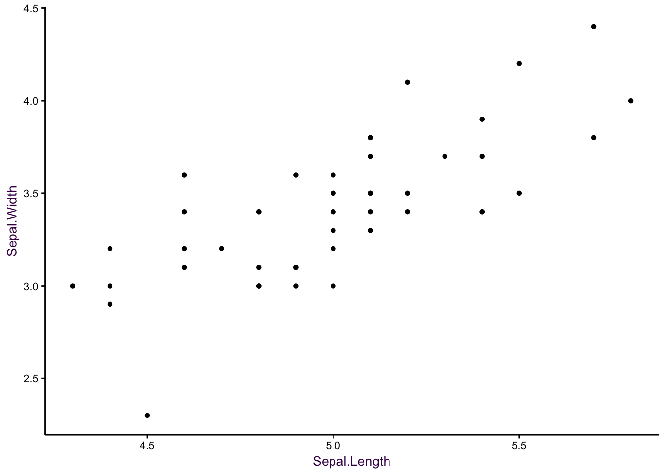
Figure 7.1: Sepal width versus sepal length for 50 observations of Setosa iris. Left: Over-plotting can obscure data points. Middle: Jittering is the first step in alleviating over-plotting. Right: Removal of unnecessary non-data ink aids clarity.
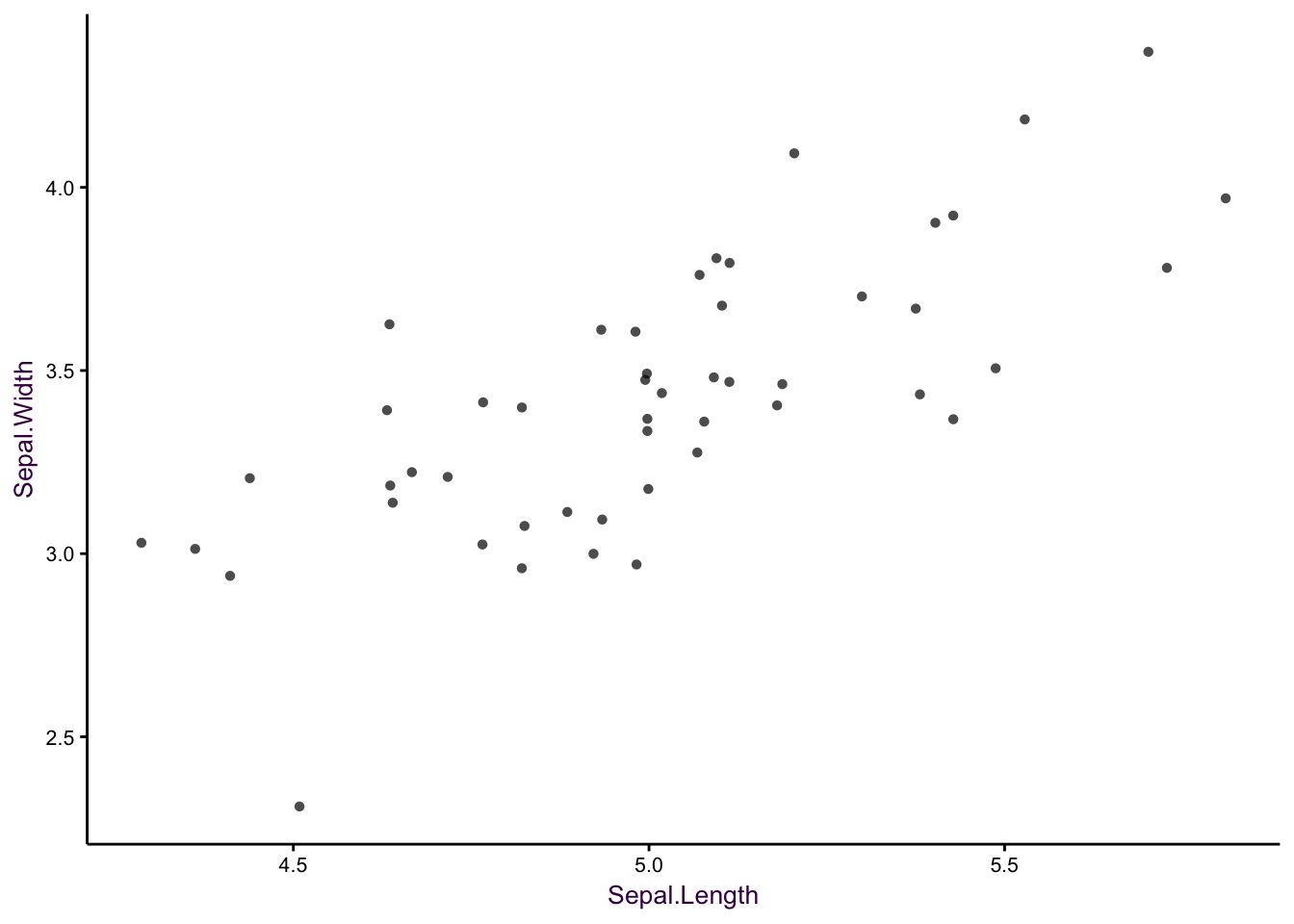
Figure 7.2: Sepal width versus sepal length for 50 observations of Setosa iris. Left: Over-plotting can obscure data points. Middle: Jittering is the first step in alleviating over-plotting. Right: Removal of unnecessary non-data ink aids clarity.
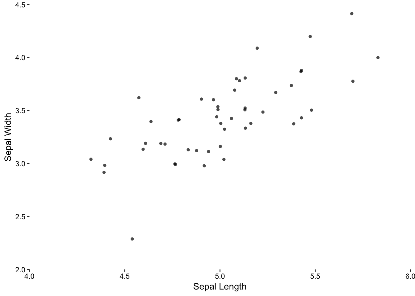
Figure 7.3: Sepal width versus sepal length for 50 observations of Setosa iris. Left: Over-plotting can obscure data points. Middle: Jittering is the first step in alleviating over-plotting. Right: Removal of unnecessary non-data ink aids clarity.
Remove non-data ink and optimize data-ink
Non-data ink, like the border around the plot, does not add useful information and can be removed. Data ink, such as the axes tick marks do not encompass the entire data set, and so can be extended. In addition, the axes labels should provide details like the units.
Adjust the aspect ratio appropriately
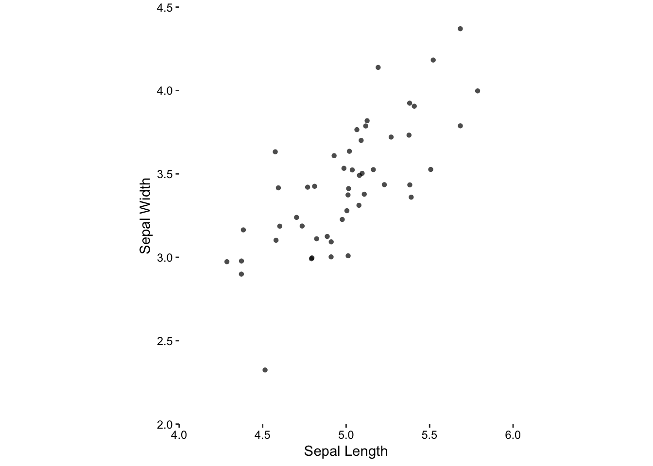
Figure 7.4: Jittering, removal of unnecessary non-data ink, and an aspect ratio of 1.
Choosing an inappropriate aspect ratio can distort the visual representation of the data. In the worst-case, emphasising weak trends and obscuring troublesome aspects in this manner can be considered unethical. Even in the best-case, you will not effectively communicate your results if you use an inappropriate aspect ratio.
Here we have a clear choice for choosing an appropriate aspect ratio. Since both variables are on the same scale (i.e. measured in centimetres), the only logical choice is that the physical scales are also the same. That is, if 1.0 cm sepal width (scale) is drawn as 0.5 cm on paper (physical) then this should also be the case for sepal length.
Plot multivariate data sets
So far, we have been working with a bivariate data set, visualising the relationship between the distributions of two continuous variables. However, the only thing this plot shows us is that there is a strong positive correlation between the two variables. This is obvious, even without a regression line, and begs the question: What is the purpose of this visualisation?24 Remember that versicolor and virginica, indistinguishable from each other, are distinct from setosa. They need to be plotted together on a multivariate plot.
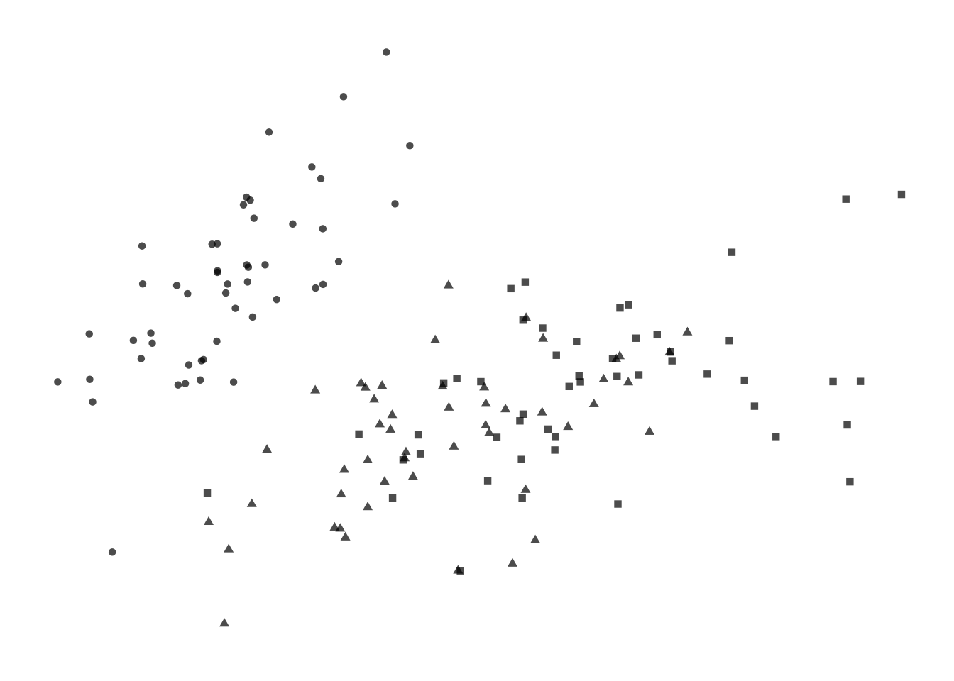
Figure 7.5: Four options for encoding categorical variables. First: Shape does not provide enough distinction among groups. _Second-: Shape and colour are not necessary since they are redundant. Third: Colour alone allows easy identification of each group. Fourth: Colour and circle outlines allow group distinction and also relieves some problems of over-plotting not solved by jittering.
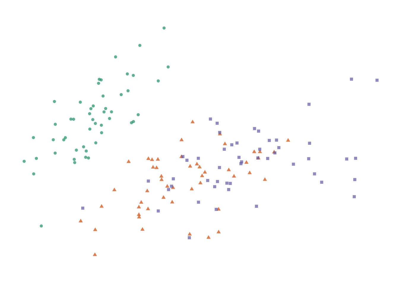
Figure 7.6: Four options for encoding categorical variables. First: Shape does not provide enough distinction among groups. _Second-: Shape and colour are not necessary since they are redundant. Third: Colour alone allows easy identification of each group. Fourth: Colour and circle outlines allow group distinction and also relieves some problems of over-plotting not solved by jittering.
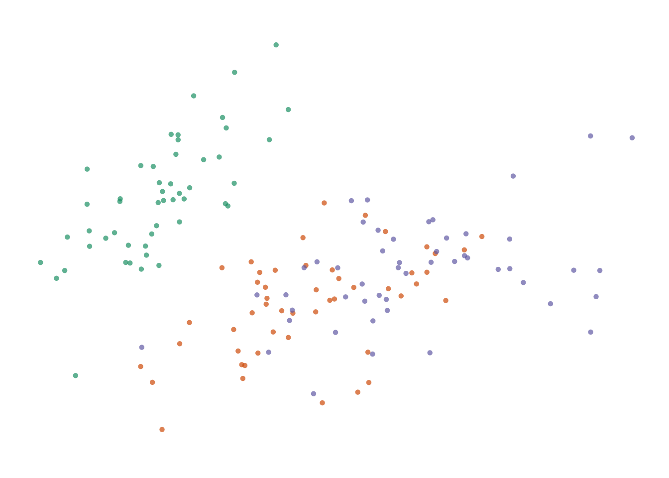
Figure 7.7: Four options for encoding categorical variables. First: Shape does not provide enough distinction among groups. _Second-: Shape and colour are not necessary since they are redundant. Third: Colour alone allows easy identification of each group. Fourth: Colour and circle outlines allow group distinction and also relieves some problems of over-plotting not solved by jittering.
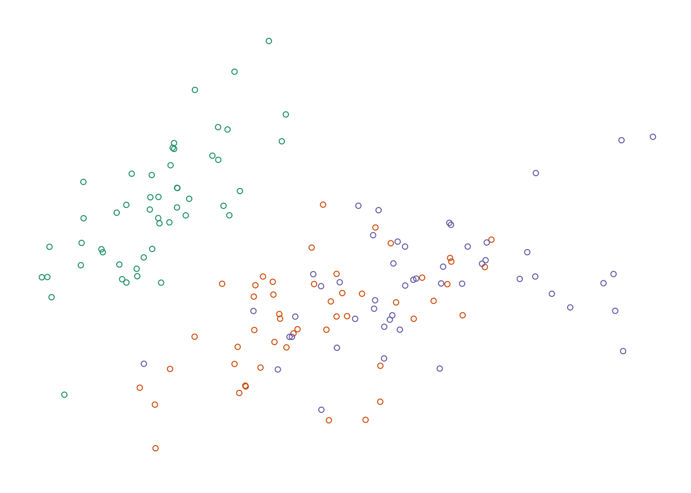
Figure 7.8: Four options for encoding categorical variables. First: Shape does not provide enough distinction among groups. _Second-: Shape and colour are not necessary since they are redundant. Third: Colour alone allows easy identification of each group. Fourth: Colour and circle outlines allow group distinction and also relieves some problems of over-plotting not solved by jittering.
Adding more information to the plot means we need to decide on which aesthetic attributes will best distinguish the different species. For categorical variables, the most distinguishable encoding elements are colour and shape. We only need one. Using two encoding elements for a single group only serves to confuse the reader. Each piece of information should be encoded by only one element. Consider the four variations shown in the figure above. Filled shapes are not easily distinguishable. Colour allows us to see the three groups very easily, but in this case is redundant with shape. Alpha-blending and open circles are useful complements to jittering.
Make a clear statement with your plots
We now have a much-improved, multivariate, version of the original scatter plot, but it’s not complete. We want to show the reader the relationship between sepal width and length. In this case we can draw regression lines using a linear model to emphasise our observation.
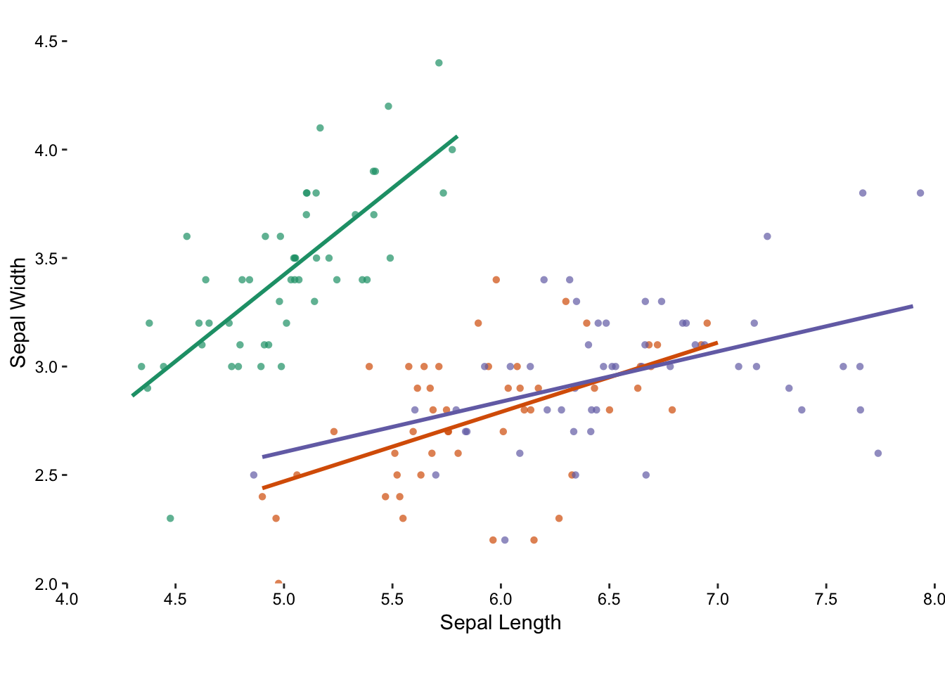
Figure 7.9: Adding a trend line to each group emphasises the distinction between the species.
Minimize table look-ups
Symbol legends add another degree of separation, forcing the reader to look at two separate pieces of information and put them together. We can eliminate the symbol legend and directly label the plot.
7.2 The story of jittering
In the previous chapter, we saw that jittering is useful when all points lie on a single axis, and we’ll see that again later on in this chapter. It’s clear what benefit jitter serves, so that wasn’t really controversial. In contrast, the previous example used jittering on two dimensions and gave the impresison of having more precision than we originally had. That’s perfectly acceptable, given that we are transparent about data transformations. We can make a convincing argument in favour of jittering in that it reveals more data points than we would otherwise, and all statistics are anyway calculated on the original non-transformed data.
So what would be an alternative? Well, we could have set the size of the circle to the number of values.
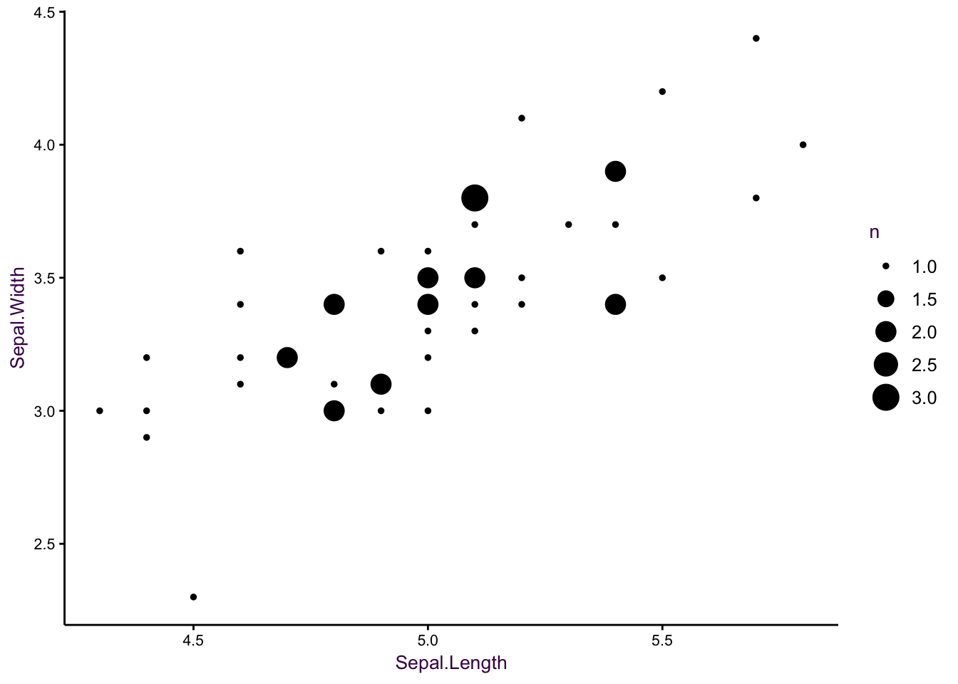
Figure 7.10: Change the size parameter.
Which is actually quite nice, even if size is not the most efficient encoding element (see page XX). We do encounter a problem, however, when we try to include more species. When circles of the same size overlap, the data can be obscured, and I find that the large circles draw our attention. For example, if we had to draw the linear model for virginica by hand, the slope would probably be steeper, since we may disregard the influence of the less frequent values at the edge of the distribution. Faceting may solve this problem, but that point of this visualisaiton is to compare the three models in one plot.
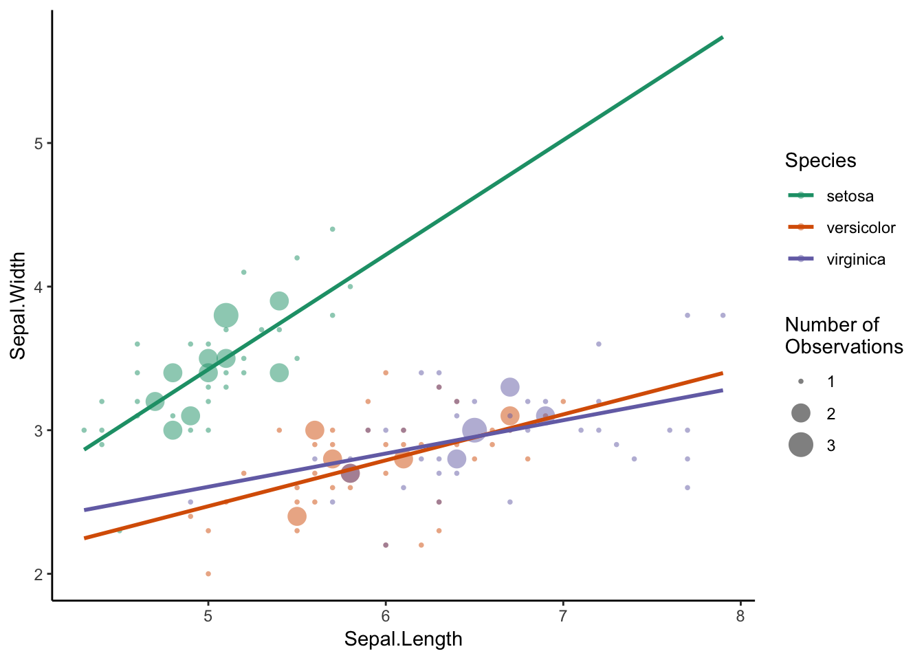
Figure 7.11: Change the size parameter.
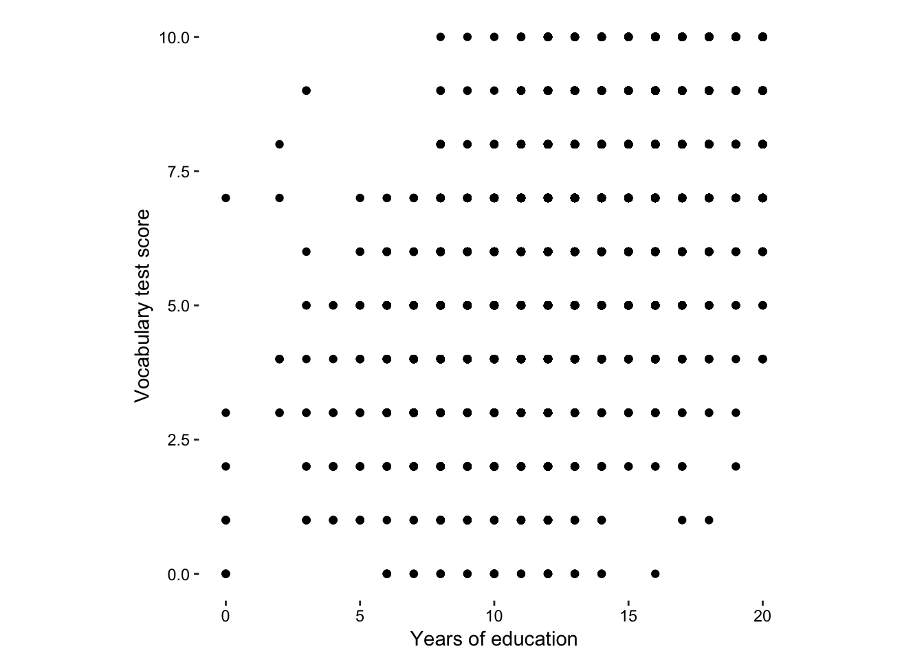
Figure 7.12: The vocab data set - imprecision due to integer data.
Here is a clear case for using jittering in two dimensions.
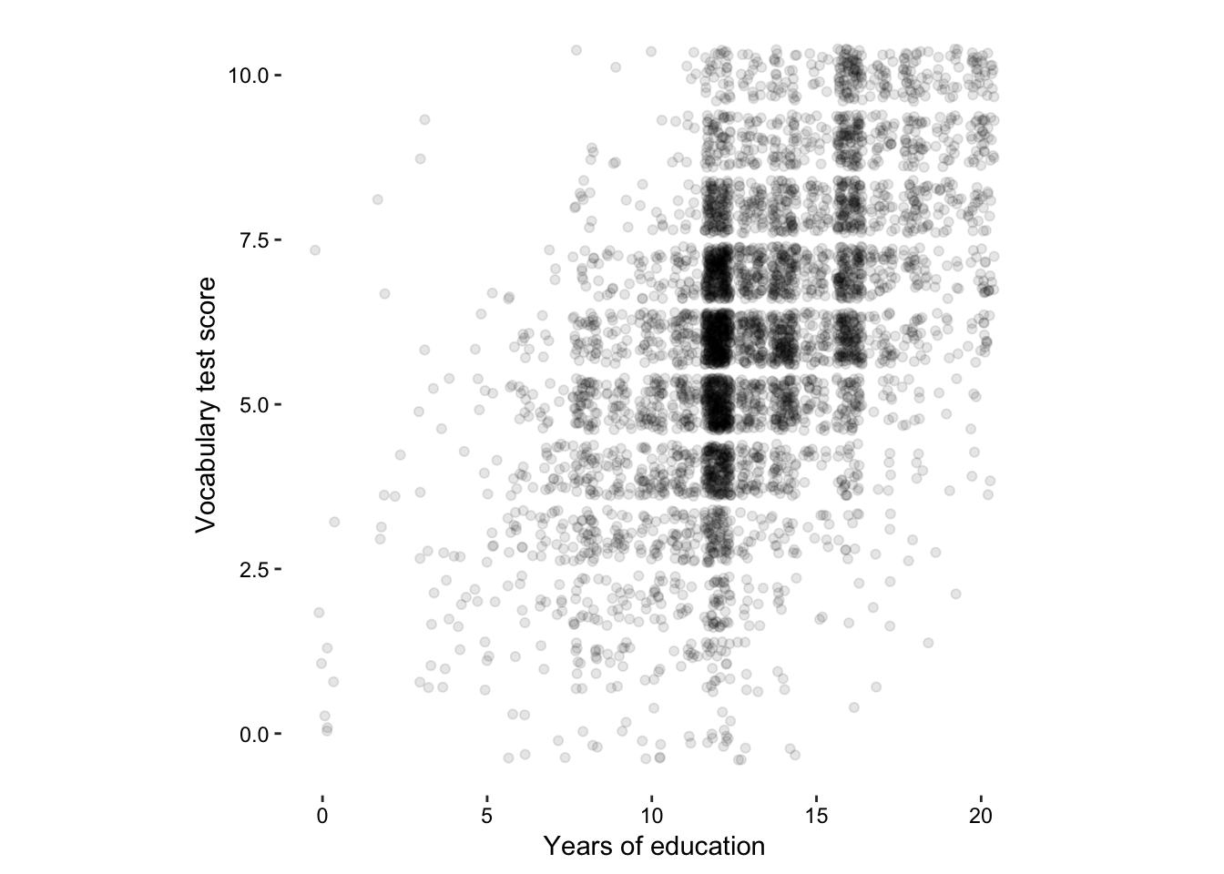
Figure 7.13: The vocab data set - 2-dimensional jittering.
previously, we mapped the total number of observations to size, we can do the same thing here…
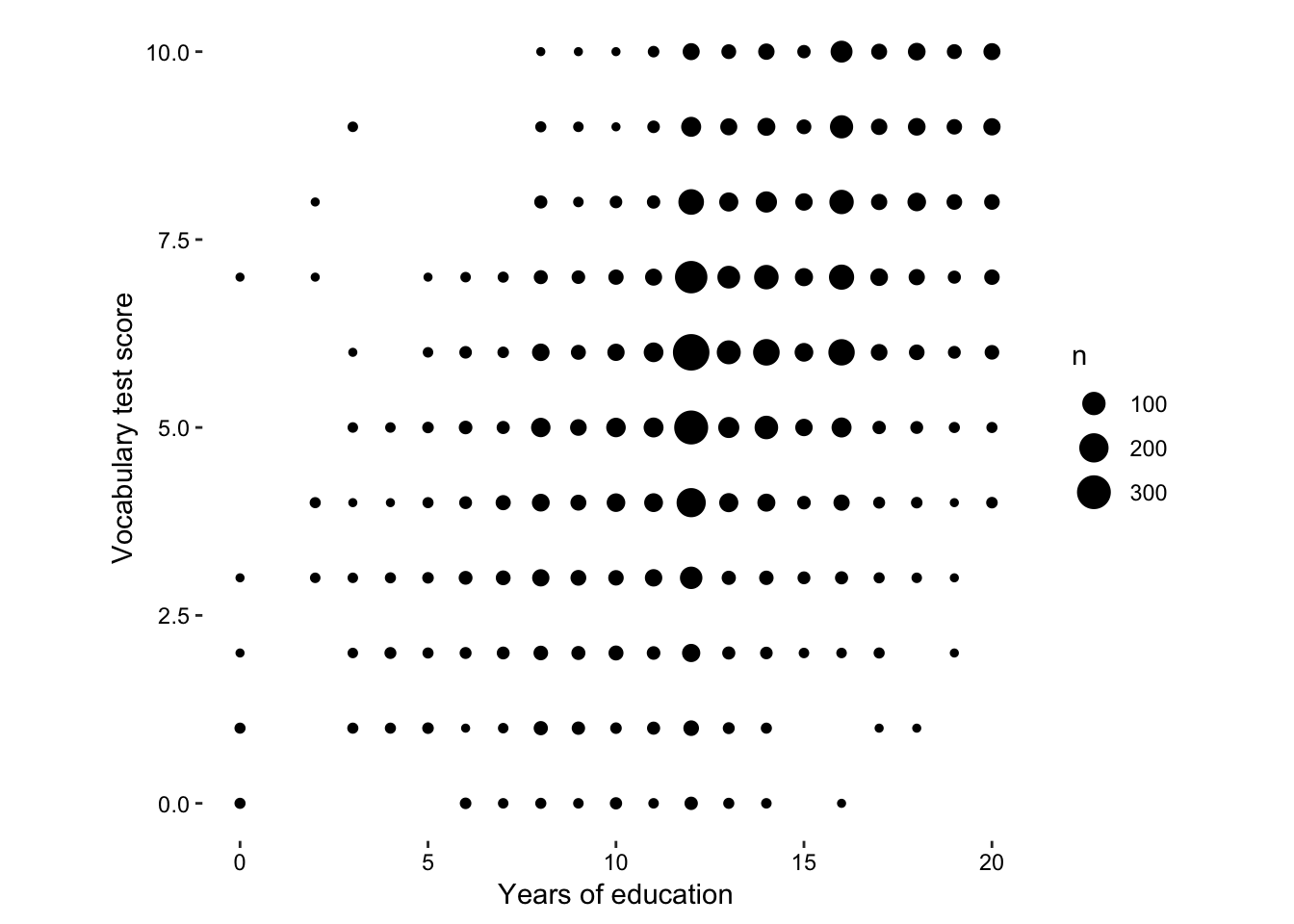
Figure 7.14: size according to total number of observations at each point.
But actually, that’s not really the story of this data set, what we want to know is the relationship between vocab score and education. A more interesting statistic to map onto size would be the proportion of each vocab score per education group.
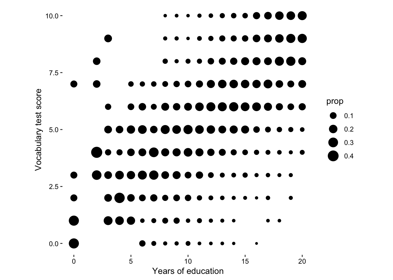
Figure 7.15: size according to proportion of vocab score in each education level.
So we can see that there is a trend towards higher vocab scores given higher education scores. Let’s draw some linear models and see how that has changed over time.
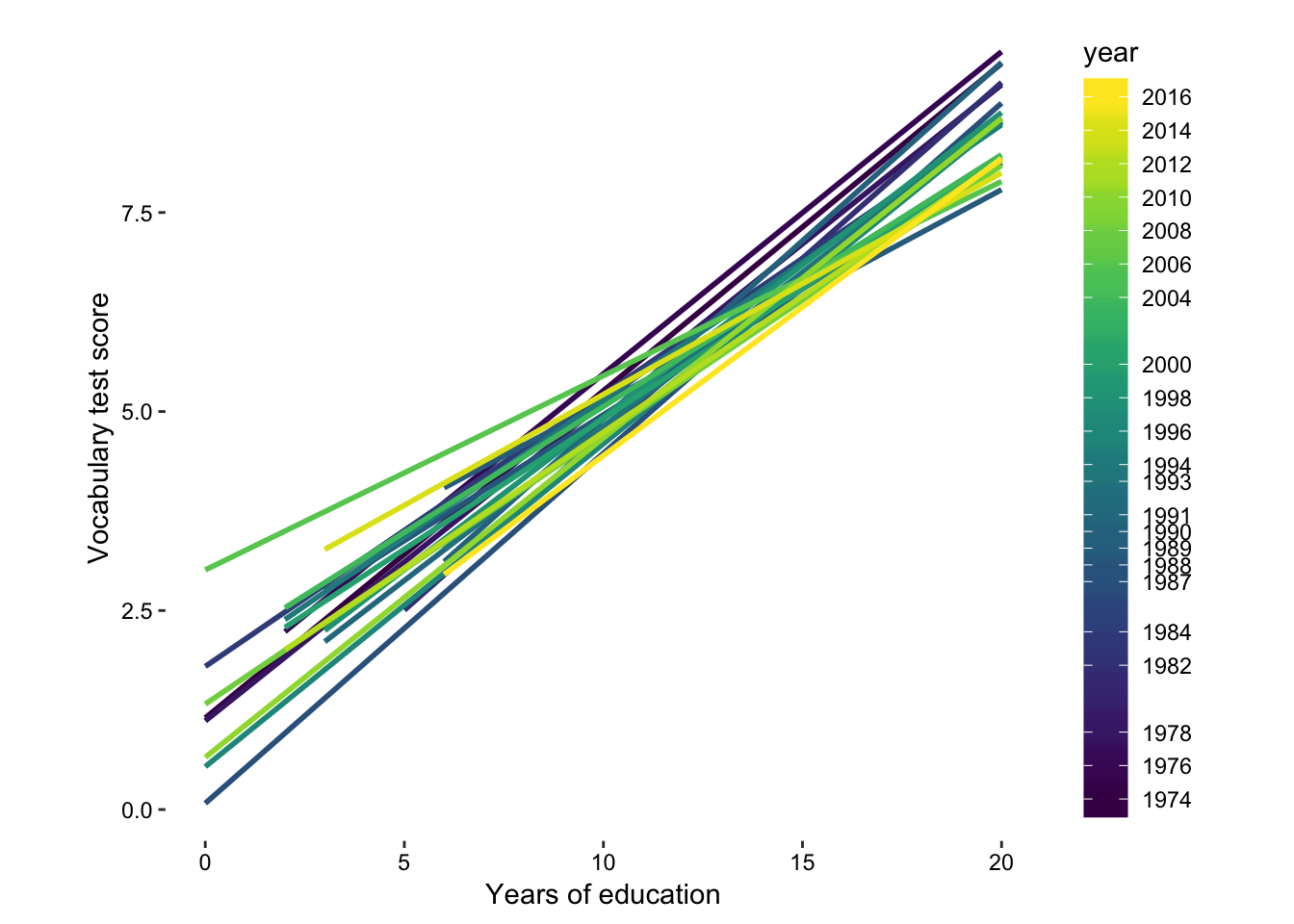
Figure 7.16: lm per year.
7.3 More points
There are at least six different ways in which we can understand a scatter plot, depending on the nature of the data and the message you want to see/convey. Let’s use the different geometries in ggplot2 to investigate these types further:
- Linear Models (previously discussed in geom part I, see page )
- Divergence from equivalence (previously discussed in geom part I, see page )
- Clustering
- Distribution
- Quadrants
- Outliers
Type 1: Linear Models
Example: The iris dataset with linear models.
- geom_point()
- stat_smooth(method = “lm”)
iris.1, again, this is the same as the left panel in fig. XXX, but this time with linear models. You can never have enough iris in your life! If you don’t believe me, see fig. XXX.
Type 2: Divergence from equivalence
Example: The wage-gap data set.
- geom_point()
- geom_abline()
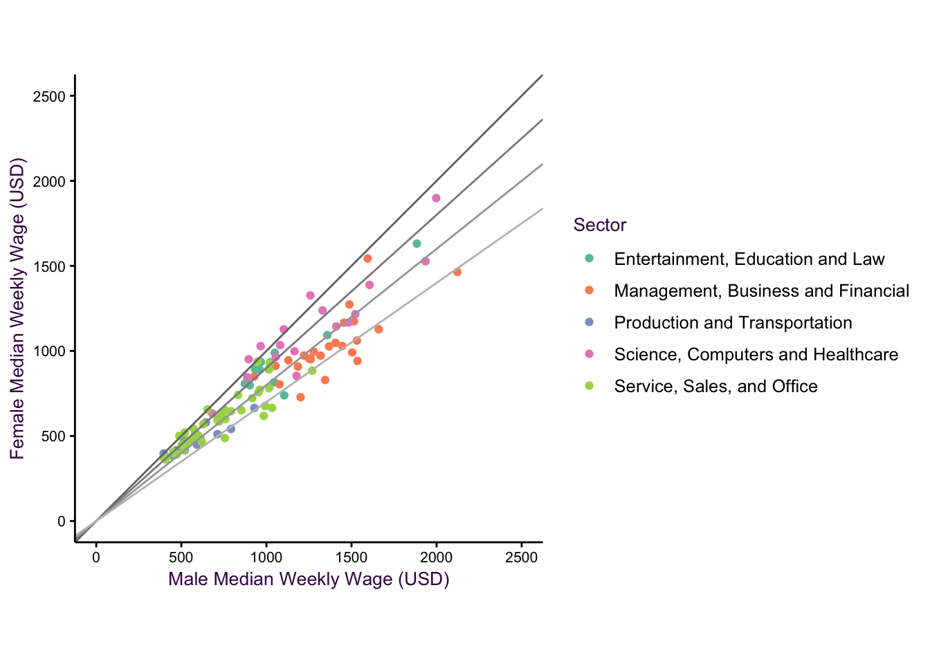
Figure 7.17: The wag gap dataset.
7.4 geom_violin(), geom_density2d()
7.4.1 Density plots
7.4.1.1 comparing multiple densities
Type 3: Clustering
Example: Showing Distributions in Two Dimensions with a Smoothed Scatter Plot
- stat_density2d()
“Two-dimensional density plots are an alternative to scatter plots when clustered points are of interest. Upper-left: A scatter plot of the Old Faithful geyser data set draws attention to the positive correlation between eruption duration and waiting time. Upper-right: A two-dimensional density plot highlights the clusters. Middle panels: This trend is clearer when the contour lines are coloured according to density, or when a colour gradient is used. Lower panels: A lower bandwidth allows a more detailed image of the data to emerge.”
An alternative to density plots that may be more intuitive would be hex binning. Note that the colours are reversed here, since the low density areas are not going to be coloured in, so darker colours are a more intuitive choice for high density regions.
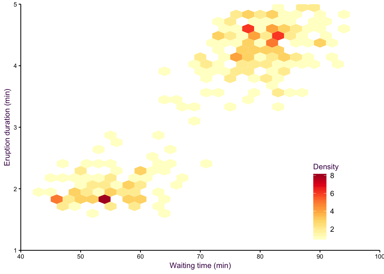

Figure 7.18: hexbin.


Figure 7.19: hexbin2.
We can also revisit the iris dataset with this topic:
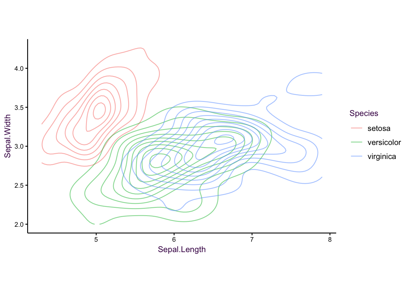
Figure 7.20: The iris data set as a controup plot
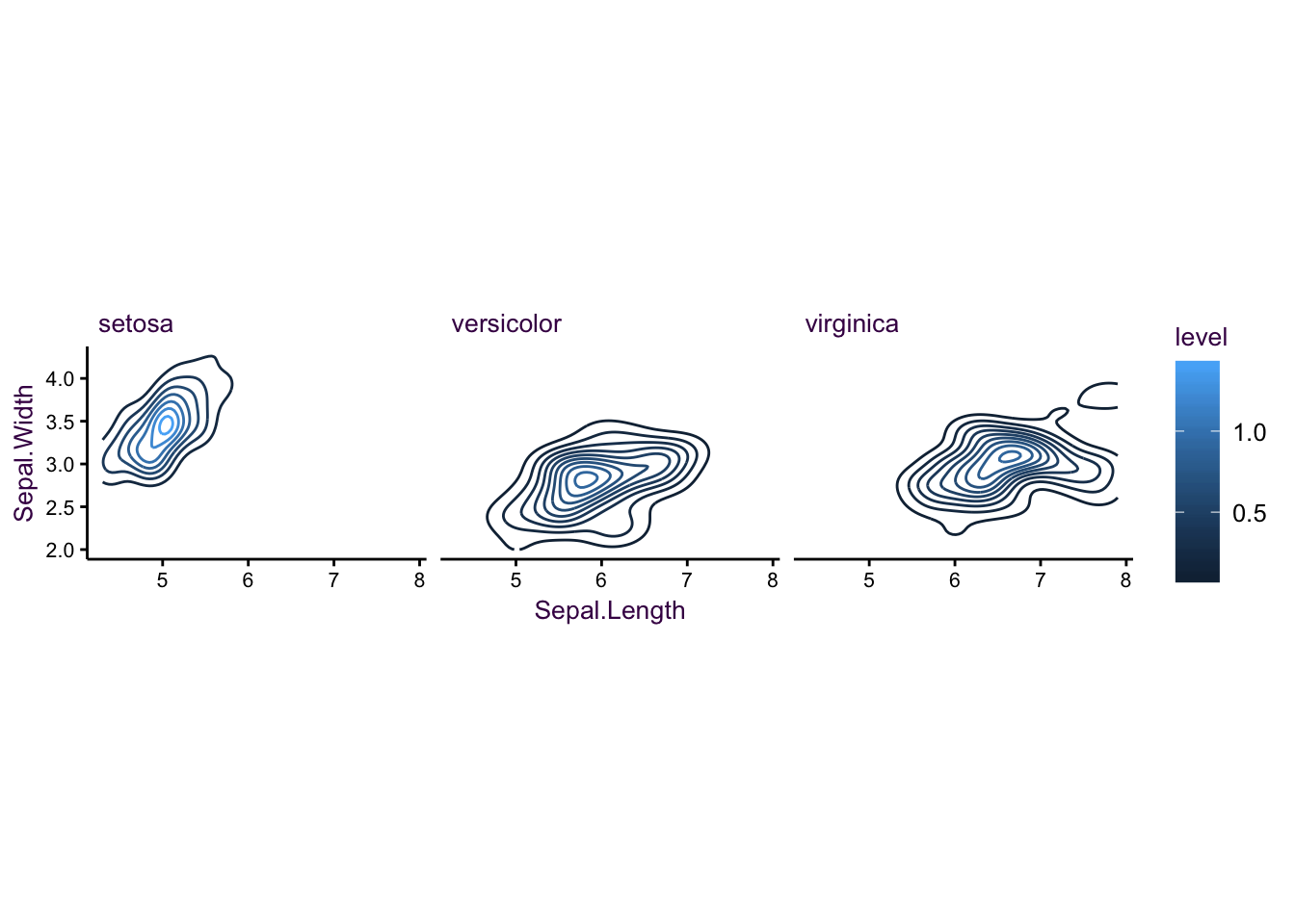
Figure 7.21: The iris data set as a controup plot
geom_polygon()
Type 4: Distribution
- geom_point()
- geom_polygon()
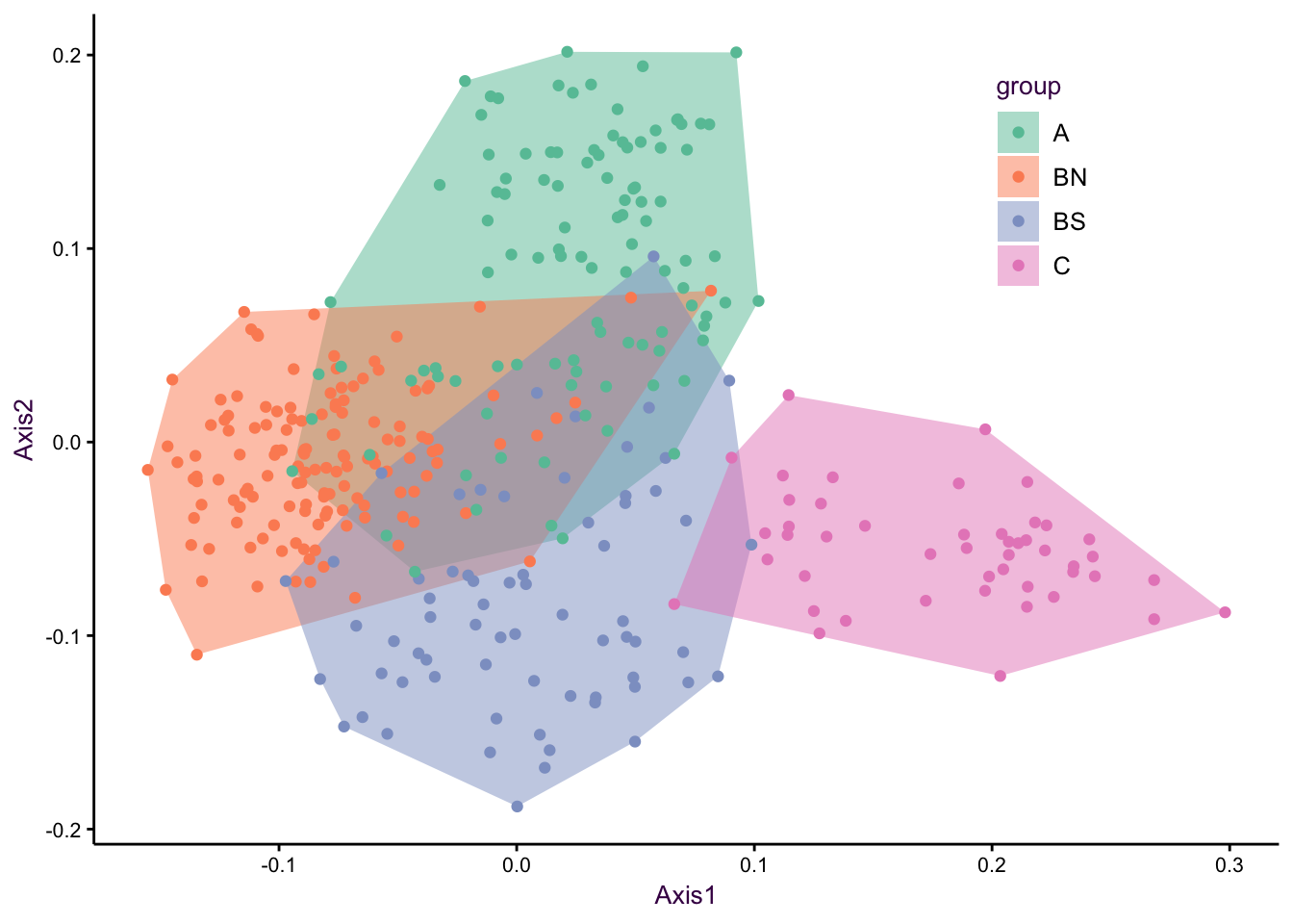
Figure 7.22: The first and second axes of a PCA
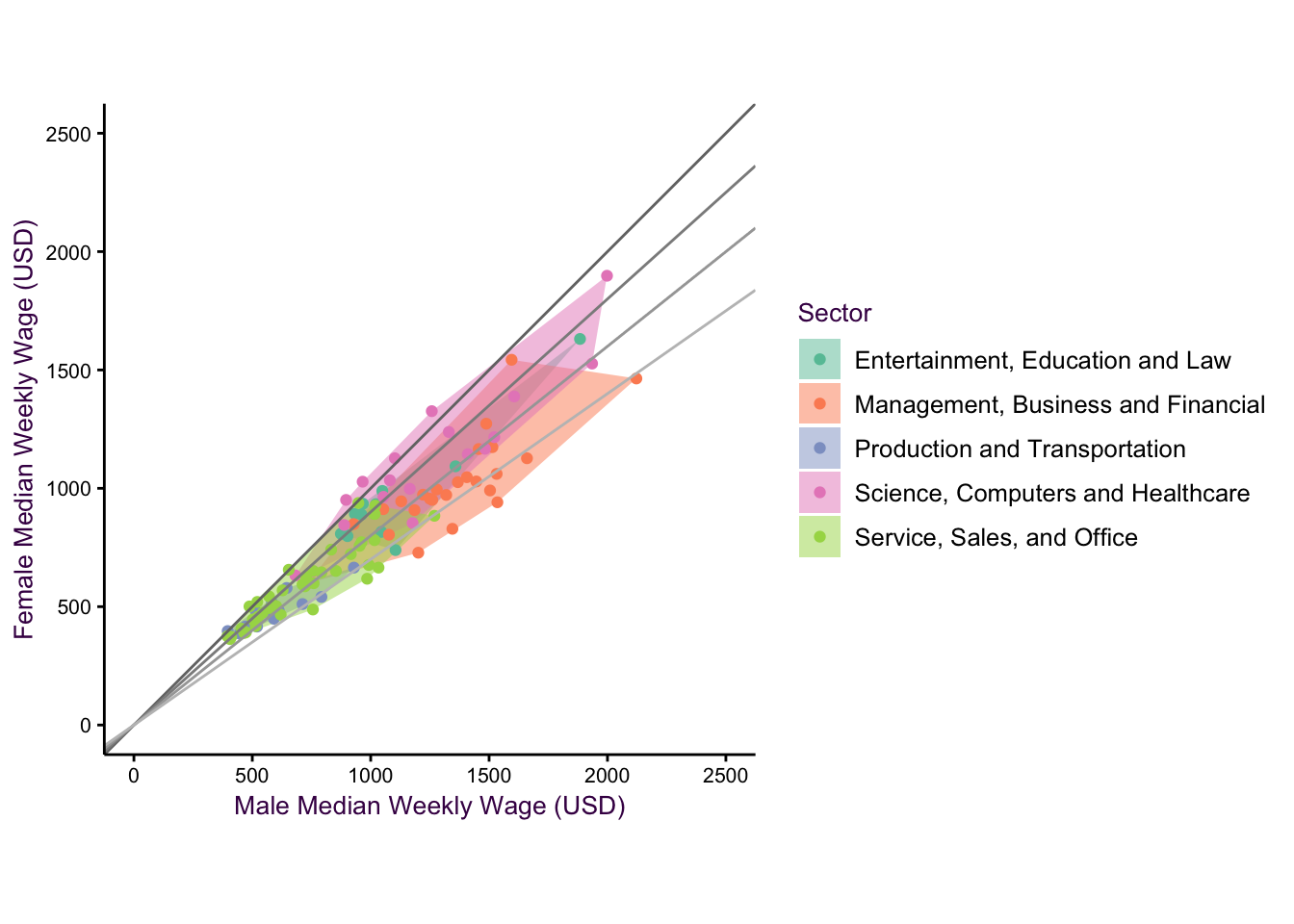
Figure 7.23: The cool thing is, we can combine these geometries!
Type 5: Quadrants
geom_point() abline?
Example: where we are interested in all four combinations of High/High, High/Low, Low/High and Low/Low. - finances?
Type 6: Outliers
- geom_point()
- hexbinning?
Example: Volcano or manhattan plot, or a smoothed scatter plot with outliers.
- geom_boxplot()
example - mammalian dataset?
Type 7: Cascade plot as a variant of cumulative sum
Here, we may be tempted to draw a diverging scatter plot, it kinda works, but it’a a bit
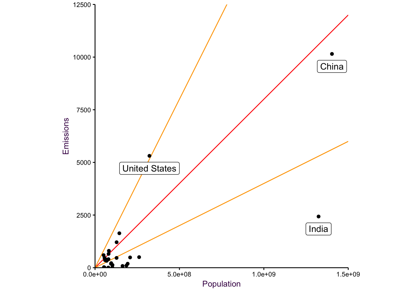
Figure 7.24: a diverging plot may serve as a good starting point.
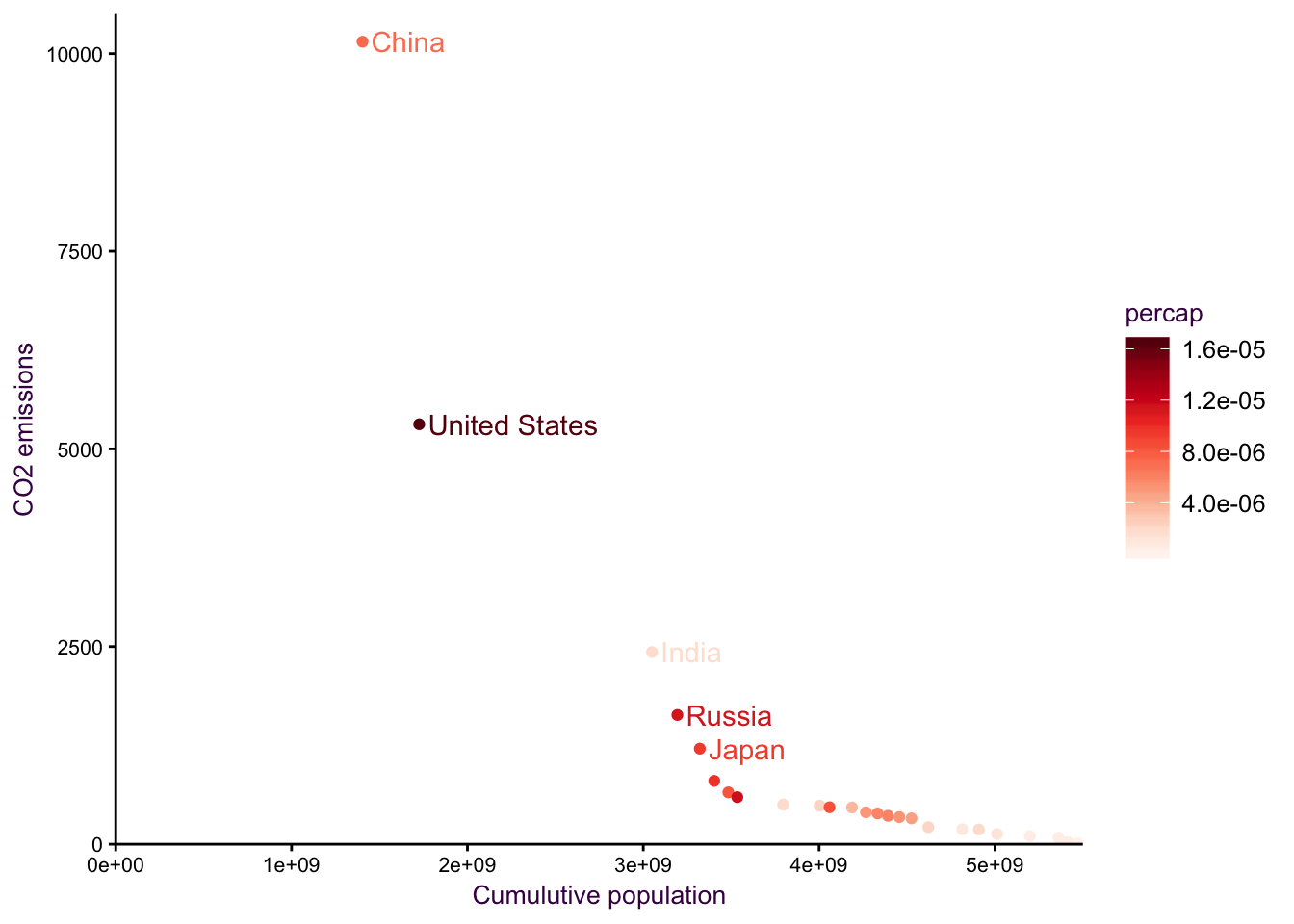
Figure 7.25: cum sum on the x axis.
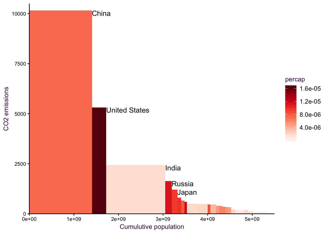
Figure 7.26: cum sum on the x axis.
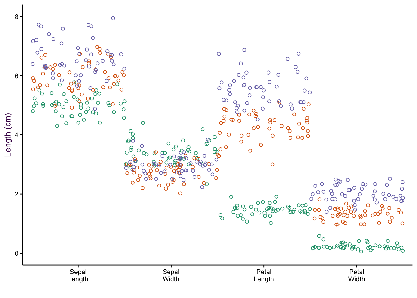
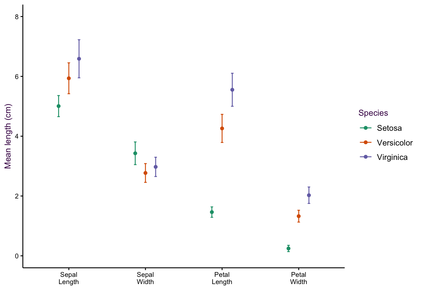
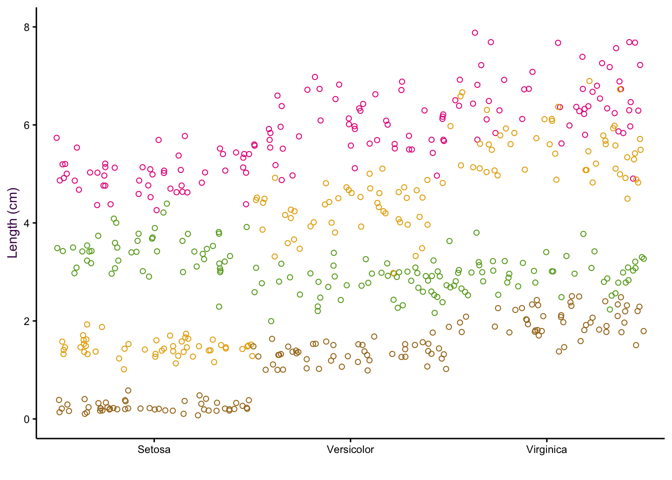
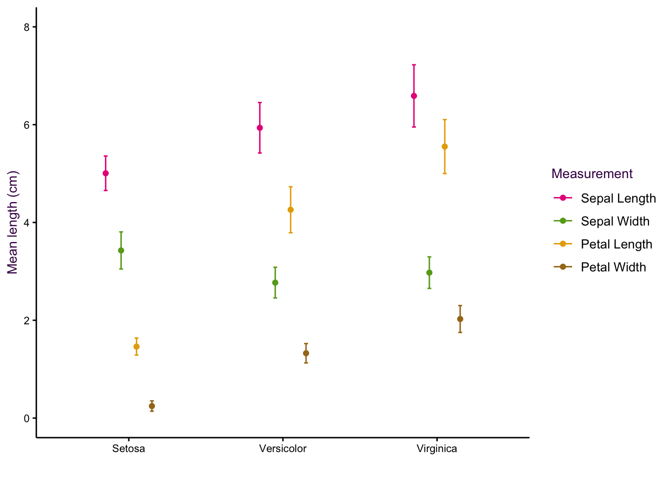
7.5 Comparing a Continuous and a Categorical Variable using Dot Plots
Scatter plots excel at comparing two continuous variables. If we wanted to plot several continuous variables, we can use a dot plot.25
Thus far, we have considered five variables: Species, Sepal Length, Sepal Width, Petal Length and Petal Width. However, there is another way of looking at our data set. We have only three variables: Species, Item measured (both categorical) and Measurement (or “value”", a continuous variable).26
Consider the two examples shown in figure ??. In the first, the item measured is on the x-axis and colour encoding is used to identify the species. In the second, the encoding of the two variables are reversed. In both cases the measurement is on the y-axis.
(#fig:fig:iris-dot-plots1)Dot plots of the iris data set. Left: All data points visible, sorting by measurement (top) or species (bottom). Right: Mean and standard deviations of each sub-group only.
(#fig:fig:iris-dot-plots2)Dot plots of the iris data set. Left: All data points visible, sorting by measurement (top) or species (bottom). Right: Mean and standard deviations of each sub-group only.
(#fig:fig:iris-dot-plots3)Dot plots of the iris data set. Left: All data points visible, sorting by measurement (top) or species (bottom). Right: Mean and standard deviations of each sub-group only.
(#fig:fig:iris-dot-plots4)Dot plots of the iris data set. Left: All data points visible, sorting by measurement (top) or species (bottom). Right: Mean and standard deviations of each sub-group only.
Sorting according to species on the x-axis is more intuitive because we are interested in how measured properties27(the dependent variables) vary according to species (the independent variable). We can see that sepal length and petal width are positively correlated whereas sepal width and petal length are negatively correlated.
Dot plots are particularly useful when presenting moderately-sized data sets with categorical variables having many groups. A famous example from William Cleveland depicts the yield of 10 different varieties of Barley at 6 different sites for two years (120 data points in total) and is shown in figure 7.27.
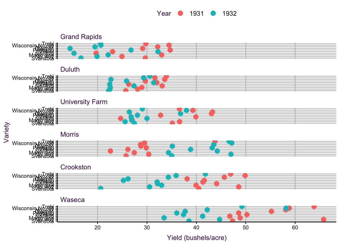
Figure 7.27: A dot plot of the barley data set popularised by William Cleveland. Three variables representing 120 data points are plotted.
7.6 Lines
7.6.1 Comparing Position in Multiple Variables using Parallel Plots
When we made the dot plots of the iris data set (Fig. ??, we took the approach that instead of five variables, we actually only had three: species, item measured and measurement (or “value”"). An extension of the dot plot is the parallel plot, where each observation is connected with a line.
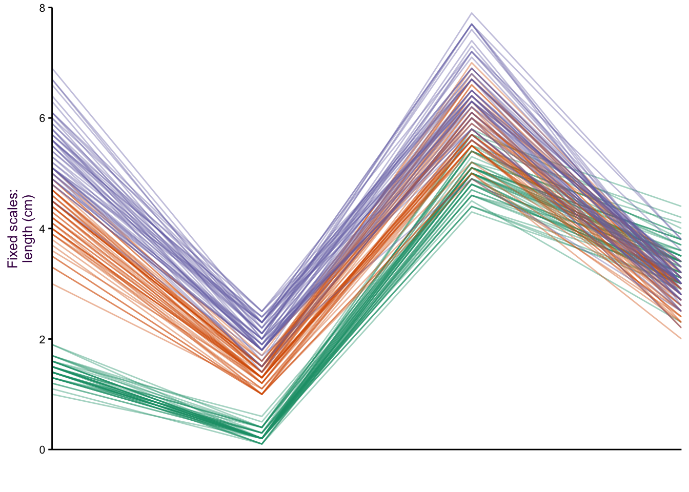
Figure 7.28: Parallel plots of the iris data set drawn on three different scale types. Top: The raw data. Middle: Free scale: x minus the mean(x)/sd, and Bottom: Minimum value = 0, maximum value = 1.
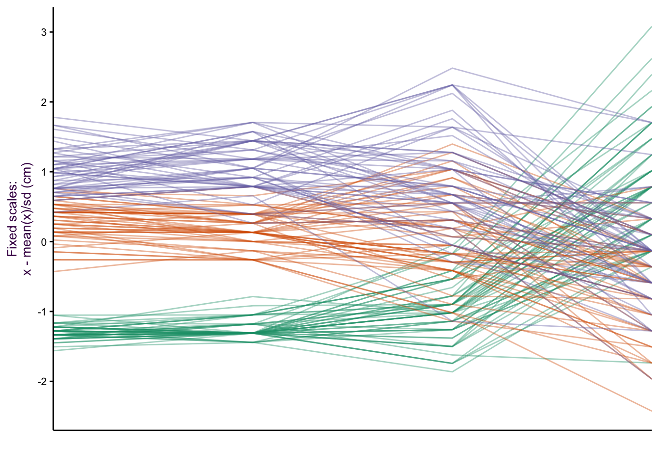
Figure 7.29: Parallel plots of the iris data set drawn on three different scale types. Top: The raw data. Middle: Free scale: x minus the mean(x)/sd, and Bottom: Minimum value = 0, maximum value = 1.
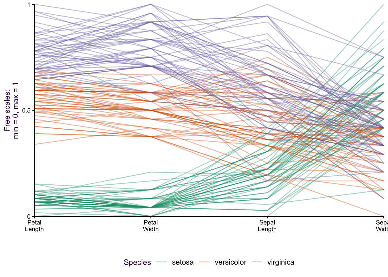
Figure 7.30: Parallel plots of the iris data set drawn on three different scale types. Top: The raw data. Middle: Free scale: x minus the mean(x)/sd, and Bottom: Minimum value = 0, maximum value = 1.
Figure 7.31: paracord.
Our focus is on how the species vary according to the item measured (i.e. Lengths and Widths of both Sepals and Petals). The untransformed data is plotted in figure ??, top. Notice the two variables we plotted as a scatter plot: Sepal Length versus Sepal Width. We can see the inverse relationship between versicolor and virginica compared to setosa. This is visible as two distinct groups in a scatter plot (see Fig. ??). What would a scatter plot of Petal Length versus Petal width look like?
Since the x-axis represents a nominal comparison, we can take advantage of the ordering of the categorical variable that best suits our needs. In this case the plotting function algorithm orders variables according to the most dramatic separation between any one class and the rest. This is distinct from the overall variation between classes. To do this, the F-statistic for each class can be calculated and compared to the rest. The axis variables were then plotted in order of decreasing order to emphasize the most discriminatory variable first.
There are a number of y-axis transformations that can be applied to the parallel plots. An example of a fixed scale transformation is plotted for the original values, minus the mean/sd (fig. ??, middle). This transformation makes the Sepal Length and Sepal Width relationship more obvious. A free scale allows each variable to be plotted on its own scale, where the minimum is given 0 and the maximum 1 (fig. ??, bottom). By placing each sub-group on a different scale, we can get an impression of the relative distribution of each group.
7.6.2 Time Series
Lines are the best choice for presenting a time series. In this case, time is the independent variable (either continuous or interval) and may be evenly or unevenly distributed.
Use lines to plot time series
Take the simple example of body temperature measurement of a beaver obtained using telemetry. Temperature is plotted against time, and a third, categorical, variable is plotted on top of the time series to indicate when the animal was active. Summary statistics for inactive and active periods are presented directly on the plot as horizontal lines and actual values.
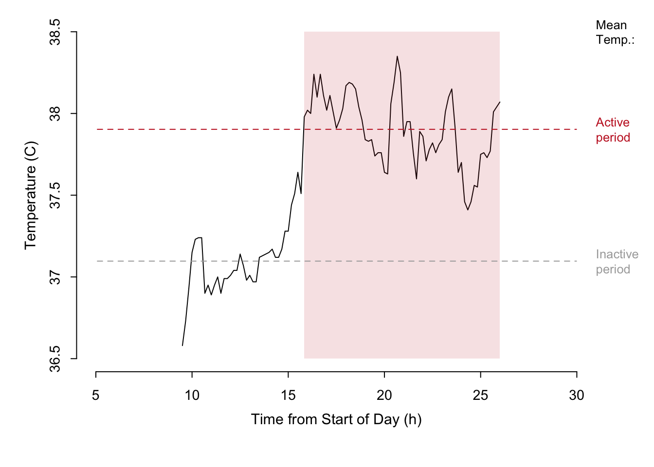
Figure 7.32: A time series of temperature measured during the course of a day for a single beaver. The active state of the beaver is represented by the shaded area.
Match the scale to the time series
Figure ?? shows another example of a dot plot. There are also three variables plotted: The total irrigation areas (thousands of hectares) for four regions at four different time points are depicted.
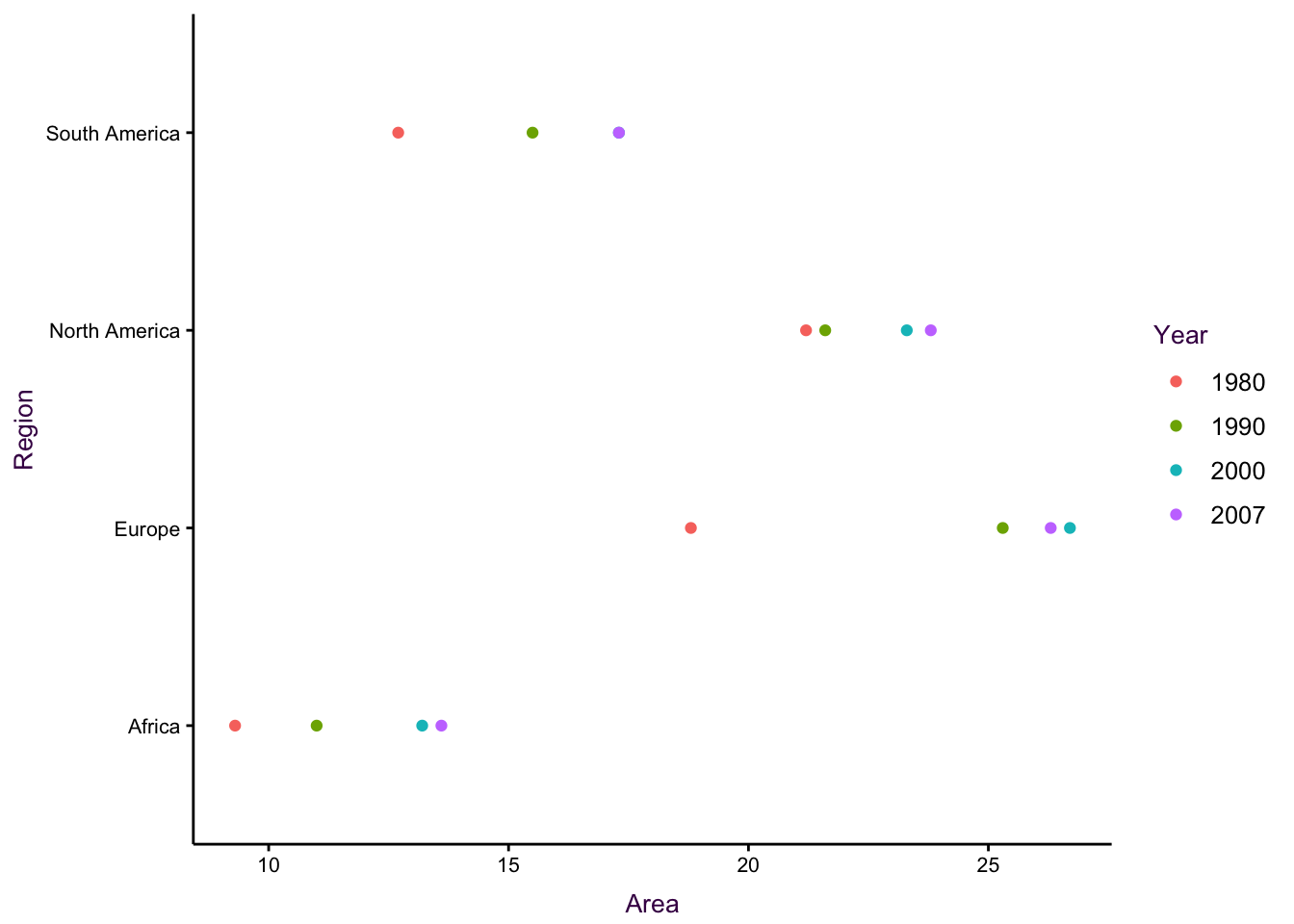
Figure 7.33: Dot plots for the irrigation data set. See an improved visualisation in figure using lines.
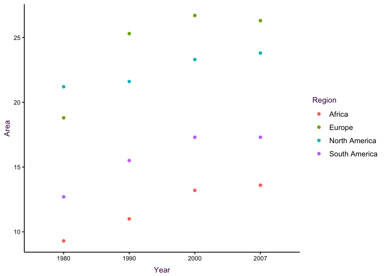
Figure 7.34: Dot plots for the irrigation data set. See an improved visualisation in figure using lines.
Placing area, as the continuous variable, on the x-axis is permissible, but in this case it is unintuitive. In addition, there is over-plotting since there are only three data points visible for South America.
In the second plot, placing time on the x-axis draws our attention to the fact that we are actually dealing with an un-even time series. Therefore, the question arises as to what the focus of the plot is. For example, is it important to show that Europe quickly surpassed North America by 1990, or to show that Africa is consistently very low? There is also an over-plotting problem since there are only three points visible for South America in 2000. In addition, the even spacing of each time point is inaccurate since the time-series in not evenly spaced. The solution will be to connect the dots and use an appropriate scale (see page ??).
Earlier we presented an example of an uneven time series presented on an evenly spaced x-axis (see page ??). Fig ?? shows a corrected line plot of the irrigation data.
Normalize data to communicate, not misrepresent, your data
Note that normalizing our data can have a dramatic affect on how it is perceived. In the first (non-normalized) plot in figure ??, gestalt principles dictate that there are two groups of interest.29North America and Europe are separate from South America and Africa. In the second plot (area as a percent of 1980) the first group consists of Europe, South America and Africa. North America appears to be an outlier compared to the original plot and Africa holds the highest position in 2007. In the last plot (absolute change over 1980) Europe is the clear forerunner.
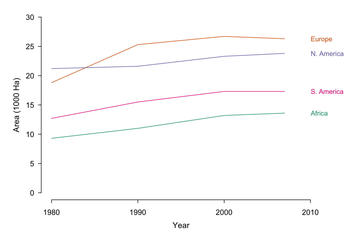
Figure 7.35: Irrigation area by year sorted according to country. The same data is presented in its original form and with two different normalisations.
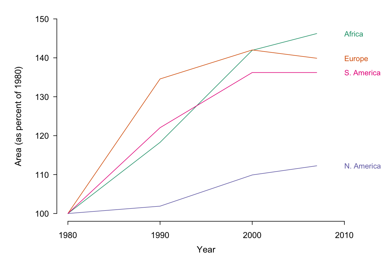
Figure 7.36: Irrigation area by year sorted according to country. The same data is presented in its original form and with two different normalisations.
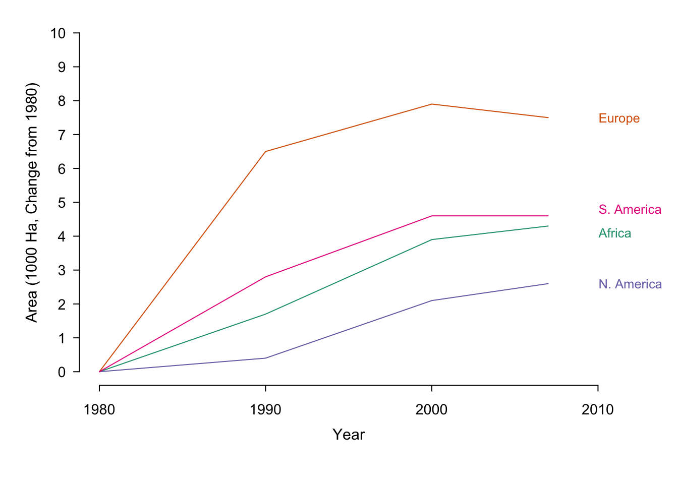
Figure 7.37: Irrigation area by year sorted according to country. The same data is presented in its original form and with two different normalisations.
Encode lines using colour when possible
In line plots with many overlapping series, it can be difficult to distinguish individual trends. Series can be encoded using line type (dashes), weight (thickness) and colour. The most salient choice is colour, when available, since it allows the easiest way of distinguishing between each series. Compare the two plots, below, depicting the global capture of seven different Salmon species from 1950 unto 2010. Theabundance of line types makes it difficult to distinguish individual species.
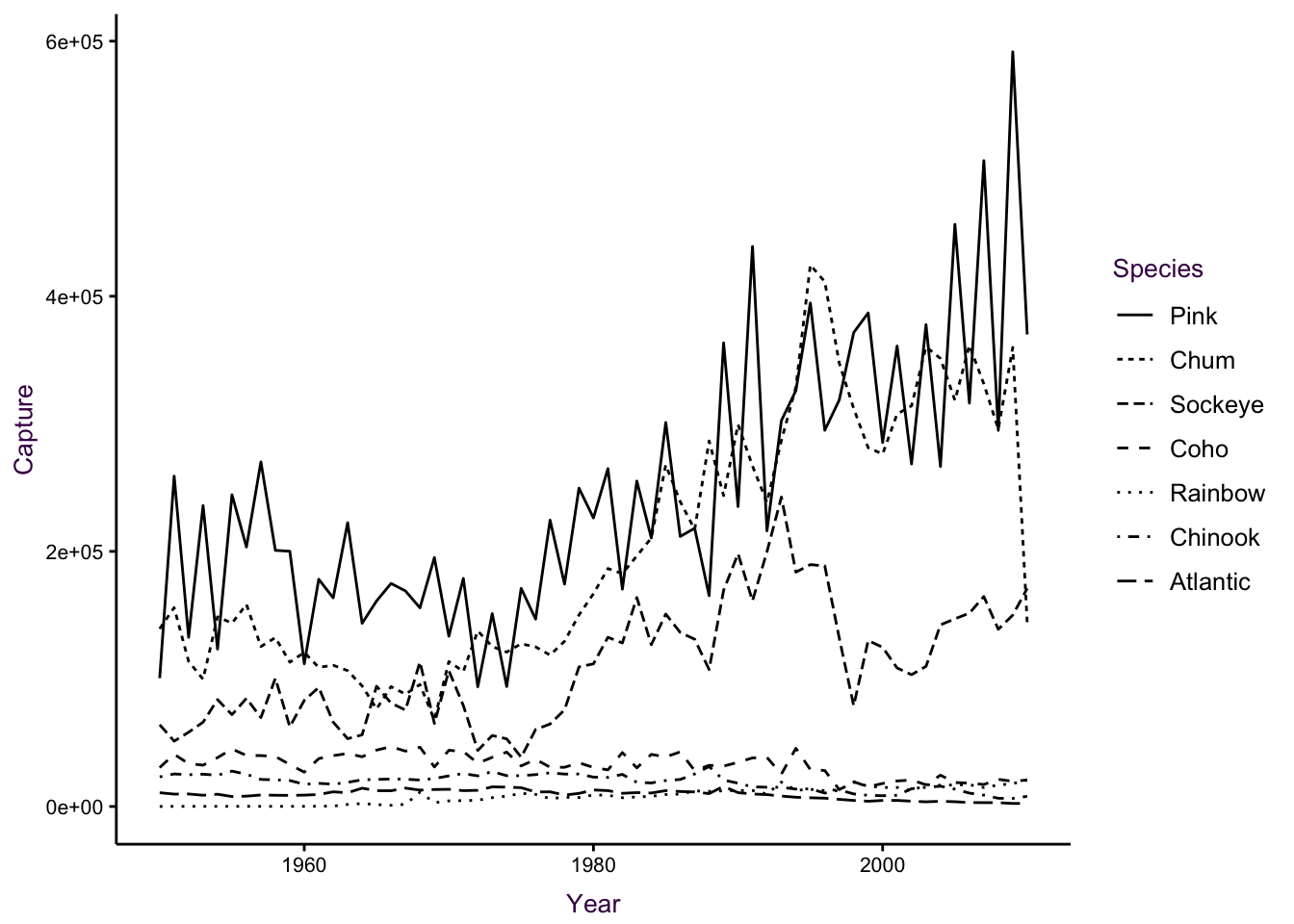
Figure 7.38: A time series of global Salmon capture. Left: Different line types are not easily distinguishable. Right: Colour is more suitable encoding option for the groups in this case.
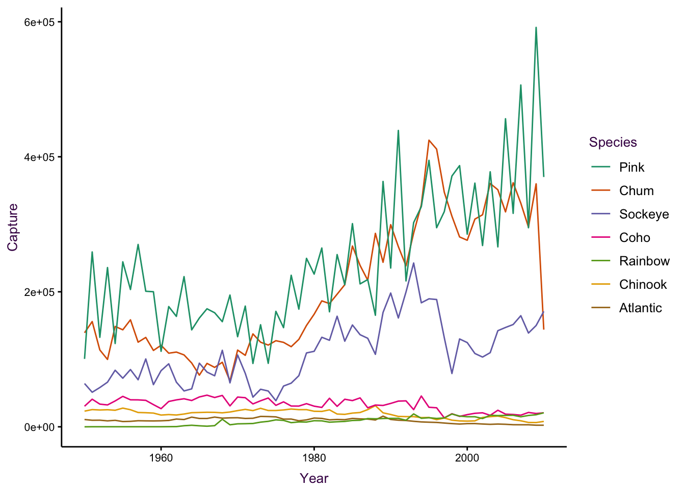
Figure 7.39: A time series of global Salmon capture. Left: Different line types are not easily distinguishable. Right: Colour is more suitable encoding option for the groups in this case.
7.7 An area plot:
In figure XX we saw how various standardization methods influence our perception of the data, i.e. the message we communicate. We also saw in section XX that It’s typical to see time series with lines, which are positioned exactly where the data specifies. consider this plot
This data was obtained from the drought monitor.
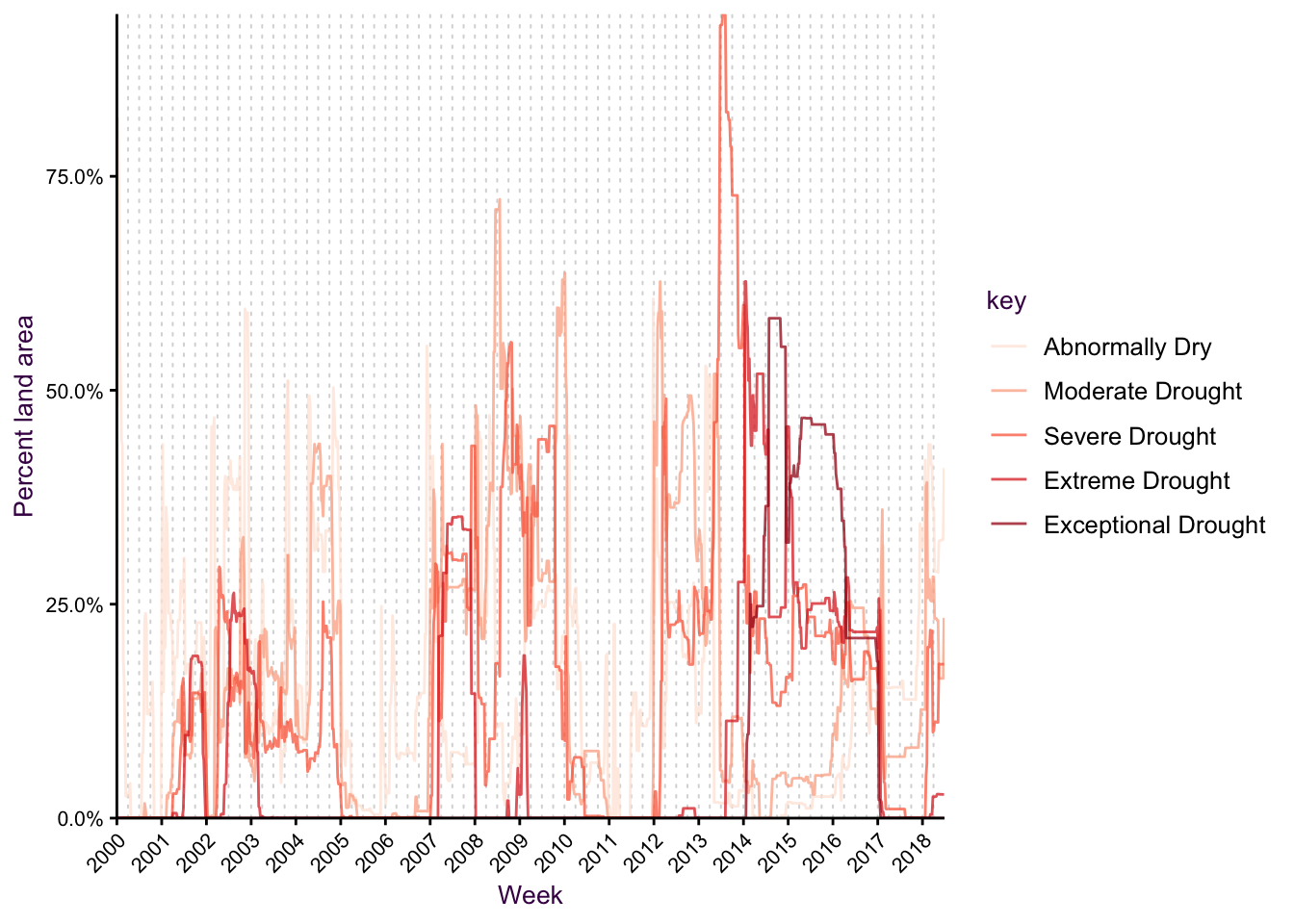
Figure 7.40: A time series. Ok, but somewhat confusing.
Use area under the line and/or stacking when appropriate
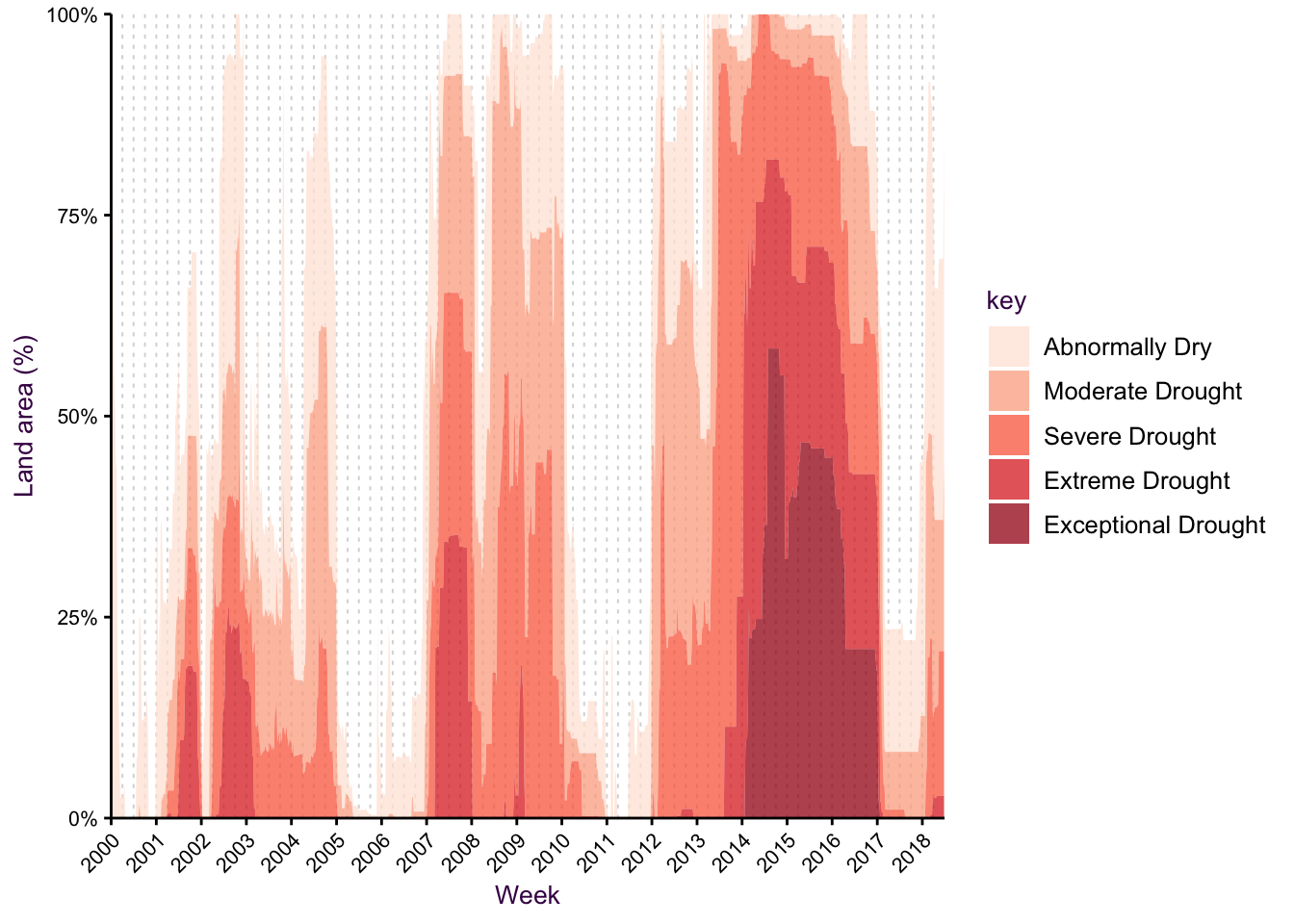
Figure 7.41: A time series as a stacked area chart.
Use horizon plot to compress large ranges
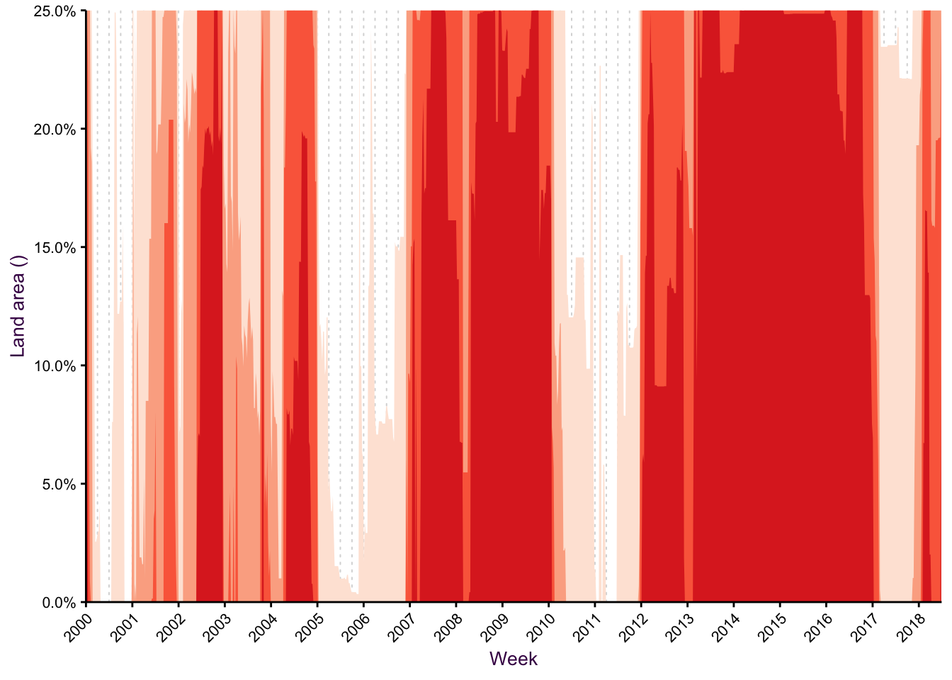
Figure 7.42: A horizon plot
7.8 Paths instead of lines
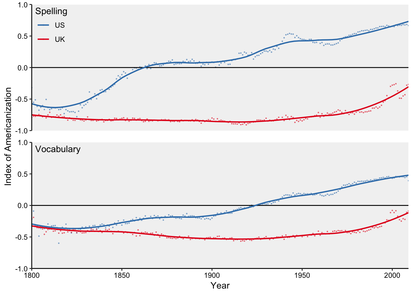
Figure 7.43: Four time series in two facets.
An alternative would be to position the two axes as such:
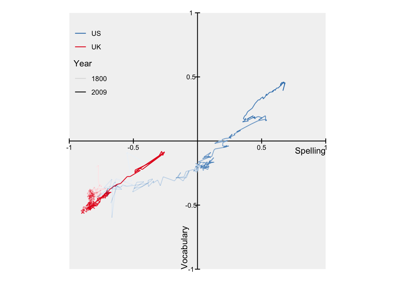
Figure 7.44: Two times series on Two axes with a path geometry.
7.9 Multiple timelines
This series of examples come from “A few simple steps to improve the description of group results in neuroscience” by Guillaume A. Rousselet, John J. Foxe and J. Paul Bolam. In this example, from xxx, patients were subjected to…
Plotting only the for each stimulus is informative, but lacking, in that we would like to know about either the spread of the data or the reliability of the estimate. Here, we opt for the 95 percent CI. In addition, the real interesting part of this experiment is at what point to the responses from the two stimuli differen enough so that we can reject the null hypothesis in a t-text. the rug below the two lines uses alpha blending to indicate where we have very low p-values.
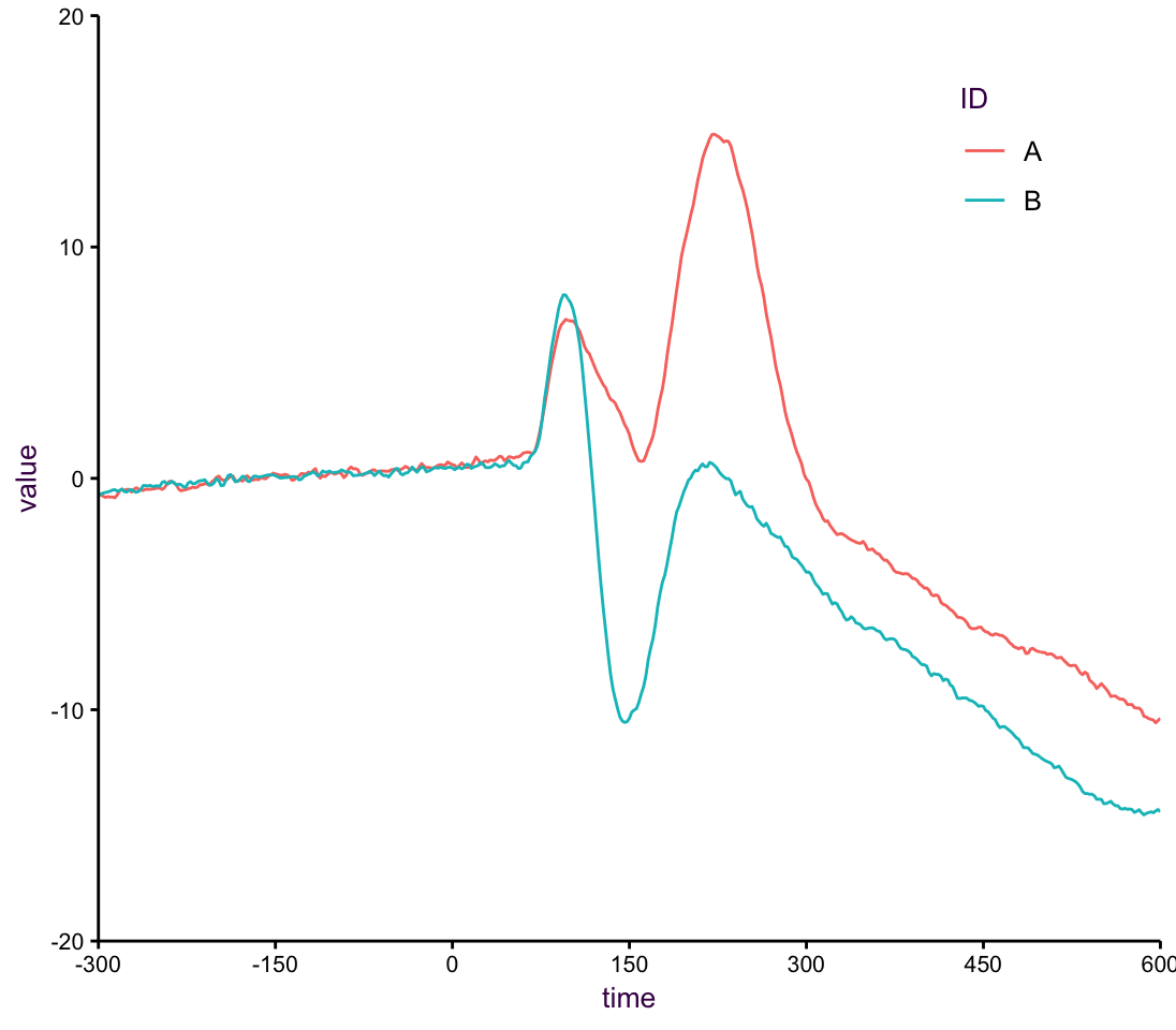
Figure 7.45: A line plot of means.
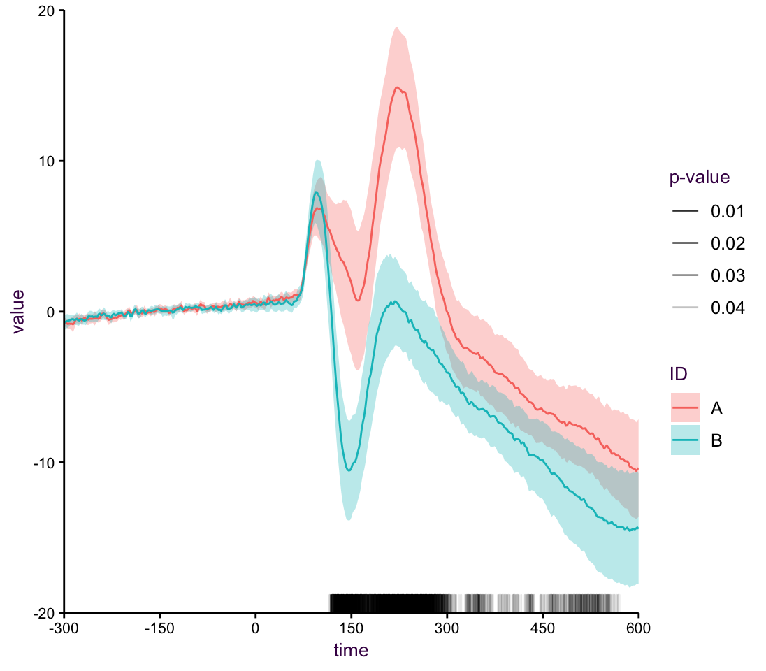
Figure 7.46: A line plot with rug.
As an extension of this we may want to plot all the individual trend, or in this case the difference between stsimuli responses per patient. The mean of all the trend lines is what’s important, but it’s nice to see all the raw data in the background. Here a line plot showing the differences with the average overlayed
Now, if we wanted to see the difference we can just plot that, instead of making the viewer do the extra work.
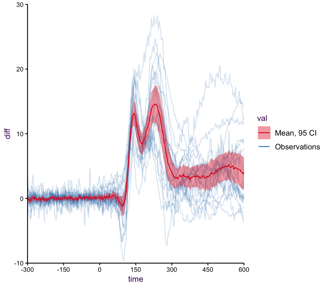
Figure 7.47: A line plot with mean.
Having many trent lines in this regard lends itself well to being a heatmap. Here I have used the viridis colour scale to emphasis the peak values.
If we have this many time series, which are inherently quite noise, it doesn’t really make sense to show them in one big plot. An alternative would be a heat map. Although mostly frowned upon, here it works really well, in particular with the viridis color palette, since we see a really nice clear pattern.
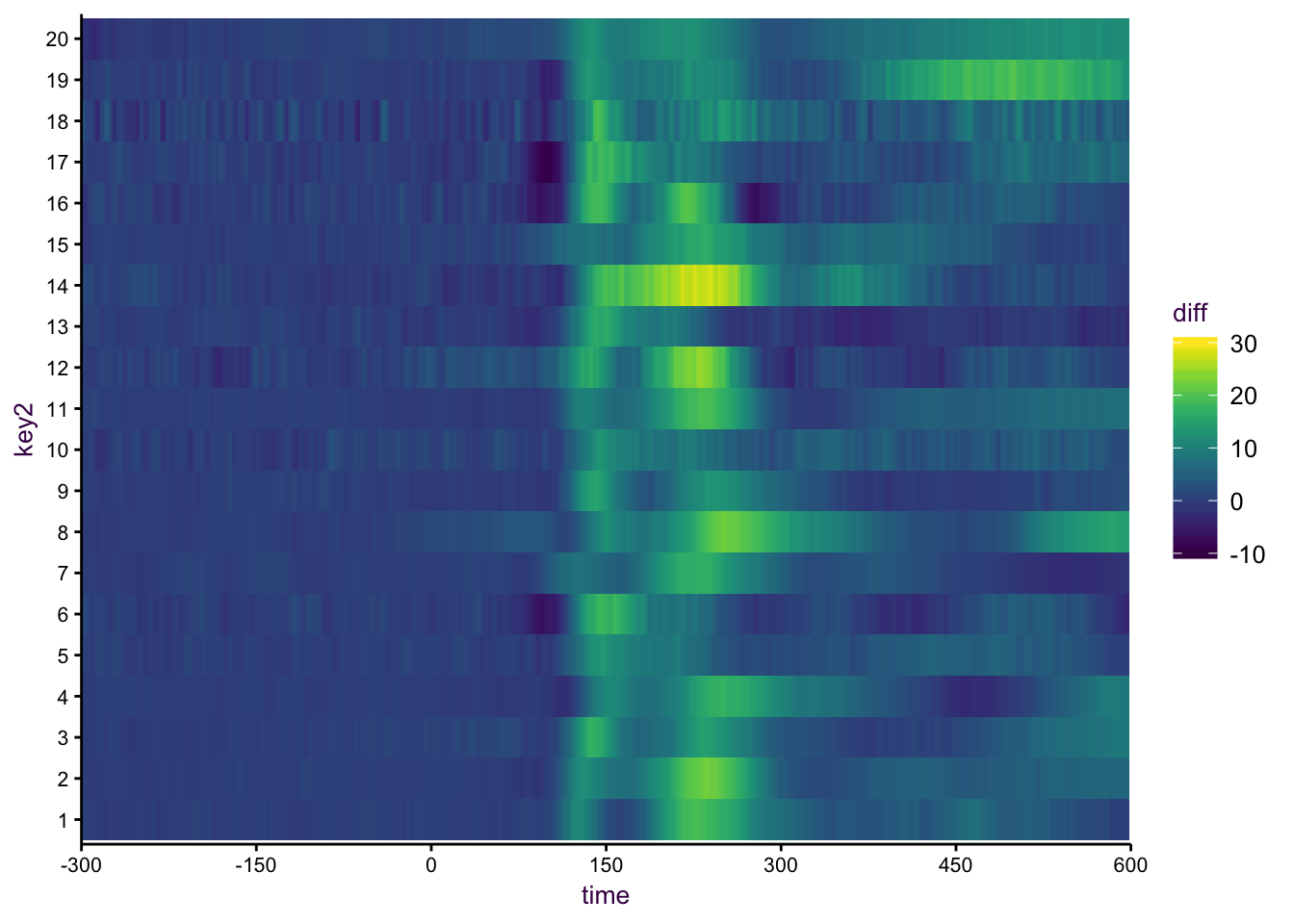
Figure 7.48: A heatmap.
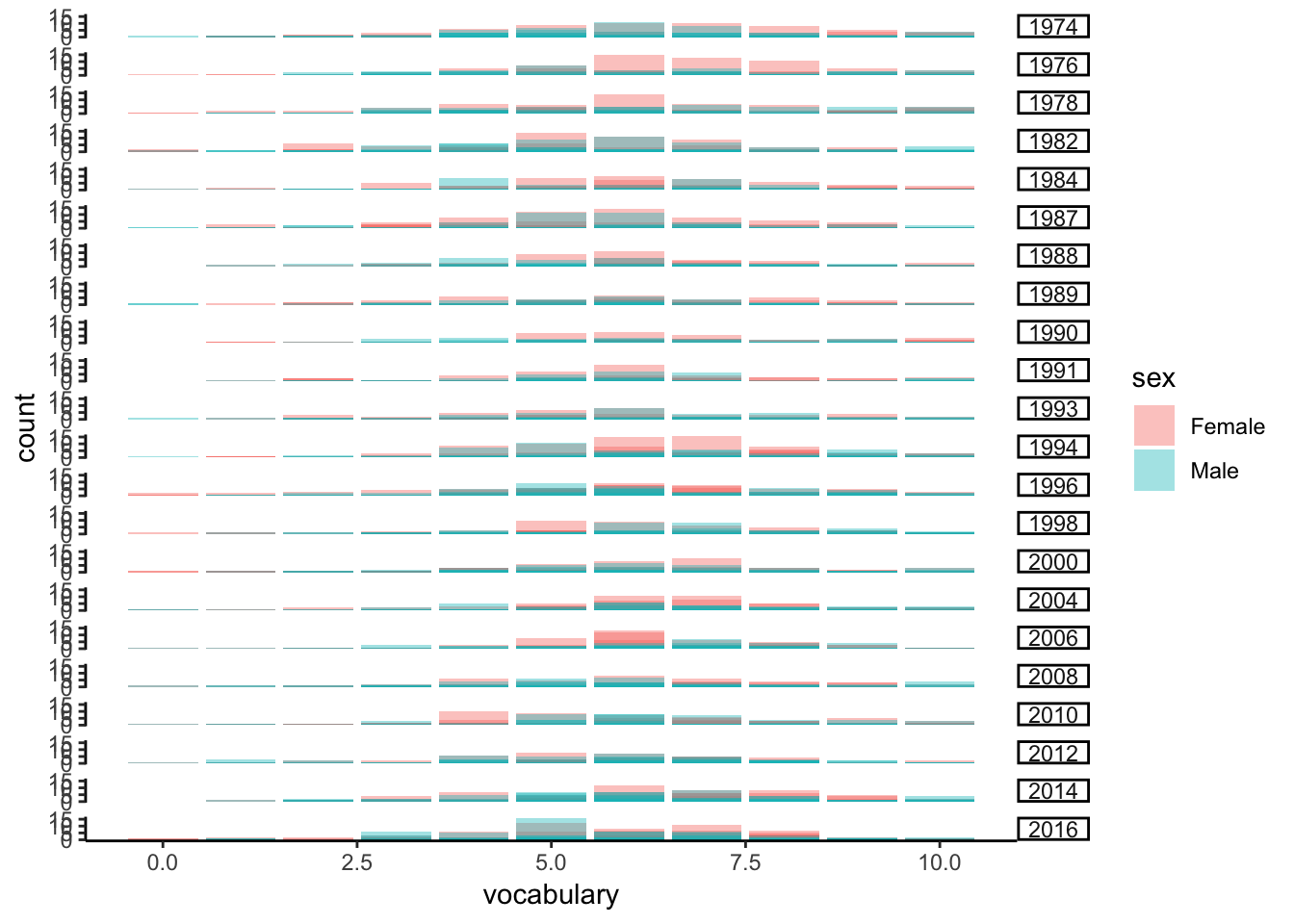
7.9.1 A nice example of small multiple with line plots
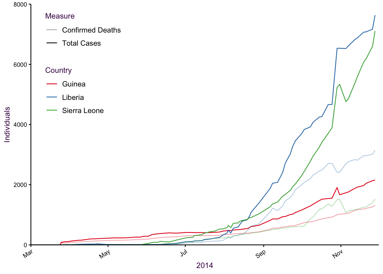
Figure 7.49: Six lines and three colours is difficult to interpret.
Small multiples is a better way to go:
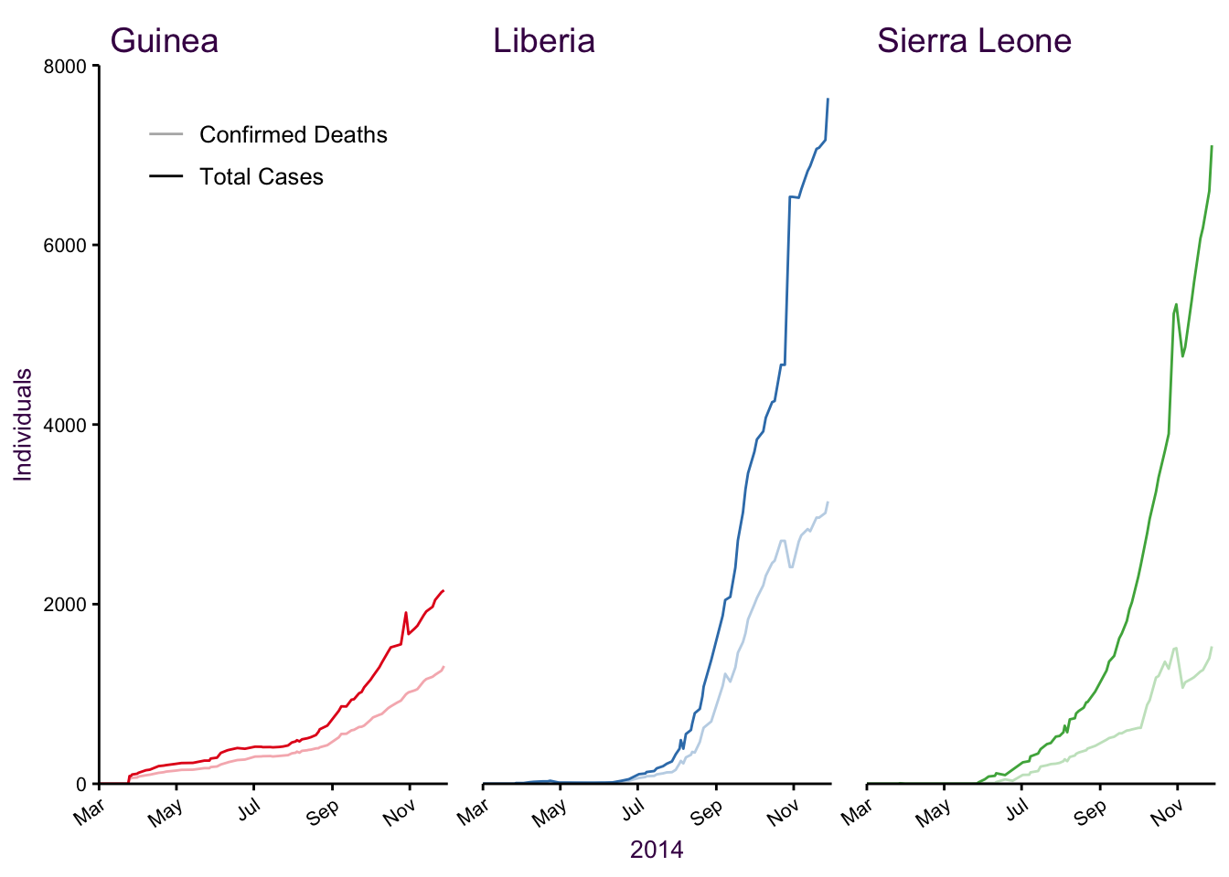
Figure 7.50: Small multiples.
Putting the 2014 epidemic into context, we can appreciate how much worse they were compared to previous outbreaks:
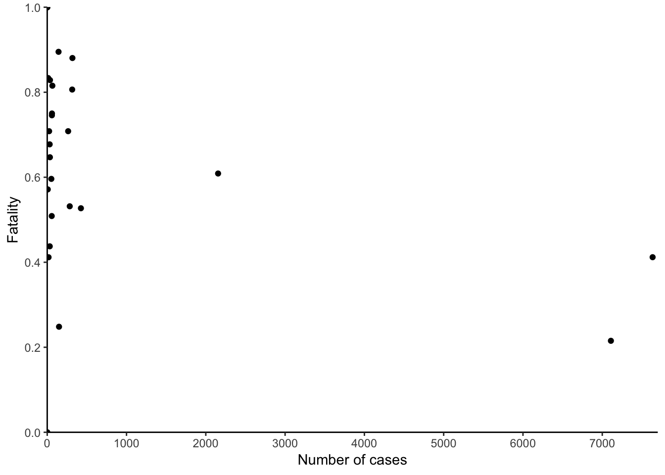
Figure 7.51: Historical context.
Similar to the americanization depications (see ref XXX) we can also plot a ratio plot of this data. In this cast the ratio, as a proportion of deadly cases, cannot exceed 1, so we can limit out plot to only the region of possibility.
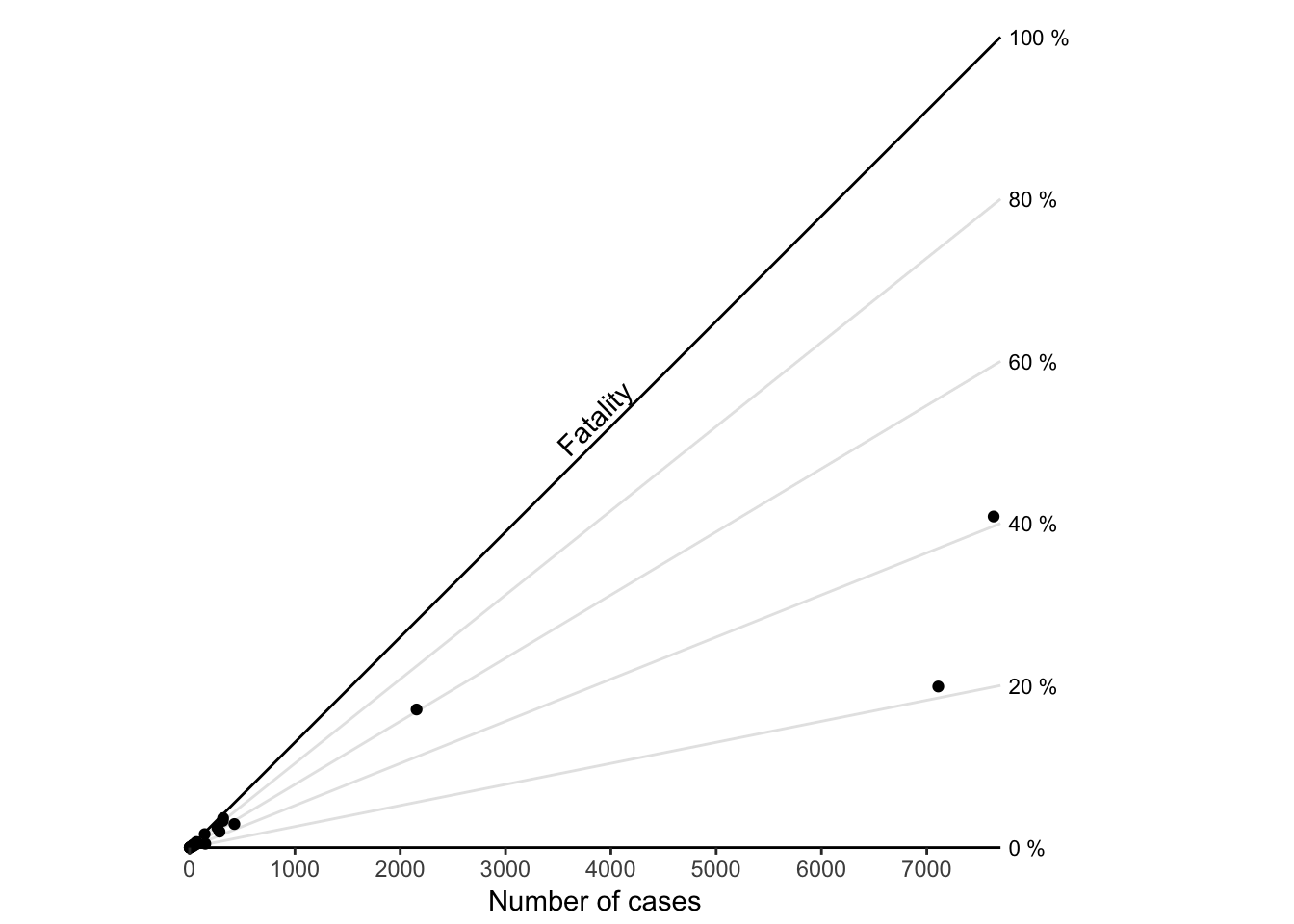
Figure 7.52: A ratio chart.
7.9.2 Comparing Distributions with Multiple Density Plots
We discussed density plots for describing the distribution of a single variable on page 6.2. Overlapping multiple density plots is an effective way of comparing multiple distributions. We will treat this as a solution to the deficiencies of plotting multiple histograms on page page 7.10.2.
7.9.3 time series with very different scales
This is another great example of how to deal with a difficult problem in scales. Here, the issue is that…
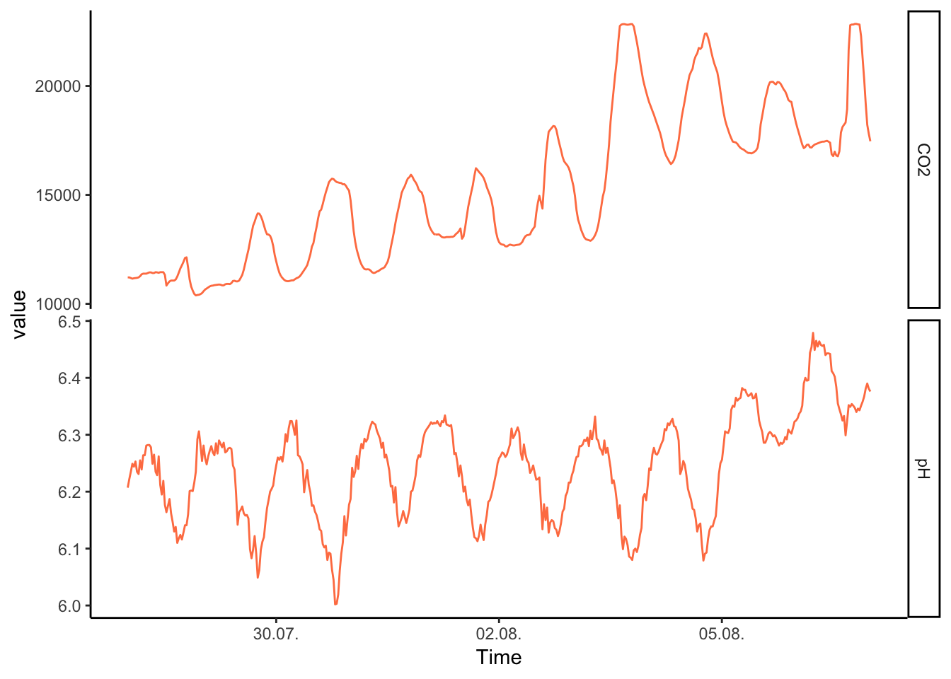
Figure 7.53: PH Fig 1
You may be tempted to make a double y axis – don’t do it!
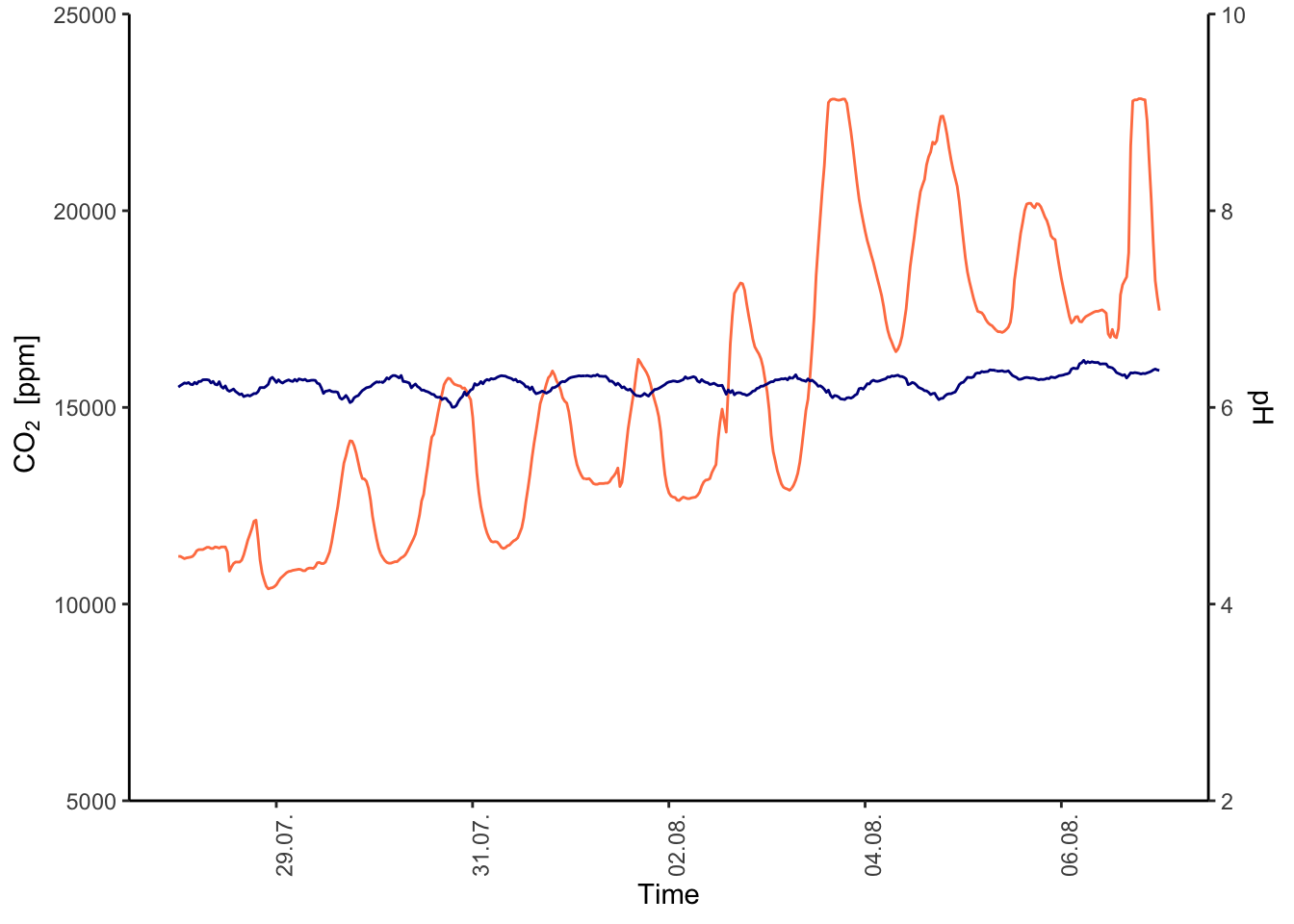
Figure 7.54: PH Fig 2
What are some alternatives? We can normalise the values to a standard range (min = 0, max = 1):
Figure 7.55: PH Fig 3
now we can try to facet again, it looks more interesting this time:
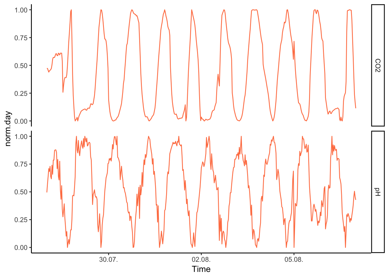
Figure 7.56: PH Fig 4
But of course, the advantage of having the two series on the same scale means that we can have them both on a single y axis:
Colour according to trend, this one I like, very clear trend here, not as fancy as the colours, above, but intuitive. You can also add grey rectangles in the backtround marking the days.
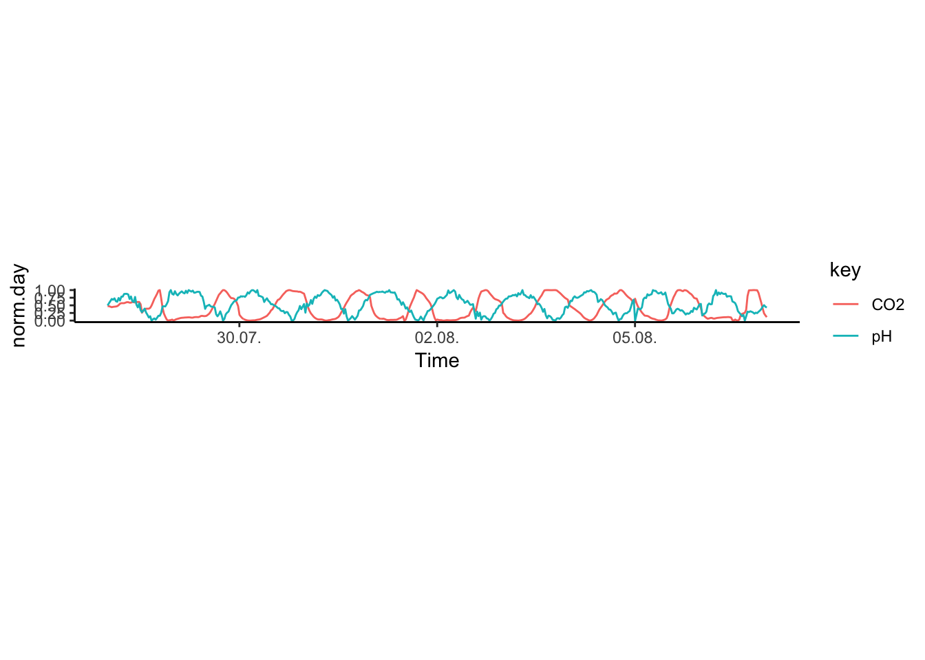
Figure 7.57: PH Fig 5
We can also break apart the larger series, and plot each day separately.
Figure 7.58: PH Fig 6
It’s pretty noise data, so we may want to add a smooth:
Figure 7.59: PH Fig 7
7.10 Bars
7.10.1 Comparisons of Categorical Variable Sub-groups
Bar charts are commonly used to compare absolute counts or distributions of several variables. Bar charts are appropriate for nominal variables, which are neither ordered nor quantitative, and ordinal variables, which are ordered but not quantitative.30
Interval variables can be represented with bar charts, but since they are ordered and quantitative, they can be treated more effectively with line plots than with bar charts.
There are several reasons why bar charts should be used only for the visualisation of absolute counts. In the bar chart below, the absolute number of samples in each sub-group of the eating habits categorical variable are depicted. The bar is an intuitive representation of this since its values are measured as a growth above the origin to a fixed point.
Ranking plots provide a simple extension of the nominal comparison. Begin by thinking about what values you want to emphasize. This will usually be the most or least abundant observation. Next, arrange the nominal scale data accordingly, using dots or bars. This modification can greatly aid the reader in following your line of thought and conveying an inherent order to otherwise unordered categories. Keep in mind that you should be consistent in your ordering of nominal categories throughout a paper or presentation.
Figure 7.60: A bar chart representing the absolute count of observations in each category of eating behaviour.
Use bar charts to compare absolute counts, but not distributions
We do not recommend using bar charts to depict distributions. This is primarily because the actual data is masked, making it very difficult to discern the distribution of underlying data points. Consider the alternative plots below, where each individual point is displayed.

Figure 7.61: Jittered points are a reasonable alternative to bar plots for depicting the distribution of a data set, in this case the total sleep time according to eating behaviour. First plot: Individual observations plotted as a dot plot reveal the entire data set’s distribution. Second plot: A bar chart showing only the mean and SD masks the underlying distribution. Third plot: A simplified dot plot for mean and SD is an improvement, but still obscures the underlying data. Fourth plot: Overlaying the individual data points with the mean and SD provide both the distribution and descriptive statistics.
Figure 7.62: Jittered points are a reasonable alternative to bar plots for depicting the distribution of a data set, in this case the total sleep time according to eating behaviour. First plot: Individual observations plotted as a dot plot reveal the entire data set’s distribution. Second plot: A bar chart showing only the mean and SD masks the underlying distribution. Third plot: A simplified dot plot for mean and SD is an improvement, but still obscures the underlying data. Fourth plot: Overlaying the individual data points with the mean and SD provide both the distribution and descriptive statistics.
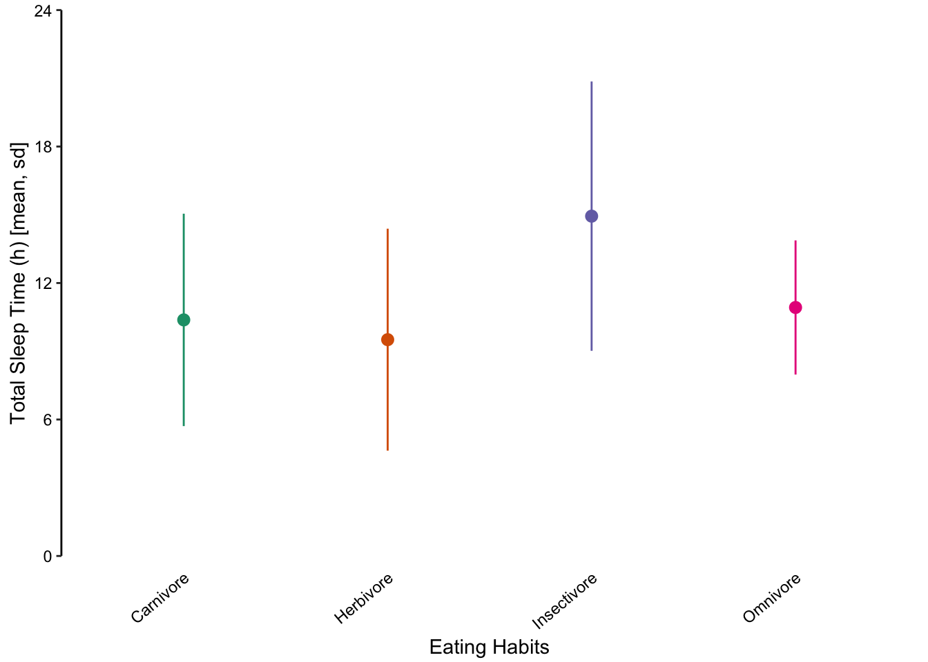
Figure 7.63: Jittered points are a reasonable alternative to bar plots for depicting the distribution of a data set, in this case the total sleep time according to eating behaviour. First plot: Individual observations plotted as a dot plot reveal the entire data set’s distribution. Second plot: A bar chart showing only the mean and SD masks the underlying distribution. Third plot: A simplified dot plot for mean and SD is an improvement, but still obscures the underlying data. Fourth plot: Overlaying the individual data points with the mean and SD provide both the distribution and descriptive statistics.
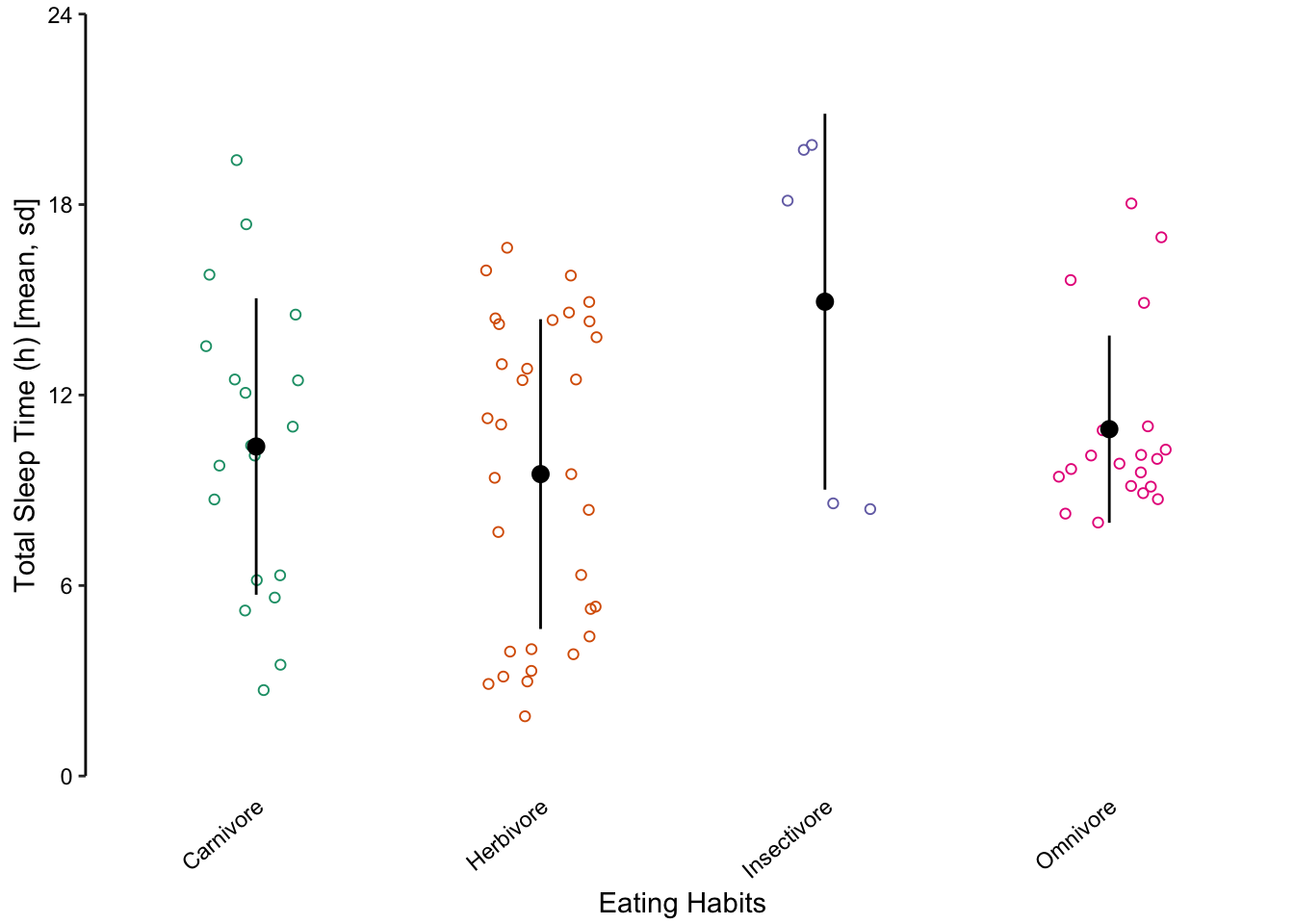
Figure 7.64: Jittered points are a reasonable alternative to bar plots for depicting the distribution of a data set, in this case the total sleep time according to eating behaviour. First plot: Individual observations plotted as a dot plot reveal the entire data set’s distribution. Second plot: A bar chart showing only the mean and SD masks the underlying distribution. Third plot: A simplified dot plot for mean and SD is an improvement, but still obscures the underlying data. Fourth plot: Overlaying the individual data points with the mean and SD provide both the distribution and descriptive statistics.
7.10.2 Comparing Distributions with Multiple Histograms
Returning to the mammalian total sleep time data set, we will consider how to depict multiple distributions with histograms and density plots. Figure ?? displays four sub-categories of mammals according to their eating behaviour. Their distributions are presented using four varieties of multiple histograms and two varieties of density plots:
Stacked histograms where each bin is vertically stacked (Figure ??, top-left).
Proportional stacked histograms where the height of each bin is 1 (Figure ??, top-middle).
Dodged histograms where all histograms are interleaved (Figure ??, top-right).
Frequency polygon where each histogram is presented as an outline instead of bars (Figure ??, bottom-left).
Overlapping density plot where overlapping lines depict the density estimation (Figure ??, bottom-middle).
Overlapping density area plot where overlapping transparent areas depict the density estimation (Figure ??, bottom-right).
None of the histogram varieties allow the reader to see the underlying distribution of each group plotted. This is in contrast to overlapping density plots, which allow easy decoding of the underlying distributions. In particular the area-shaded density plot does an effective job of allowing the reader to distinguish between the four groups.
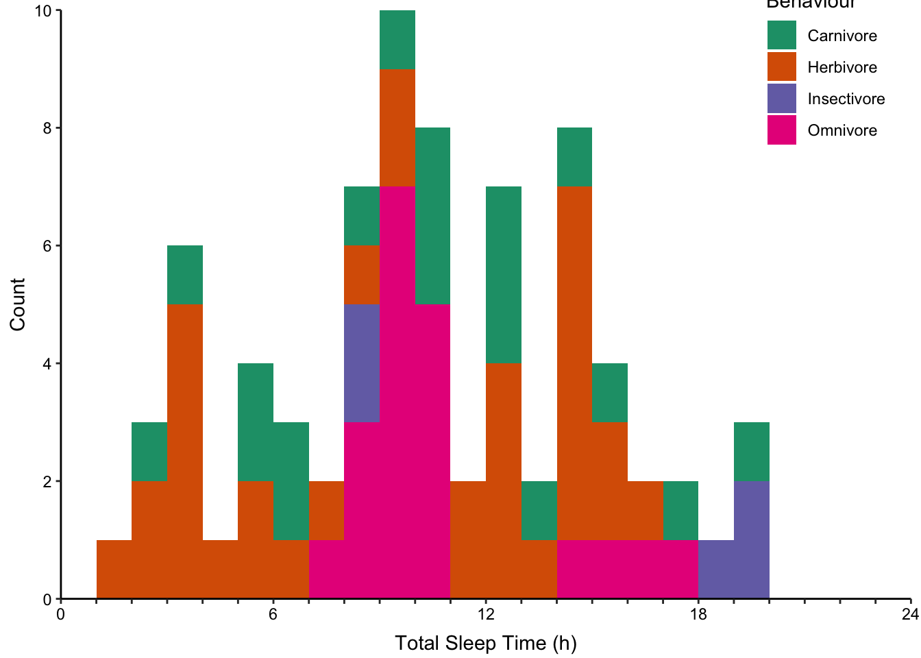
Figure 7.65: Plotting the distribution of four sub-groups using four varieties of histograms and two varieties of density plots. Top: stacked, proportional and dodged histograms. Bottom: Frequency polygon, density outline and density area plots.
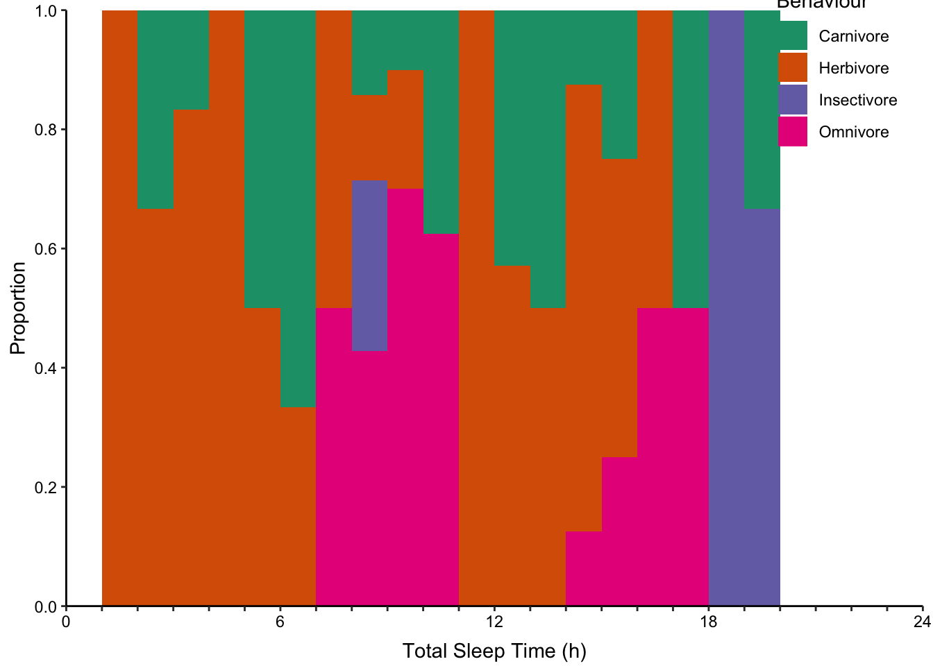
Figure 7.66: Plotting the distribution of four sub-groups using four varieties of histograms and two varieties of density plots. Top: stacked, proportional and dodged histograms. Bottom: Frequency polygon, density outline and density area plots.
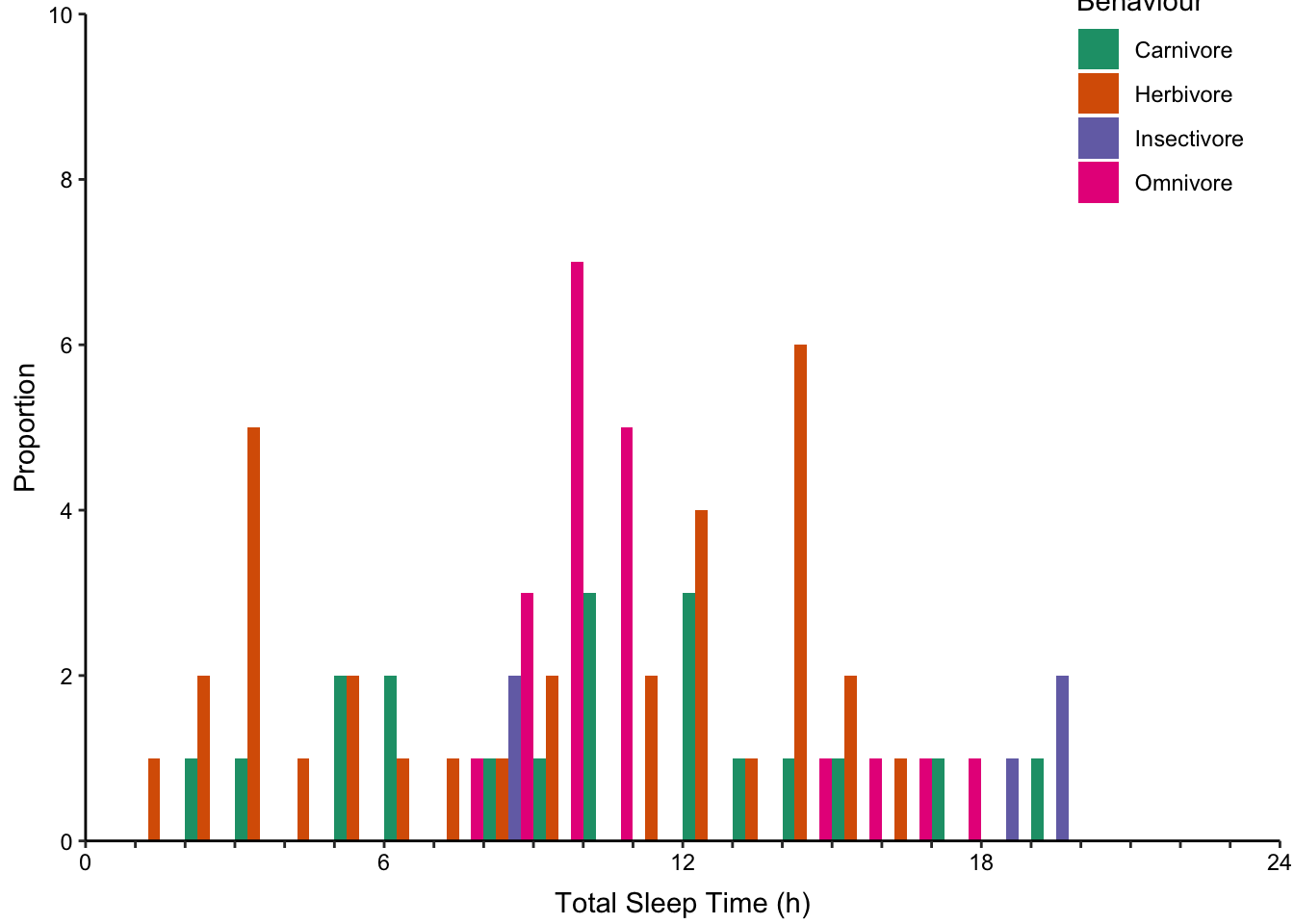
Figure 7.67: Plotting the distribution of four sub-groups using four varieties of histograms and two varieties of density plots. Top: stacked, proportional and dodged histograms. Bottom: Frequency polygon, density outline and density area plots.
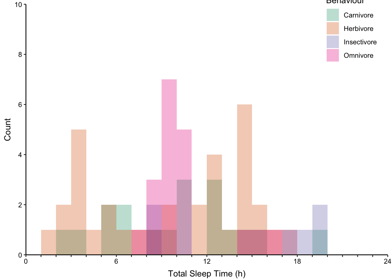
Figure 7.68: Plotting the distribution of four sub-groups using four varieties of histograms and two varieties of density plots. Top: stacked, proportional and dodged histograms. Bottom: Frequency polygon, density outline and density area plots.
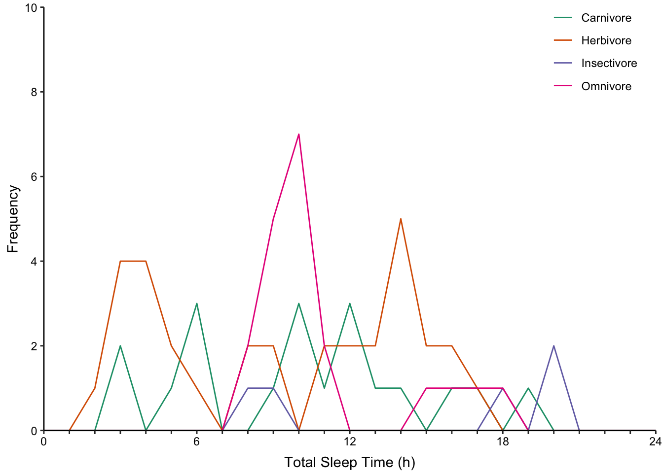
Figure 7.69: Plotting the distribution of four sub-groups using four varieties of histograms and two varieties of density plots. Top: stacked, proportional and dodged histograms. Bottom: Frequency polygon, density outline and density area plots.
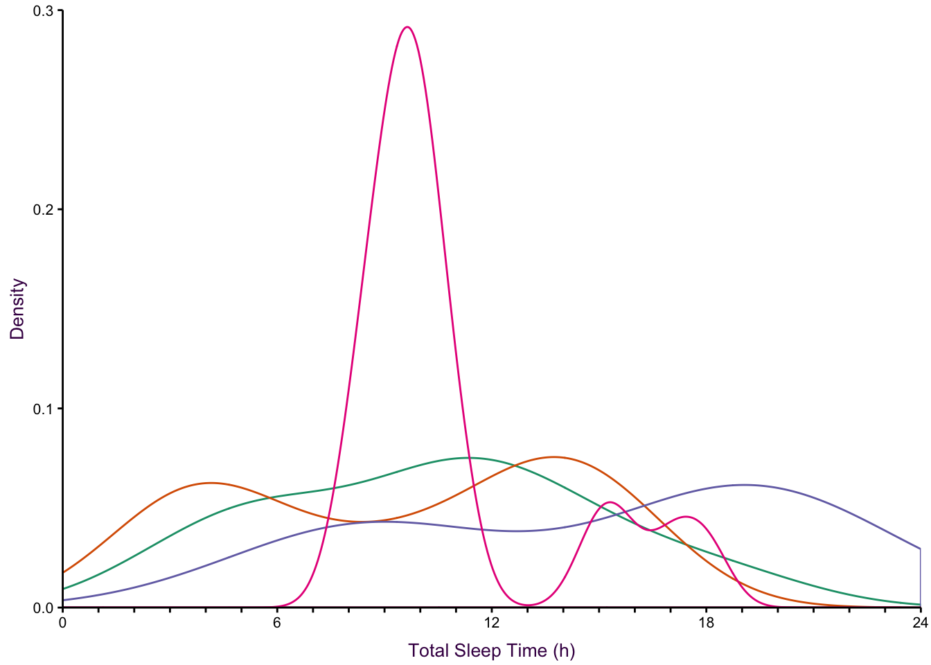
Figure 7.70: Plotting the distribution of four sub-groups using four varieties of histograms and two varieties of density plots. Top: stacked, proportional and dodged histograms. Bottom: Frequency polygon, density outline and density area plots.
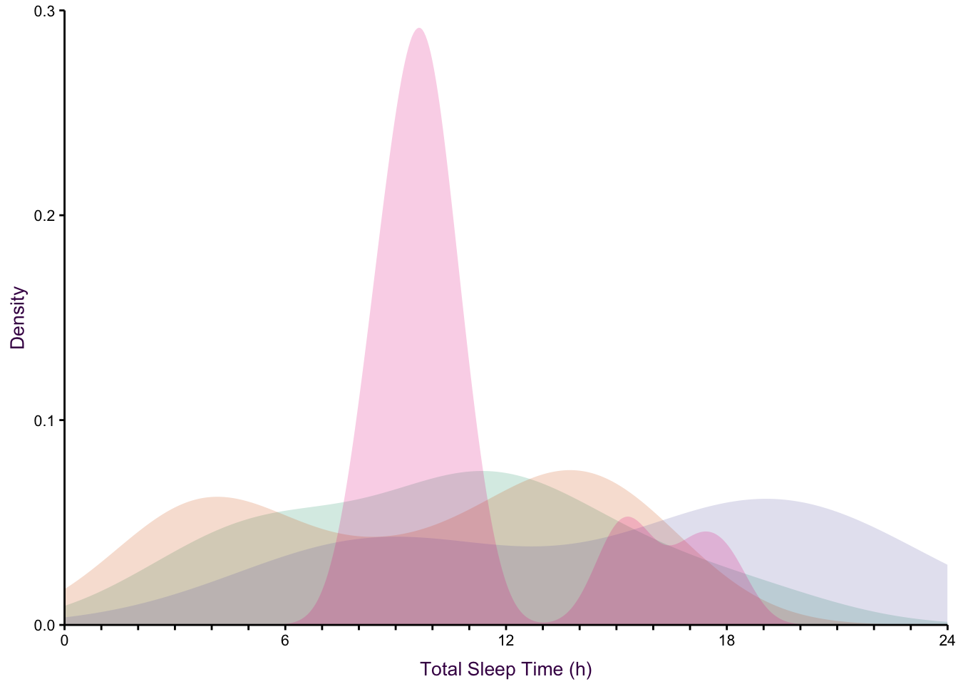
Figure 7.71: Plotting the distribution of four sub-groups using four varieties of histograms and two varieties of density plots. Top: stacked, proportional and dodged histograms. Bottom: Frequency polygon, density outline and density area plots.
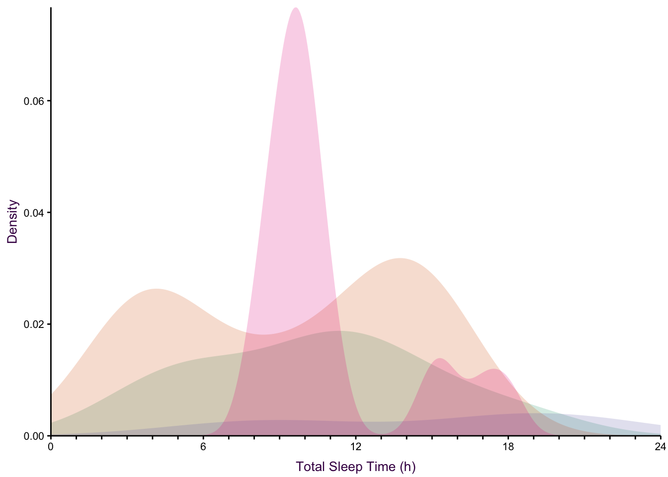
Figure 7.72: Plotting the distribution of four sub-groups using four varieties of histograms and two varieties of density plots. Top: stacked, proportional and dodged histograms. Bottom: Frequency polygon, density outline and density area plots.
7.11 Boxes
Use multiple box plots to compare medians and IQRs of several variables
Returning to the mammalian sleep data set, we can also represent the distribution of total sleep times using multiple box plots. The advantage here is that extreme values are highlighted as points. However, the irregular distributions of the insectivore and omnivore groups are masked, similar to bar plots.

Figure 7.73: Comparing multiple box plots as an alternative to bar plots. In the last plot, the width of the box is proportional to the sample size.
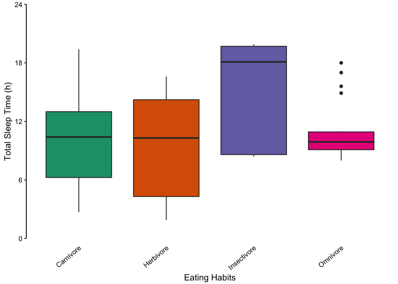
Figure 7.74: Comparing multiple box plots as an alternative to bar plots. In the last plot, the width of the box is proportional to the sample size.
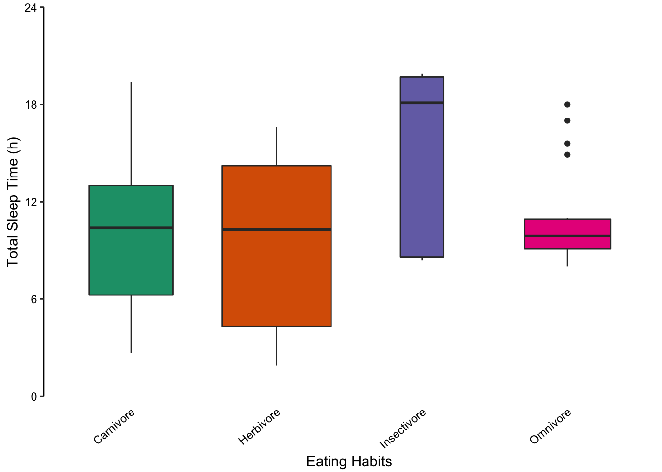
Figure 7.75: Comparing multiple box plots as an alternative to bar plots. In the last plot, the width of the box is proportional to the sample size.
Here’s another example of box plots:
Figure 7.76: Jenia’s example.
Figure 7.77: Jenia’s example, a better box plot.
or use points:
Figure 7.78: Jenia’s example, a better box plot.
Try colouring in the background to represent the different variables
Figure 7.79: Jenia’s example, a better box plot.
7.12 Area
7.12.1 Violin Plots
Use violin plots to compare unusual distributions of multiple variables
Violin plots are a useful method for comparing distributions of several categories. In this case, a mirrored, vertical density plot is used to create a symmetrical shape representing the underlying data’s distribution. Violin plots are particularly useful for representing non-normally distributed data sets which are inadequately described by the mean and standard deviation.
To get an idea of how this works, let’s take a look at how random numbers fitting to different distributions look. We will use bimodal, normally and uniform distributed data.
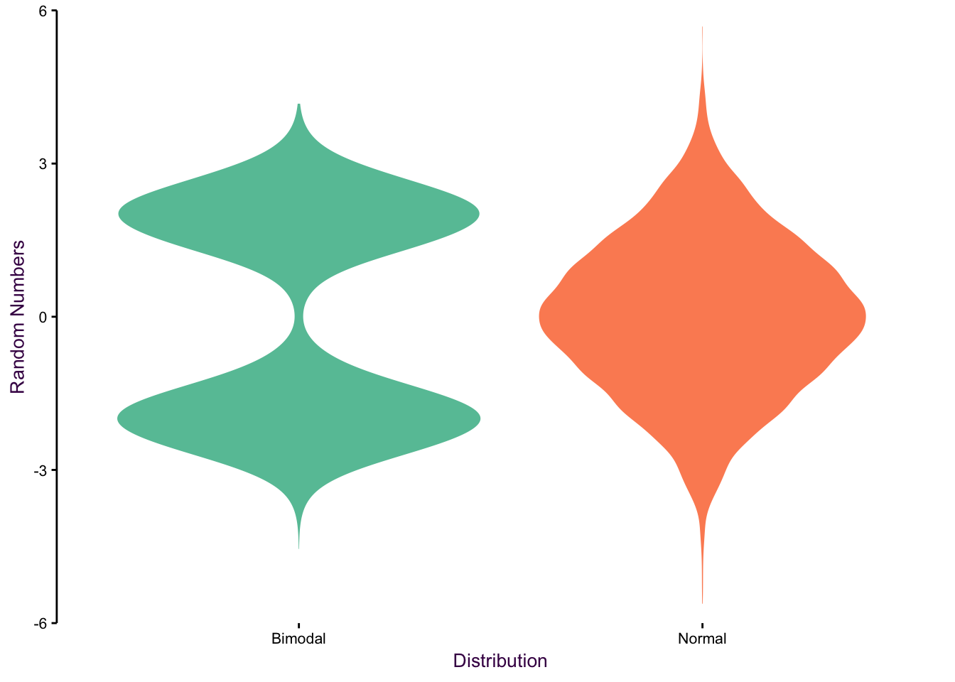
Figure 7.80: Violin plots of bimodal, uniform and normal distributions.
Since the distribution of total sleep time is not normally distributed, we concluded that bar or dot charts showing the mean and standard deviation are poor visualisation choices. Violin plots are a good alternative. In the figure below, we present each sub-group’s individual data points (left) and the corresponding violin plot.
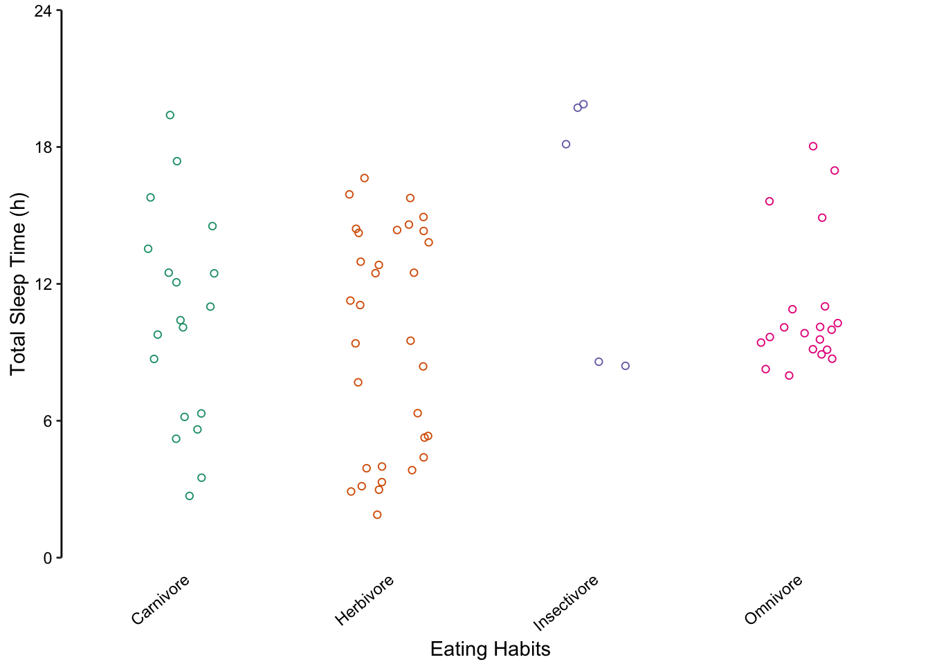
Figure 7.81: violin plots offer another alternative to bar charts for showing unusual distributions.
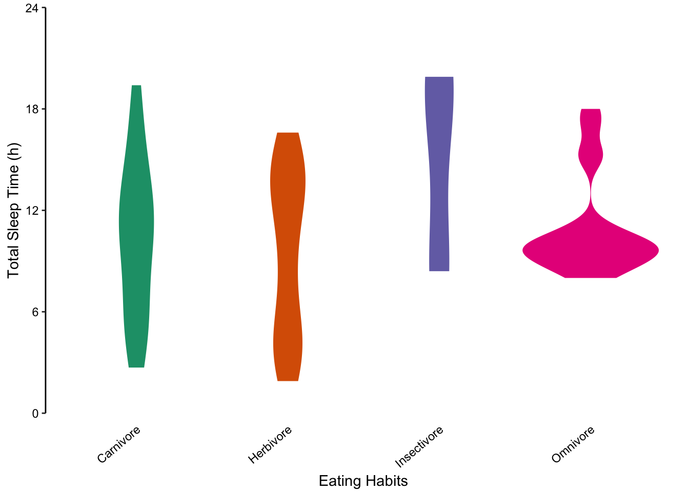
Figure 7.82: violin plots offer another alternative to bar charts for showing unusual distributions.
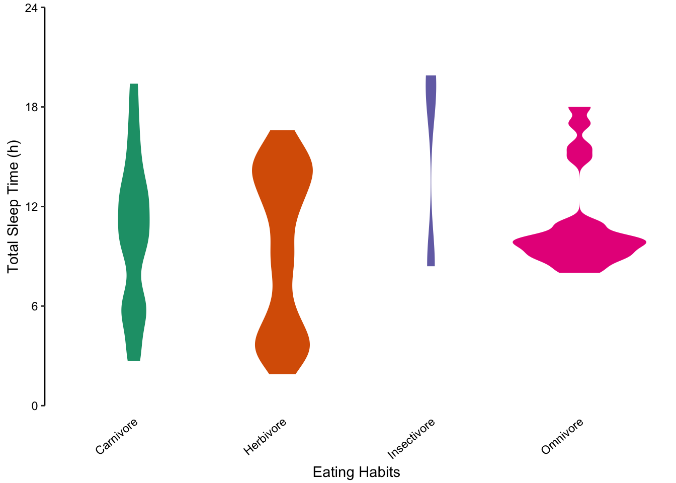
Figure 7.83: violin plots offer another alternative to bar charts for showing unusual distributions.
7.12.2 ridges
Here’s another great use case for density plots:
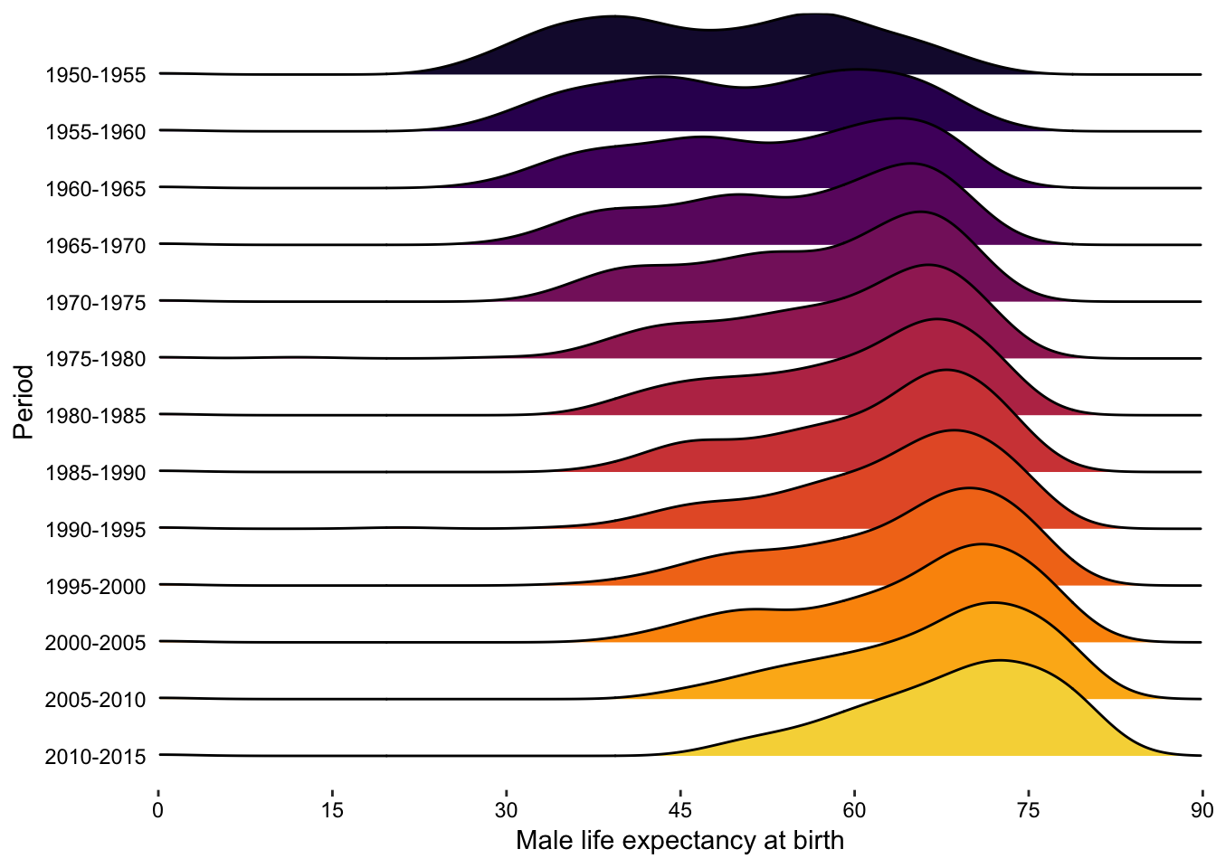
Figure 7.84: violin plots offer another alternative to bar charts for showing unusual distributions.
7.12.3 Showing parts-of-a-whole using Pie Charts and Stacked Bar Charts
Scientists are often interested in what proportion of a categorical variable is represented by each sub-group, that is, parts-of-a-whole.31 The implicit question is if any sub-groups are over- or under-represented.
As an example, we will consider the results for a survey of male and female hair and eye colour. We want to uncover and represent any biases in the data set which may reveal previously unappreciated associations between the three variables: sex, hair colour and eye colour.
As we have seen, bar charts are usually the first choice for nominal comparisons (fig. 7.60). However, the major deficiency here is that we are presenting the absolute values, when we are really interested in the parts-of-a-whole distribution. Bar charts don’t reveal any interesting trends, such as over- or under-representation without a large time investment from the reader.
As an alternative to the bar chart, pie charts and stacked bar charts are commonly used for representing parts-of-a-whole. Unfortunately, they both have major drawbacks in visual perception and don’t excel at communicating an effective story. Here we will show how this data is presented and provide a solution using mosaic plots in the next sub-section.
Use pie charts and stacked bar charts with caution
Pie charts are particularly appealing for representing parts-of-a-whole data sets since they intuitively tell the reader that all parts add up to 100%. In addition, the sample size can be encoded in the radius of the circle (fig. ??). The major disadvantage of pie charts is that they encode values using slice area, arc length or angle at centre, all of which are fairly inaccurate methods of encoding quantitative information (see fig. 4.7).
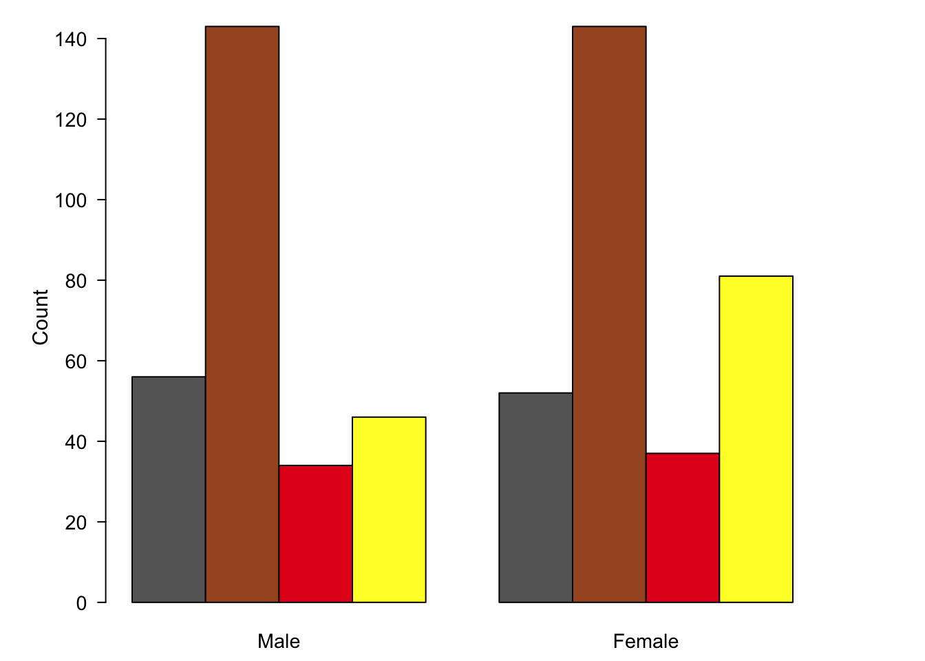
Figure 7.85: Bar charts and pie charts are poor choices for representing part-of-a-whole data sets.
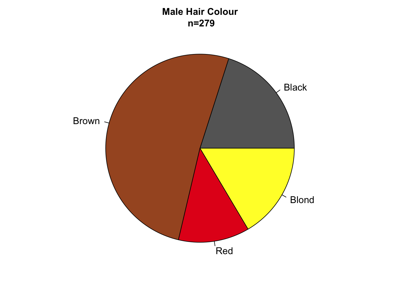
Figure 7.86: Bar charts and pie charts are poor choices for representing part-of-a-whole data sets.
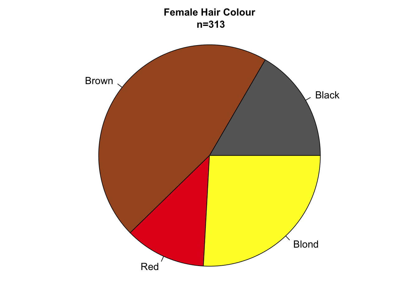
Figure 7.87: Bar charts and pie charts are poor choices for representing part-of-a-whole data sets.
Stacked bar charts, plotted on a relative scale, depict the relative proportions of each sub-group in a categorical variable (fig. ??). This provides a common scale of relative abundances. Similar to the radius of pie charts, we can encode the sample size in the width of each bar.
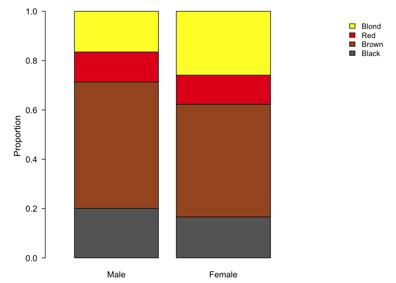
Figure 7.88: Stacked bar plots are an alternative to pie charts, but also suffer from visual perception problems such as un-aligned scales.
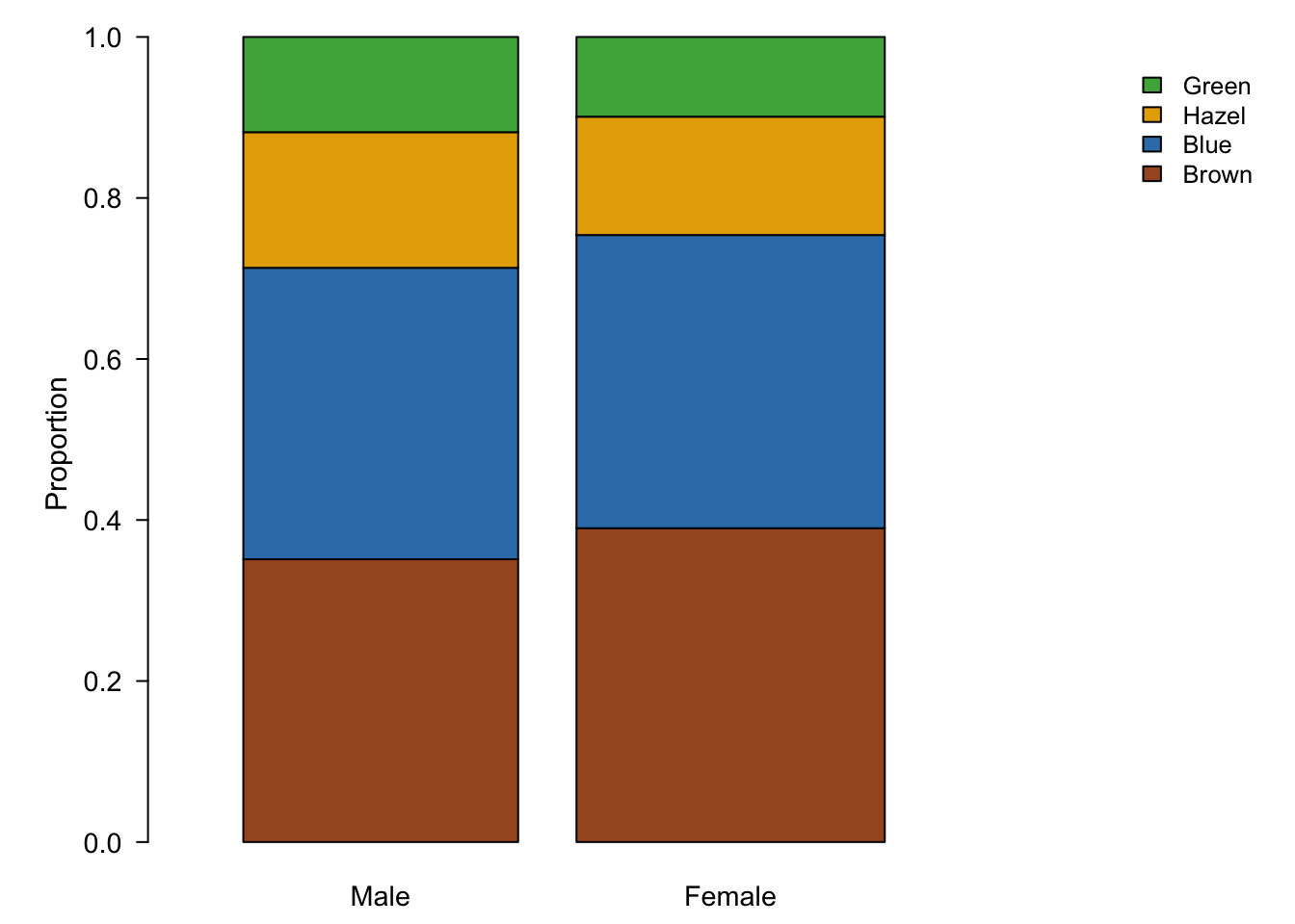
Figure 7.89: Stacked bar plots are an alternative to pie charts, but also suffer from visual perception problems such as un-aligned scales.
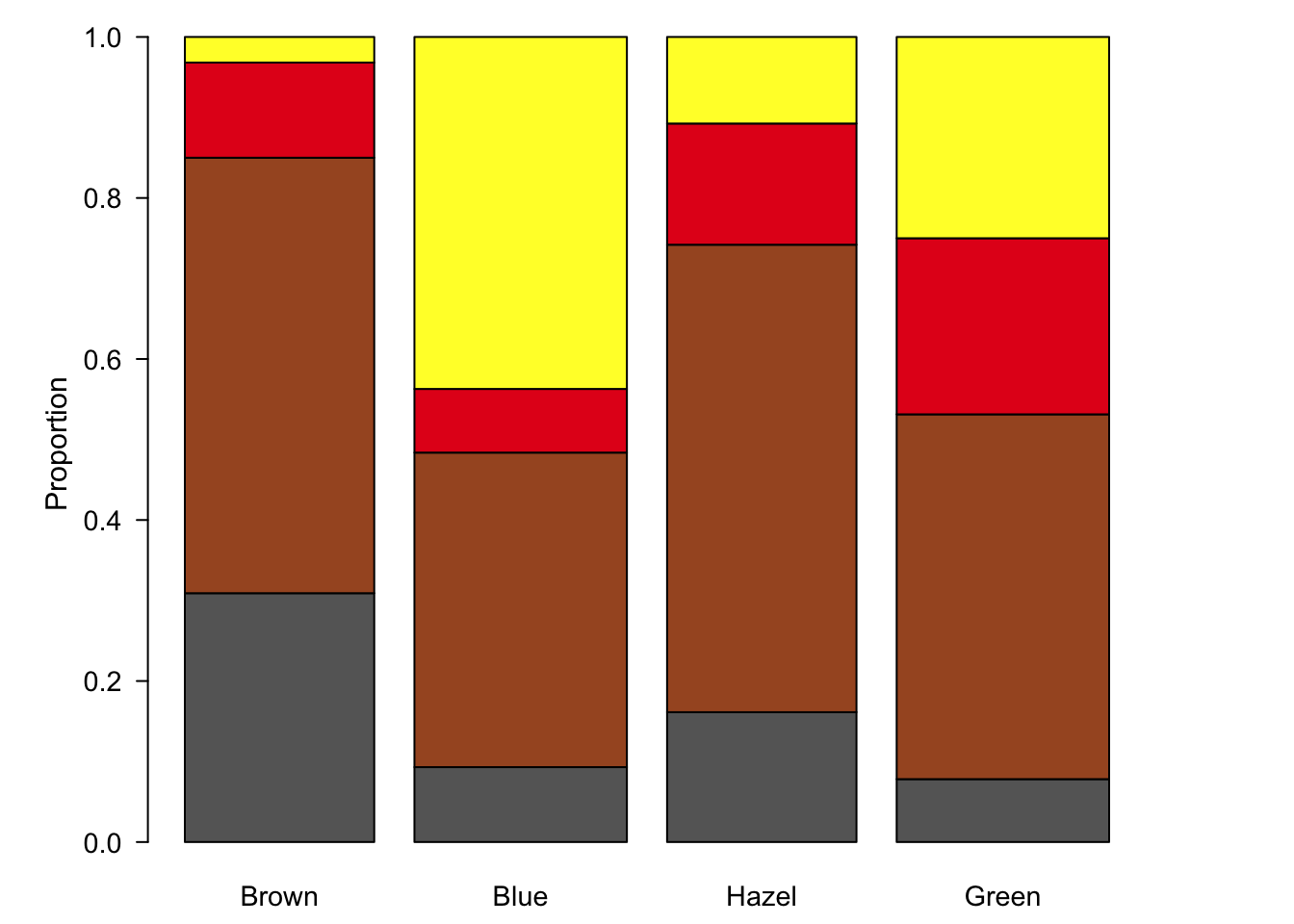
Figure 7.90: Stacked bar plots are an alternative to pie charts, but also suffer from visual perception problems such as un-aligned scales.
Stacked bar charts are an improvement over the pie charts since at least some of the sub-groups are plotted on a common scale. However, since we have four categories, only the two at the bottom and top of the bar chart benefit from this feature. In figure ?? we have plotted the three variables as three pair-wise plots. Although all our data is visualised, these plots fail to really tell a story, we still don’t know which sub-groups are over- or under-represented and the relationship between hair and eye colour is not displayed, a third plot would be required for that.
7.12.4 Comparing two or more Categorical Variables using Mosaic Plots
Mosaic plots are an excellent alternative to stacked bar plots. The major difference here is that we are essentially representing our data as a contingency table. Each sub-group is presented as a box (hence mosaic plot) with area proportional to sample size. Notably, scales are absent. Relying on area rather than a common scale is one of the major disadvantage of pie charts, but as we have seen, even stacked bar charts don’t adequately solve this problem. In short, we are forced to encode proportions as areas, where calculating the area and line lengths of boxes is certainly more intuitive than slice area and arc length of circles.
Use mosaic plots to visualise proportional comparisons of multiple categorical variables
The following figure is a direct conversion of stacked bar charts into mosaic plots, showing all three pair-wise comparisons for sex, hair colour and eye colour.
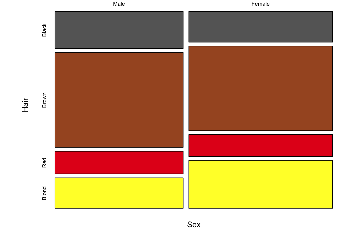
Figure 7.91: Three mosaic plots for all pair-wise combinations of three variables (hair colour, eye colour and sex) is an extension of stacked bar charts. Note the loss of a scale, since each axis adds up to 100% of the data, area is equivalent to size of the group.
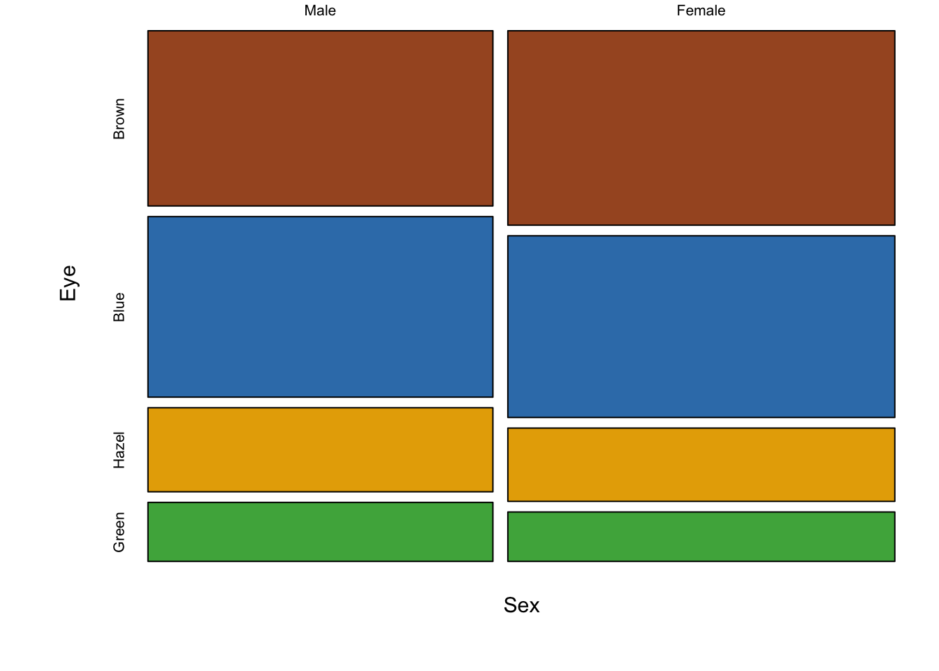
Figure 7.92: Three mosaic plots for all pair-wise combinations of three variables (hair colour, eye colour and sex) is an extension of stacked bar charts. Note the loss of a scale, since each axis adds up to 100% of the data, area is equivalent to size of the group.
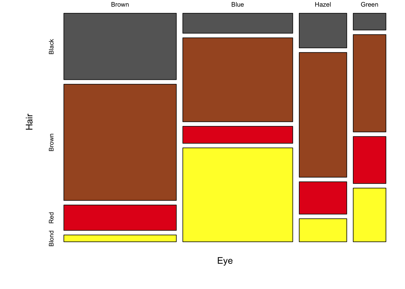
Figure 7.93: Three mosaic plots for all pair-wise combinations of three variables (hair colour, eye colour and sex) is an extension of stacked bar charts. Note the loss of a scale, since each axis adds up to 100% of the data, area is equivalent to size of the group.
The real strength of mosaic plots is their ability to represent three categorical variables simultaneously (fig. ??). This is the first plot that starts to tell the reader something interesting. The area of each box represents three variables, all possible combinations can be viewed and compared in a single plot. A logical extension of the basic mosaic plot is to reveal our underlying statistical analysis, where we asked which sub-groups are over- or under-represented. Using a colour scale, boxes (understood as sub-group intersections) are shaded according to their relative over- or under-representation in the data set as a whole. This communicates a story to the reader in an effective manner, using appropriate encoding and colouring to convey a message. In this case, the story is that categories with high positive residuals are more frequent in the population than the equiprobability model would predict.
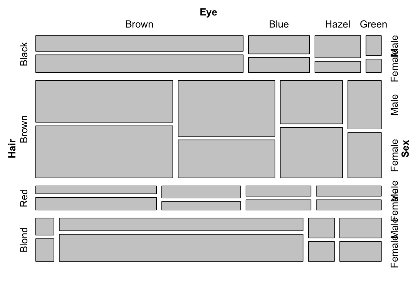
Figure 7.94: Mosaic plots with three variables (hair colour, eye colour and sex) depicting all possible combinations in the data set. Left: Uniform shading. Right: Shading according to Pearson’s residuals.
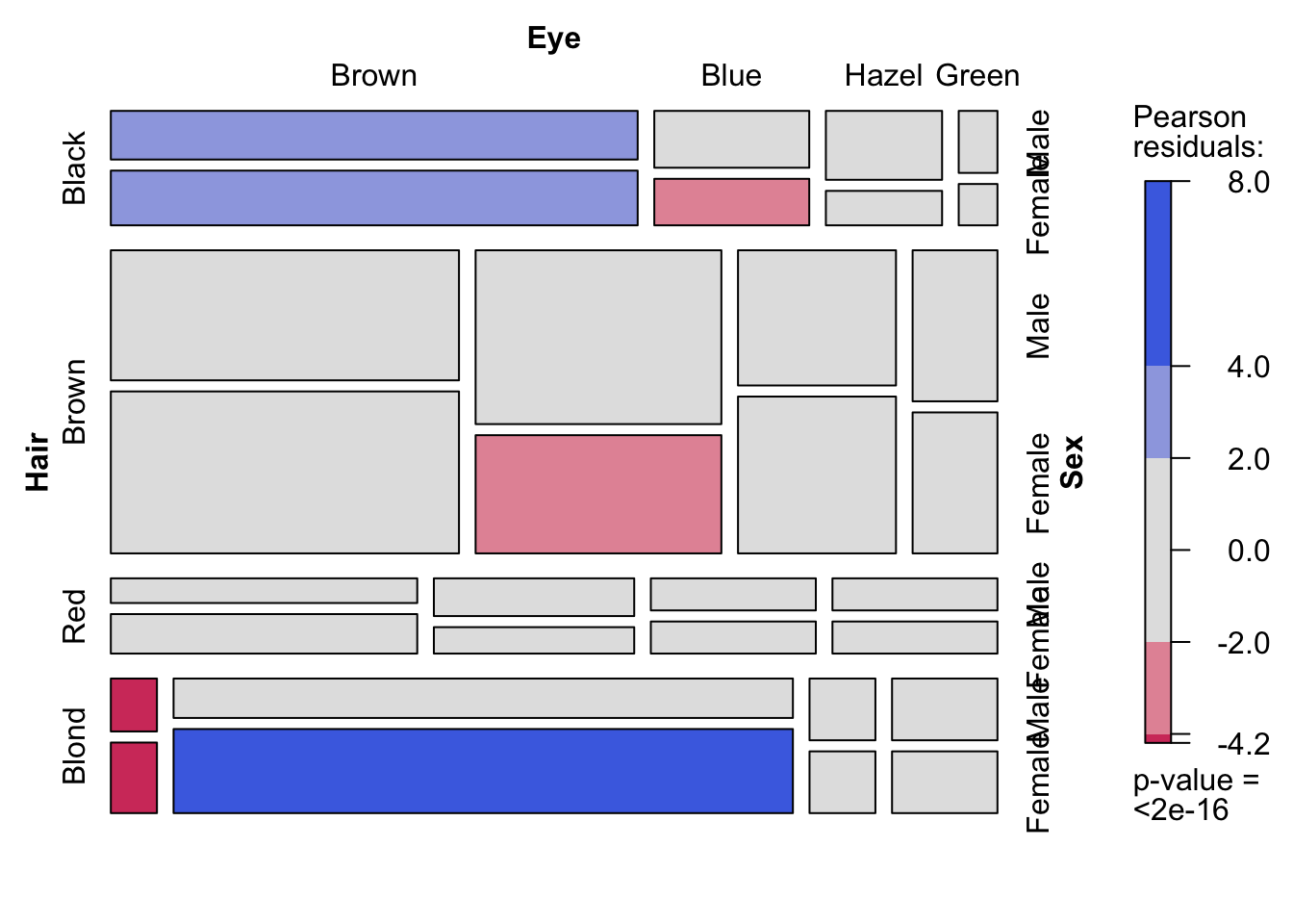
Figure 7.95: Mosaic plots with three variables (hair colour, eye colour and sex) depicting all possible combinations in the data set. Left: Uniform shading. Right: Shading according to Pearson’s residuals.
We can go one step further in our representation of these three categorical variables and use area to represent the results from a Pearson \(\chi^{2}\) test as an association plot, as shown in figure 7.96. The heights are proportional to the standardized Pearson residuals and the width is proportional to the square root of the expected value for that category given the equiprobability model. In each row, the base line equals independence and each box is plotted on a common scale. Here position and colour clearly indicate which categories are over- and under-represented, and to what degree.
Figure 7.96: An association plot of all 32 possible hair colour/eye colour/sex combinations.
7.12.5 Showing Distributions in Two Dimensions with a Smoothed Scatter Plot
A smoothed scatter plot is an interpretation of a two-dimensional density plot. Either drawing lines of the density function or using shading for a “smoothed scatter” are solutions to the problem of plotting large data sets (i.e. dense scatter plots). In this case, the colour of the lines can also be used to represent density. In the example shown in fig. 7.97, the duration of eruptions and wait time between eruptions of the Old Faithful geyser in Yellowstone National Park in the US are plotted. The two variables are clearly positively correlated, but applying a linear model to explain their relationship would be insufficient, because the variables are both bimodel, independently and in combination. This becomes evident when using density lines or a smoothed scatter. There are clearly two clusters, short eruptions occur after less than a one hour wait, longer eruptions occur after waiting approximately 80 minutes.
Figure 7.97: Two-dimensional density plots are an alternative to scatter plots when clustered points are of interest. Upper-left: A scatter plot of the Old Faithful geyser data set draws attention to the positive correlation between eruption duration and waiting time. Upper-right: A two-dimensional density plot highlights the clusters. Middle panels: This trend is clearer when the contour lines are coloured according to density, or when a colour gradient is used. Lower panels: A lower bandwidth allows a more detailed image of the data to emerge.
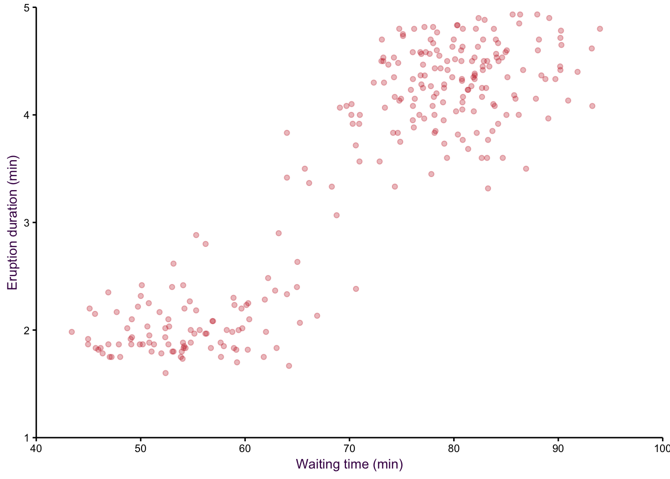
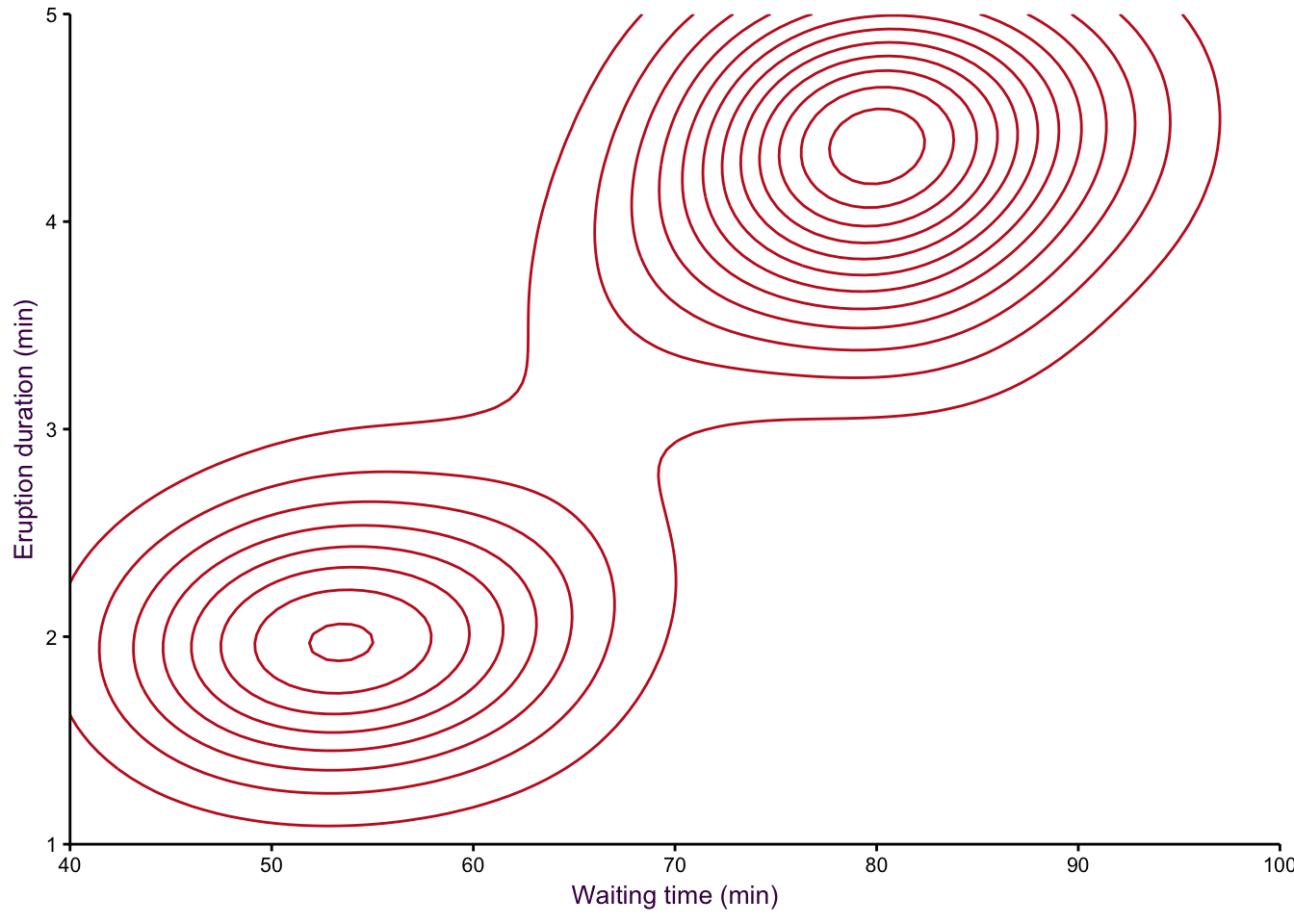
Figure 7.98: eruptions
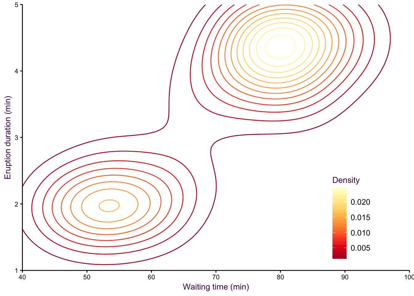
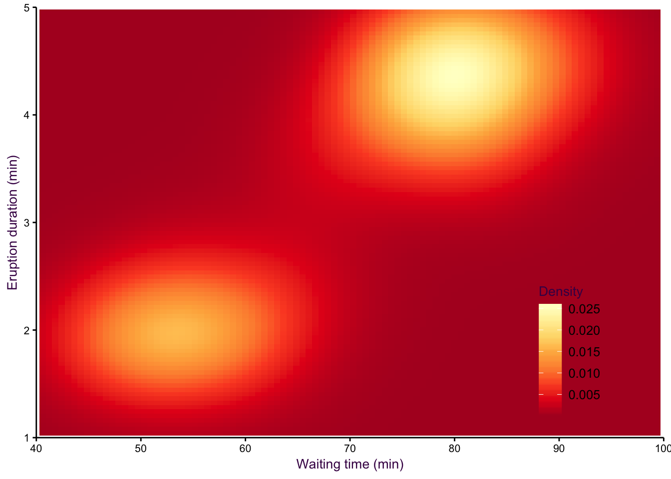
Figure 7.99: eruptions 2
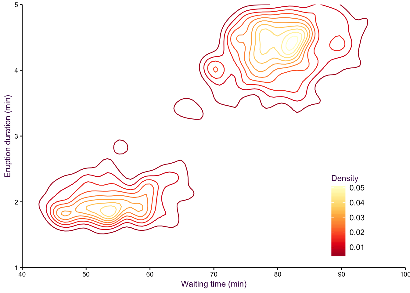
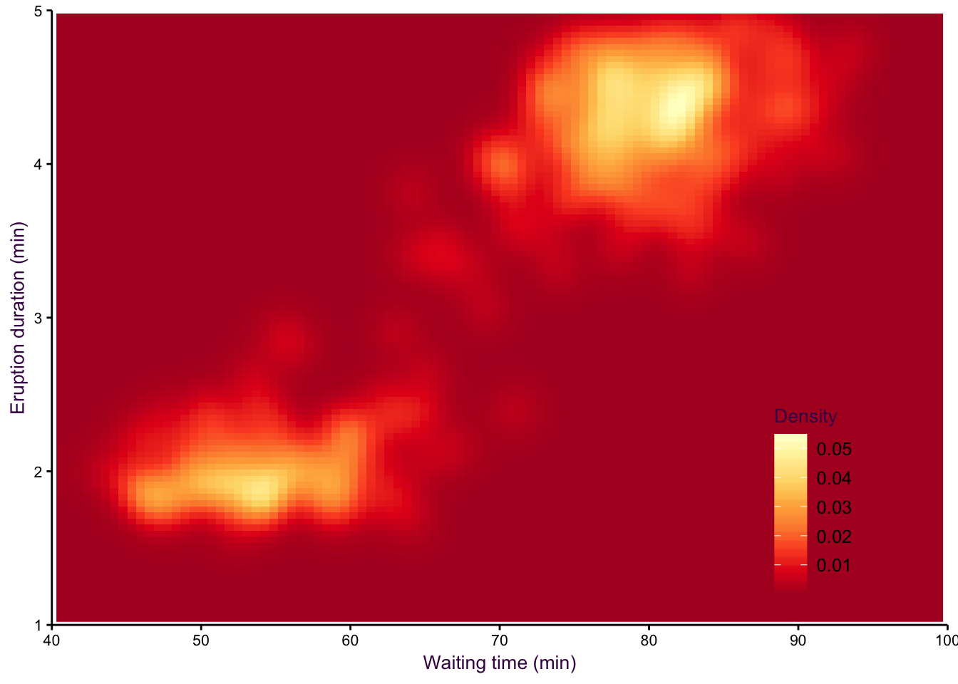
Figure 7.100: eruptions 3
7.13 Intersections between two or more variables
7.13.1 Venn and Euler Diagrams
Venn diagrams are a popular choice for showing absolute counts of the same variable tested in different conditions. An example would be over-expressed genes identified in a systematic screen of several different comparisons. The question being asked is to what extent is the composition of the variable (i.e. over-expressed genes) consistent under different conditions. The key to a useful Venn diagram is to show all possible pairwise comparisons and allow the size of the circles and overlap to be proportional to their actual values.
Euler diagrams are an extension of Venn diagrams, with a relaxation on the criteria that all possible combinations must be depicted. This means that there can potentially be several groups which are included in the diagram but do not overlap with any other groups. A common use of Euler diagrams is to show progressive sub-setting of a data set. For example, it is common to use several criteria on the out-put of a systematic screen to whittle down a list of many genes to a manageable number of interesting identifications. A visualisation of this process is depicted in figure ??.
better
Figure 7.101: Better venneuler version
7.13.2 Intersection plots:
Figure 7.102: An interaction plot is a great alternative to complex venn-euler diagrams.
7.14 Matrices
7.14.1 Multivariate Comparisons using Heat Maps
Heat maps are often used in combination with a clustering algorithm, although how data is clustered and how it is represented are independent. Here we will use the Golub data set comparing gene expression in different types of cancer cell lines to draw a heat map and consider some of the difficulties in this type of visualisation.
Consider a heat map depicting gene expression log2 fold-changes. log2 fold-change occurs on a continuous scale, but is often depicted with varying shades (saturation) of red and green. The first difficulty is that the reader must associate red (“bad”, “negative”) and green (“good”, “positive”) with a direction. This is unintuitive and raises the question of how no change, i.e. 0, should be represented. Often the choice is of colour black. There is clearly no logical reason why black is situated between red and green, but in this case it has been used to mask all uninteresting values with a log2 ratio close to 0. It is nearly impossible to interpret exact values from heat maps because of local effects on colour perception. In addition, colour saturation draws attention away from other more interesting values, for example a large number of moderately high log2 values, as opposed to the few very high values. Heat maps continue to be a common visualisation tool, although their popularity is arguably decreasing.
Figure 7.103: Colour is not appropriate for encoding continuous variables, but is popular with heat maps. Left: topological colour scheme, Middle: Red-black-green colour scheme, Right: sequential colour scheme.
7.14.2 7b) Multivariate Comparisons using Scatter Plot Matrices
A scatter plots matrix (SPLOM) is a great way of comparing multiple continuous variables. The example in figure ?? compares all four continuous variables of Fisher’s iris data set and colours each species according to colour. This is a data heavy and inherently redundant (symmetrical matrix) plot that is more suitable as an exploratory visualisation rather than an explanatory visualisation.
A Correlation matrix is a logical extension of a SPLOM, eliminating the redundancy in favour of statistical summaries. In the example in figure ??, three visualisations of the distribution of each variable are provided: a histogram with an overlaid density plot and underlying rug. A LOESS regression line is plotted over each scatter plot and in the corresponding boxes in the upper-right portion, their correlation values are provided with corresponding asterisks for significance. The large amount of summary information presented in this plot also makes it clear that this visualisation is more for exploration than presentation.
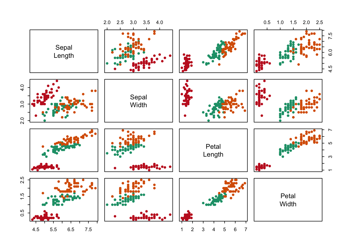
Figure 7.104: An example of a SPLOM (scatter plot matrix) and a correlation matrix.
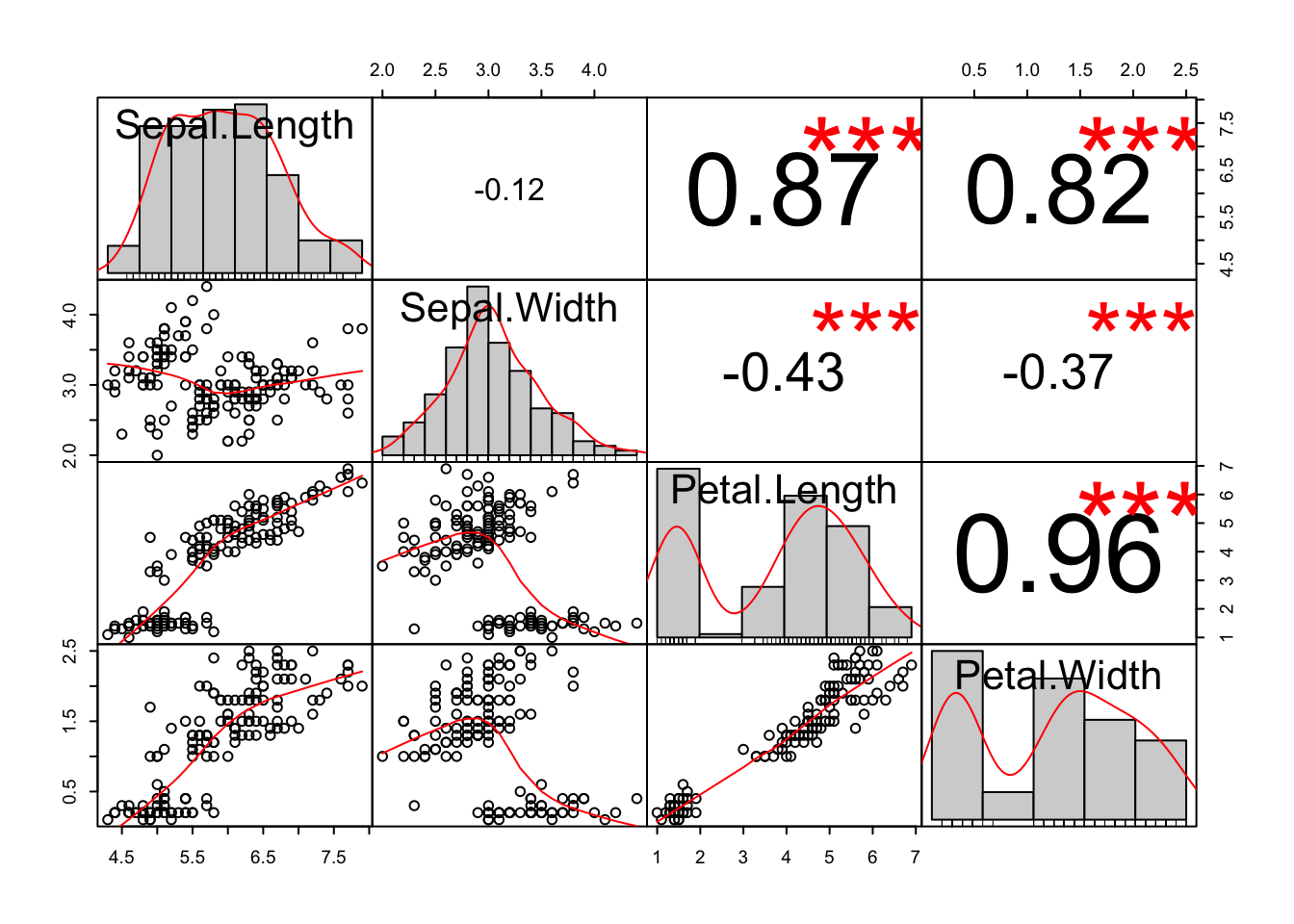
Figure 7.105: An example of a SPLOM (scatter plot matrix) and a correlation matrix.
A less common method, sunflower plots, depicts overlapping points with a flower-like pattern, having as many ``petals’’ as there are overlapping data points.↩
If we only want to emphasise the magnitude of the correlation coefficient (Pearson’s R = 0.74), then communicating it in the text would have sufficed.↩
Although you may be tempted to draw a 3-dimensional scatter plot for three variables, these are quite difficult for the reader to decode.↩
This is essentially how we understand data with bar plots (see page 7.10.1), but instead of using bars, we will use dots to represent each observation.↩
Although the dot plot presents more data, is it more difficult to identify setosa as the linearly distinguishable species.↩
See: this article for this example and the Food and Agriculture Organization of the United Nations here for the raw data.↩
We could refer to the second and third plots in figure ?? as deviation plots. A deviation plot shows how specific values differ from some reference point. The reference line must always be present.↩
In general, lines are inappropriate for comparing nominal and ordered variables because neither are quantitative. That is, the physical distance between categories, and thus the slope of the line, is arbitrary. In addition the order is also usually arbitrary, so that certain trends can be misrepresented. However, this is exactly what is done with parallel plots (see page 7.6.1). Contrast this with interval variables, which are quantitative. The spacing of categories is determined by the interval being described.↩
A common example of part-of-a-whole type problems is gene classifications in a list of significantly over-expressed genes identified by a microarray or mass spectrometry screen.↩
Your readers will preferentially and intuitively compare different aspects of a pie chart. Regardless of their particular preference, imagine the difficulty in calculating the angle (\(\theta\)), the area (\(\theta r^{2}/2\)), or the arc length (\(r(\theta\pi/180)\)), which which is what you are effectively asking your readers to do in their minds.↩
Perhaps the only instance where pie charts are suitable is for representing large quantitative differences in at most three groups, which begs the question if a visualisation is even necessary.↩
Note that in figures ?? and 7.96, colour is mapped to a continuous variable, something that we advised against in section @(fig:Cont-Encoding). In this case it is permissible because the continuous scale (Pearson’s residuals) has been partitioned into discrete bins, making it a categorical (interval) variable.↩