Chapter 4 Descriptive Statistics – Understanding Your Data
Descriptive statistics are often given a cursory treatment, both in classes and in real–life analyses. People think of them as self–explanatory and somewhat boring and are impatient to jump to more sophisticated downstream methods, like hypothesis testing. In this chapter, we’ll argue that using descriptive statistics is necessary for:
- Developing an intuitive feeling for your data,
- Finding mistakes in your data,
- Generating hypotheses,
- Communicating results in presentations and publications (Data visualization).
The reason why using descriptive statistics is so helpful with all of these things is that it provides a way to compress the dataset and to present it in a way that you and your colleagues can immediately understand. In essence there are two ways to carry out a descriptive analysis, either using one (or a few) numbers that describe the variables in an informative way or using plots. In this chapter, we will briefly talk about both of these options. The Scavetta Academy also offers an entire workshop dedicated to data visualization.
4.1 Types of Variables
Before we start with the actual data description, one of the most important points of this chapter is to remind ourselves of the fact that there are different kinds of variables! To do so, let’s take a look at the dataset in Table 4.1 which shows some of the variables that were recorded for the 10 Martians collected at site I:
| Height (cm) | Age (years) | Nose Colour | Eye Sight | Number of Antennae |
|---|---|---|---|---|
| 192.5 | 32 | Blue | Excellent | 0 |
| 212.2 | 21 | Blue | Excellent | 0 |
| 202.9 | 47 | Blue | Average | 5 |
| 190.3 | 61 | Blue | Average | 1 |
| 198.0 | 49 | Red | Average | 9 |
| 202.9 | 80 | Blue | Poor | 9 |
| 200.1 | 27 | Blue | Excellent | 0 |
| 199.6 | 74 | Blue | Poor | 5 |
| 201.8 | 63 | Blue | Average | 0 |
| 199.7 | 16 | Blue | Excellent | 1 |
Exercise What different kinds of variables do you see in Table 4.1?
4.2 Categorical variables
Categorical variables describe13 qualitative features and can take only a finite and countable set of possible values. In Table 4.1, this description applies to the variables nose colour and eye sight. Despite this common feature, there is a clear difference between the two variables. There is no inherent order to the values of nose colour, they can’t be put into a logical ascending or descending sequence. nose colour is a nominal variable. In contrast, the values of eye sight can; they are ordered (poor < average < excellent). Eye sight is an ordinal variable.
| Nominal | Ordinal | |
|---|---|---|
 |
 |
|
| Ordered | Yes | |
| Example | nose colour | eye sight |
4.3 Continuous variables
Continuous variables describe quantitative features and can take any value on a continuous scale. Obvious examples in the Martian dataset are height and age. Like with categorical variables, there are two sub-categories that we distinguish for continuous variables, namely interval and ratio.
| Interval | Ratio | |
|---|---|---|
 |
 |
|
| Meaningful zero | No | Yes |
| Example | temperature in celsius | height, age, temperature in K |
The difference between these sub–categories is rather academic: variables on a ratio scale have a natural zero whereas the value zero doesn’t have a direct natural meaning for variables on an interval scale. To demonstrate this distinction, think about temperature. On the Kelvin scale, the value zero really refers to the absolute minimum, whereas \(0\) is a rather arbitrary value in terms of absolute temperature.14
As the vast majority of continuous variables will come with a natural zero, we won’t bother with this distinction and will simply use the term continuous for both interval and ratio variables for the rest of the workshop.
4.4 Grey Zones
As always in life, things are not clear-cut, and sometimes it can be difficult to determine the variable type. Consider the number of antennae. From the dataset we see that Martians can have 0, 1, 5 or 9 antennae. Does this make the number of antennae continuous? Or is it ordinal with four categories? And now that we’re at it, what if the eye sight would have been recorded in dioptre (a unit of refractive power)? Would that turn eye sight into a continuous variable?
Actually it is hard to think of an ordinal variable that isn’t just a categorised version of a continuous variable. Whether you treat the variable as ordinal or continuous depends on the nature of the categorisation. With just three categories, eye sight is clearly an ordinal variable – especially as we don’t know how the categories were built and if there is an equal spacing between them. For number of antennae, the observed values in Table 4.1 would also point towards an ordinal variable. But imagine the next Mars expedition results in a big dataset in which the number of antennae takes most values between 0 and e.g. 107, then treating number of antennae as continuous might be justified.
Exercise Can you think of situation where age would be treated as a ordinal variable?
4.5 Suitable Questions and Information Content
The nature of the variables in a dataset is so important because it determines the questions that you can ask! This dictates the types of mathematical operations that can be performed which in turn has a direct impact on the type of analyses (including statistical tests) that can be used to investigate the data. Here is a summary of the types of questions that are meaningful for the different variable types that we covered above:
| Nominal | Ordinal | Interval | |
|---|---|---|---|
| How many of a certain kind? | yes | yes | yes |
| How many values are bigger than a certain value? | no | yes | yes |
| What’s the (mathematical) difference between two values? | no | no | yes |
The above table tells us that information content increases from nominal to ordinal to continuous. The more information you have, the more questions you can ask of your data!
4.6 Descriptive Summary Statistics
At the beginning of the chapter we said that the primary aim of descriptive statistics is to compress the dataset that you have in front of you in a way that the main features can be immediately understood. For a single variable, this is usually carried out by calculating two important features:
The location summarises the center of the observed values which can be interpreted as the most typical value of the variable.
The spread summarises how much the observed values scatter around the center.
4.7 Location
The location of a set of observed values can be thought of as a single value that best describes the variable. It summarises where the center of the variable is located, and is sometimes called the central tendency. But center can be interpreted in different ways, which gives rise to different measures of location. The three most common measures are the mode, the median, and the mean.15
4.7.1 The mode
The mode is simply the value that is most frequently observed. If you were to plot the values, it would refer to the peak of the plot. The problem with the mode is that it can result in several values.
Exercise What’s the mode for nose colour in Table 4.1? What’s the mode for height?
4.7.2 The median
The median is the value that sits in the middle of the data regarding the order of magnitude. To find the median, the values of interest are arranged in ascending order and split into two equally sized groups. For example, in Table 4.1, the number of antennae would be arranged as
0 | 0 | 0 | 0 | 1 | 1 | 5 | 5 | 9 | 9
We have an even number of values, producing two groups of five values each. The median is therefore assigned to be the average between the two center values, i.e. \((1+1)/2\). If we had an odd number of values, the case is easier. We just take the observation that is in the middle of the ordered sequence.
Exercise Imagine that the \(10th\) value was 107 antennae, instead of 9. What would be the median now? What does the result imply for the median in terms of its robustness to outliers?
Exercise What’s the median for nose colour in Table 4.1? What’s the median for eye sight?
4.7.3 The (arithmetic) mean
The mean is the average value of all the observations. To calculate it, we simply sum up all the values and divide it by the number of observations. The corresponding formula looks like this
\[ \bar{x} = \frac{x_1 + x_2 + \ldots + x_{n-1} + x_n}{n} = \frac{\sum_{i = 1}^n x_i}{n}, \]
where \(n\) denotes the number of observations.
Exercise Calculate the mean for number of antennae, once wih the original data and once imagining the \(10th\) value was 107 antennae, instead of 9. What do the results imply for the mean in terms of its robustness to outliers? Does it make sense to calculate the mean number of antennae?
Exercise What’s the mean for eye sight in Table 4.1? What’s the mean for nose colour?
These examples have shown us that the different measures of location require different mathematical operations (e.g. sorting and calculating sums). This is why not all measures of location are suitable for all variable types (cf. also Table 4.4).
| Variable Type | Mode | Median | Mean |
|---|---|---|---|
| Nominal | Yes | No | No |
| Ordinal | Yes | Yes | No |
| Continuous | Yes | Yes | Yes |
4.8 Spread
The location tells you about the typical value of a set of observations, whereas the spread tells you about how much variation there is around the location.16 Just as there are different measures of location, there are also different measures of spread.
4.8.1 Proportions
Proportions are a very simple measure of spread. They are not used very often, because (unless the variable can only take two distinct values) more than a single number needs to be reported. Sometimes though, proportions are the only measure of spread that you can report, see Table ??, below. For example, the proportions for the number of antennae are \(p(0) = 0.4\) and \(p(1) = p(5) = p(9) = 0.2\).
Exercise What would you do if you wanted to report proportions for height?
4.8.2 The Range
The range is defined as the distance between the minimum and the maximum of the observed values. This can either be reported as the interval or the difference between these most extreme values. As we will explain below, the minimum and maximum are sometimes referred to as \(0th\) and \(4th\) quartile of the data which are commonly denoted as \(Q_0\) and \(Q_4\), respectively. With this, the formulae for the range become \([Q_0, Q_4]\) or \(Q_4 - Q_0\).
4.8.3 The Interquartile Range
The interquartile range is defined as the distance between the \(1st\) and the \(3rd\) quartile of the data. Let’s deal with quartiles first. There are five of them17 that split the data in four even chunks. So far we have heard that the minimum is \(Q_0\), and the maximum is \(Q_4\). Also without noticing, we have also already learned about \(Q_2\) which is the median. So there are only \(Q_1\) and \(Q_3\) left. For this, let’s have a look at the number of antennae again. They are split into two evenly-sized groups by \(Q_2\),
0 0 0 0 1
and
1 5 5 9 9
From here it’s super easy to arrive at \(Q_1\) and \(Q_3\) which are just the medians of the lower and upper chunk, respectively. So for the above data we have \(Q_1 = 0\) and \(Q_3 = 5\). Like the range, the interquartile range can come in two forms, either as the interval \([Q_1, Q_3]\) or as the difference \(Q_3- Q_1\).
4.8.4 The Variance
The variance is defined as an average of the squared distance of each data point from the mean18. The corresponding formula is
\[ s^2 = \frac{\sum_{i = 1}^n (x_i - \bar{x})^2}{n-1}. \]
The values in the numerator are squared to avoid the possibility that negative and positive distances \((x_i - \bar{x})\) cancel out. Note that the unit for the variance of a variable is the original unit squared (e.g. the variance for height would have the unit \(cm^2\)) which makes it difficult to work with. To simplify this, we use the standard deviation.
4.8.5 The Standard Deviation
The standard deviation is the square root of the variance, i.e. \[ s = \sqrt{s^2} \] which provides a measurement of spread on the same scale as the original dataset. {#var-sq}
Like with the measures of location, not all measures of spread can be calculated with all variable types. Table 4.6 gives an overview of the possibilities.
| Variable Type | Proportions | \([Q_0, Q_4]\) or \([Q_1, Q_3]\) | \(Q_4- Q_0\) or \(Q_3- Q_1\) | variance or standard deviation |
|---|---|---|---|---|
| Nominal | Yes | No | No | No |
| Ordinal | Yes | Yes | No | No |
| Continuous | Yes | Yes | Yes | Yes |
4.9 Overview and outlook
We have now learned about a number of descriptive statistics and when to use them. Let’s apply this to the height variable in Table 4.4. It’s displayed in Figure 4.1.
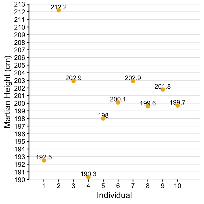
Figure 4.1: The values for height from 10 Martians collected at Site I.
Exercise Calculate \(\bar x\), \(s^2\), \(s\), \(Q_0\), \(Q_1\), \(Q_2\), \(Q_3\), \(Q_4\), the range and the interquartile range from Figure 4.1!
As mentioned above, both location and spread should be reported when a variable is described. The combinations that go well together are either \((\bar x, s)\) or \(Q_2\) with the range or interquartile range.
4.10 Outlook – relation to statistical models
Let’s talk about the combination \((\bar{x}, s)\) for a minute. If you draw \(\bar{x}\) as horizontal line in Figure 4.1 and then vertically connect each of the observed values with this line, this might remind you of a picture that you have seen before in the context of linear regression. We won’t cover linear regression in this workshop until Chapter @ref(sec:linear_regression), but let’s seize the opportunity to already point out a connection between topics here!
Although they are not normally referred to as such, the vertical distances that you drew can be seen as residuals that describe the discrepancy between the very simple linear model \(\bar{x}\) and the data points \(x_i\). The size of the individual residual \((x_i - \bar{x})\) tells you how well the model \(\bar{x}\) fits the data point \(x_i\), and if you were asked to provide an overall measure for the goodness of fit of the model (that avoids cancelling out between negative and positive residuals) you would quickly arrive at the standard deviation \(s\)!
Hold this thought, this will become an important view of the world later in the workshop!
4.11 Boxplots
Before we move to the next chapter, we also would like to briefly talk about graphical ways of data description. A very important topic in this context is the boxplot which can be drawn using the quartile–based location/spread measures.
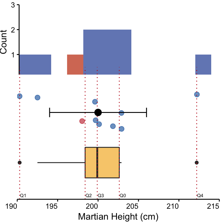
Figure 4.2: Three visualisations of a symmetrical dataset : Height of 10 Martians from site I. top: A histogram, and middle: A dot plot, coloured according to nose colour, depicting mean and standard deviation in black. bottom: A box plot. The mean and median are similar, indicating that the data is symmetrically distributed around the mean.
A box plot of the Martian height data set is shown the upper panel of Figure 4.2. The box encompases the IQR, and the “whiskers” extend up to, but no further than the maximum value within a fence of \(1.5\times\) IQR, in either direction. Data points beyond this region are represented as points.
There are two important considerations here. First, not every graphical software program defines the default cutoff value for these points in the same way, and it can also be manually set. Second, these points cannot automatically be classified outliers, although students consistently like to refer to them as such and they are even called that in many software packages. They are more accurately referred to as extreme values. Importantly, they shouldn’t automatically be discarded from the analysis. Often extreme values are the interesting ones as they are unexpected and deserve a thorough investigation.
Exercise If there is no universal defintion for an outlier, how would you identify and eliminate outliers?
Boxplots are a convenient way to visualise the distribution of a variable. For continous variables there are two other options that we’ll briefly mention here, namely dot plots and histograms.
Dot plots are the most transparent visualisation method for continuous variables. Here, every data point is shown and can be coloured according to another variable. We also added the region \([\bar x - s, \bar x +s]\) to the plot. Compare the dot plot to the histogram and box plot in Figure 4.2.
4.12 Skewed distributions
Ideally, we like to work with unimodal symmetrically distributed variables like Martian height shown above. Data points are centered around the mean (exhibiting only one peak) and evenly distributed on either side, becoming less frequent as we move away from the center. The mean and the median are very similar in symmetrical distributions. However, you may also observe skewed distributions.
Positively-skewed data have a long right tail, with observations clustering at lower values; the mean is higher than the median. Conversly, Negatively-skewed data have a long left tail, with observations concentrated at higher values; the mean is lower than the median.
Height at Site I is symmetrically distributed (Figure 4.2). The Body-Mass Index (BMI, a combination of height and weight that provides a measure of relative size) is often positively-skewed. Below a certain value individuals are likely to die, but very high values in some individuals are possible (Figure 4.3). Scores on aptitude tests, which may be too easy for the target group, are often negatively-skewed. That is, most participants are likely to have a high score (Figure 4.4). Another example of a negatively-skewed variable would be age at onset of a disease that appears in old-age (e.g. dementia, arthritis).
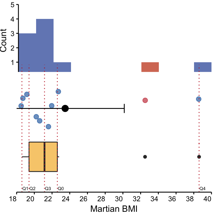
Figure 4.3: Three visualisation of a positively-skewed dataset : BMI of 10 Martians from Site I. top: A histogram, and middle: A dot plot, depicting mean and standard deviation, coloured according to nose colour. bottom: A box plot. The long right tail is evident in all visualisations and the mean is larger than the median, indicating a positive skew.
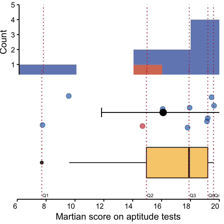
Figure 4.4: Three visualisation of a negatively-skewed dataset: Scores on an aptitude test of 10 Martians from Site I. top: A histogram, and middle: A dot plot, depicting mean and standard deviation, coloured according to nose colour. bottom: A box plot. The long left tail is evident in all visualisations and the mean is lower than the median, indicating a negative skew.
Exercise Give an example of a positively or negatively-skewed variable that you will encounter in your own work.
You may also see this referred to as discrete data, which refers to distinct, non-overlapping groups. Other names are qualitative or factor data. Don’t let the different terminology confuse you!↩
The presence of a natural zero is important when it comes to building ratios. In terms of absolute temperature, 20K is really twice as warm as 10K whereas the relationship between 10 C and 20 C is not immediately obvious.↩
Here we use mean to refer to the arithmetic mean. You may also encounter the geometric mean during your studies and perhaps even the harmonic mean (although it is very rare). There are even other variations on the theme, such as weighted means.↩
Just like the location, the spread is exactly what is sounds like. Think Nutella - or schmaltz, if that’s your thing - how wide can you spread it around?↩
The five quartiles \(Q_0\), \(Q_1\), \(Q_2\), \(Q_3\), \(Q_4\) are sometimes also referred to as the 5-number summary.↩
Note the denominator which is \(n-1\) instead of \(n\), so the variance is like taking the arithmetic mean of the squared distances \((x_i - \bar{x})^2\).↩