Chapter 20 Case Study: Depletion Curves
20.1 Learning Objectives
By the end of this chapter you should be able to:
- Low-level EDA (exploratory data analysis)
- Data munging with
dplyr - Merging files
- Base graphics for quick plots and ggplot2
20.2 Introduction
Microscale thermophoresis (MST) experiments are used to measure affinity of interaction between two different molecules. Affinity is expressed in the value of the dissociation constant (KD). The goal of the experiment in this case-study is to measure the dissociation constant (KD) of the binding between the neutrophil elastase and its ligand elafin directly in plasma.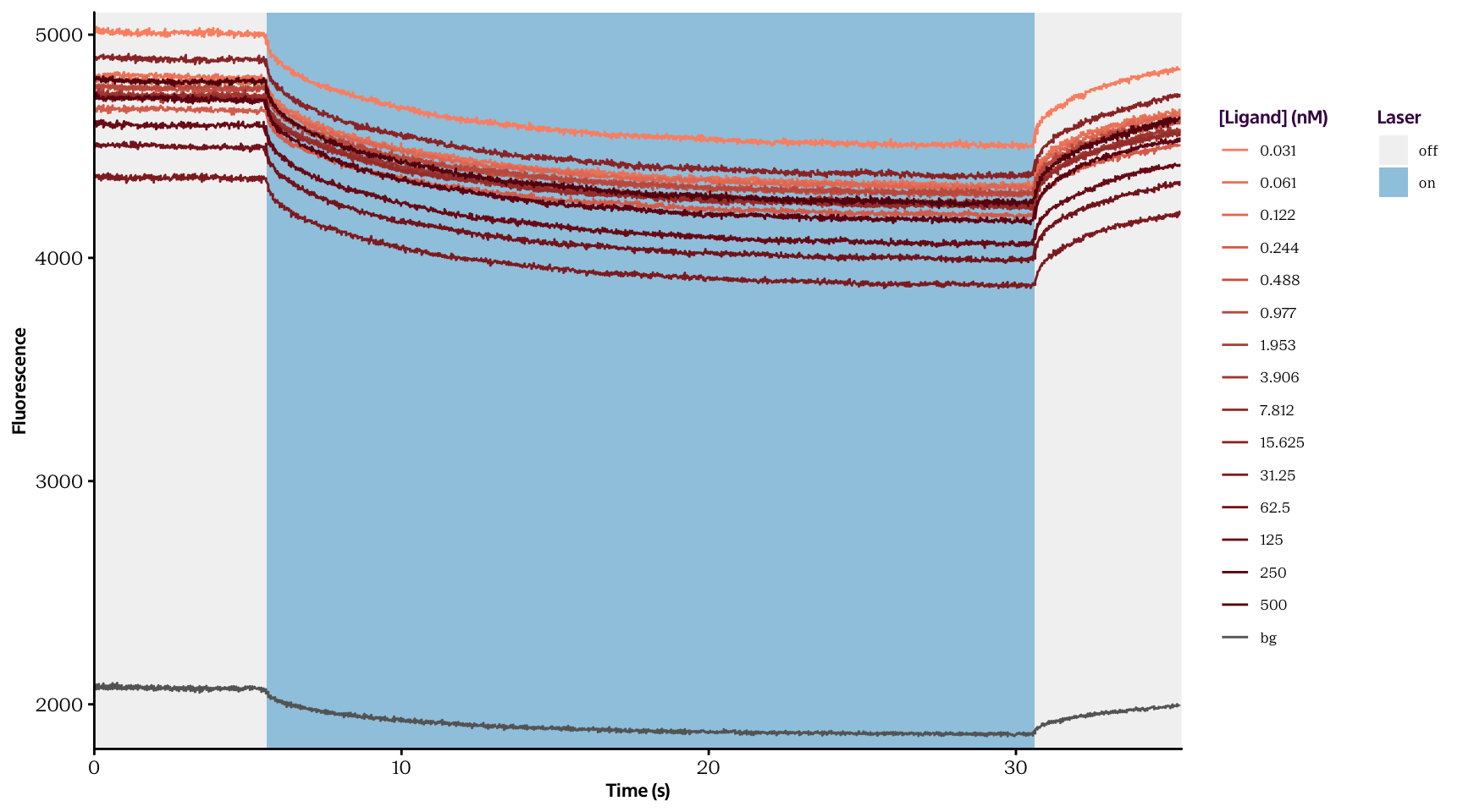
In MST experiments, one of the two molecules is labelled with a fluorescent dye. Here, neutrophil elastase was labeled with Alexa Fluor 647 dye. A spot in the solution is then heated with an infrared laser to create a temperature gradient of 3 - 4 degrees Kelvin. The temperature gradient makes different molecules move differently depending on their size, charge, and hydration shell. This effect is called thermophoresis and can be monitored by measuring the fluorescence around the heated spot in the solution. The degree to which the fluorescently labelled molecule is bound to its ligand (free to completely bound) is reflected in the amount of thermophoresis.
In this case study we will work with the data to develop depletion curves, of the raw data.
20.3 Case-study Details
For this analysis, 15 concentrations of the unlabeled ligand molecule were tested. The raw data which we will use is contained in two files (described below) and are depicted in fig. 1.
Curves.txt contains thermophoresis time traces for 15 samples containing the same concentration of the fluorescently-labeled binding molecule and 15 different concentrations of the unlabeled ligand. For each ligand molecule concentration, the experiment is performed in triplicates. The columns are arranged as presented in the margin.
timefluorescence for 0.031nM run1timefluorescence for 500nM run1timefluorescence for 0.031nM run2timefluorescence for 500nM run2timefluorescence for 0.031nM run3timefluorescence for 500nM run3
BG.txt contains the data for thermophoresis time traces of the background (only plasma in the sample, no fluorophore) in triplicate. The columns arrangement is presented in the margin.
timefluorescence run1timefluorescence run2timefluorescence run3
Your task is to subtract BG.txt curves from Curves.txt. Then, to calculate depletion levels by dividing the fluorescence level when the laser for temperature gradient is on (e.g. from 29th second until 29.9th second) by the fluorescence level when the laser is off (e.g. from 4.5th second until 5.4th second). Next, you’ll average triplicates of depletion levels for each ligand concentration, and plot the binding curve (averaged depletion levels against ligand concentrations).
20.4 Read in the background data
Begin a new R Markdown script. Fill in the details with the title of this exercise, your name & date.
Exercise 20.1
Import the BG.txt file and save it as an object called bg. Use the typical functions for exploring the structure of a data frame to confirm this file is what you think it should look like.
Pay attention to how the variables are called. Notice that they all begin with an X, because R doesn’t like beginning variable names with digits. You should also notice that the columns don’t exactly match what we expected given the file description above.
read.delim() command.
Maybe this particular file has this feature, but in the future, other files will be OK, so if we blindly remove the last column, we’ll lose data! Therefore, we can run a check, if the last column is full of NA values then we remove it, otherwise we keep it.
Exercise 20.3 (Optional) Write an if statement that checks if the last column is only NA values. If TRUE then remove it.
The columns containing time are identical, so they are redundant.
c(3,5)).
"time", "bg_1", "bg\\_2", and "bg\\_3".
You should have been able to complete all the exercises up until this point with the material covered until the end of day 2. The next tricks are how to work with the data further and combine background and raw data. We can continue to use the data in this format, which is wide format data, but we will use the material covered on day 3 to transform this to long format data.
The resultant data frame should have the dimensions 1425, 3.
20.5 Read in the raw data
curves.txt contains more information, since we have all 15 concentrations of the unlabelled ligand molecule
curves. Use the typical functions for exploring the structure of data frames.
When looking at the structure of curves you’ll notice something strange.
The reason for this is that NA characters are coded using different symbols, so we need to take this into account when reading in the file!
NA values are coded?
NA values can be coded.
NA values. Use the conditional statement you wrote earlier to remove this column. Also, the last row contains some NA values, so we can remove it.
The dimensions of curves should now be 475, 90
The curves data frame now has the dimensions 475, 46 and the names X0.0_t, X0.0_f, X0.1_f, X0.1_f.1, X0.2_f, X0.5_f. We should give some meaningful names to make it easier to work with later on. Notice that the concentrations are in the variable names, but that they have been rounded, this causes some problems in particular for the fourth and fifth columns, where \(0.061\) and \(0.122\) have both been rounded to \(0.1\). We also want a consistent naming format like what we did with the bg data frame, because we’ll combine this all pretty soon.
Use the following command to define the concentrations used. The "_" is part of the new name. Just replace the ___ parts.
conc <- c(0.031, 0.061, 0.122, 0.244, 0.488, 0.977, 1.953, 3.906, 7.812, 15.625, 31.25, 62.5, 125, 250, 500)
names(___) <- c("___", paste("___", conc, "_", rep(___, each = ___), sep = ""))
Exercise 20.13 We also want to have a consistent naming convention for the column headers to make it easier to work with this in the future. We will gather this data afterwards. Change the column names to:
timeconc0.031_1, conc0.061_1, conc0.122_1, \dotsconc0.031_2, conc0.061_2, conc0.122_2, \dotsconc0.031_3, conc0.061_3, conc0.122_3, \dots
20.6 Combine background and raw data
rbind() or bind_rows() to put the two data frames together, then use separate() to split up the var column into probe and rep variables.
probe and rep variables to factors.
You should now have a data frame called total with dimensions measuring (22800, 4) and variable names time, probe, rep, value. If you had a hard time to get to this point. This data frame has been provided for you as total.txt, which you can import in to R.
20.7 Normalise and plot the data
We now have a large data frame with 16 time series: one for each of the 15 concentrations and a reference background. We need to subtract the background at each time point from all 15 concentrations, but before we do that, let’s use some simple visualisations to see what we’re dealing with.
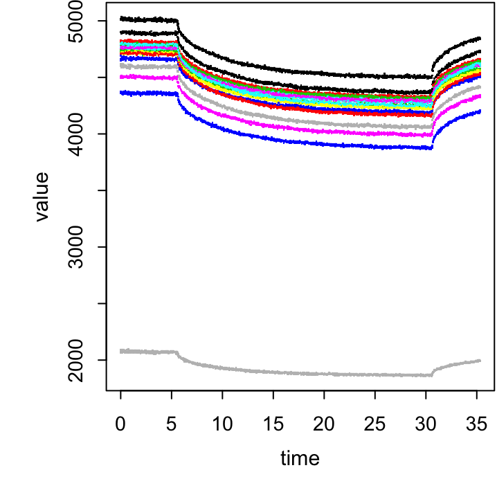
Figure 20.1: The plot for the above exercise
Now we’re ready to subtract the background curves from the measured values. This is where the power of long-format data and plyr comes into action!
total.sum and plot it as before (see figure 20.2).
# First take the average of all reps for each probe at each time point:
total %>%
  group_by(___, ___) %>%
  summarise(value = mean(___, na.rm = T)) -> total.sum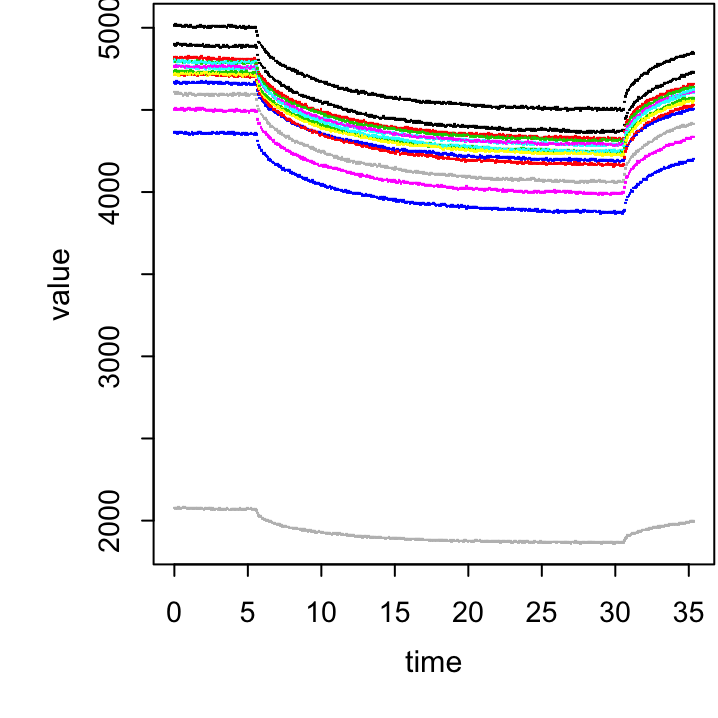
Figure 20.2: Exercise figure.
# Calculate the differnce above bg:
total.sum %>%
  group_by(___) %>%
  mutate(___ = ___ - ___[___ == "___"]) -> total.sum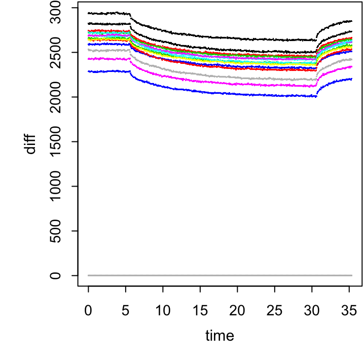
Figure 20.3: The plot for exercise above.
20.8 Calculate and plot the depletion curves
Now we are ready to calculate depletion levels. To do this we’ll need to divide the average fluorescence level when the laser is on (29.0-29.9s) by the fluorescence level when the laser is off (4.5 - 5.4s).
last that contains the values “off” and “on” for the appropriate time frames.
total.sum %>%
  group_by(___) %>%
  summarise(averageON = mean(diff[___ == "___"]),
averageOFF = mean(diff[___ == "___"])) -> total.sumNow we have the values for the binding curve (averaged depletion levels against ligand concentrations).
Exercise 20.24 First, remove the background probe since we don’t need that for plotting. Once the background is gone, all of our probes are numerical, which means we can use them as the x axis in our plot. Make sure they are classified as such, and not as characters.
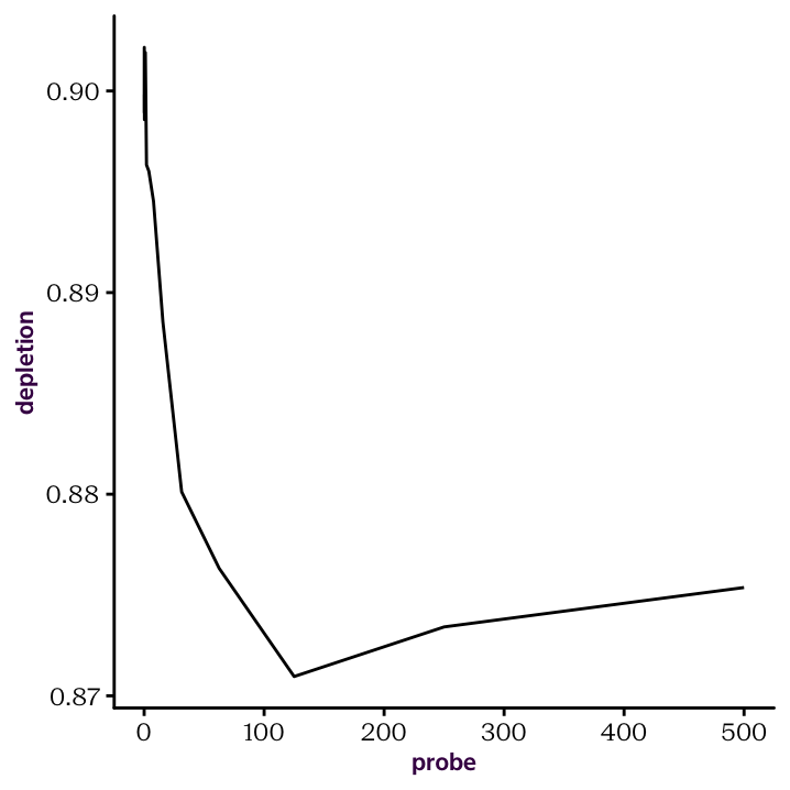
Figure 20.4: Raw depletion curve.
20.9 Transform and plot the depletion curve
Exercise 20.26 Shift the curve so that the baseline at the high ligand concentrations is at the zero level. To do this we'll just normalize so that the minimum value is at zero. Afterwards, draw the normalized depletion curve, and set the x-axis to a log scale (fig 20.5).
The KD is the concentration measured on x axis that correspond to max(Y axis)/2.
ggplot(total.sum, aes(log(probe), depletionNorm)) +
  geom_line() +
  geom_hline(yintercept = max(total.sum$depletionNorm)/2, col = "red")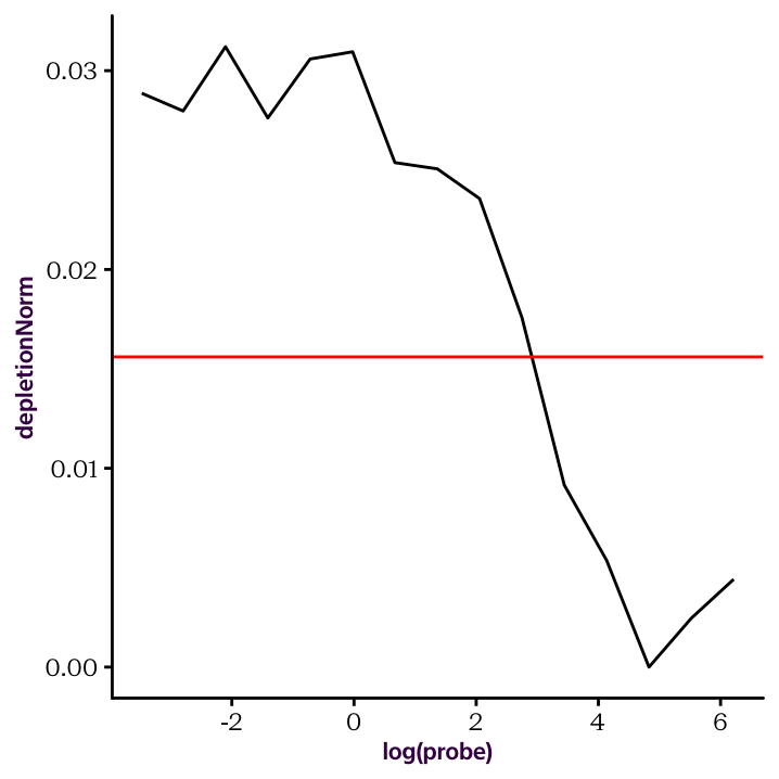
Figure 20.5: The normalised depletion curve plotted on a log x scale.