Chapter 13 The Limits of Untidy Data
So far we’ve been working with the protein.df data set as a long list observations (each row is a protein). This is ok, but you probably noticed that there was a lot of repetition in our code, which makes it longer and more error prone.
We’ll deal with this in the next sections by using the dplyr functions to access our data in better ways than we have done so far and then well use the full power of tidy data to make an elegant workflow.
Before we get there, let’s take a look at one more exercise implementing factor variables in a plot.
13.1 Plotting Challenge
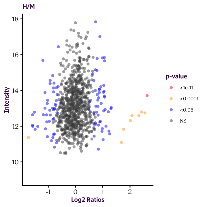
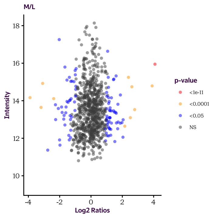
Until now we plotted histograms of our protein.df data frame to check the distribution of our data. These are useful exploratory plots. Now we’re ready to produce some explanatory plots, like the two shown here.
Because of how our data is arranged, you’ll need to make two separate plots. We’ll see how to make this more efficient in the next sections.
Ratio.H.M.Sig.Cat and Ratio.M.L.Sig.Cat and use the cut() function to convert the continuous significant values into factor variable (categorical values). The break points should occur at 1e-11, 1e-4 and 0.05. Check the help page to understand how to use the function.
Ratio.H.M.Sig.Cat and Ratio.M.L.Sig.Cat, produce the two scatter plots given below and color the dots according to these values.